Details
IEASEMUSIC is Elegant NeteaseMusic desktop app, Rock with NeteaseMusic
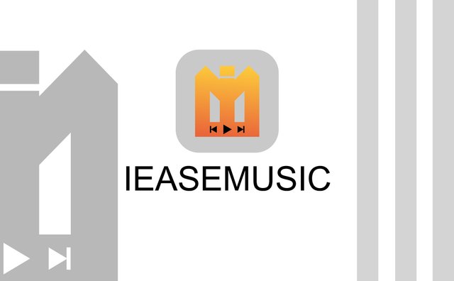
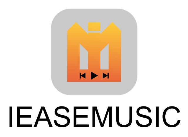
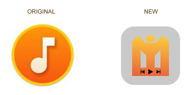
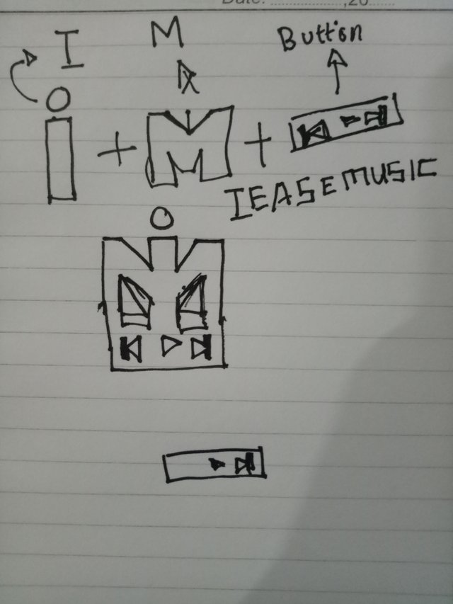
My Logo
Logo/Logo type versions
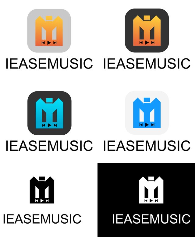
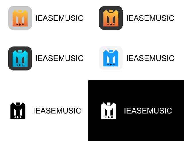
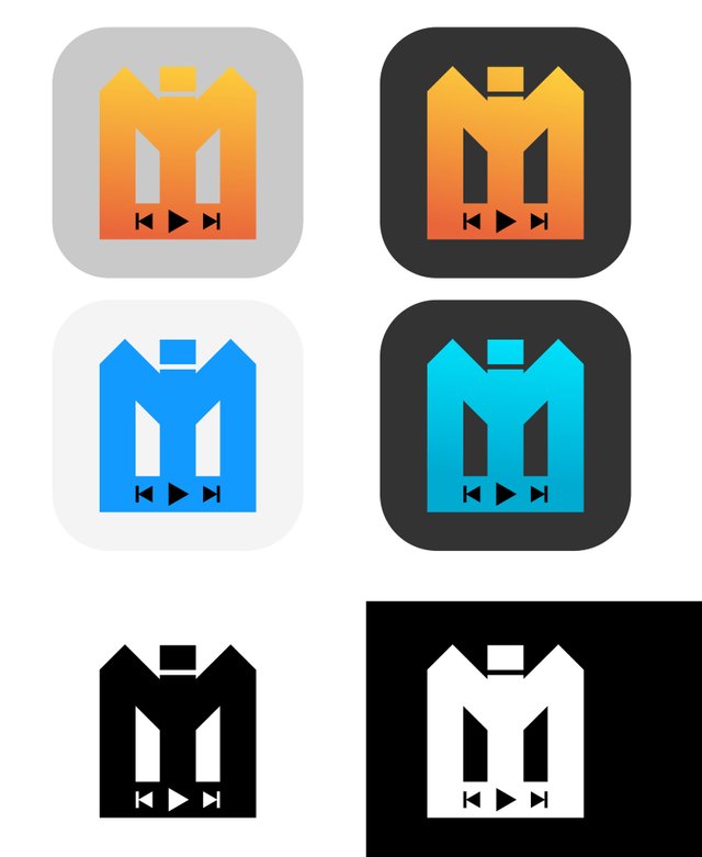
Logo/Logo Icons Versions
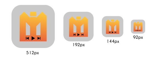
Logo/Logo Icon Size
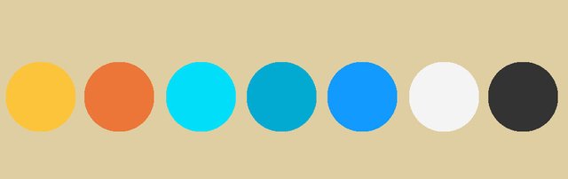
Logo/Logo Color Info
Benefits / Improvements
My design merge the letters I , M , and Button Play,Previously ,and Next.
Because the letters I and M explain the name of the application(IEASEMUSIC)
Tools
Adobe Illustrator cc 2018
Proof Of Work
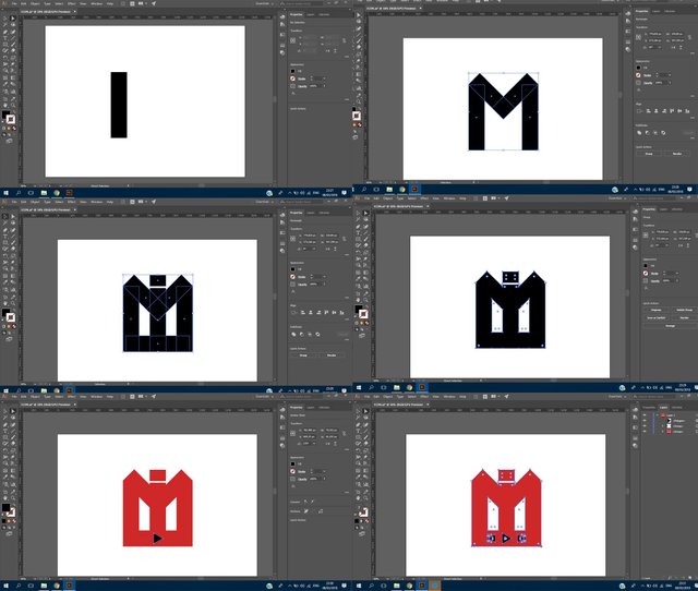
Original files
Posted on Utopian.io - Rewarding Open Source Contributors
some familiar name brought me here.....
Downvoting a post can decrease pending rewards and make it less visible. Common reasons:
Submit
Your contribution cannot be approved because it does not follow the Utopian Rules.
Hard rules broken:
Suggestion:
You can contact us on Discord.
[utopian-moderator]
Downvoting a post can decrease pending rewards and make it less visible. Common reasons:
Submit