I have been a Wordpress Developer since the start of my career, and today I will be showcasing a logo that I have made for Wordpress.

The Idea
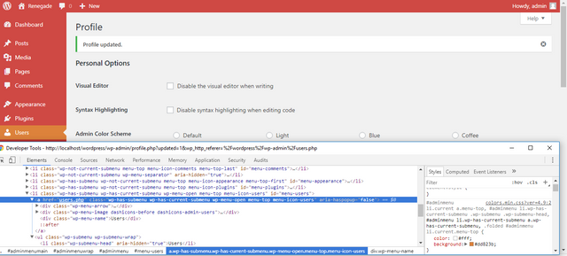
Upon browsing the Wordpress Admin Dashboard, I have come upon the users page where you can change the theme of the dashboard.

I then came up with an idea, how about I design a logo for each and every color scheme? Namely the famous default, light, blue, coffee, ectoplasm, midnight, ocean, and sunrise.
Using Google Chromes Developer Tools, I got the Hex Colors from the admin dashboard itself

Creating the Design
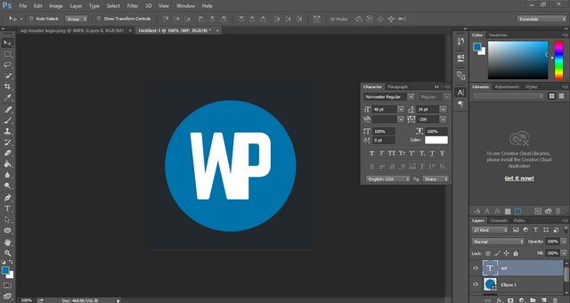
I used Photoshop to create the design, with the font called Norwester I then created the WP letters which is the shortcut for WordPress. I then created an ellipse shape that would be the base of the logo. I then reduced the tracking or the letter spacing to -200 to make the letters W and P to fuse together. With the color scheme of the default admin dashboard:


Default Color Scheme
I came up with this design.
Color Palette: #0073aa, #23282d, and #fff

Light
Color Palette: #f5f5f5, #888888, and #e5e5e5

Blue
Color Palette: #096484, #52accc, and #fff

Coffee
Color Palette: #c7a589, #59524c, #46403c

Ectoplasm
Color Palette: #a3b745, #523f6d, #413256

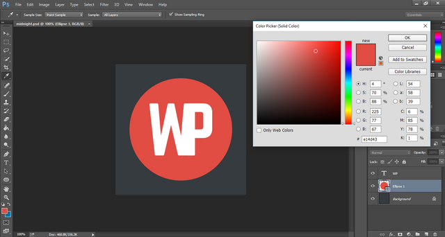
Midnight
Color Palette: #e14d43, #363b3f, #fff

Ocean
Color Palette: #9ebaa0, #738e96, #627c83

Sunrise
Color Palette: #dd823b, #cf4944, #be3631

I liked the Blue, Midnight, and Coffee Color schemes. So what do you think? What is the best color scheme? Drop a comment down below to make your say.
Links: Google Drive - PSD and PNG Files
Posted on Utopian.io - Rewarding Open Source Contributors
Great stuff and really nice to see your process, though I would suggest looking into "why" when selecting fonts, colours and creating bespoke elements.
The current Wordpress logo feels like a homage to the old letterpress process which speaks to the origins of publishing, and these types of considerations really add to the result, in my opinion.
That said, great use of colour and keep up the good work!
Downvoting a post can decrease pending rewards and make it less visible. Common reasons:
Submit
Thank you very much for the great comment. Yes selecting a font is also a critical process. As it describes the branding.
I never considered that though, what wordpress is for. Should have included it in the process. But well I wanted to make a completely different design. Thanks again for the comment I will keep this things in mind. :)
Downvoting a post can decrease pending rewards and make it less visible. Common reasons:
Submit
Hey, there's no right answer, I just thought I'd offer another voice to the mix. Really good stuff though 👍
Downvoting a post can decrease pending rewards and make it less visible. Common reasons:
Submit
Did not mean it that way haha. was just stating some points where I can improve on.
Downvoting a post can decrease pending rewards and make it less visible. Common reasons:
Submit
Thank you for the contribution. It has been approved.
I like your explantion of the process and the bold graphics are cool!
You can contact us on Discord.
[utopian-moderator]
Downvoting a post can decrease pending rewards and make it less visible. Common reasons:
Submit
Thank you very much :) Every design I make I explain the process
Downvoting a post can decrease pending rewards and make it less visible. Common reasons:
Submit
Hey @vallesleoruther I am @utopian-io. I have just upvoted you at 25% Power!
Achievements
Community-Driven Witness!
I am the first and only Steem Community-Driven Witness. Participate on Discord. Lets GROW TOGETHER!
Up-vote this comment to grow my power and help Open Source contributions like this one. Want to chat? Join me on Discord https://discord.gg/Pc8HG9x
Downvoting a post can decrease pending rewards and make it less visible. Common reasons:
Submit
I actually like the last one the best.
Downvoting a post can decrease pending rewards and make it less visible. Common reasons:
Submit
Nice pick, Sunrise. Liked the colors of that too. I usually like blue colors so Blue was my best choice.
Downvoting a post can decrease pending rewards and make it less visible. Common reasons:
Submit
Good process.
Though I don't like the thickness of the WP intersection. It makes it look optically unbalanced to me. I'd try playing with the vectorized W to improve that a bit.
Otherwise awesome job :).
Downvoting a post can decrease pending rewards and make it less visible. Common reasons:
Submit
Yes it kind of thick in between of the W and P might tweak it some more.. Thanks for the suggestion I will look into it :)
Downvoting a post can decrease pending rewards and make it less visible. Common reasons:
Submit
I'm happy to help anytime :). That's how we all learn the most.
Downvoting a post can decrease pending rewards and make it less visible. Common reasons:
Submit
Midnight logo is best

there colour are rich and attrective.
Downvoting a post can decrease pending rewards and make it less visible. Common reasons:
Submit
Nice choice, me too one of my top 3
Downvoting a post can decrease pending rewards and make it less visible. Common reasons:
Submit
Congratulations @vallesleoruther! You have completed some achievement on Steemit and have been rewarded with new badge(s) :
Click on any badge to view your own Board of Honor on SteemitBoard.
For more information about SteemitBoard, click here
If you no longer want to receive notifications, reply to this comment with the word
STOPDownvoting a post can decrease pending rewards and make it less visible. Common reasons:
Submit
It looks very good, but maybe the size between the W and the P, on the bottom, is too width.
Downvoting a post can decrease pending rewards and make it less visible. Common reasons:
Submit
Thank you for the suggestion, I will try to sort it out. :)
Downvoting a post can decrease pending rewards and make it less visible. Common reasons:
Submit
I did some really fast edit here, not exactly how it should be, but for some reason, it looks more balanced to me.
Downvoting a post can decrease pending rewards and make it less visible. Common reasons:
Submit
Nice, why dont you try to edit the PSD's? it is open source
https://drive.google.com/drive/folders/1tt8Fx_dj-vOIPAgbSXs4_gjTo-3OFqLb?usp=sharing
Cheers!
Downvoting a post can decrease pending rewards and make it less visible. Common reasons:
Submit
Well done - I like the way you explain it.
Downvoting a post can decrease pending rewards and make it less visible. Common reasons:
Submit