USING CALLIGRAPHIC LINE AND PHOTOSHOP FILTERING TO REINVENT A PHOTOGRAPHIC IMAGE
Artist are always pushing their work in new directions. Sometimes the artist will take bold leaps and make radical changes, but more often than not will introduce change in small and calculated steps. They will introduce some new twist or visual element into an old idea. Such is the case with the work I am presenting today.

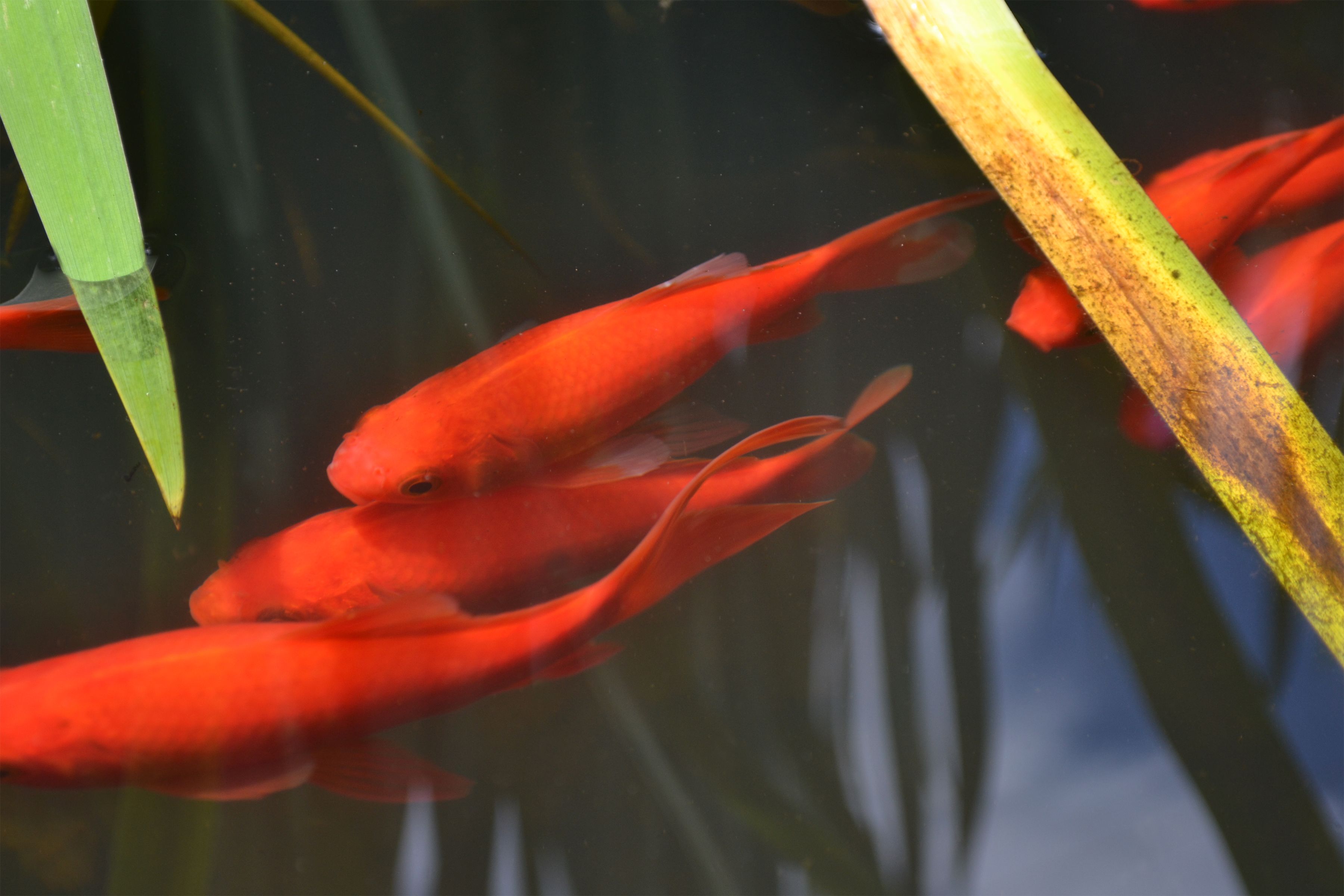
This photo was taken the other day out by my fish pond. It remains unaltered, a straight photograph, except for some general clean up I did in Photoshop. Originally there were some distracting bits of debris floating in the water and these I removed.


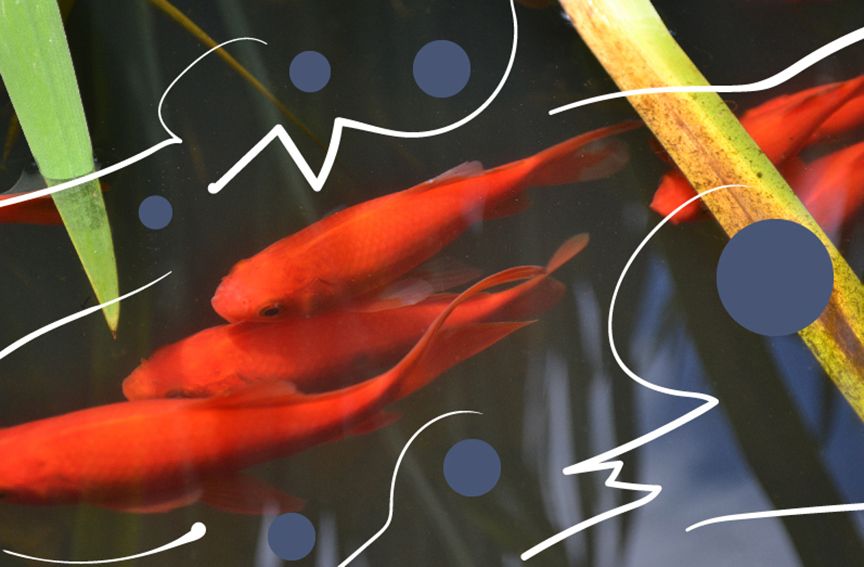
The Japanese are particularly fond of fish ponds and often use koi and goldfish within their designs. I haver always appreciated Japanese art and I especially like Japanese calligraphy. I decided it might be interesting to experiment with overlaying some calligraphic lines on my photo. For this I used a pressure sensitive stylus to draw with in Photoshop. I tried to make lines that moved with the flow of the fish.


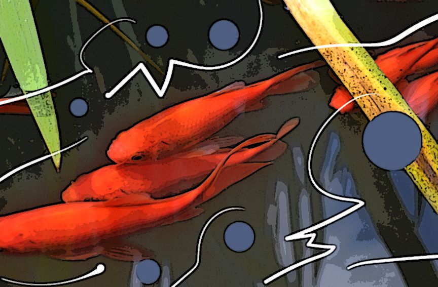
In this final image I was looking to escape the look of photography and to create a more painterly style. To achieve this I ran the image through a series of Photoshop filters.

So which of these images is most appealing to you? The straight unaltered photo, or one of the abstractions?

It is very beautiful this method. I like very much, I will follow you because you have a lot of talent. Thank you
Downvoting a post can decrease pending rewards and make it less visible. Common reasons:
Submit
Thanks I am glad you enjoyed it.
Downvoting a post can decrease pending rewards and make it less visible. Common reasons:
Submit
Great Effort Indeed.
Followed, ReSteemed , Commented
pls look at my post -
https://steemit.com/steemit/@anil777/how-steemit-changed-me-as-a-person-believe-me-it-s-phenomenal
Downvoting a post can decrease pending rewards and make it less visible. Common reasons:
Submit
Thanks, liked your post and up voted.
Downvoting a post can decrease pending rewards and make it less visible. Common reasons:
Submit
Downvoting a post can decrease pending rewards and make it less visible. Common reasons:
Submit
Thanks, that's one big thumb!
Downvoting a post can decrease pending rewards and make it less visible. Common reasons:
Submit
Whilst I have no problem with any of them, if forced to choose then I would go with the final one. I just like the effect, and that it is over the complete image. It helps that the original image was a nice, balanced photo.
Downvoting a post can decrease pending rewards and make it less visible. Common reasons:
Submit
Thanks good analysis I agree.
Downvoting a post can decrease pending rewards and make it less visible. Common reasons:
Submit
How big is your pond?
Downvoting a post can decrease pending rewards and make it less visible. Common reasons:
Submit
Here is an old post with the ponds history. https://steemit.com/art/@beginningtoend/one-shovel-such-a-big-hole
Downvoting a post can decrease pending rewards and make it less visible. Common reasons:
Submit
Very lovely.
Downvoting a post can decrease pending rewards and make it less visible. Common reasons:
Submit
Though I don't have photoshop I appreciated following the process you used. In this case I like the third version best because it incorporates the artist's response to the original image.
Downvoting a post can decrease pending rewards and make it less visible. Common reasons:
Submit
Thanks, thats my favorite as well.
Downvoting a post can decrease pending rewards and make it less visible. Common reasons:
Submit