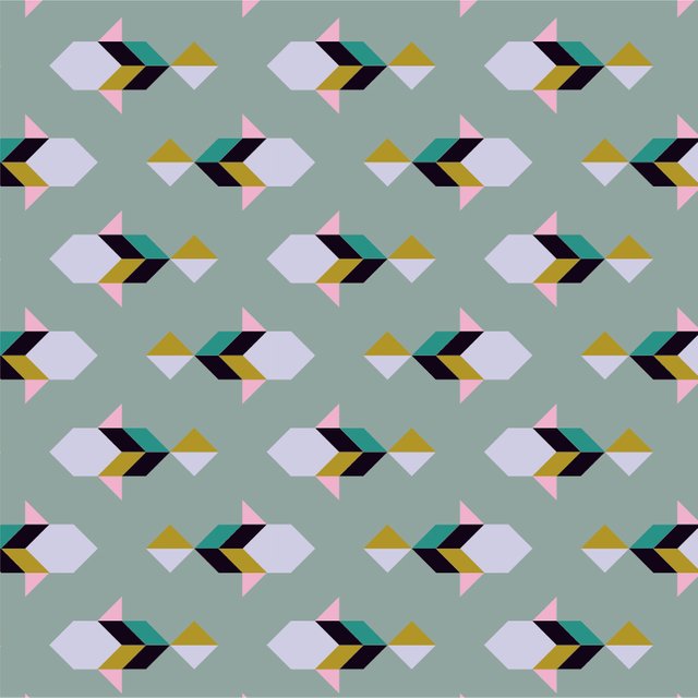
Yesterday I started a page in my sketchbook further exploring some shapes I had done in the past and found interesting. I developed them into a stylized fish motive and repeated them in quite a rigid way, as I sometimes like to do. I arranged the components in a manner that's far from realistic but still gave the impression of a school of fish.

I completely filled the page with the motive, I find it quite a calming thing to do. Then I started the most fun part in my opinion, which is adding colour and texture. For this one I whipped out my favourite sketching tool: my golden gel pen 😄 I also thought some turquoise would look nice, especially next to the gold. I'm not too crazy about the orange, but when I'm working on something in my sketchbook I usually try not to allow myself to overthink things too much, so I just went with it anyway.

I liked the result so much that I decided to recreate the pattern digitally. I didn't think of taking screenshots, so I've got only the end result to show. I stuck with the original layout and only chose to change the colours to more of my usual palette which varies a bit from time to time, but mostly stays the same. What can I say, I just really like baby pink and mustard yellow! Although, lately, I seem to have developed a fondness for black as well.

So that was my quick little share of something I created today, as I myself always love to see a glimpse of what people have been up to creatively. I'll try to maybe catch more of the stages for next time!

I post about my work and what inspires me! Follow my journey as a pattern designer and let me introduce you to art, people and places I find inspirational here.
Excellent art work
Downvoting a post can decrease pending rewards and make it less visible. Common reasons:
Submit
Thanks!
Downvoting a post can decrease pending rewards and make it less visible. Common reasons:
Submit
Nice work, @tishyaoedit. I like how the colored real life version evolved into a digital one. I love the outcome of the final product. It has a very nice color scheme. Great decision to switch to digital 👌
Downvoting a post can decrease pending rewards and make it less visible. Common reasons:
Submit
Thanks for the lovely comment, I agree that the digital version works very well or even better!
Downvoting a post can decrease pending rewards and make it less visible. Common reasons:
Submit
@tishyaoedit,
This gem of a post was discovered by the @OCD Curation Team!
Please Reply to this comment if you accept, and are willing to let us share your gem of a post! By accepting this, you have a chance to receive extra rewards and one of your photos in this article may be used on our compilation post!
You can follow @ocd – learn more about the project and see other Gems! We strive for transparency!
Very cool pattern, I like the minnow look to it! :-)
Please Reply and I will nominate your artwork to the @OCD Curators!
Downvoting a post can decrease pending rewards and make it less visible. Common reasons:
Submit
@ma1neevent of course, that would be amazing! Haha, I hadn't even realised the comparison, it's Steemit working on my subconscious maybe 😂
Downvoting a post can decrease pending rewards and make it less visible. Common reasons:
Submit
@royrodgers has voted on behalf of @minnowpond. If you would like to recieve upvotes from minnowponds team on all your posts, simply FOLLOW @minnowpond.
Downvoting a post can decrease pending rewards and make it less visible. Common reasons:
Submit
Cool pattern, interesting to see it go from a concept sketch to finished. You were featured on @ocd :)
Downvoting a post can decrease pending rewards and make it less visible. Common reasons:
Submit
Thank you!
Yes, I know, I'm a lucky gal :-)
Downvoting a post can decrease pending rewards and make it less visible. Common reasons:
Submit