I have not forgotten about the logo contest. It has taken me longer than I thought to figure out how to judge and pick a logo. A lot of people like the one I'm using (which is cool since it was done by Mrs B.).
I'm thinking maybe of using multiple and changing it up some as many people liked to see different images instead of the same one all the time. I tried to use some of the logos on the Daily Contest to get feedback from others which worked pretty well expect for my lack of ability to keep up :(.
I had figured there would be one that really stood out and worked perfectly but there were so many good entries that wasn't the case. And another issue was some of the ones I liked Mrs B didn't like so we couldn't really agree on a clear winner. So I'm not sure how to handle that case. I'm thinking maybe to divide the prize and split it between the top entries (maybe up it a little so that the top entrys all get something). So I'm thinking of narrowing it down to the top 5 and giving each person 4 SBD (which would be total of 20 instead of 15). Then I would rotate those on different posts.
These are the top 10 that I picked. If you don't see your logo on the list I'm sorry, but I did have to pick the ones I liked the best. All entries were very good and I appreciate everyone that took the time to make a logo.
Let me know what you think of my plan?
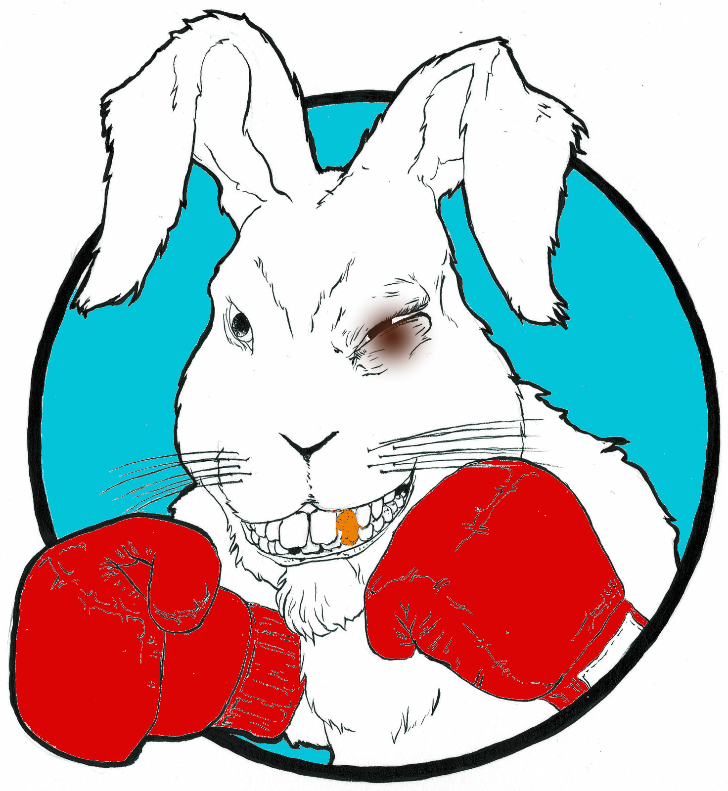





I like the one the bottom left. It's not busy with clean lines. It shows a bunny with boxing gloves, which is very appropriate.
Downvoting a post can decrease pending rewards and make it less visible. Common reasons:
Submit
You just planted 0.56 tree(s)!
Thanks to @rufusfirefly
We have planted already 5217.82 trees
out of 1,000,000
Let's save and restore Abongphen Highland Forest
in Cameroonian village Kedjom-Keku!
Plant trees with @treeplanter and get paid for it!
My Steem Power = 25231.11
Thanks a lot!
@martin.mikes coordinator of @kedjom-keku
Downvoting a post can decrease pending rewards and make it less visible. Common reasons:
Submit
As a designer I will choose the winner base on their originality and work process just don't choose a logo with no proof of work i suggest to put a link of their post to prove that the design is from their hard work not from google or copy paste... good luck!
and don't choose a winner base on vote some of them have a lot of account and friends. It's unfair for the one that work hard on your design...
Downvoting a post can decrease pending rewards and make it less visible. Common reasons:
Submit
Downvoting a post can decrease pending rewards and make it less visible. Common reasons:
Submit
I really like this one

Downvoting a post can decrease pending rewards and make it less visible. Common reasons:
Submit
Wow all these bunnies are really wowing @bunnypuncher it's going to be a tough call on this one. But my favorite is the forth to the last it's mature
Downvoting a post can decrease pending rewards and make it less visible. Common reasons:
Submit
the glasses give personality! I can improve it!
offer you other versions of this, I'll post it here to see what you think, this I did in a hurry
great preselection sr bunnypuncher
Downvoting a post can decrease pending rewards and make it less visible. Common reasons:
Submit
The entries are awesome. I would like to give you top 3
honestly, I do not see much difference between your current logo and the 1st column 5th row logo. just inverted between blue and white and its weak. Otherwise I'd have posted top 4.
Downvoting a post can decrease pending rewards and make it less visible. Common reasons:
Submit
Looks like the rule this time is a little confusing, but I like it because there are challenges for the contest participants
Downvoting a post can decrease pending rewards and make it less visible. Common reasons:
Submit
Thank you
Downvoting a post can decrease pending rewards and make it less visible. Common reasons:
Submit
Think youre on the right track - this one better be in the top 5 because it's freaking awesome!! Super epic dude ! A big bravo goes to everyone but a double big bravo goes to the artist behind this one. Hope you're doing well man! All the best.
Downvoting a post can decrease pending rewards and make it less visible. Common reasons:
Submit
Thank you so much...
Downvoting a post can decrease pending rewards and make it less visible. Common reasons:
Submit
My top five would be


Downvoting a post can decrease pending rewards and make it less visible. Common reasons:
Submit
Downvoting a post can decrease pending rewards and make it less visible. Common reasons:
Submit
congrats to the winners! i’m interested in making a couple for you anyways though that are a little more detailed and fitting.
Downvoting a post can decrease pending rewards and make it less visible. Common reasons:
Submit
i like this icon
Downvoting a post can decrease pending rewards and make it less visible. Common reasons:
Submit
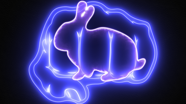
Me gusta bastante este logo:

me parece bastante original, es como uno de esos letreros con luces de neón y se sale de lo común: imagen de caricatura.
Downvoting a post can decrease pending rewards and make it less visible. Common reasons:
Submit
This is the best for me, I would change it to blue color, very good creation.
Downvoting a post can decrease pending rewards and make it less visible. Common reasons:
Submit
This is among top 3 for me.
Downvoting a post can decrease pending rewards and make it less visible. Common reasons:
Submit
bottom 2 are my favorites
Downvoting a post can decrease pending rewards and make it less visible. Common reasons:
Submit
I really like the logo of the gray bunny winking. He is friendly and cheerful.
Downvoting a post can decrease pending rewards and make it less visible. Common reasons:
Submit
Vote for 5th
Downvoting a post can decrease pending rewards and make it less visible. Common reasons:
Submit
I vote for this logo, I think it's great and it does not have so many details. It is very imaginative since it is the fist and the rabbit at the same time.
Downvoting a post can decrease pending rewards and make it less visible. Common reasons:
Submit
In my opinion I think the distribution of the prize is fine but since you already made a preliminary selection give an additional prize to the 5 remaining selected logos.
Downvoting a post can decrease pending rewards and make it less visible. Common reasons:
Submit
I like this rabbit

Downvoting a post can decrease pending rewards and make it less visible. Common reasons:
Submit
My favorite rabbit is

Downvoting a post can decrease pending rewards and make it less visible. Common reasons:
Submit
I know selecting a winner isn't an easy task but if dividing it equal will be the right thing then go for it. Meanwhile, Congratulations to all the winners
Downvoting a post can decrease pending rewards and make it less visible. Common reasons:
Submit
There is a lot of talent in the logos, being in the selected ones, they are already winners, luck to all. My logo was selected thanks for taking me into account
Downvoting a post can decrease pending rewards and make it less visible. Common reasons:
Submit
I really like this one
![] )
)
(
Downvoting a post can decrease pending rewards and make it less visible. Common reasons:
Submit
Hi Bunnypuncher, your idea is really good, you are very fair. I think the best five could be: the second logo, fourth, sixth, eighth and tenth, are very competitive.
Downvoting a post can decrease pending rewards and make it less visible. Common reasons:
Submit
dear @bunnypuncher,
for me the best one is:
Downvoting a post can decrease pending rewards and make it less visible. Common reasons:
Submit
This looks like a mature logo. You could use it for something important that you want to inform the community
Downvoting a post can decrease pending rewards and make it less visible. Common reasons:
Submit
All are good designs, choose one with which you identify more, the one that makes you feel more comfortable, in which you see and think that gives you an original touch and is combined with @bunnypuncher, from its original creation.
Downvoting a post can decrease pending rewards and make it less visible. Common reasons:
Submit
Selecciona los cinco con apoyo de tus seguidores, dales lo pensado en la premio compartido.
Downvoting a post can decrease pending rewards and make it less visible. Common reasons:
Submit
I loved it
Downvoting a post can decrease pending rewards and make it less visible. Common reasons:
Submit
I support your judgement. You are generous. I am glad I saw four of the logos I liked among the first 10. They are the 4th, 6th, 7th, and 10th as arranged above.
Downvoting a post can decrease pending rewards and make it less visible. Common reasons:
Submit
Holaaa a todos!!! Excelente plan @bunnypuncher, todos los logos están espectaculares, el esfuerzo de hacerlos bien está demostrado!!! Felicitaciones!!! Que gane el mejor!!! Mis favoritos son los siguientes:


Downvoting a post can decrease pending rewards and make it less visible. Common reasons:
Submit
The many faces of @bunnypuncher love the designs
This one here is super Dope!
In My Rocky Voice AaaY Yo!
Downvoting a post can decrease pending rewards and make it less visible. Common reasons:
Submit
My brother is a graphic designer, and he says this one is the best one, I agree!
Downvoting a post can decrease pending rewards and make it less visible. Common reasons:
Submit
This one looks so cute 👇👇 voting for this one this one

Btw I think your idea is superb , you can alternate between the bunnies to make ur profile look more active and fun .
Downvoting a post can decrease pending rewards and make it less visible. Common reasons:
Submit
This post has received a 15.82 % upvote from @boomerang.
Downvoting a post can decrease pending rewards and make it less visible. Common reasons:
Submit
Well that's cool
Downvoting a post can decrease pending rewards and make it less visible. Common reasons:
Submit
I love this rabbit this chubby
Downvoting a post can decrease pending rewards and make it less visible. Common reasons:
Submit
I think is a good way to handle it, fair to everyone. These two are the best for me:
Downvoting a post can decrease pending rewards and make it less visible. Common reasons:
Submit
Downvoting a post can decrease pending rewards and make it less visible. Common reasons:
Submit
I think this logo is cool
Because it is very rare to see rabbits wearing glasses
Downvoting a post can decrease pending rewards and make it less visible. Common reasons:
Submit
That sounds generous and fair,there is a lot of talent out there!
Downvoting a post can decrease pending rewards and make it less visible. Common reasons:
Submit
Thank you @bunnypuncher for this top 10 nomination. Goodluck to all the nominees.
Downvoting a post can decrease pending rewards and make it less visible. Common reasons:
Submit
Hello @bunnypuncher greetings! Still without deciding the winners of the logo? Hahahaha really you are just like you! hahahaha all you chose are cool ... you have us on embers hahahaha
Downvoting a post can decrease pending rewards and make it less visible. Common reasons:
Submit