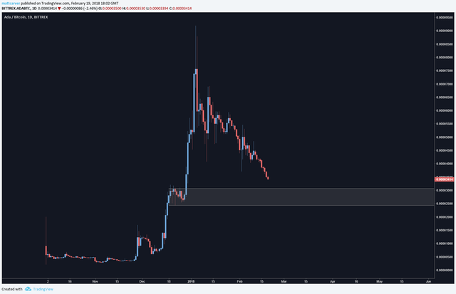
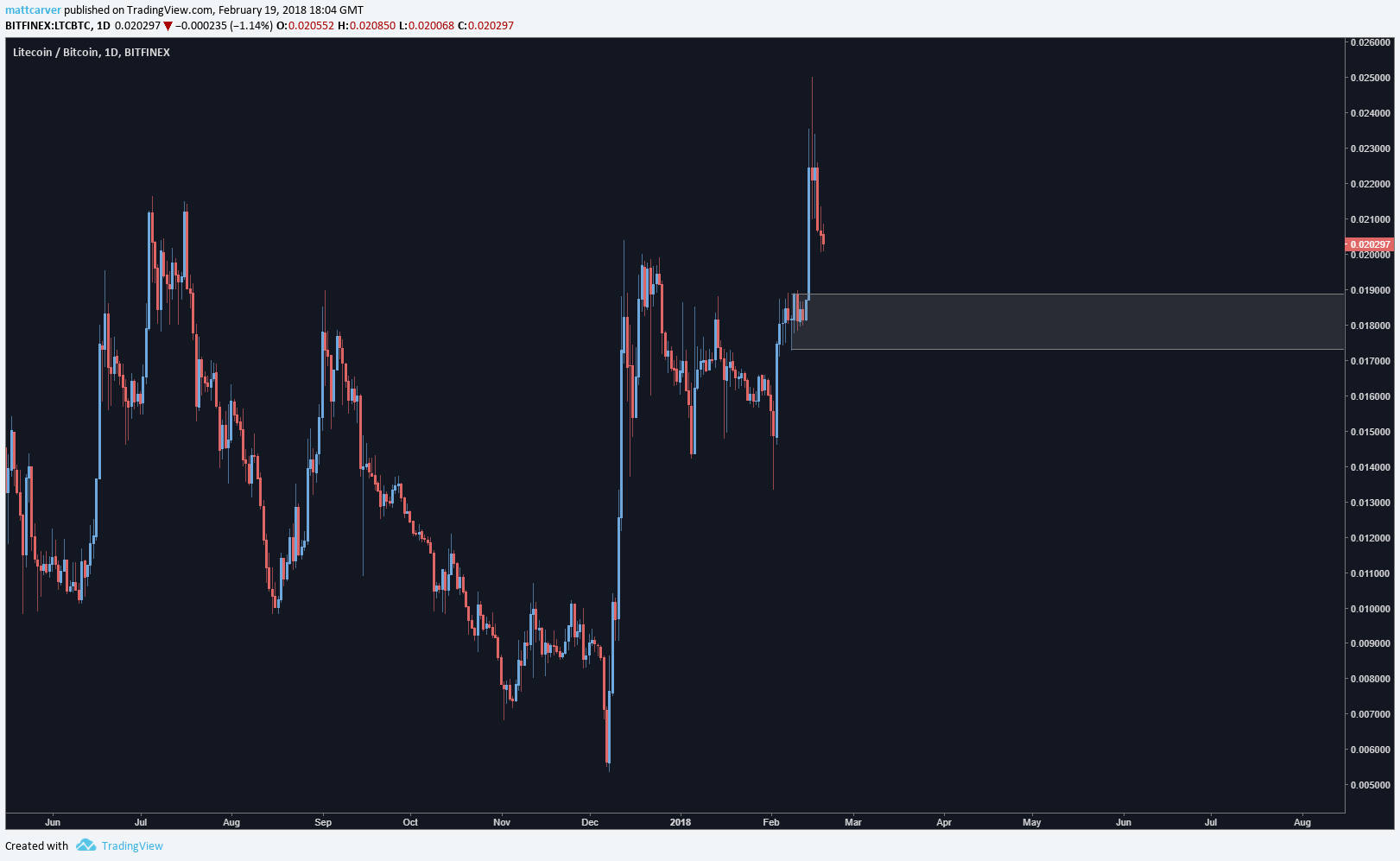
One thing which I don't particularly see mentioned a lot in crypto is supply and demand, and particularly so when it comes to charting.
This is a huge deal, for me. Supply and demand is the very essence of the value of the coins we're trading in crypto, and having even just a basic understanding of how it works can improve your trading ten fold.
Let's first look at the fundamentals of supply and demand trading.
Supply and demand in the market is created by large imbalances in the order books. Essentially, the more rapidly price moves away from a particular place on the chart, the more likely it is that there are unfilled orders remaining at that level.
Or, at the very least, if there's strong buying or selling at a level on the chart, there's likely to be more again when price returns to that level. Let's say you have £10m to invest at a certain price, you'll need £10m in liquidity to get your money into the coin. If there's only £5m liquidity at that level, only half of your order is going to be filled. The other half will sit there waiting to be filled - so what will happen to price when we arrive back there?
Why is this important? Well, this is one of the most effective methods of trading, should your patience be up to the task!
We wait for an obvious area of supply or demand to be defined on the chart, and then we wait for price to revisit it, and look for signs of a reaction.
That's an extremely basic overview of course, as there are many different subtleties and nuances to understand, as well as being able to use other technical analysis to enhance our odds of making a successful trade.
The entire point of a supply or demand zone, is to look at an area on the chart where price has a higher probability of reacting and reducing our risk.
We often hear "buy low, sell high" - but how many people know where the low or high is? Supply and demand.
Let's look into how S/D zones look now. They are essentially flags, as per my article here:
https://steemit.com/cryptocurrency/@technicalanal/improve-your-technical-analysis-flags-part-one
Areas of demand, i.e. areas where there is DEMAND to buy into the symbol:


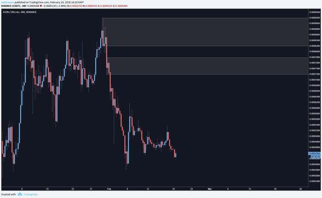
Areas of supply, i.e. areas where there is a SUPPLY to sell:

I've marked 2 areas of supply on this chart, and in my next article I'm going to go into areas of significance.
You can find many areas of supply and demand on a chart but the real skill is being able to find which ones are the important levels and which ones don't mean as much.
As a general observation, it's a lot tougher to find really obvious areas of supply on crypto charts because when most coins reach a high, they don't stay up there for very long! And with the majority of coins being so young, there isn't a lot of history to go off.
We should always look to work from the higher timeframes when finding these areas to mark, because the higher timeframe is always in control. The bigger the zone on a weekly or daily chart, the bigger the orders are at that level and we can usually expect a strong reaction from them.
During the course of a weekly move on a chart, price will not move down or up in a straight line, but instead will move in a zig zag. You can look at these on the lower timeframes and along the way from one destination to the other, price will create new areas of supply and demand. These are great to trade on lower timeframes, but you can't use them to look for an overall reversal of a weekly or daily move.
There is a saying that rings very true: that price moves from supply to demand and then from demand to supply.
It's up to us to define these areas of supply and demand and look to make trades accordingly. Marking them on our charts can really help us understand what's going on with price, and can cool us down when we're looking at FOMOing into a short term spike in price.
Personally, I use areas of higher timeframe demand for entries, and smaller timeframe supply zones for exiting. That however, is because I'm predominantly a day trader and don't want to wait potentially days for a trade to play out while price struggles at a supply zone. If you're a long term investor, as I would recommend for most, these big areas of demand are where the golden opportunites are.
If you see a big spike in price, it's more than likely that at a HTF demand zone, there will be huge orders remaining. And that's good because you are reducing your risk massively, you are looking at the highest probability area, and you are looking at a lower, logical entry point meaning your ROI will be higher.
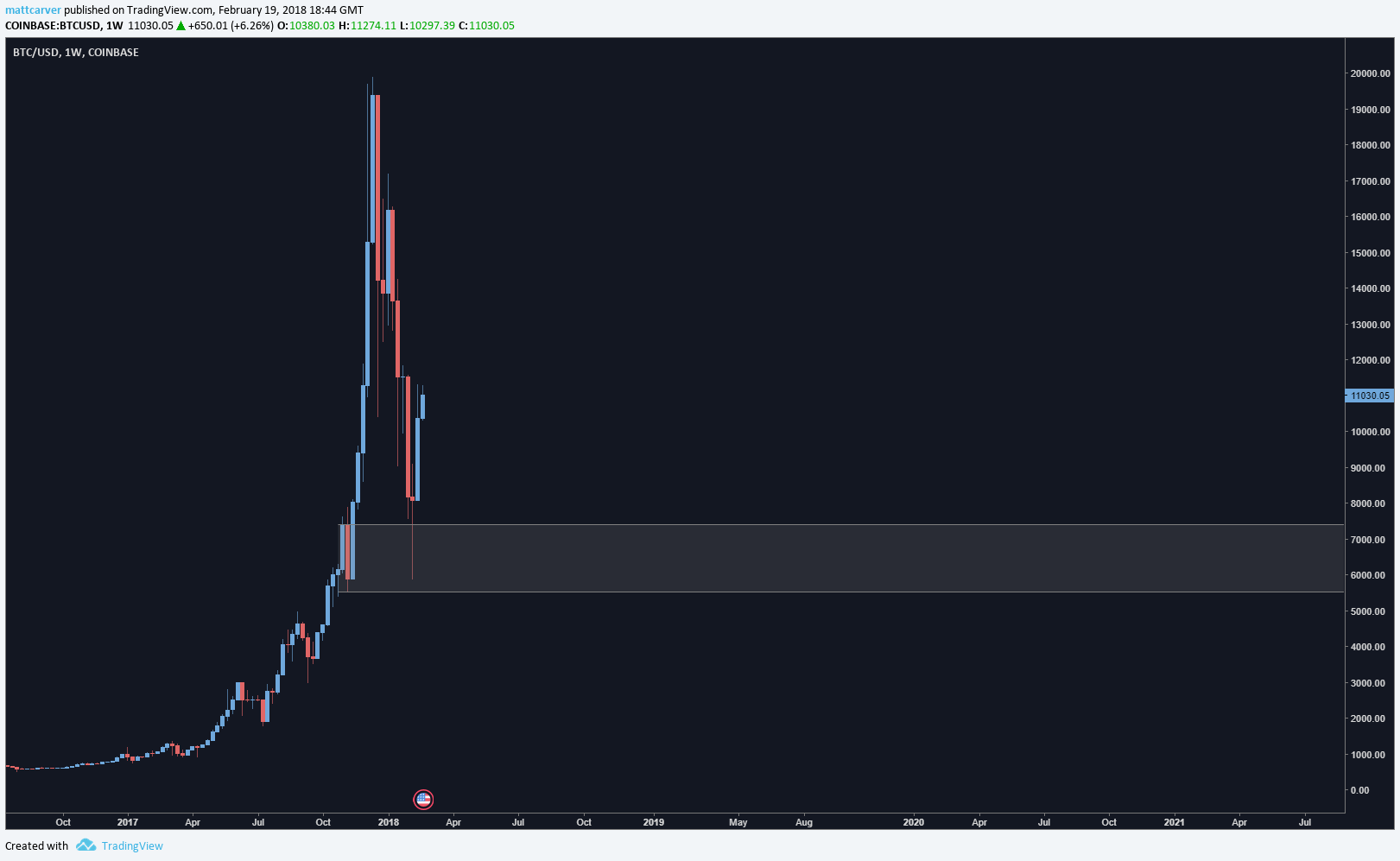
I mean, look at Bitcoin as an example. Pretty nice profits if you had marked that level well in advance and had enough patience to wait for it to play out.

What goes up in a parabolic fashion, must come down.
Mark in advance a nice area of demand that hasn't been tested yet, and look to enter as deep into that level as possible. Crypto can become a lot easier this way.
Feel free to ask any questions in the comments below. I'll be going into how to find a more significant level in my next article, as well as showing some good examples of how demand levels work in crypto. I'd like to see your examples too if you have them.
Excellent post, very well written, I will be following, thank you.
Quick question for you, is the supply / demand zones different to the support / resistance levels? How do you differentiate between them if they are different? Do you use confluence with indicators such as volume?
Thanks :)
Downvoting a post can decrease pending rewards and make it less visible. Common reasons:
Submit
Hello mate.
Support and resistance shows us an area where price has tested a few times and failed to break through.
Supply and demand goes a bit deeper. S/D shows us an area where buyers and sellers are met at a sort of equilibrium and then due to an imbalance in the order books, we see a huge reaction one way or the other. If we rally, can get a good idea that there isn't much selling pressure at that level, and vice versa. S/R can't offer the same sort of depth of insight.
With S/D we look for areas of strong price movement which usually react in the same direction when price revisits
Downvoting a post can decrease pending rewards and make it less visible. Common reasons:
Submit
Thanks for the reply, I'm definitely going to explore this more. Look forward to more of your posts.
Downvoting a post can decrease pending rewards and make it less visible. Common reasons:
Submit
Hello there! Thanks for the good article once again. Regarding the USD/BTC chart just above, could we say that we are currently revisiting that same supply zone? We also had a spike reaction when revisiting in April... Could a supply zone be revisited several times and react the same way? Does it sometimes gets ''emptied'' and have no more orders waiting in the books? Thanks!!++
Downvoting a post can decrease pending rewards and make it less visible. Common reasons:
Submit
Hi Peter
First, you've got your zones messed up - that's a demand zone!
But yes, the principle is that the zones get "emptied" the more they are tested and then we see price break through them. This is why I only trade on first time back to these sorts of levels
Downvoting a post can decrease pending rewards and make it less visible. Common reasons:
Submit
''that hasn't been tested yet'' I guess i have my answer
Downvoting a post can decrease pending rewards and make it less visible. Common reasons:
Submit