Today, anything we can get data from can be measurable with the right knowledge and tools. WhatsApp is not the exception, thanks to the possibility that it offers us, to export complete conversations. I want to introduce you to rwhatsapp, a small but very useful package, which provides what is necessary to work with WhatsApp text data in R as Data Frame.
Beginning. How do I export my conversations?
You can export every conversation in a very simple way, from your WhatsApp in any open conversation, from the options menu / More / Export chat. Immediately after this, you can send the complete history as a text file with the extension “.txt”.
The main function in the package is the rwa_read() function, which allows you to import TXT files directly, so you just need to provide the path to a file to load the messages directly as a Data Frame.
For this post, a friend very kindly (whom I thank for the trust) has shared her txt file of the chat with a person with whom she usually has a “casual relationship without commitments” for two years or more. For practical purposes we will analyze this conversation, visualizing some relevant data.

Preparation and reading data
We will import some of the libraries that we will use, we will establish the text file that we will read, and to make this a little more interesting, we will segment by seasons of the year, from the summer of 2018 to the spring of 2020.
library(rwhatsapp)
library(lubridate)
library(tidyverse)
library(tidytext)
library(kableExtra)
library(RColorBrewer)
library(knitr)# LEEMOS EL CHAT A TRAVÉS DEL TXT EXPORTADO DESDE LA APP
miChat <- rwa_read(“miChat_1.txt”)# PREPARACIÓN DE DATOS PARA ANÁLISIS POR DATE/TIME
miChat <- miChat %>%
 mutate(day = date(time)) %>%
 mutate(
 # SEGMENTACIÓN POR MES
 estacion = case_when(
 day >= dmy(18082018) & day <= dmy(22092018) ~ “Verano 2018”,
 day >= dmy(23092018) & day <= dmy(20122018) ~ “Otoño 2018”,
 day >= dmy(21122018) & day <= dmy(20032019) ~ “Invierno 2018”,
 day >= dmy(21032019) & day <= dmy(21062019) ~ “Primavera 2019”,
 day >= dmy(22062019) & day <= dmy(23092019) ~ “Verano 2019”,
 day >= dmy(23092019) & day <= dmy(20122019) ~ “Otoño 2019”,
 day >= dmy(21122019) & day <= dmy(20032020) ~ “Invierno 2020”,
 day >= dmy(21032020) ~ “Primavera 2020”,
 T ~ “Fuera de rango”)
 ) %>%
 mutate( estacion = factor(estacion) ) %>%
 filter(!is.na(author))
Daily message frequency
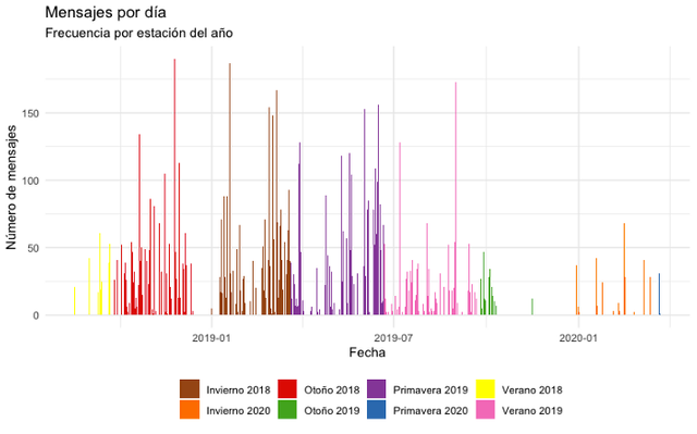
Let’s look at the daily frequency of messages, assigning a personalized color palette for a first graph that shows the messages per day in a very visual way during the established seasons of the year.
# COLOR PALETTE
paleta.estaciones <- brewer.pal(8,"Set1")[c(7,5,1,3,4,2,6,8)]
# VERIFYING HOW MANY MESSAGES WERE SENT DURING THE PERIOD OF TIME
miChat %>%
  group_by(estacion) %>%
  count(day) %>%
  ggplot(aes(x = day, y = n, fill=estacion)) +
  geom_bar(stat = "identity") +
  scale_fill_manual(values=paleta.estaciones) +
  ylab("Número de mensajes") + xlab("Fecha") +
  ggtitle("Mensajes por día", "Frecuencia por estación del año") +
  theme_minimal() +
  theme( legend.title = element_blank(),
         legend.position = "bottom")
We will obtain the following plot as a result. Something happened in Fall 2019, they stopped talking so often huh!
Message frequency by day of the week
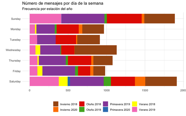
Let’s see the daily frequency of messages, but in addition to viewing by season, let’s find out the specific day of the week in which there has been the most interaction.
# MESSAGES PER DAY OF THE WEEK
miChat %>%
 mutate( wday.num = wday(day),
 wday.name = weekdays(day)) %>%
 group_by(estacion, wday.num, wday.name) %>%
 count() %>%
 ggplot(aes(x = reorder(wday.name, -wday.num), y = n, fill=estacion)) +
 geom_bar(stat = “identity”) +
 scale_fill_manual(values=paleta.estaciones) +
 ylab(“”) + xlab(“”) +
 coord_flip() +
 ggtitle(“Número de mensajes por día de la semana”, “Frecuencia por estación del año”) +
 theme_minimal() +
 theme( legend.title = element_blank(),
 legend.position = “bottom”)
We will obtain the following plot as a result. On Saturdays and Sundays, there have been more interaction!
Message frequency by the time of day
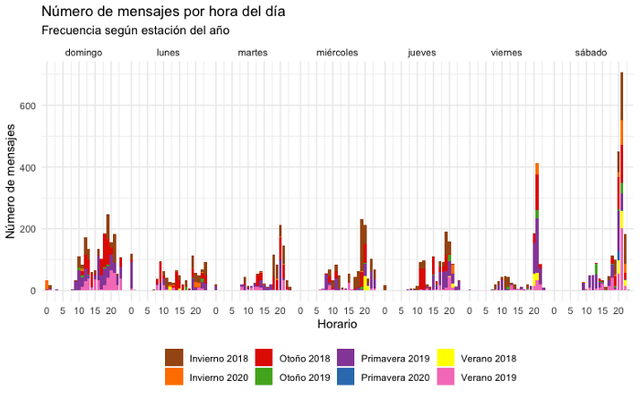
Now let’s look at the daily frequency of messages, but let’s delve into visualizing the most recurring recorded time of interaction.
# KEEP THE WEEKEND OF THE WEEK AND RENAME THEM
diasemana <- c(“domingo”,”lunes”,”martes”,”miércoles”,”jueves”,”viernes”,”sábado”,”domingo”)
names(diasemana) <- 1:7# MENSAJES POR HORA DEL DÍA
miChat %>%
 mutate( hour = hour(time),
 wday.num = wday(day),
 wday.name = weekdays(day)) %>%
 count(estacion, wday.num, wday.name, hour) %>%
 ggplot(aes(x = hour, y = n, fill=estacion)) +
 geom_bar(stat = “identity”) +
 scale_fill_manual(values=paleta.estaciones) +
 ylab(“Número de mensajes”) + xlab(“Horario”) +
 ggtitle(“Número de mensajes por hora del día”, “Frecuencia según estación del año”) +
 facet_wrap(~wday.num, ncol=7, labeller = labeller(wday.num=diasemana))+
 theme_minimal() +
 theme( legend.title = element_blank(),
 legend.position = “bottom”,
 panel.spacing.x=unit(0.0, “lines”))
We will obtain the following plot as a result. Between 8 p.m. and 9 p.m., We observe that there is mostly a habit of interaction.
Who has sent the most messages?
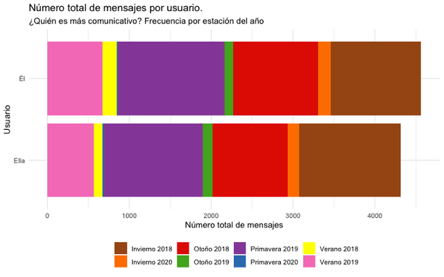
Let us now analyze which of our users has shown a greater intention of interaction, according to the number of messages sent. To preserve the confidentiality of the subjects, we will also change the names of the users to “Él” (He) and “Ella” (She) simply.
# CHANGE THE NAME OF USERS FOR CONFIDENTIALITY
levels(miChat$author)[2] <- “Ella”
levels(miChat$author)[1] <- “Él
# MESSAGES PER USER
miChat %>%
  mutate(day = date(time)) %>%
  group_by(estacion) %>%
  count(author) %>%
  ggplot(aes(x = reorder(author, n), y = n, fill=estacion)) +
  geom_bar(stat = "identity") +
  scale_fill_manual(values=paleta.estaciones) +
  ylab("Número total de mensajes") + xlab("Usuario") +
  coord_flip() +
  ggtitle("Número total de mensajes por usuario.", "¿Quién es más comunicativo? Frecuencia por estación del año") +
  theme_minimal() +
  theme( legend.title = element_blank(),
         legend.position = "bottom")
We will have the next plot, clearly noting that slightly, but for a little more, He has sent more messages to Her.
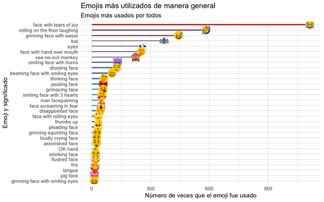
What are the most used emojis in chat?
Emojis are Unicode graphic symbols, which are currently used as an abbreviation to express concepts and ideas, there are hundreds of emojis and rwhatsapp allows us to explore the popularity in the message exchanges of any conversation.
Before sorting Emojis, let’s remove its variations. Variations are when, for example, skin or hair color changes, these variations are encoded by the composition of various Unicode characters. When a device reads these characters, it is composed and displayed as one. This process is called “ligation” and it has some interesting implications. Before sorting, we will keep only the first Unicode of the Emoji, removing everything else.
# LIBRARY FOR EMOJI PNG IMAGE FETCH FROM https://abs.twimg.com
library(ggimage)# EMOJI RANKING
plotEmojis <- miChat %>%
 unnest(emoji, emoji_name) %>%
 mutate( emoji = str_sub(emoji, end = 1)) %>%
 mutate( emoji_name = str_remove(emoji_name, “:.*”)) %>%
 count(emoji, emoji_name) %>%

# PLOT TOP 30 EMOJIS
 top_n(30, n) %>%
 arrange(desc(n)) %>% # CREA UNA URL DE IMAGEN CON EL UNICODE DE EMOJI
 mutate( emoji_url = map_chr(emoji,
 ~paste0( “https://abs.twimg.com/emoji/v2/72x72/”, as.hexmode(utf8ToInt(.x)),”.png”))
 )
# PLOT OF THE RANKING OF MOST USED EMOJIS
plotEmojis %>%
 ggplot(aes(x=reorder(emoji_name, n), y=n)) +
 geom_col(aes(fill=n), show.legend = FALSE, width = .2) +
 geom_point(aes(color=n), show.legend = FALSE, size = 3) +
 geom_image(aes(image=emoji_url), size=.045) +
 scale_fill_gradient(low=”#2b83ba”,high=”#d7191c”) +
 scale_color_gradient(low=”#2b83ba”,high=”#d7191c”) +
 ylab(“Número de veces que el emoji fue usado”) +
 xlab(“Emoji y significado”) +
 ggtitle(“Emojis más utilizados de manera general”, “Emojis más usados por todos”) +
 coord_flip() +
 theme_minimal() +
 theme()
Now we will have the following plot, showing punctually which have been the 30 most used emojis in the chat of our users. After all, today an emoji says more than a thousand words, huh!
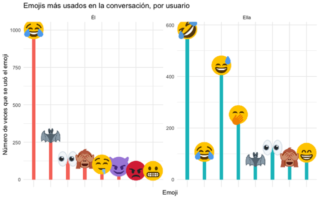
## Most used emojis in chat, per user
We can do the same analysis above, but specifically per chat user, showing which Emojis are most used by each one.

# EMOJI RANK PER USER
plotEmojis <- miChat %>%
 unnest(emoji, emoji_name) %>%
 mutate( emoji = str_sub(emoji, end = 1)) %>% #
 count(author, emoji, emoji_name, sort = TRUE) %>%
# PLOT TOP 8 EMOJIS PER USER
 group_by(author) %>%
 top_n(n = 8, n) %>%
 slice(1:8) %>%

# CREATE AN IMAGE URL WITH THE EMOJI UNICODE
 mutate( emoji_url = map_chr(emoji,
 ~paste0(“https://abs.twimg.com/emoji/v2/72x72/”,as.hexmode(utf8ToInt(.x)),".png")) )
# PLOT DATA
plotEmojis %>%
 ggplot(aes(x = reorder(emoji, -n), y = n)) +
 geom_col(aes(fill = author, group=author), show.legend = FALSE, width = .20) +
# USE TO FETCH AN EMOJI PNG IMAGE https://abs.twimg.com
 geom_image(aes(image=emoji_url), size=.13) +
 ylab(“Número de veces que se usó el emoji”) +
 xlab(“Emoji”) +
 facet_wrap(~author, ncol = 5, scales = “free”) +
 ggtitle(“Emojis más usados en la conversación, por usuario”) +
 theme_minimal() +
 theme(axis.text.x = element_blank())
We will obtain the following plot with the top 8 most used emojis. They both have a lot of fun huh!
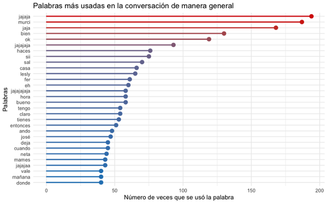
What are the most used words in chat?
As we did with the Emojis, we can also do the frequency analysis of the most used words in the chat, as well as for each of the users. The tidytext package makes this analysis very simple and easy to apply. We will carry out the classification of words, adding all those that we wish to discriminate, that may not be relevant, such as articles, pronouns, etc.
library(tidytext)
library(stopwords)
# REMOVE WORDS WITHOUT RELEVANT MEANING, SUCH AS PRONOUNS, ETC.
remover_palabras <- c(stopwords(language = “pt”),
 “multimedia”, “y”, “la”, “el”,”en”, “es”, “si”, “lo”, “ya”, “pero”, “esa”, “los”,”yo”,”mi”, “un”, “con”, “las”, “omitido”, “más”,”eso”, “al”, “una”, “del”, “qué”, “todo”, “así”, “le”, “su”, “va”, “porque”, “todos”, “hay”, “les”, “pue”, “ese”, “son”, “está”, “pues”, “ahí”, “sí”,”ver”, “estás”, “algo”, “vas”, “ir”,”voy”, “creo”,”fue”,”solo”, “ni”,”sólo”,”nada”, “aqui”, “q”, “tú”)
# WORD COUNT
miChat %>%
 unnest_tokens(input = text, output = word) %>%
 filter(!word %in% remover_palabras) %>%
 count(word) %>%
# PLOT TOP 30 MOST USED WORDS IN CONVERSATION
 top_n(30,n) %>%
 arrange(desc(n)) %>%
 ggplot(aes(x=reorder(word,n), y=n, fill=n, color=n)) +
 geom_col(show.legend = FALSE, width = .1) +
 geom_point(show.legend = FALSE, size = 3) +
 scale_fill_gradient(low=”#2b83ba”,high=”#d7191c”) +
 scale_color_gradient(low=”#2b83ba”,high=”#d7191c”) +
 ggtitle(“Palabras más usadas en la conversación de manera general”) +
 xlab(“Palabras”) +
 ylab(“Número de veces que se usó la palabra”) +
 coord_flip() +
 theme_minimal()
So now we will get the following plot, showing the 30 most used words. What the hell will “murci” be, a keyword to refer to Batman? (In spanish “bat” is “murciélago”)
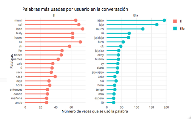
## Most used words in chat, by user
Now let’s do the same analysis that we have done, but per user of the conversation, showing which are the words that are mostly expressed by each one.

# WORD COUNT PER USER
miChat %>%
 unnest_tokens(input = text,
 output = word) %>%
 filter(!word %in% remover_palabras) %>%
 count(author, word, sort = TRUE) %>%

# TOP 20 MOST USED WORDS BY USER
 group_by(author) %>%
 top_n(n = 20, n) %>%
 slice(1:20) %>%
 ungroup() %>%
 arrange(author, desc(n)) %>%
 mutate(order=row_number()) %>%
 ggplot(aes(x = reorder(word, n), y = n, fill = author, color = author)) +
 geom_col(show.legend = FALSE, width = .1) +
 geom_point(show.legend = FALSE, size = 3) +
 xlab(“Palabras”) +
 ylab(“Número de veces que se usó la palabra”) +
 coord_flip() +
 facet_wrap(~author, ncol = 3, scales = “free”) +
 ggtitle(“Palabras más usadas por usuario en la conversación”) +
 theme_minimal()
Now we will have the following plot with the top 20 words expressed by each user.
I would like to leave this first part up to here, friends, to make what follows more digestible, which will be lexicon analysis and sentiment analysis, using the same conversation.
If you want to see elegant, you can use “plotly” to give your plots a little more life. Here I leave a sample of it on a flexdashboard that I put together to present the plots in a more attractive way for this article: https://rpubs.com/cosmoduende/whatsapp-data-analysis-r-part1
So, to implement data analysis with your groups, family, or whoever you want. You can find very interesting data.
Here you can find the complete code: https://github.com/cosmoduende/r-whatsapp-analysis-parte1
Thank you and see you next time.