1. What is data visualization?
In the era of big data, visual dashboards have become an important tool for business decisions.
A series of means of visually presenting complex and abstract data in a more understandable form is called data visualization. Data visualization is designed to enable people to quickly understand the meaning behind the data.
In addition to visual features, data visualization has the characteristics of communication and interaction.
2. What is data visualization for the large screen?
The visual dashboard design with large screen as the main display carrier is called data visualization for large screen. It features large areas, cool dynamic effects and rich colors. The dashboard for large screen can be used for information display, data analysis, monitoring and early warning.
3. What are the application scenarios for large screens in the enterprise?
In order to make you better understand the concept of data visualization for large screen, I will list some application scenarios for large screen in the enterprise.
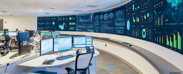
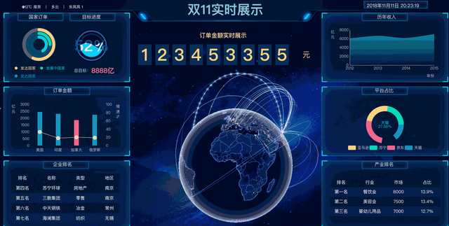
3.1 Real time Monitoring Center
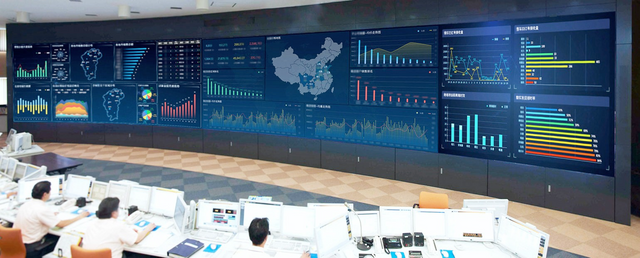
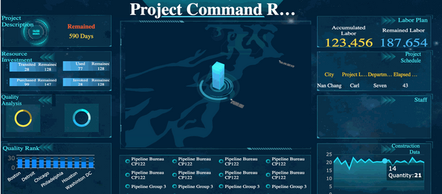
3.2 Strategic Command Headquarter
3.3 Exhibition Center
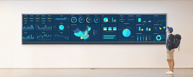
3.4 Conference Center
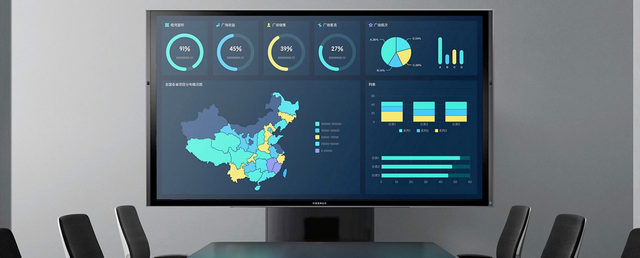
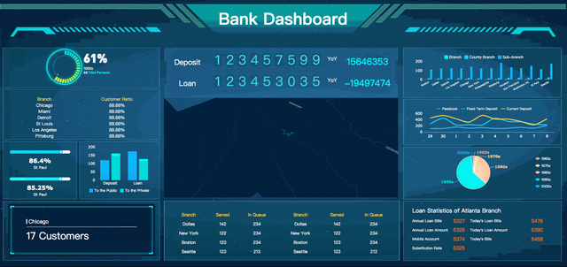
3.5 Activity Center
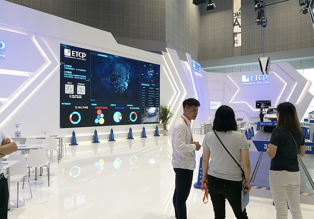
4. How to get started with data visualization for large screen?
Here I take the data visualization tool FineReport as an example to teach you some basic skills, so that you can quickly and effectively learn to make a cool dashboard for large screen.
FineReport provides enterprises with digital large-screen solutions. It can easily create cool dashboards for large screen without special customization, and it supports centralized control of multi-scene large screens. And its personal version is completely free, you can download it safely to practice visualization techniques.
Now, let’s start from the basics of dashboard design.
4.1 Learn about basics of dashboard design
①Description
FineReport uses a canvas-style operator interface, which is specially designed for large screens and mobile terminals. It can help users build a powerful and comprehensive “management cockpit” with a simple drag and drop operation. The dashboard design mode of FineReport has many advantages:
multiple layout methods: adaptive layout, absolute layout and Tab layout;
abundant visualization components: report block, charts and widgets;
component linkage: click on one component, and others reload data correspondingly;
data monitoring: change of data at the back end can be detected automatically and the dashboard will refresh to update the changes;
carousel: different charts can be switched in carousel mode in the same component.
②Dashboard interface
Open the designer and click File > New Form to create a new dashboard template, as shown below.
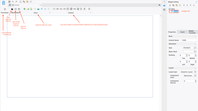
The dashboard has many components like parameter interface, blank block, chart, etc. To help you understand the meaning of each component, I add all the components to the same interface.
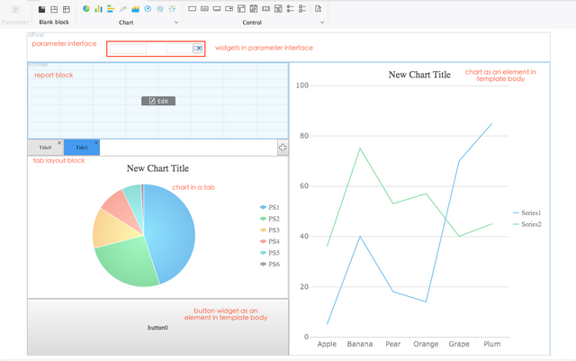
-Parameter interface: Drag this element to the canvas, and you will get a panel for filtering data in report blocks and charts. You can add widgets to the panel.
-Blank block: Blank blocks contain tab layout blocks, absolute layout blocks and report blocks.
A tab layout block can display different component in tabs and realize component switch in carousel mode.
An absolute layout block makes the size of element fixed.
A report block resembles a regular report, and the data is displayed within the extent of the component.
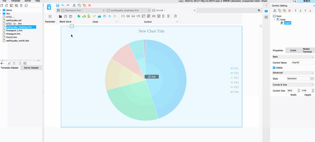
-Chart: All chart types supported in regular reports can be dragged to the canvas for data visualization.
-Widget: A widget is a component that filters data. It can be added as part of a parameter interface or as a separate component.
4.2 Select chart types according to indicators
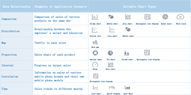
The ultimate goal of data visualization is to convey information more clearly, that is, what graphics are used to present the data is very important. After we have determined a data relationship type, we can find out the corresponding chart and usage suggestions based on the usage scenario of the data, and select among them.
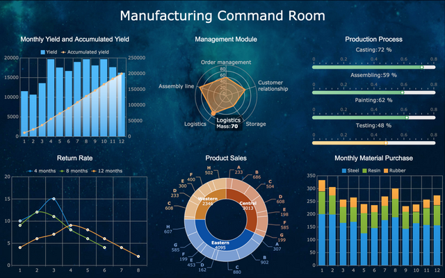
4.3 Design layout for large screen
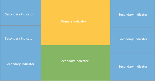
Design layout is to divide the large screen into several areas according to its size, and place a business indicator in each area. The indicators are extracted according to the purpose of data visualization, and are divided into primary indicators and secondary indicators. The primary business indicators are usually arranged in the middle position, occupying a large area, and the remaining indicators are carried out around the primary indicators. Here is a common layout design for large screen.
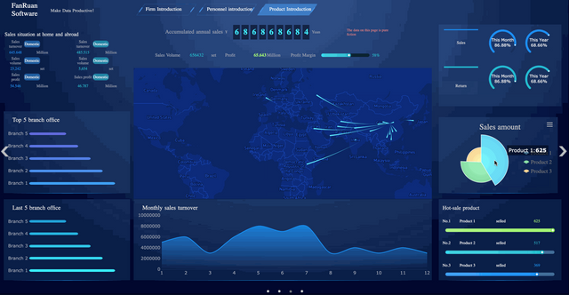
From FineReport
4.4 Consider color schemes
A reasonable layout can make the business content more hierarchical, and a reasonable color scheme can make the viewer more comfortable. The background color of the dashboard for large screen usually follows two principles: dark tone and consistency. As shown below, I’ll show you a few recommended color schemes.

And the background of a single element should be consistent with the overall background color to avoid abruptness. It is recommended to match some individual component elements with a transparent color.
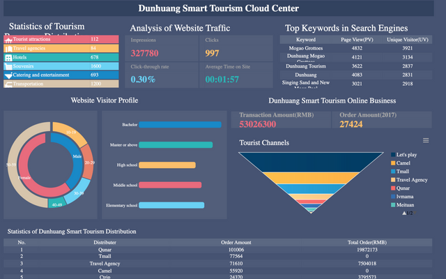
From FineReport
4.5 Add dynamic effects
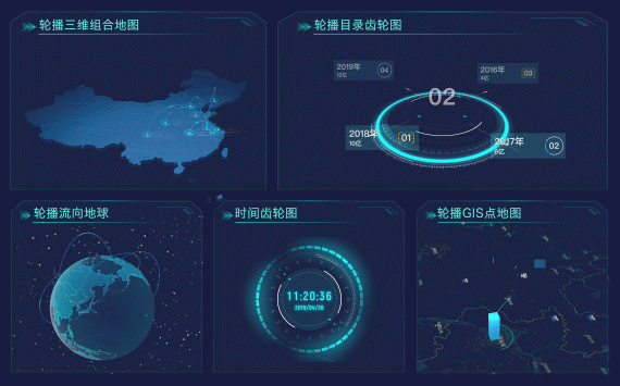
The range of dynamic effects is very wide and can be interpreted from many angles, such as background animation, refreshing loading animation, carousel animation, flashing animation of charts, flow animation of maps, etc., all of which belong to the category of dynamic effects.
From FineReport
The increase in dynamism can make the large screen look alive. However, excessive dynamism dazzle viewers, causing large-screen dashboards to lose the value of commercial displays. It is necessary to balance the cool effects, and highlight the content.
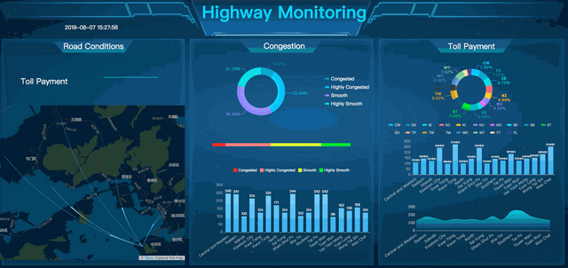
As shown in the highway monitoring dashboard below, the value of Toll Payment in Road Conditions is dynamically displayed, making the key information clear at a glance.
From FineReport
In the end
Now, do you understand what is data visualization for large screen and how to implement it? If you want a more detailed large screen dashboard production tutorial, this article A Step-by-Step Guide to Making Sales Dashboards will be helpful to you. And I think the visualization tool FineReport is a good choice for those beginners.
Original source: http://www.finereport.com/en/data-visualization/what-is-data-visualization-for-large-screen-and-how-to-implement-it.html
Hi! I am a robot. I just upvoted you! I found similar content that readers might be interested in:
https://towardsdatascience.com/what-is-data-visualization-for-large-screen-and-how-to-implement-it-1d79cf07783
Downvoting a post can decrease pending rewards and make it less visible. Common reasons:
Submit
To be honest, this is rather doubtful, because these screens break very often. There are a couple of malls with digital signage in my town and they are always broken.
Downvoting a post can decrease pending rewards and make it less visible. Common reasons:
Submit
I think the problem is not with the digital sign itself, but with the service company. It means that these are unreliable specialists if they cannot fix the signs in time. I think that shopping center signs can be very effective, and in order for everything to work properly, it is worth working with Digital Panel Services Australia so as not to worry that the digital signage will stop working and no one will solve this problem.
Downvoting a post can decrease pending rewards and make it less visible. Common reasons:
Submit