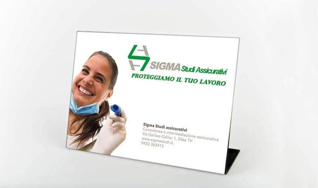
Tips and Tricks For Designing Custom Signs.

When creating custom signs for promoting your business, you should always make them easy to read and understand. Some potential customers may pass by many businesses while running errands, so you want to make sure your outdoor signs catch their attention and make a lasting impact.
Less is More.
Less can be more when designing any sign! Leaving space around the edges and not filling the space completely with your text will add impact to what you do use on the sign.Setting.
Ideally, the design and the colors of your location or building should reinforce the design and colors of your sign (or vice versa). Color is probably the easiest and most cost-effective device for this coordination of design for business identification.
Contrast.
Take a look to the image to the left. Which of the two looks larger... the white one? They are both the same size! The use of a light colored letter against a dark background lends to it seeming larger. Light letters tend to come forward, where dark letters tend to recede.