I appreciate every aspect of this graphic lessons as I learn each week on how to be perfect with my designs thank you for this lecture. For this week, a huge lessons has been taught and I learned a lot from it typography.
Well, let me share my knowledge of understanding of this topic by answering the homework task.
Typography is everywhere we look, in books we read, on the internet, on the street (bill board/signage) stickers, packaging bags. Etc
But let me define typography in my understanding
Typography is an artistic writing of text that is visually attractive to capture the interest of the readers when displayed. It should not just be picked randomly but it requires careful consideration on the text, audience and ofcourse the designs so as to match accurately with the work and conveys information to the readers.
To achieve a good typography that suit a particular design, principles like Hierarchy, alignment Whitespace, Emphasis etc. needs to be considered so as to help in giving out the best and appealing results to the viewers.
Basically, typography can be an intimidating subject because before now, I do misinterpret typeface for font. But thanks to this lecture because I only need to know a little to differentiate it as I do see it every day. So I now understand from the illustration in the lecture that font and typeface are not synonymous but refers to different things.
Typeface is described as a style of writing a text while font refers to variations of a typeface in the same text such as its size and weight. This means that typeface is a displayable design we can see physically while font is how that design is being presented or delivered which is what is use in the design.
There are different categories of typeface but then after making some research I discovered other ones that I want to share.
- Geometric sans; as the name implies it involves geometry forms like the shape of ‘o’ which appears to be precisely round. Triangles, and straight lines which forms the core shape of their letterforms, they do not contrast among the strokes, a typical examples is Futura.
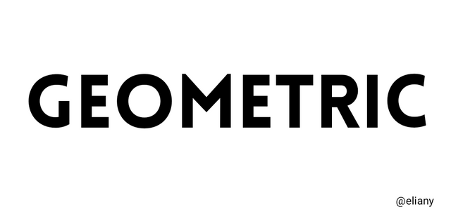
Font; lovelo
- Glyphic Serifs; This style appears more carved and engraved at edges than the ones drawn with pen. They produced an indentation at the end of each stroke, the serifs look more triangular and flaring towards one side. The glyphic designs are unique they don't look fade into the background, they always standout. Example of it are , New text, Albertus, Quorum etc.
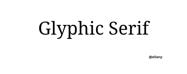
Font; droid
- Calligraphic; this is an artful writing style with consistent crossing of letters. They are really beautiful and all letters edges are not equal just as it is artful writing, some of the letters shapes are bold while some part are thin. They have high contrast among the strokes, they can be handwritten which will take a lot of time, they are used to add more beauty to graphic which captures the interest of veiwers.
Some examples includes; Mistral, Ballerino, Alex bush
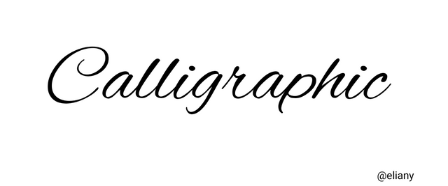
Font; Alex bush
1. CALLIGRAPHY
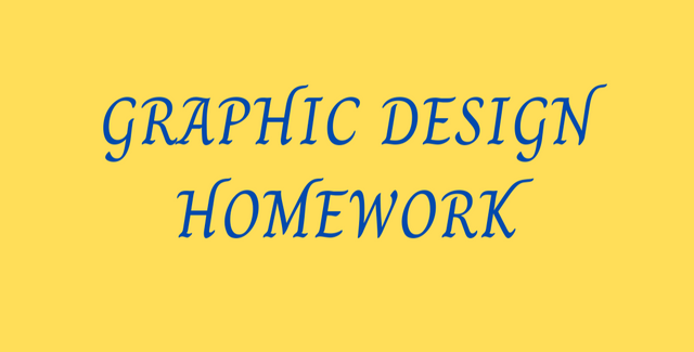
| SN | Items | Answer |
|---|---|---|
| 1. | Typeface/font used | charm (thin) |
| 2. | BG Colour Hex used | #ffde59 |
| 3. | Text Colour Hex used | #004aad |
| 4. | Alignment used | center |
2. MONOSPACE
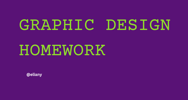
| SN | Items | Answer |
|---|---|---|
| 1. | Typeface/font used | courier prime (thin) |
| 2. | BG Colour Hex used | #591276 |
| 3. | Text Colour Hex used | #90dd2c |
| 4. | Alignment used | left |
3. SAN SERIF
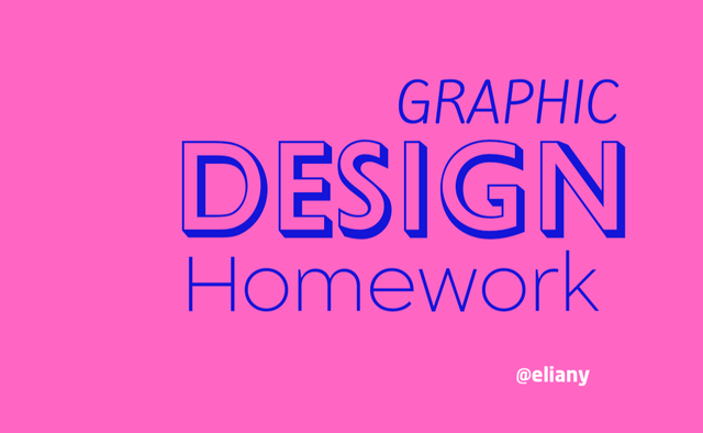
| SN | Items | Answer |
|---|---|---|
| 1. | Typeface/font used | balgin(thin) Gill sans shadows (thick) and kite one(thin ascender) |
| 2. | BG Colour Hex used | #ff66c4 |
| 3. | Text Colour Hex used | #1315d8 |
| 4. | Alignment used | right |
4. GEOMETRIC
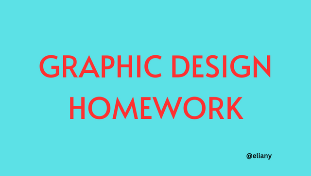
| SN | Items | Answer |
|---|---|---|
| 1. | Typeface/font used | Alata(thin) |
| 2. | BG Colour Hex used | #5ce1e6 |
| 3. | Text Colour Hex used | #ff3131 |
| 4. | Alignment used | center |
From my work, I applied hierarchy by using different fonts/typeface sizes and weight such as bold and thin
Emphasis is also being seen on my work by using colours (Triadic, Analogous and complementary colors scheme used)
I also applied alignment to the left, right and center making the work look neat and attractive.
Whitespace was also captured, because the elements were not jam packed, but there were accurate spacing.
Unity is seen, as all the element worked to complement themselves.
I also used font/typeface category combination which is San serif and geometric in image 3
I appreciate this lecture as I learn new thing and practice it, looking forward to more training ahead.
Thank you 👍

Graphic design is really broad with various terminologies. You’ve explained the concept of typography so well in your own words for others to understand. Your presentation is detailed and very neat.
Many success to you in the contest!
Downvoting a post can decrease pending rewards and make it less visible. Common reasons:
Submit
Greetings dear friend
Your did a Wonderful post presentation, this is good for every learner, this challenge has been useful, the write up designs and the fonts look beautiful.
You have given us a clear and simple definition of typography. Talking about typeface, your definition and design are great.
I wish you success in this contest
Downvoting a post can decrease pending rewards and make it less visible. Common reasons:
Submit
A very good one
The field of Graphics design is very wide, for you to come this far shows determination and hard work. All the best in the contest ma.
Downvoting a post can decrease pending rewards and make it less visible. Common reasons:
Submit