 |
|---|
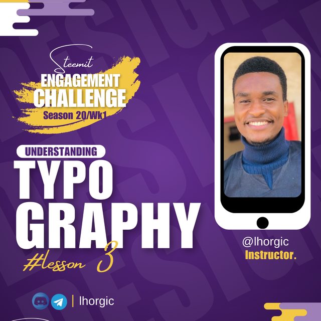
Welcome back guys! It the week three of our course, I trust you're getting more than you expect from the lessons. The feedback I've been getting from student are heart warming as some of these student are just getting to understand what they've been doing absent mindedly all these while.
Now they understand how these things work now and of course I can see a very big difference in their approach to design because of the well grounded understanding they are now getting. We would be moving into the pure practical aspect of the lesson by next week, so brace up guy! However we would be looking at the last phase of our theory + Practical today. Let go guys!
• What is Typography
• Understanding Typeface and font.
• Typefaces Classification
• Homework Task/Rules.
Typography is an important part of your graphic design and it must be done skillfully. Have you ever seen a design which would have been perfect but for the poor knowledge of typography on the path of the graphic designer. The fact is if you can master the act of typography, you might not need too much in your design to make it look good and stand out.
 |
|---|
Typography can be defined as the skillful art of choosing and arranging your typeface in such a way that your message is communicated without looking disorganized. To achieve this, your typeface must be legible, readable and well presented. Some of the errors I've seen over time includes using the wrong typeface for a particular kind of design.
Another is using too many typeface or font in a single design all in the name of trying to be creative. A good creative knows that a single typeface can do your magic if you understand the game. In addition to the errors I have seen along this line is not engaging the principle we earlier talked about when dealing with typeface and font.
Principles like Hierarchy, alignment Whitespace, Emphasis etc are key when dealing with the subject of typography. They help you deliver accurately when rightly applied in your design work.
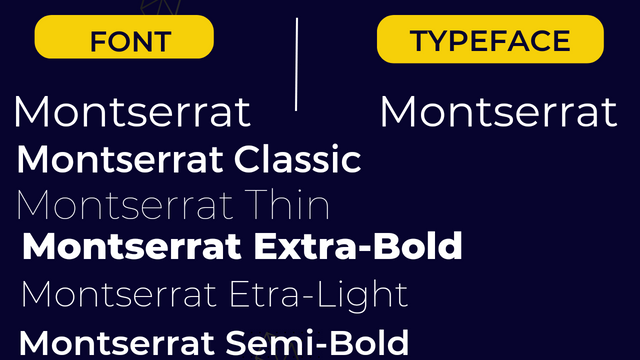
I would like to correct a misconception we have about the term "font". Many think font to be the type of lettering/text style you use for your design work but it's not completely true. Hence the need to talk about Typeface and Fonts.
A typeface is the name given to a lettering style especially lettering style that has many variants , or simply put, a lettering style with family members. While font is one of the variant or family member. All variant are not the same, hence the reason why it's called variant, one can be bold, another light, some others in italics, others very bold yet of the same family.
 |
|---|
Let me balance it with this example. Mr. Jeff Cower, has a family of 5; a wife and 4 Kids. They can all be referred to as the Cowers because it's their common name yet they all posses their distinct differences even though they bear the same name. Cower is the Typeface, their differences is the Font, as one of the kid might be tall, another chubby, another dark, yet another short. I hope you get the point now.
In this section we want to talk about the categories of typefaces. We have quite a number of them and i will be discussing them in this section. Every lettering styles you see out there belong to one of these categories we are about to discuss. Lets get into it guys.
• Serifs: These are typefaces that has small extension at the tip or edge of every of it letter. You must have come across it many times maybe on publications and on websites. It's known to evoke a formal and classy vibe. Example of this typeface include Time new Roman, Cambria etc. Below is a visual representation.
 |
|---|
• Sans-serif: San serif simply means "without" in French. Since we defined serif as a lettering style with extensions at the edge, san-serif means a lettering style without extensions at the edge. So it's the direct opposite of the serif font and it evokes a more relaxed and informal vibe. Examples include Calibria, Poppins etc below is a visual representation.
 |
|---|
• Script: This typeface is synonymous to that of a human handwriting, they are known to be very flexible and adds it unique touch to designs. Example includes Alex brush, Vivaldi Hallie, scriptina. Below is a visual representation.
 |
|---|
• Slab serif: This is a typeface with extension as well but different from that of serif in that the extension here is made up of solid rectangular shape just as seen below. Example includes Roboto.
 |
|---|
We have other typeface which I wouldn't want to go into, of course I will have to engage you in this area by making you do a little research for yourself. We would be back here later.
In combining typefaces, you have to be very careful because you might just end up distorting your design if you don't. You can decide to use just a typeface for a complete design, all you need do is to leverage on the principle of hierarchy, apply the upper or lower case of the type face to create differences, use weights (bold, thin, italics etc).
If you must combine your typeface, then you should start by learning to combine serifs and San serif typefaces. As you keep learning you would know how to combine other categories of typefaces but for now let's keep it simple. You would see my examples as we proceed in this lecture.
In this section I will be showing us you different stuffs I made showing you a very simple way on how to approach typography. I am sure you will also be able to reproduce them if you carefully study my examples. Below are my examples.
 |  |
|---|
 |  |
|---|
From the images above, you can tell that I adopted the principles of graphic design I taught you in lesson one.
• You can see hierarchy at work using different fonts/typeface sizes and weight such as bold and light
• Emphasis is also on display using colours.
• You can spot alignment; to the left, right and center
• Whitespace was also captured, as you can see that the elements were all allowed to breath and not all chocked up.
• You can spot unity, as all the element worked to complement themselves.
• You can also spot font/typeface category combination i.e San serif and script typeface in image 4
By now you also can testify to the fact that graphic design is not a very big deal once it's understood, as we have just made a semi design looking all cool just with types and a little of the principles taught. Of course in our next class we would be making a full, yet simple design with additional elements like images to complement our design.
• Discuss your understanding about Typography.
• Research 3 other typeface categories not captured in this lesson. Talk about them and also give a visual representation of the typefaces.
• Demonstrate your understanding of Typography just like I have done with my four example using the following guidelines below.
a. Use "GRAPHIC DESIGN HOMEWORK" as your main caption
b. Use the colour combination you picked in last week's colour scheme task or any other different from mine to demonstrate
c. Ensure you create 4 different (typographic) designs and highlight the principles applied just like I did.
d. Fill in the details below after each of the four designs using this table.
| SN | Items | Answer |
|---|---|---|
| 1. | Typeface/font used | ----- |
| 2. | Colour Hex used | ------ |
| 3. | Alignment used | ------ |
Note: Do not rush this task, understand what you're asked to do because it's a sensitive task. A well detailed step, explanation and presentation will be your leverage. You have been taught how to navigate the app, it's your turn to put to work what you have learnt so far...so guys! Let's have it.
• You title should be "SEC20/WK3: Typography and Practical Application."
• You can publish your homework task anywhere you deem fit and in any language.
• You're are to use the special tag #graphics-s20wk3 among other relevant tag like #country and your #steemexclusive.
• Plagiarism/AI generated content will not be tolerated. The penalty would be absolute disqualification.
• You're encouraged to continue with your club status, however it will not be taken into account for your grading & assessment.
• Invite 3 of your friends and don't forget to leave valuable comments on their posts.
• Use the burnsteem25 tag only if you have set the 25% payee to @null.
• Feel free to upvote and resteem this post if you want to.
• Participation schedule is between Monday, September 23 , 2024 at 00:00 UTC to Sunday, - September 29, 2024 at 23:59 UTC.
Outstanding Students will be rewarded with a sumptuous upvote for participating. A total number of 5 entries would be selected to get this compensation weekly from SC01 & 02
However, kindly bear in mind that upvotes are not guaranteed just for making an entry.
Regards
@lhorgic❤️
I love this your particular class as it exposed me to the fundamentals of graphics design. I will definitely be participating in this one actually. I have really learnt quite a lot about graphics design and you did justice to this in your class.
What people pay high money for to study in tutorials or on udemy, you prepare it for us to be more accessible and easy to learn and quite understanding also. I will definitely drop my entry as soon as possible 😁
Downvoting a post can decrease pending rewards and make it less visible. Common reasons:
Submit
Wao! Am glad you are getting value from the lessons. You're right, people pay a whole lot to get these lessons but you're getting it here on steemit all for free...trust me, it's my pleasure teaching this course. I will be looking forward to your entry.
Downvoting a post can decrease pending rewards and make it less visible. Common reasons:
Submit
I was eagerly awaiting for this lesson. Last week I enjoyed and learned colour theory from your lesson ansd not only that but also teach that lesson to my niece too. Now she knows the Colour theory and colour wheels. She thanked you. Hope this week, I will learn more than last week.
Downvoting a post can decrease pending rewards and make it less visible. Common reasons:
Submit
Wao! You mean your niece also benefit from the lessons? I feel humbled right now for the impact so far. I will be looking forward to your entry. My regard to your niece.
Downvoting a post can decrease pending rewards and make it less visible. Common reasons:
Submit
Check your grammar.
Downvoting a post can decrease pending rewards and make it less visible. Common reasons:
Submit
I guess Steem is giving birth to a new variation of English. Steemlish. Sounds like magic.
Downvoting a post can decrease pending rewards and make it less visible. Common reasons:
Submit
Is this comment of yours really necessary, friend? How about gently calling my attention to my mistakes like SC01 did without being sarcastic about it....I hope this is not being done to get undue attention? We all can always do better with our actions and inactions. I wish you the very best my friend.
Downvoting a post can decrease pending rewards and make it less visible. Common reasons:
Submit
Sorry My Bro, I meant I do that kind of mistake as well, too much if one wants to count, since I am not native speaker and use google, you know how "good" google is. So it was not only about you, but about me as well. I was just kidding. Sorry if you feel offended. This is not a good joke, okay. I am really sorry. What can I do to make it better, is there anything I can do?
I hope this is not being done to get undue attention?
Of course NOT.
How about gently calling my attention to my mistakes
I didn't event see what meistakes you make. I understand enough.
Downvoting a post can decrease pending rewards and make it less visible. Common reasons:
Submit
The other day I even use AI to do translation and my text was found AI-generated. Can you believe that an AI claimed to be born at some place and have some ethnicity?
Downvoting a post can decrease pending rewards and make it less visible. Common reasons:
Submit
Hahahahahahaha😃...you seem to be a funny person. I think I want to know you better. Here's my discord I.D : lhorgic. We can have some hilarious convo once in a while.
Downvoting a post can decrease pending rewards and make it less visible. Common reasons:
Submit
Why not here and share the fun at the backdoor?
You game too?
Team True Colours - @ wakeupkitty
Downvoting a post can decrease pending rewards and make it less visible. Common reasons:
Submit
Your comments are getting shorter and shorter but you are great in egaging.
Team True Colours - @ wakeupkitty
Downvoting a post can decrease pending rewards and make it less visible. Common reasons:
Submit
It's alright my friend, thanks for making yourself clear...we are good 🤼😜
Downvoting a post can decrease pending rewards and make it less visible. Common reasons:
Submit
Thank God ,, I could get blacklisted from your classes,, you know how I enjoy the class ... 😅😅
Downvoting a post can decrease pending rewards and make it less visible. Common reasons:
Submit
Hahahahahahah 😃... I would do no such thing. We all have equal right to enjoy this platform
Downvoting a post can decrease pending rewards and make it less visible. Common reasons:
Submit
Dear @steemcurator01, my sincere apologies, thanks for calling my attention. Corrections have been made, if there is any other area you want me to check, you can call my attention to it. I will be more than ready to do the needful.
Downvoting a post can decrease pending rewards and make it less visible. Common reasons:
Submit
I really love this class! You can expect my participation, Professor.
🤠🤠🤠
Downvoting a post can decrease pending rewards and make it less visible. Common reasons:
Submit
My entry
https://steemit.com/graphics-s20wk3/@impersonal/sec20-wk3-typography-and-practical-application
Downvoting a post can decrease pending rewards and make it less visible. Common reasons:
Submit
My entry
https://steemit.com/graphics-s20wk3/@solaymann/sec20-wk3-typography-and-practical-application
Downvoting a post can decrease pending rewards and make it less visible. Common reasons:
Submit
My entry : https://steemit.com/graphics-s20wk3/@pea07/sec20-wk3-typography-and-practical-application
Downvoting a post can decrease pending rewards and make it less visible. Common reasons:
Submit
https://steemit.com/hive-109435/@khursheedanwar/sec20-wk3-typography-and-practical-application
My participation 🥰
Downvoting a post can decrease pending rewards and make it less visible. Common reasons:
Submit
https://steemit.com/graphics-s20wk3/@ninapenda/sec20-wk3-typography-and-practical-application
Downvoting a post can decrease pending rewards and make it less visible. Common reasons:
Submit
Hola amigo @lhorgico... Buen tema para esta semana este curso me gusta mucho, quiero aprender sobre el diseño gráfico, sin embargo mi participación de la semana dos no fue evaluada, igual participaré está tercera semana
Downvoting a post can decrease pending rewards and make it less visible. Common reasons:
Submit
Oh Sorry about that my friend, did you use the special hash tag? If no, it must have been the reason. Please endeavor to use the special graphic design weekly hash tag so that your entry can be easily tracked. Gracias!
Downvoting a post can decrease pending rewards and make it less visible. Common reasons:
Submit
Tiene razón , ya me di cuenta que me faltó la etiqueta principal 😔, ya no puedo agregarla?
Downvoting a post can decrease pending rewards and make it less visible. Common reasons:
Submit
¡Saludos amigo!🤗
Por acá te comparto mi participación en la dinámica: https://steemit.com/graphics-s20wk3/@paholags/sec20-wk3-tipografia-y-aplicacion-practica
Downvoting a post can decrease pending rewards and make it less visible. Common reasons:
Submit
Here's my entry link:
https://steemit.com/graphics-s20wk3/@hudamalik20/sec20-wk3-typography-and-practical-application
Downvoting a post can decrease pending rewards and make it less visible. Common reasons:
Submit
My entry
https://steemit.com/graphics-s20wk3/@josepha/sec20-wk3-typography-and-practical-application
Downvoting a post can decrease pending rewards and make it less visible. Common reasons:
Submit
It really is a task that requires dedication, but as long as it is for learning I will look for free time to participate.
Many blessings..🙏🏻
Downvoting a post can decrease pending rewards and make it less visible. Common reasons:
Submit
my entry https://steemit.com/graphics-s20wk3/@graceleon/sec20-wk3-typography-and-practical-application
Downvoting a post can decrease pending rewards and make it less visible. Common reasons:
Submit
My entry
https://steemit.com/graphics-s20wk3/@rafk/sec20-wk3-typography-and-practical-application
Downvoting a post can decrease pending rewards and make it less visible. Common reasons:
Submit
Here's my entry
https://steemit.com/hive-109435/@abdullahw2/sec20-wk3-typography-and-practical-application
Downvoting a post can decrease pending rewards and make it less visible. Common reasons:
Submit
https://steemit.com/@alejos7ven/notifications
Downvoting a post can decrease pending rewards and make it less visible. Common reasons:
Submit
https://steemit.com/hive-103393/@aneukpineung78/sec20-wk3-typography-and-practical-application
thanks Professor @lhorgic
Downvoting a post can decrease pending rewards and make it less visible. Common reasons:
Submit
My entry:
https://steemit.com/graphics-s20wk3/@muhammad-ahmad/sec20-wk3-typography-and-practical-application
Downvoting a post can decrease pending rewards and make it less visible. Common reasons:
Submit
https://steemit.com/graphics-s20wk3/@simonnwigwe/sec20-wk3-typography-and-practical-application
Downvoting a post can decrease pending rewards and make it less visible. Common reasons:
Submit
My entry
https://steemit.com/hive-139765/@kidi40/sec20-wk3-typography-and-practical-application
Downvoting a post can decrease pending rewards and make it less visible. Common reasons:
Submit
https://steemit.com/graphics-s20wk3/@yolvijrm/sec20-wk3-tipografia-y-aplicacion-practica
Downvoting a post can decrease pending rewards and make it less visible. Common reasons:
Submit
Saludos cordiales, mi participacion
https://steemit.com/graphics-s20wk3/@zory23/msec20-wk3-tipografia-y-aplicacion-practica
Downvoting a post can decrease pending rewards and make it less visible. Common reasons:
Submit
My entry
https://steemit.com/graphics-s20wk3/@daprado1999/sec20-wk3-typography-and-practical-application
Downvoting a post can decrease pending rewards and make it less visible. Common reasons:
Submit
https://steemit.com/graphics-s20wk3/@nahela/sec20-wk3-tipografia-y-aplicacion-practica
Downvoting a post can decrease pending rewards and make it less visible. Common reasons:
Submit