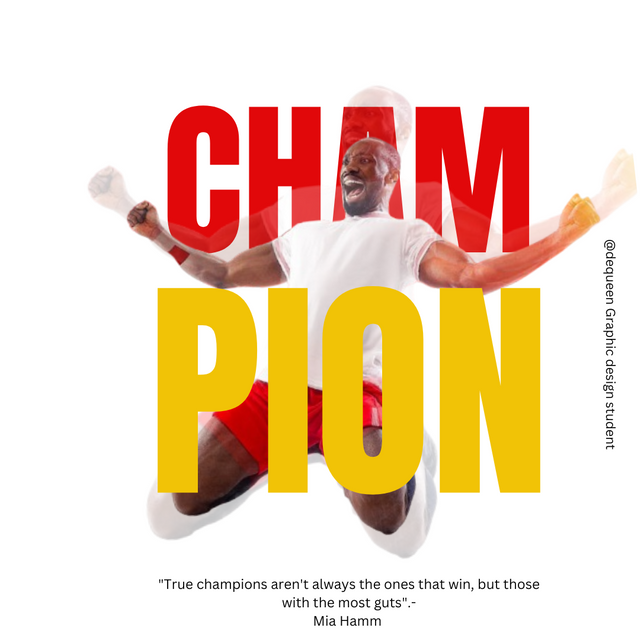
Imagine how time flies✈️✈️✈️. We are currently on week 5 of graphic design class. I found this class to be highly educational and interesting, how about you?
In this week homework, we are requested to replicate a graphic design given by our instructor which celebrates our success and motivation. Please follow through as I will try my little best to do so.
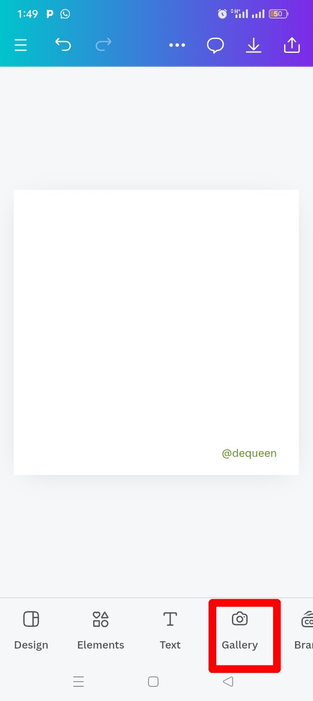
The frist thing I did was launching to my canva app.
I went to the three dot at the top Menu bar and clicked on CUSTOM SIZE, then I choose 1080×1080 dimension which "Instagram posts square" size.
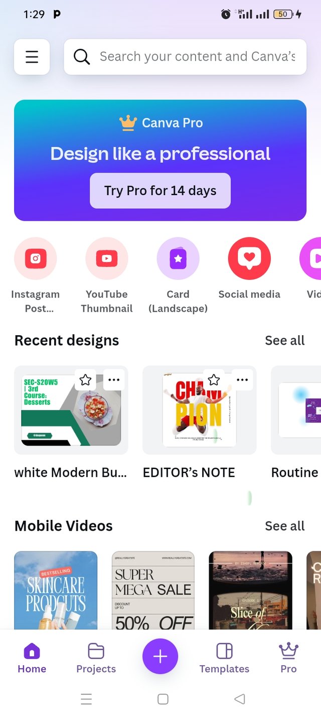 | 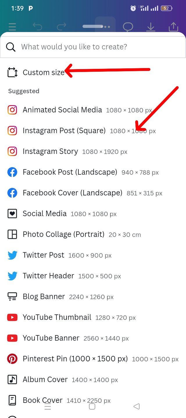 | 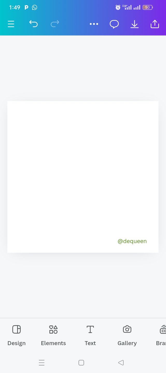 |
|---|---|---|
| Step 1 | Step 2 | Step 3 |
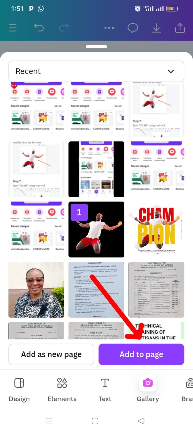
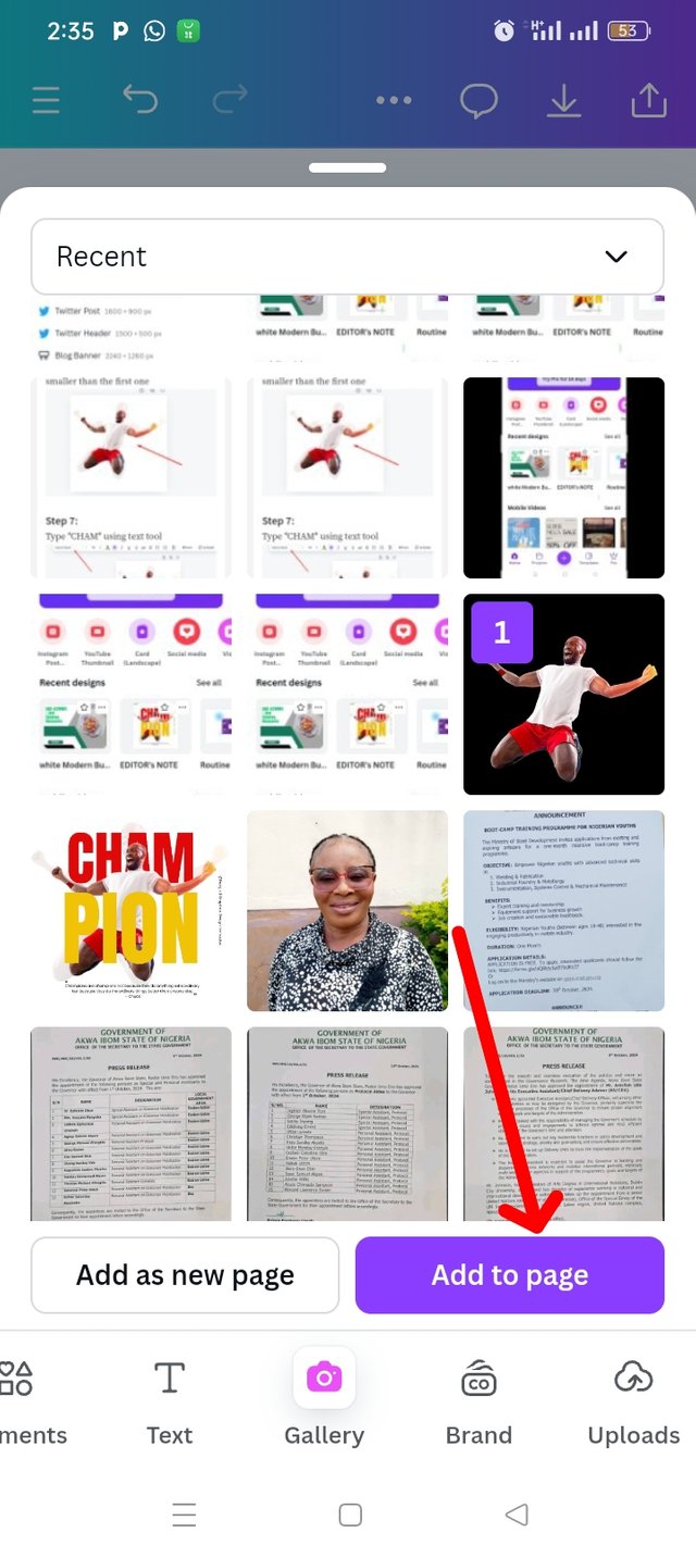
I proceed to adding background image by clicking the gallery icon. I then selected my already downloaded photo from the lesson course outline and then clicked on ADD TO PAGE.
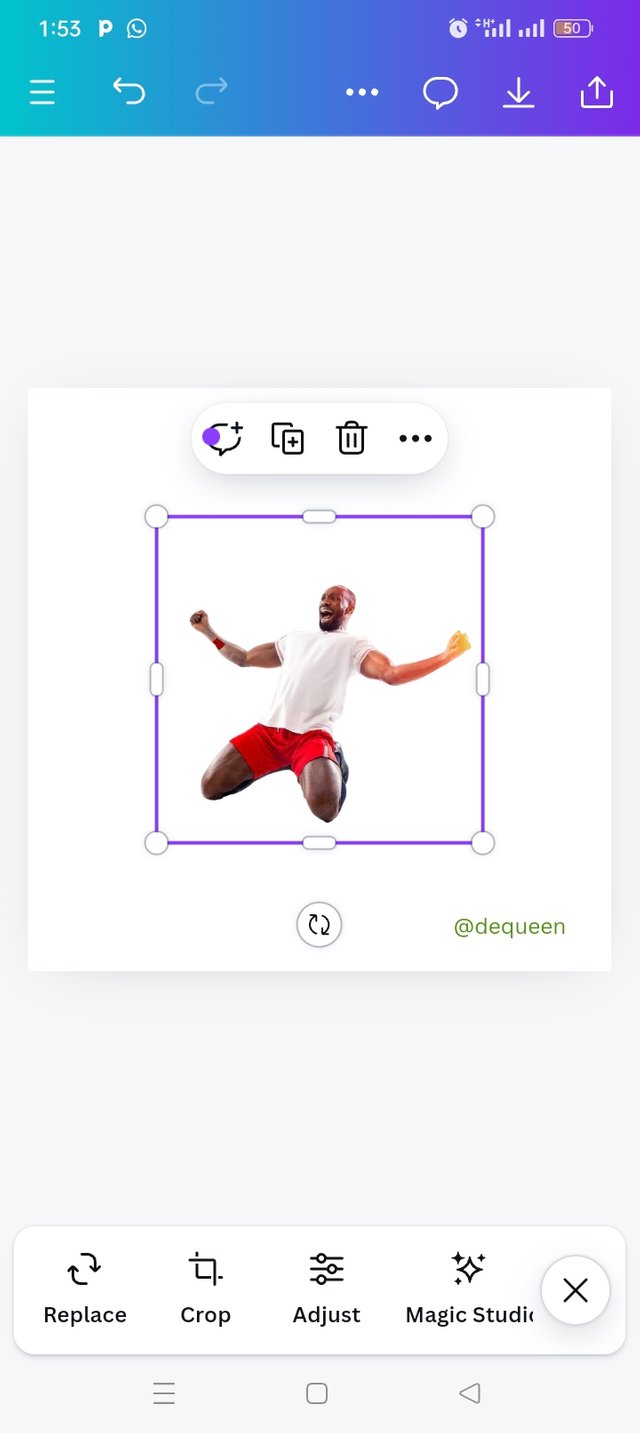
As you can see below, the image is well inserted in my working space and I increased my pictures sizes.
 |  |  |
|---|---|---|
| Step 4 | Step 5 | Step 6 |
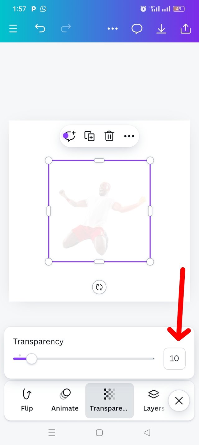
I used my transparency tools to reduce my pictures transparency to 10 as you can see the effect in this picture.
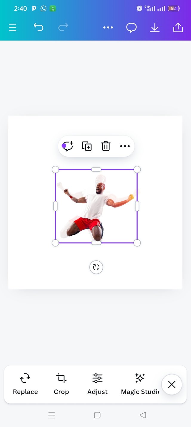
I went back to my gallery by clicking on camera icon, selected same image , this time, I reduce the size to be smaller than the first one.
 |  |  |
|---|---|---|
| Step 7 | Step 8 | Step 9 |
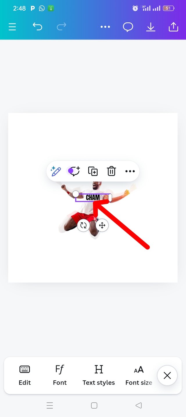
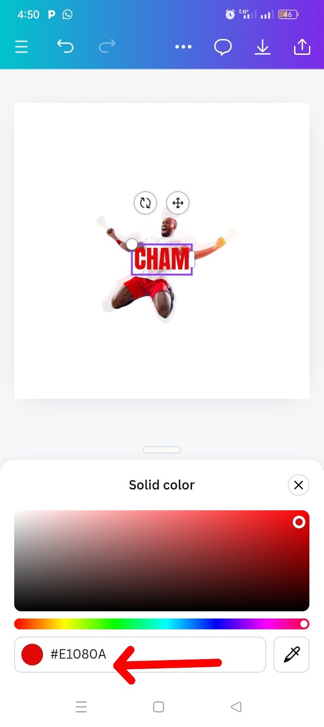
I clicked on text icon , typed in "CHAM", add font style which is "Anton", Letter spacing of 0.8. I enlarged the text before going to select my preferred color; "RED" using #E1080A hex code.
I clicked on my position, four different options came out and I choose backwards and the text is inserted at the back of my images.
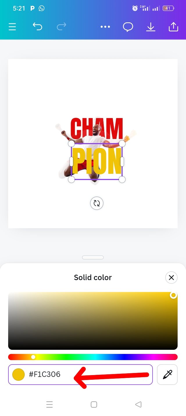
My next step was typing of the second text, PION then used the same font Anton. I added colour to the text by using the colour wheel and I choose colour hex code #F1C306. I also used font size of 300 to enlarge the text, there by making it more visible.
 |  |  |
|---|---|---|
| Step 10 | Step 11 | Step 12 |
At this point my champion is formed. "CHAM" is in red colour while my "PION" is in yellow.
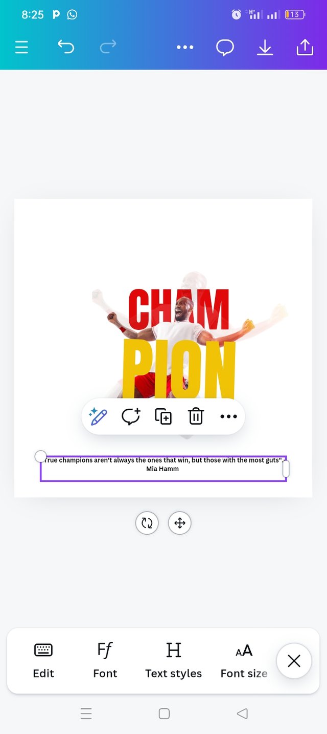
I used my text icon to a quote Hia Hamm "True champions aren't always the ones that win, but those with the most guts"
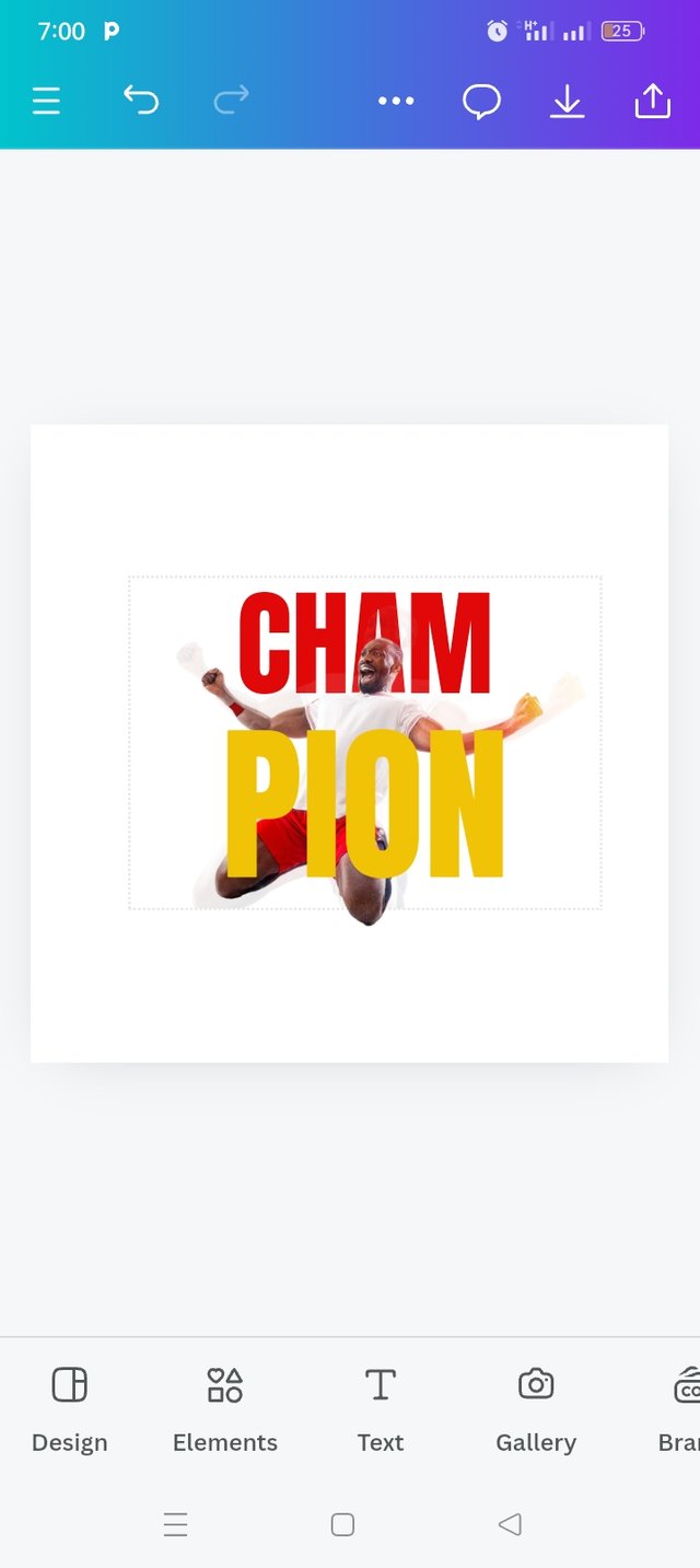
I also typed my username at the right hand side. At this point, I'm done with my pictures editing but l tried to compare my own with that of my instructor.
 |  |  |
|---|---|---|
| Step 13 | Step 14 | Step 15 |
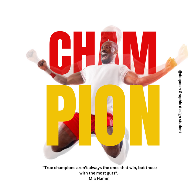
I tried to remove some minor errors. Here is my final result.

Welcome to some of the principles I use in this week homework task
Design Size & Dimension: I decided to explain design size and dimension first because that is what I did at the beginning of my work. I choose design size and dimension of 1080x1080px which allows us to see a clear visibility of all the elements and how it fit well within that space. It was a best decision because it is one of the social media post.
Balance: I ensured the composition of both images and text fonts are correctly balanced by distributing colors evenly, using red for "CHAM" to complement the yellow "PION." Everything is very balanced and fitted.
Hierarchy: I applied this principle on the first image, I positioned the background image making it transparent then the second image remain normal.
Colour Combination: In my graphic design the colour I used were White, Red and Yellow. I used a white background, red on CHAM and yellow on PION text which makes it a beautiful combination. Remember yellow colour is very nice when combined with red.
Alignment: My element and text are well aligned as you can see from my design.
My special thanks goes to our instructor @lhorgic I appreciate your skills and good way of impacting knowledge to others.
I will like to invite @dove11 @patjewell and @wirngo and @ripon0630 to take part in this contest.
Downvoting a post can decrease pending rewards and make it less visible. Common reasons:
Submit
Hi @eliany and team 05 thanks so much for the support, l really appreciate.
Downvoting a post can decrease pending rewards and make it less visible. Common reasons:
Submit
🤗🤗🤗
Downvoting a post can decrease pending rewards and make it less visible. Common reasons:
Submit
🤗🤗🤗
Downvoting a post can decrease pending rewards and make it less visible. Common reasons:
Submit
Your graphics design is really beautiful, your step by step process is understandable and your explanation on the different principles shows how you really understand the course.
Keep it up
Downvoting a post can decrease pending rewards and make it less visible. Common reasons:
Submit
Thanks so much commenting on my post,l appreciate.
Downvoting a post can decrease pending rewards and make it less visible. Common reasons:
Submit