Design with canva
From your illustration it is very obvious that almost all the things that we used belongs to a particular brand and they have their logo. For example the mobile device I'm using is from redmi Xiaomi and of course they have their own logo so anywhere I see this logo I will know that this particular product belongs to Xiaomi.
Our individual businesses also have logo most times, we do brand our businesses and it needs. A graphic designer is needed to be able to design logos for different businesses and as an upcoming graphic designer I need to learn how to make logo.
Appreciate this week lecture us it's also broaden my knowledge in the making of logo. Thank you @lhorgic for yet another great lesson.
To my understanding, logo can be defined as a visual symbol which is design to give identity to an organisation, a company, a product or a brand. It can be made with so many things including text, symbols, colour and image, which distiquished your brand with others.
It is usually combined with symbols or texts that reflect your brand or the product or your type of business.
Ideally, logo creates a quick memory with just a glimpse of your logo which means as a graphic designer, much concentration and creativity is needed to create a good eye catching logo. So with regards to this, one need to pay attention to your colours to your element used to your text because it is very necessary so as to catch the interest of the audience at a glimpse of the viewers of the logo.
Like I already mentioned, logo has great impact to a brand. For example if I want to buy a product that I am very used to I will know their logo and if the logo is not on the back of what I'm buying I will not be comfortable buying it. This means that logo is very very important It creates impact on a product.
Another example is even buying a particular product in a supermarket maybe something I have not used before I will look up to their logo possibly try to read about them online to know how good their product is and if I search online and I couldn't see the same logo it means the products is not what is inside therefore, logo really promotes products.
Therefore, the impact of logo to a brand is unique because logo is the face of a brand, It says everything a customer needs concerning the product.
Characteristics of an effective logo includes;
simplicity
Versatility
Memorability
Availability .
Simple; As a graphic designer creating of logo should be made simple with few elements fewer text and unique colours. The golden rule Less is more should be put into consideration while creating a logo. It should be comprehensible.
Versatile; while creating logo, it should be in a way that it can be copied to any other platforms or can be used on t-shirts, books, bill Board etc.
Originality; while creating Logo, I should not copy someone else logo design to recreate rather I should be original. I should be creative.
Memorable; logo should never be forgotten Therefore it should not be too busy It should be easy and the elements should also be easy for recognition and remembrance.
• Explain and demonstrate visually the do's and don't when it comes to Logo design. You can do more research to be outstanding and kindly ensure not to use my specimen logo.
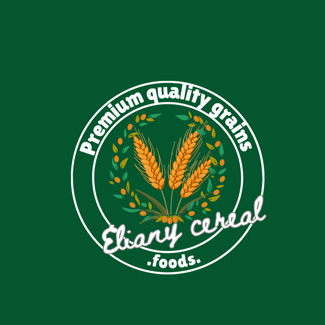
Typography; use fonts that align with your work and not just anything that comes your way. So to avoid this, I need to play around my font and make the right choice.
 ✅ ✅ |  ❌ ❌ |
|---|
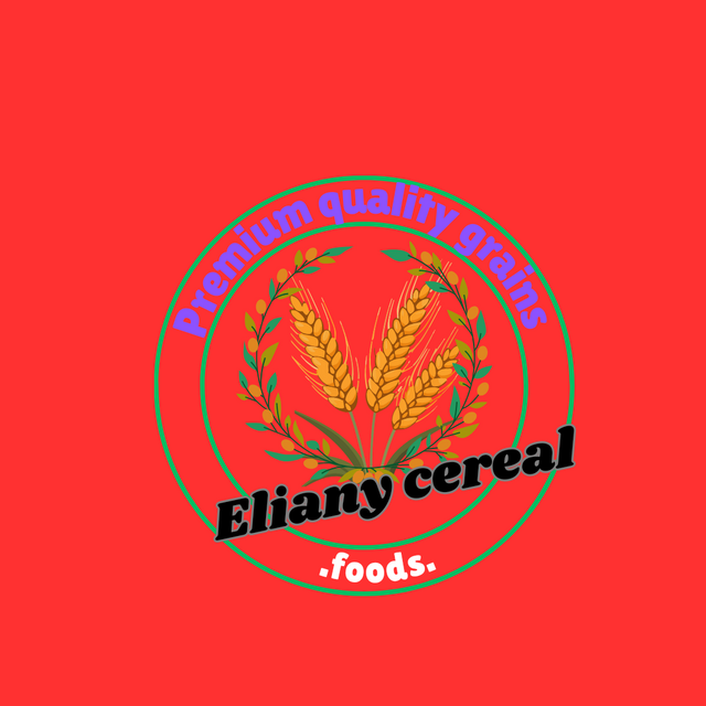
Colour combination; there's what we call colour riots it's always look harsh on objects or even when humans wear colour riots. So in graphics, while choosing colours, colour wheel should be considered so as to enable us to make the right size of colour. Then while making logo, the brand is also put into concentration so as to know the type of colour to use. That is for example if you're making a logo for food then it means that some colours that represent that food need also to be put into concentration.
 ✅ ✅ |  ❌ ❌ |
|---|
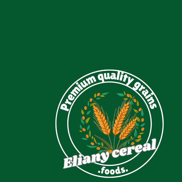
- Allignment; I My work should be aligned correctly you done to the centre correctly or to the left or to the right but it should be positioned in a straight way.
 ✅ ✅ |  ❌ ❌ |
|---|
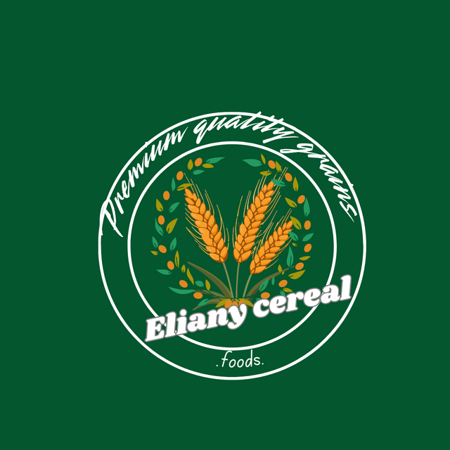
- Balance your Tagline choose a tagline that best describe the logo very short and best describe the brand.
 ✅ ✅ |  ❌ ❌ |
|---|
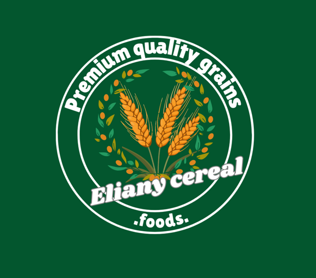
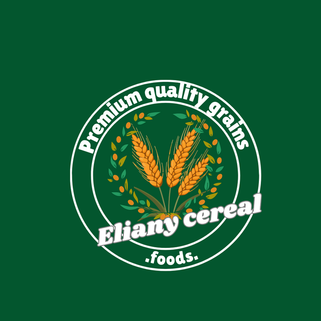
So a client who is dealing with different kinds of grains in making cereals contacted me to make a logo for his brand. The client gave me her business name which is eliany cereals
So you After drafting how the design will look like, I put into consideration that she is dealing with grains, and so I'll need to include a grain in the logo then my choice of colour should reflect food and that is the reason I choose green which portrays grains and then I choose orange colour which is actually the colour that reflects the grain seeds.
The name; Eliany cereals
Slogan; Premium quality grain foods
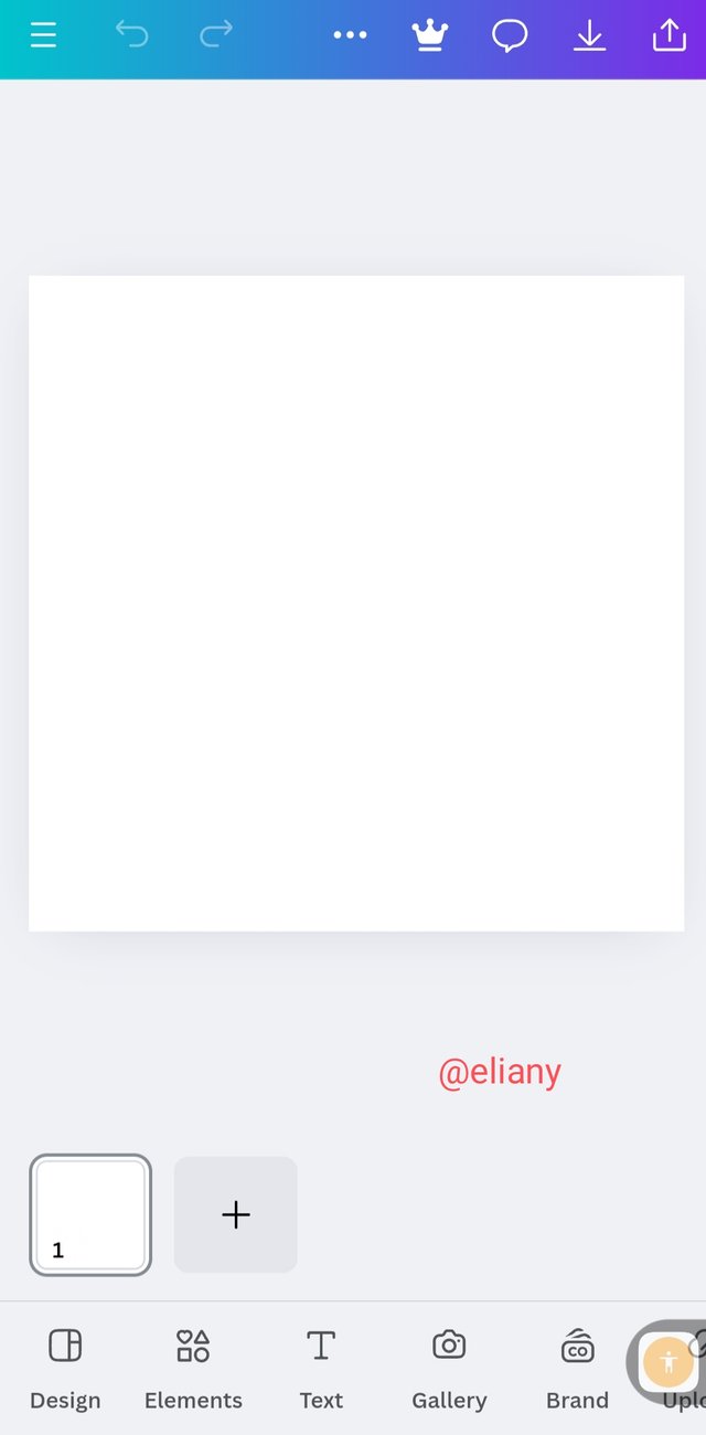
After making this I open my canva
 1 1 | 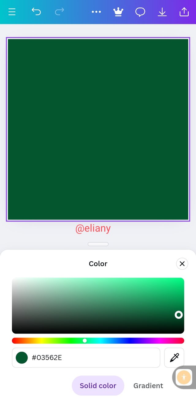 2 2 | 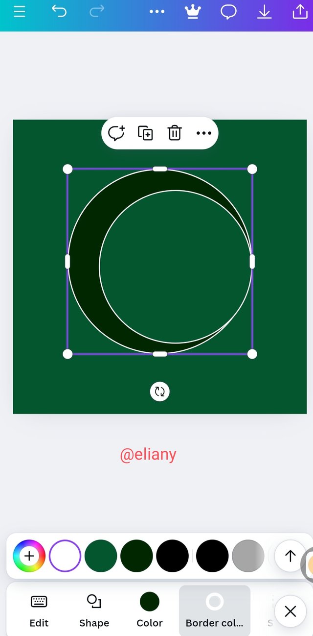 3 3 |
|---|
I created my work space in canva app
I used a green background to create my logo
Then I added 2 circle then added the same green colour to it
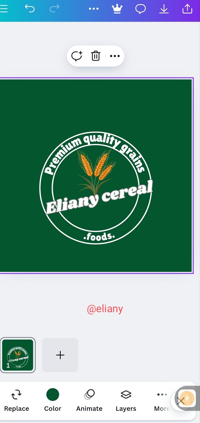 1 1 | 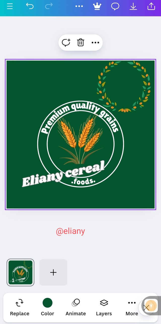 2 2 | 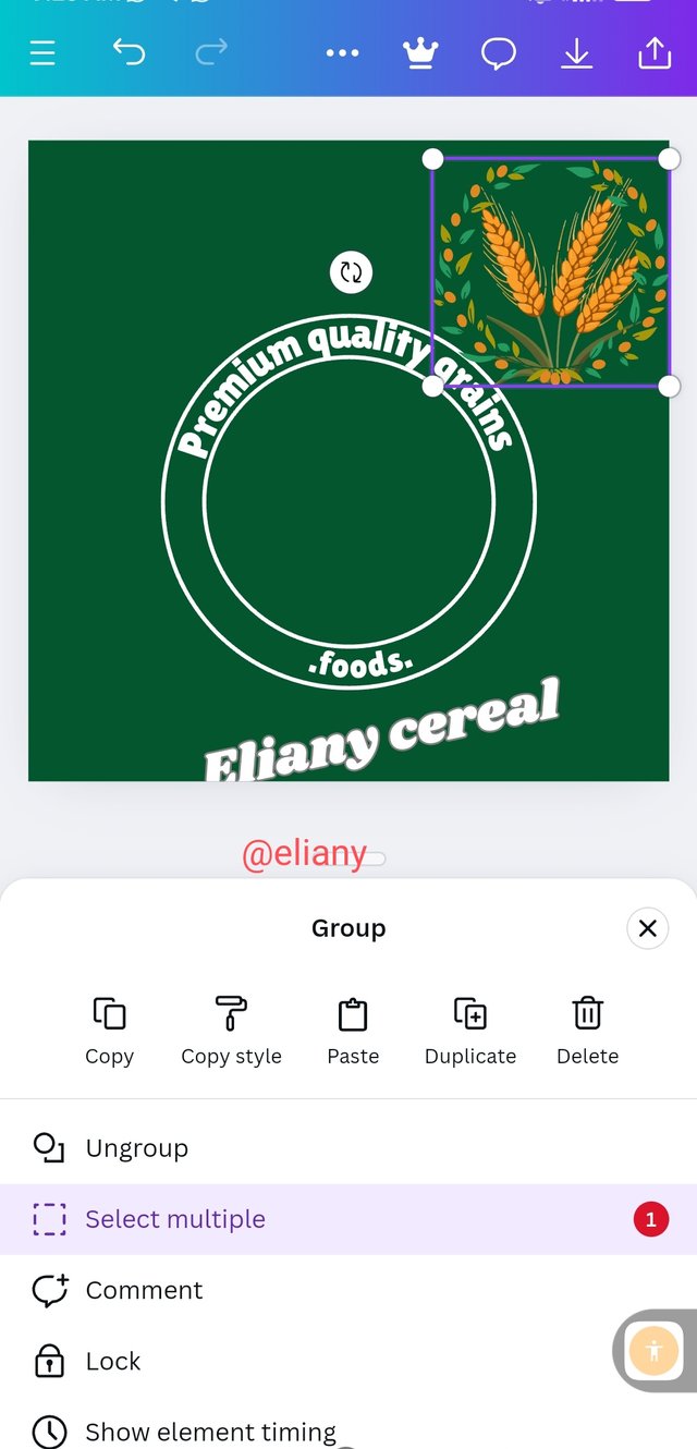 3 3 |
|---|
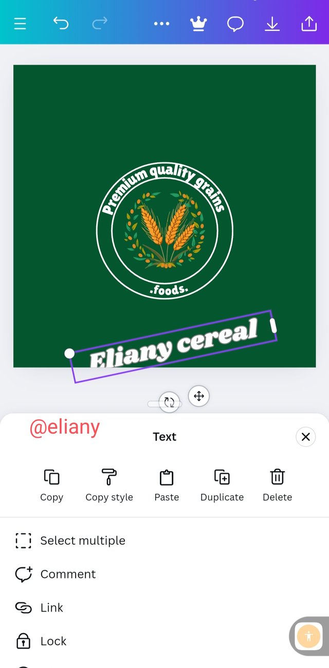
I added my text and grains symbol to it, using effect icon I added curve to my text and placed them as I want to, my slogan is in a circular form.
To create my logo I also search for another grains symbol and added to my work space, I didn't really know where to use it but I played along with the design.
I finally got an idea so I added the grain seeds to the wheat like symbol I selected and it turns out great.
 1 1 | 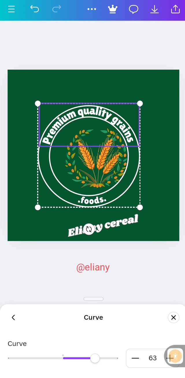 2 2 | 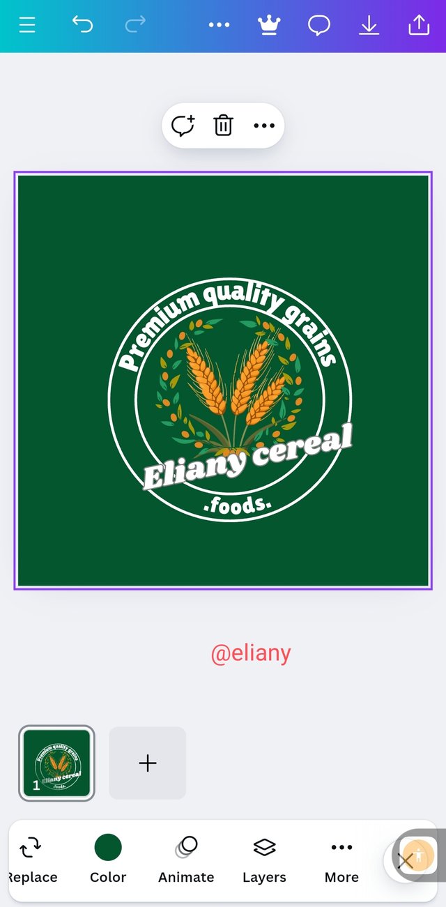 3 3 |
|---|
Finally, I placed the logo in the middle of the circle
I group all my work and reduce the size to look like a logo.
- I finally arranged my work as seen.
The outcome 👇

Ofcourse the outcome of my design clearly tell the kind of brand/business organization i designed for. I designed a logo for a cereal business of which cereals are made from grains.
I want to invite @dequeen @goodybest and @adinah to take part in this contest.

Your logo is really beautiful and it describes the type of brand it represents without having to think much. I like the way you approached each question. Well done and many success to you!
Downvoting a post can decrease pending rewards and make it less visible. Common reasons:
Submit
Oh I appreciate this thank you so much
Downvoting a post can decrease pending rewards and make it less visible. Common reasons:
Submit
Your logo design is really unique and catchy!
Downvoting a post can decrease pending rewards and make it less visible. Common reasons:
Submit
Thanks
Downvoting a post can decrease pending rewards and make it less visible. Common reasons:
Submit
Your logo design is really unique and attractive. The way you have used colors, elements and layout in this is very impressive. Simplicity and originality in a logo is important to strengthen brand recognition and memorability, which is reflected in your design. You have also taken care of the subtleties of design, which improves the recognition of any brand. What a great job!
Downvoting a post can decrease pending rewards and make it less visible. Common reasons:
Submit