
Introduction
Hello crypto Lovers!
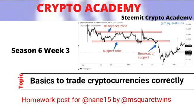
Today is a beautiful day here. I hope you have been enjoying week 3 of season 6. I am Kehinde Micheal and my username is @msquaretwins here on this great platform. In this post, I am going to be answering the questions posted in the homework task by Professor @nane15 who presented a lecture on the topic "Basics to trade cryptocurrencies correctly". Happy reading!

1. Explain your understanding of charts, candlesticks, and time frames. (Use your own words and put screenshots)
Charts
Chart is a graphical representation of data which is employed in all field of life. In finance trading, it is a graphical representation of price and market data. There are different types of charts that are employed in financial trading and each has it own purpose. Some of the chart types tgat are used in finance trading are; bar chart, Hekin Ashi, line chart, candlestick chart etc.
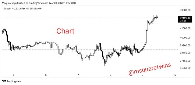
Chart is a two dimensional representation of data in market. The main purpose of chart is for analysis. It is used to make good analysis and to predict the price of an asset by looking at the past and present price data. Another importance of chart is that it helps traders to determine the trend of an asset.
Candlestick Chart
Candlestick chart is a type of chart employed to make good analysis of an asset. It is the most widely and commonly used of all types. It is very simple to read and present every detail of price data in market. Candlestick chart consist of bear candles and a bull candles. By default, the bear candles are red and the bull candle are green. The bull candle forms when the price of an asset is rising and the bear candle forms the price is falling.
It consist of a body and upper and lower wicks. There different types of candlestick pattern and when they form, they signify different thing in market. A times, a candle may form with just a body without wicks, and it may form with wicks and a body. The wick is otherwise known as shadow.
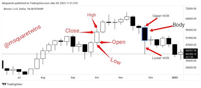
Each candle present the low, high, close and open of price at a period of time under consideration. The open is a point at which market open for a period. The low point of candle indicate the lowest low price touches at a particular period. The high is the highest point reached by price at a period under consideration. The close is the point at which price close at a period.
Timeframes
Time frame is not nothing but time interval that is used to describe price movement at a specific period of time. Each candle represent the time period under consideration. For example, 1 month time frame will have a candle for a whole month, and 6 candles in 1 month timeframe will represent 6 month. 1 week timeframe will have 1 candle represented by a week and 6 candles will contain 6 weeks of price data. A candle represent all activities that take place in a day for 1 day timeframe, and 7 candles in this case will mean a week.
The importance of timeframe can never be overemphasized as it helps traders to get details of market data that is not visible in any timeframe. By switching from daily timeframe to 4 hour timeframe, traders will be able to see micro details of price data which may not be visible in daily timeframe. Also, 1hour timeframe will contain some details that may not be present in 4hour time frame.
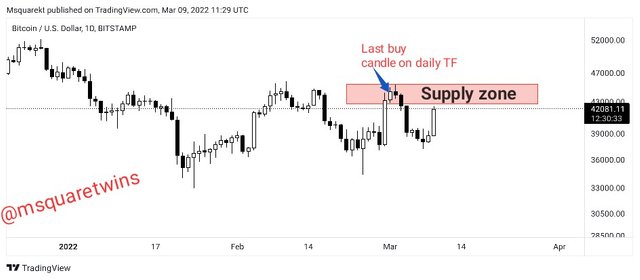
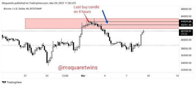
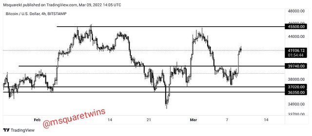
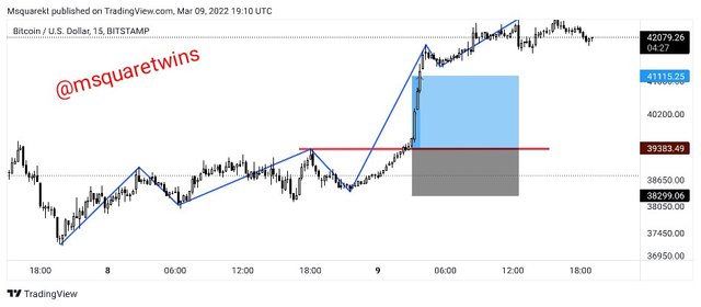
In the screenshot uploaded below, we can see a zone marked by a red box. This zone is a supply zone and it os also an a whole area of a last buy candle before a sell down. This is taken on a daily time frame.
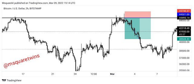
Now let switch this chart to a 4 hour time frame.
The chart uploaded below is a 4 hour timeframe chart of the aforementioned chart. As we can see, this timeframe gave more details of price data. Also we see that the last buy candle area has been refined. This is a power of multiple timeframe.
2. Explains how to identify support and resistance levels. (Give examples with at least 2 different graphs)
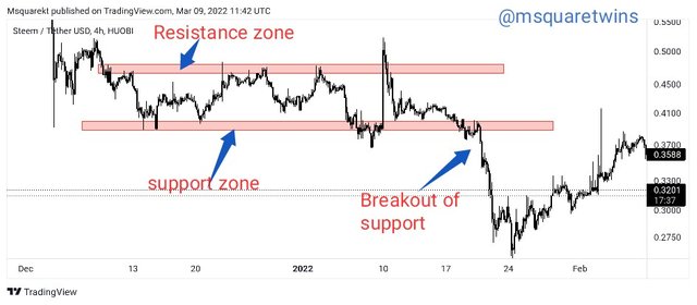
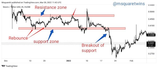
Support and resistance are area where price take a turn in market. They are great area of price reversal. Support zone is a zone where market that has been on a bearish trend meet with a buying pressure and then reverses back to the upside direction. On the other hand, resistance zone is an area in market where an asset which has been buying meets with selling pressure and then turns to the opposite direction.
Some people draw resistance and support level as a single line. However, support and resistance level is not just a line but a zone. To identify support and resistance zone, the following guidelines are recommended.
- Remove all drawing and indicators from chart and make it clean and clear as much as possible
- Zoom out your chart to have a clear overview of price and market structures.
- Draw horizontal support and resistance across areas where price has rejected more than once before.
- The horizontal support and resistance must at least have two touch of previous area of price reversal.
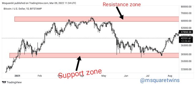
The screenshot uploaded below shows an example of support and resistance on a real chart. As we can see, there are multiple touches of price at the support and resistance zone drawn.
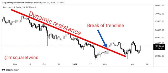
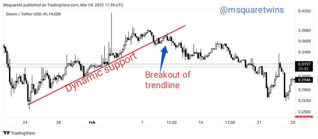
Apart from normal horizontal support and resistance, we also have dynamic resistance and support. Dynamic resistance and support are resistance and support line drawn just like an incline line which form a slope across the chart. The examples of dynamic support and resistance are displayed in a screenshot below. As we can see price keep touching the dynamic resistance and support and it bounces back until a breakout.
3. Identifies and flags Fibonacci retracements, round numbers, high volume, and accumulation and distribution zones. (Each one in a different graph.)
Fibonacci Retracement
Fibonacci retracement is a technical tools that is used to determine the point of price reversal in market. There are different levels of Fibonacci retracement. Some of the levels are 23.6%, 38.2%, 50% 61.8%, 78.6% 100% etc. Fibonacci retracement is used to identify support and resistance zone. Some traders use it as a confluence to their strategy.
The Fibonanci retracement can be drawn to identify support for a bullish trend. In this case, traders will find opportunity to join a bullish trend at a support after a retracement.
To draw a Fibonacci retracement for a trend that is bullish, we will put a point one of the retracement tool at the previous support and then extend it to the next high as seen in the screenshot below.
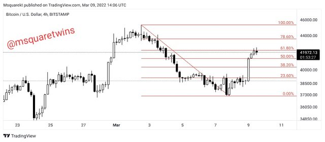
To draw a Fibonacci retracement for a bearish, we will put a point one of the retracement tool at the previous resistance and then extend it to the next low as seen in the screenshot below.
Round number
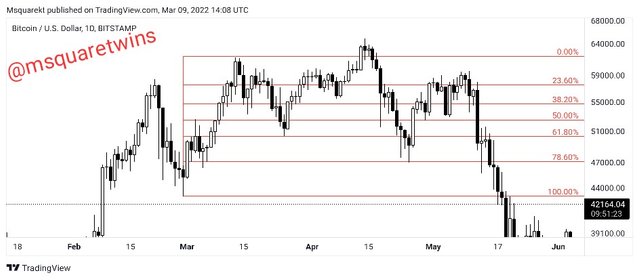
Round number is another strategy that is used by many traders to determine the area of price reversal in market. Traders believe that price often reverse at the round number of price in market. And in setting stop loss and take profit, traders often uses round number like 32.0, 45.0 etc. This makes more order to present at a round number.
Let take a look at the picture uploaded below. We have some round number indicated by horizontal lines in the screenshot uploaded below. The first one is 45500.00, we can see that price has reversed more than 3 times in this area, and if we trace that line backward, we will be surprise to see more touches which has been previously respected. Another line is the second to the last line which has a round number 37020.00. We see that price has also reverse multiple times at this area. So the understanding of round number can help traders to identify support and resistance zone.
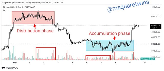
Accumulation and Distribution Phase
Accumulation and distribution phase is a phase in market where price pauses and ranges for a while before it reverses back to the opposite direction. Accumulation phase occurs at the bottom of a chart. It occurs after a long bearish trend. This phase is usually caused by a strong hands in market and the aim of this strong hands is to induce the retail traders and hunt them and then move price to upside direction.
On the other hand, distribution phase occur at the top of a chart. It forms after a long bullish move. This phase is initiated by professionals and institution in market. Their aim is to deceive retail traders and hunt them. After a distribution phase, price will move downward massively.
The picture uploaded below shows both accumulation and distribution phase and the volume associated to each phase at the same time.
4. It explains how to correctly identify a bounce and a breakout. (Screenshots required.)
A rebound occur anytime price meets a support or resistance level and the take an opposite direction without breaking the zone. For instance, in the screenshot below we can see how price touches the support level and then reverse back upward. This is called a rebound of a support level. The rebound of a resistance level occur when price touch the resistance level and reverse back without breaking the resistance zone.
A break occur when price get to this zone and break it without rebounding back. The break can either be at the support or resistance zone. When it occur at a support zone, it will break the support zone downward, but when it occurs at a resistance zone, it will break the resistance zone upward.
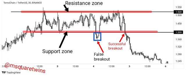
5.Explain that it is a false breakout. (Screenshots required.)
False breakout is a limitation of support and resistance breakout strategy. This is a limitation because it can make traders who take the false breakout trade. False breakout occurs when price break support or resistance and then moves or reverses back to the opposite direction.
For instance, the picture uploaded below shows an example of a false breakout and a real breakout in market. As seen in the screenshot below, we have price bouncing back every time it touches support and resistance. But at a point, price break a support zone downward as indicated by a blue box in the screenshot. Then after this break, instead of price to go in the direction of the break, it reverses back to the upside. Hence, It is a false breakout.
6. Explain your understanding of trend trading following the laws of supply and demand. It also explains how to place entry and exit orders following the laws of supply and demand. (Use at least one of the methods explained.)(Screenshots required.)
Understanding Trend Trading
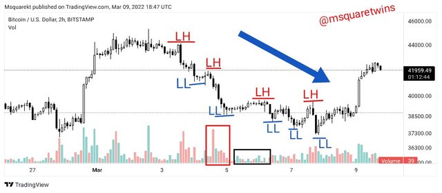
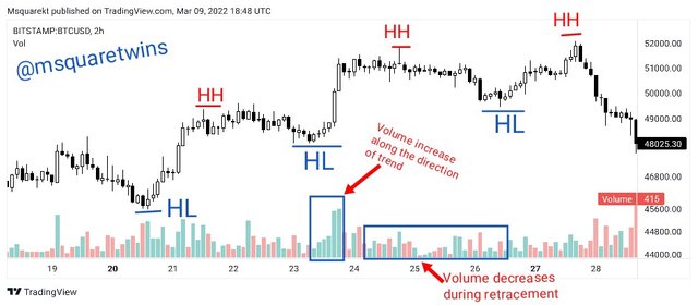
When supply is greater than demand, price of an asset will fall. And on chart, this will be confirm by market structure which is always indicated by a continuous series of Lower Highs (LHs) and Lower Lows (LLs) as seen in the screenshot below. Also, during the fall of price, i.e during downtrend, there will be high volume for impulse leg and low volume for retracement leg as shown in the screenshot.
When demand is greater than supply, price of an asset will rise. And on chart, this will be confirm by market structure which is always indicated by a series of Higher Highs (HHs) and Higher Lows(HLs) as seen in the screenshot below. Also, during this uptrend, there will be high volume for impulse leg and low volume for retracement leg as shown in the screenshot.
Placing entry and exit orders following the laws of supply and demand.
Three ways of placing entry and exit orders following the laws of supply and demand will be discussed and shown under this topic.
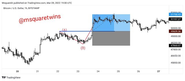
- Final retracement following Elliott waves (a,b,c).
To get an entry for final retracement, we will wait for a current trend to finish. Then we will draw the corrective wave a, b, and c of the Elliot wave. This means that the current trend is already getting exhausted and here we may have opportunity to enter a trade even at the beginning of a trend.
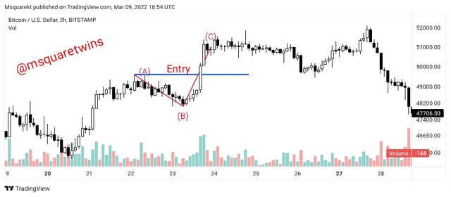
The an entry will be made at the break of the wave a with a stop loss below the minimum low and a take profit set to 1:1 or 1:2 as seen in the screenshot below.
- Pullback Entry
This type is done for a trend that has already started. We then wait for the trend to make a pullback and check for candle with great volatility and high volume along the direction of the current trend. We then use this point to make entry in market.
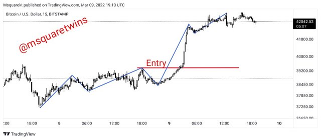
The entry should be made immediately after the break of the last high with a stop loss below the low and a take profit with 1:1 or 1:2.
- Entry After Market Trap
Entry can also be made after we noticed a trap in market. For example, in the image uploaded below, we marked a resistance level which has been previously respected by price. As we can see, price touch it and made a little break of that level upward by a wick as seen in the screenshot. After this, market later traded downward. The first break upward is initiated by strong hands in market, and their aim is to trap and hunt retail traders in market.
So if we notice this, we also can think like strong hands by taking this trade. After the close of the candle that makes a trap of retail traders, we can make a sell operation after bearish move with high volume. The stop loss should be above the trapped candle and the risk to reward ratio can be made to be 1:1 or 1:2.
7. Open a live trade where you use at least one of the methods explained in the class. (Screenshots of the verified account are required.)
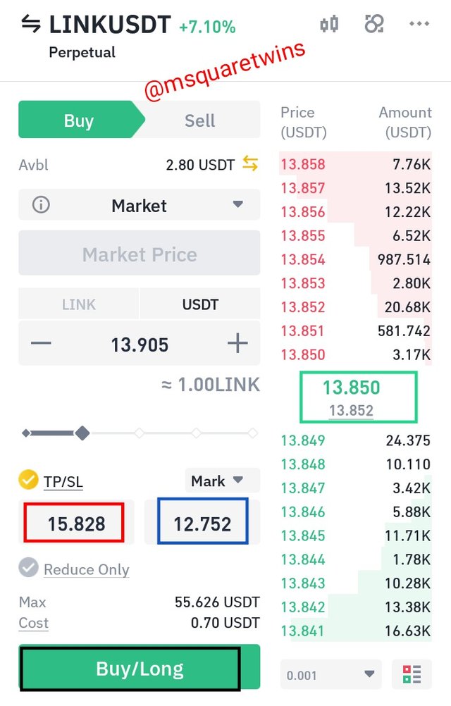
The image uploaded below is the chart of LINK/USDT on a 1hr timeframe. As we can see, the asset has been bearish for a while. But a point, the selling pressure started to be weakening and there was a break of structure to the upside. This confirms a change in trend. Then we see final retracement of Elliot wave a, b c as showned in the image below.
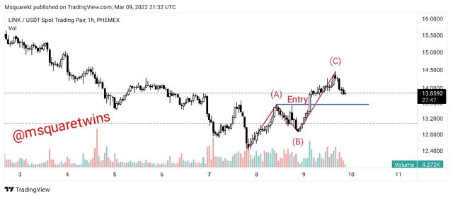
Then we can also see that volume increased greatly during the leg c and it broke the high a, ath the retest of the the broken high, I made a buy entry with;
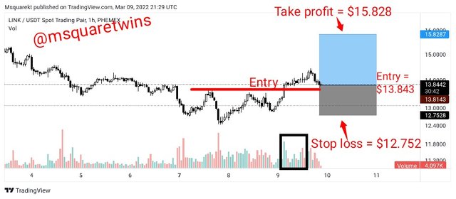
- entey = $13.843
**- Stop loss = $12.752
**- Take profit = $15.828
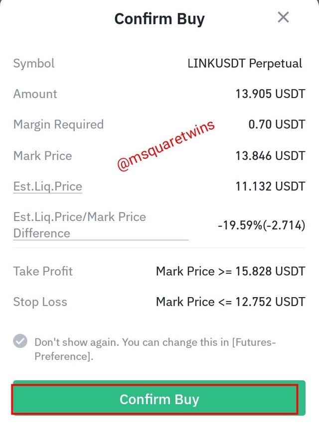
Then I took a real buy trade on Binance future trading platform as displayed in a screenshot below.
Then I confirmed the but order by clicking the "confirm button" as shown in the screenshot below.
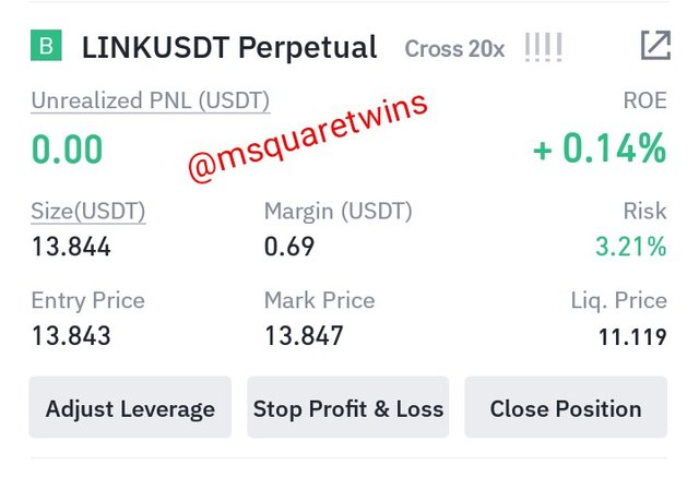
The image uploaded below is the running order of LINK/USDT on Binance platform
Conclusion
In this post, I have explained chart and it importance in financial trading. I also explained the use of candlestick chart which is the mostly widely and commonly chart used by traders. I also said my understanding of Timeframe with necessary screenshot.
Also, I discussed the importance of support and resistance and how to identify them. More so, I explained the meaning of rebound and breakout with clear illustration from chart. Trend trading with the use of supply and demand strategy was also demonstrated with different types of entry strategy. Finally, I took a real order based on the strategy discussed in class.
Special thanks to Professor @nane15 for this wonderful lecture.
Professor @nane15, please this post has not been curated. I did a repost 4 days ago. Please see to this.
Thank you.
Downvoting a post can decrease pending rewards and make it less visible. Common reasons:
Submit
I will take a look!
Downvoting a post can decrease pending rewards and make it less visible. Common reasons:
Submit