Hello all, a wonderful day to you all. I am continuing in this weeks steemit crypto academy. This time, I will be doing the homework task of @sapwood who thrilled us on the topic Onchain Metrics- Part 3.

What do you understand by Global In/Out of the Money? How is a cluster formed? Explain ITM, ATM OTM, etc with examples?
Global in/out of the money is an idea in which the on-chain information or various prices of an asset as at the time it was bought are collected together, their addresses are also gathered and grouped together in what is known as clusters based on the price range at which they where bought.
So each cluster or group consist of a number of addresses that are within a price range and the volume of the asset held by each address added together. So depending on the price range which was used to gather a particular cluster together, the assets average price of the group could be determined.
GIOM as an on-chain metrics which helps to ensure whether an address holding a coin is in profit or loss. Thus this on-chain metrics tends to show the connection between the current price of an asset and the average price of the various clusters of the GIOM.
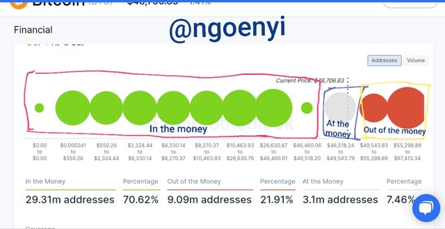
This can be illustrated with the screenshot below.
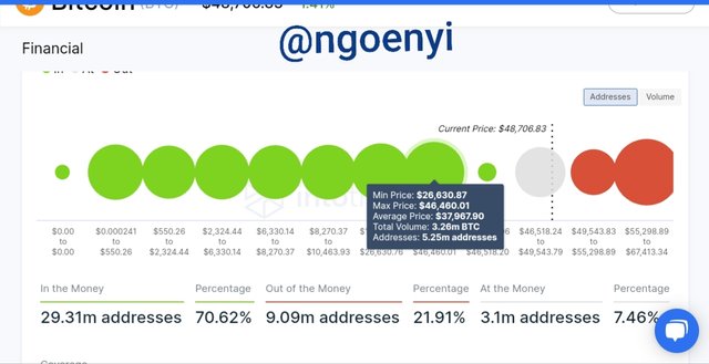
From the screenshot above, we can see the various clusters or groups with there price ranges below them and the number of addresses making them up.
The green clusters are the In the money clusters. For these ones, comparing their average price of purchase and the current price, the average price is higher than the current price. They are said to be in profit right now.
The cluster in ash colour are the At the money cluster, just one. The average purchase price of these addresses that make it up is equal to the current price of Btc.
The clusters in red are the Out of the money clusters. They are just two clusters. This implies that the average purchase price of the holders address which makes them up is currently lower than the current price. This implies they are not in profit.
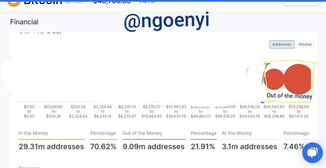
Let us remember that this is not an individual address assessment, but a cluster assessment of the purchase price of the addresses that makes up the cluster. So it is possible that some might be in profit even though they are in the ash cluster. Price range for ash cluster At the money is from $46,543.83 to $55,298.89, while the current price is $48,706.83
From the screenshot above, we can also notice that for the green cluster highlighted, the average price was $37,967.90, while the addresses in this range was 5.2m holding a total volume value of 3.26BTC. This represents about 17.2% of BTC currently in supply.
It would be good to note too, that these cluster prices can also serve as support and resistance depending on the size of the cluster.
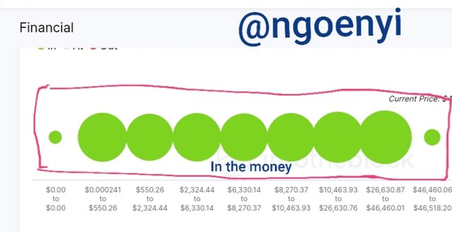
In The Money
When the current price of an asset is higher than the average price price of a cluster, We will then conclude that the cluster is in the money. From the chart we have above, the in the money clusters are the ones in green colour.
The current price is $48,706 while the last small green cluster closest to the ash cluster have an average price of $46,492. The in the money clusters can serve as support for the BTC asset.
The number of addresses or holders in the ITM cluster is 29.31m addresses which translates to 70.62% of all BTC holders
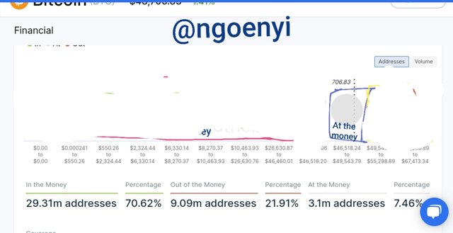
At the money
When the current price of the asset is equal to the average price of the cluster or its within its range, the cluster is said to be At the money.
From the diagram above, the cluster that falls into this category is the ash colour cluster.
The current price which is $48,706.90, falls within the range of the At the money cluster. The cluster range is $46,518.24 to $49,543.79. The number of addresses or holders that fall within this range is 3.1m addresses which makes of 7.46% of BTC holders.
Out of the Money
Whe the current price of the asset is lower than the average price of a cluster and also lower than the lowest amount in the range, it is now said that the cluster is Out of the money. They are shown as clusters in red colour. It can also be a support point for the asset . How strong the support is, is dependent on the size of the cluster which is made up of the number of addresses.
The current asset price is $48.706.90 while the range for the out of the money clusters are from $49,543.83 to 67,413.34. We can

Kindly Explain about Large Transaction Volume indicator with examples? And What is the difference between Total and Adjusted Large Transaction Volume?Examples?
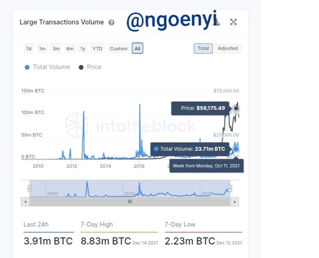
This is an on-chain metric that keeps track of all transactions that are bigger than $100,000. It helps to pick out when a whale has entered the market, be it an individual or institutional investor.
This indicator accumulates all the transacti9n above $100k and plots them in a graph either as total large transaction volume or adjusted LTV.
The spikes seen on the chart are indicative of the large transaction volume for that period by individuals or institutional investors.
The Difference between total and adjusted Large transaction volume
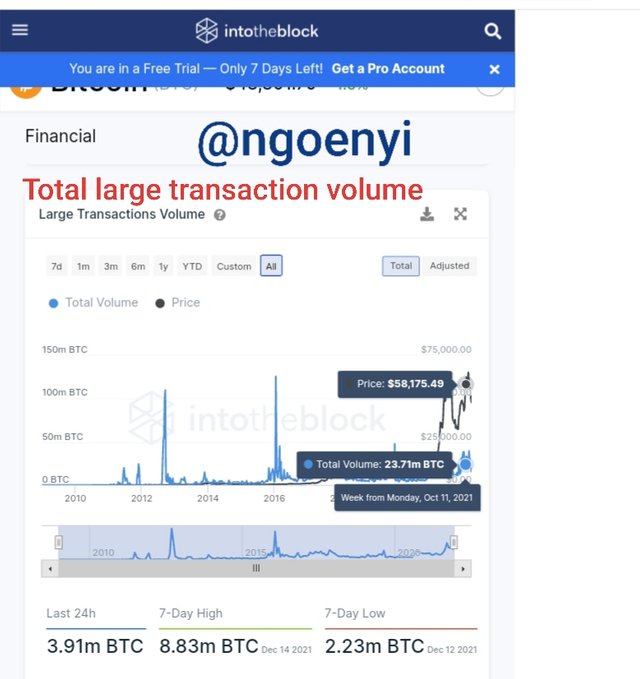
The large transaction volume takes into account all the assets moved from $100k and above irrespective of the addresses from where it is moved. Thus if a person have two addresses and moved the asset worth more than $100k from address A to address B and returns it back to address A, it is counted as different transaction volumes and both will be added to the Large Transaction volume value.
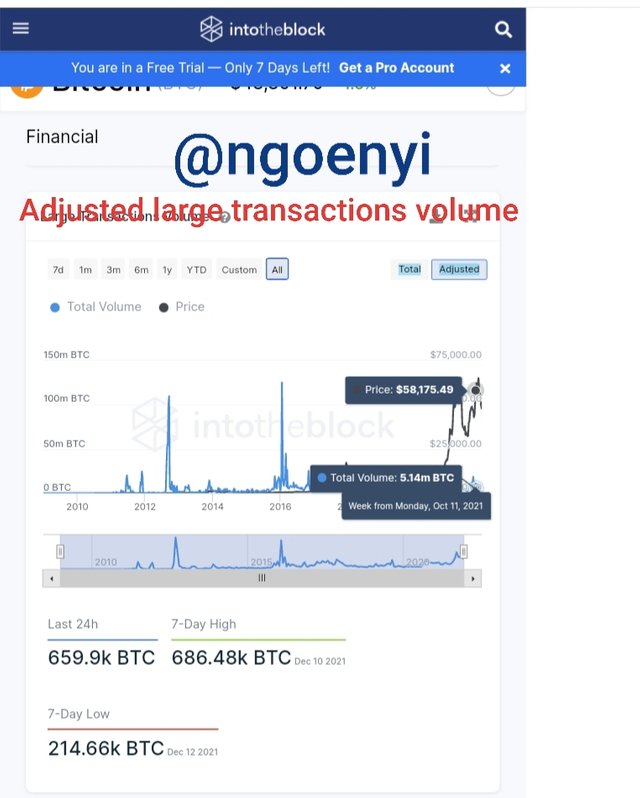
Whereas, for adjusted large transaction volume, it does not take into account the round-tripping of assets from similar addresses. That is, if a person moves an asset above $100k from address A to address B and later moves it back from address B to address A. It will not be added to the value of the large transactions volume.
It will be filtered out and not be part of the data. Thus it is evident the the value of total large transaction volume will be higher both in addresses affected and volume of transaction than the Adjusted LTV.
From the screenshots above, we will clearly notice the differences
● the Large transaction volume(LTV) figure was different for both charts. The Total (LTV )had a volume of 23.71m, while the Adjusted (LTV) had a volume of 5.14m at the same period under consideration..
● The 7-day low volume for Total(LTV) was 2.23m BTC as against the Adjusted (LTV) of 214.66k
● The 7-day high volume for Total (LTV) was 8.83m BTC as against the Adjusted (LTV) of 686.48k
● The 24 hour volume for Total (LTV) was 3.91m as against the Adjusted (LTV) of 659.9k
From the volume values we can deduce that those kind of transfer to and fro the same addresses were filtered out in the Adjusted LTV values.

Kindly Analyze a crypto asset(other than BTC) using on-chain metric: GIOM, and Adjusted Large Transaction Volume? Also Ascertain whether it supports a Bullish or Bearish bias or Neutral? How can you find the support and resistance using GIOM? How do you confirm the upside/downside momentum using GIOM? Use InTotheBlock app or any suitable app? (Examples/Screenshots)
I am using GIOM on-chain metric to analyse Ethereum asset.
In the money
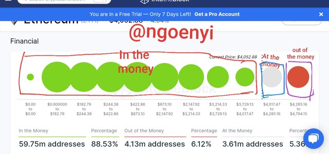
The in the money clusters for the Ethereum asset can be see in the screenshot above with green colours. we can also see the various ranges of the clusters. Remember that they belong to this group because, the current price is higher than the average price of the green clusters. The no of addresses that make up the in the money is 59.75m adddresses which is 88.53% of Ethereum holders.
At the money
This is the cluster in ash colour. The current price is equal or in the range of prices of the assets purchased. The number of addresses in this category is 4.13m holders which is 6.13% of Ethereum holders.
Out of the money
These are the clusters in Red colour, they represent the ranges in which the current price of Ethereum is lower than its average price or lower than some of the purchased prices by some addresses within this range.
The number of addresses in this cluster is 3.61m addresses representing 5.36% of Ethereum holders.
Ethereum Adjusted Large Transaction Volume
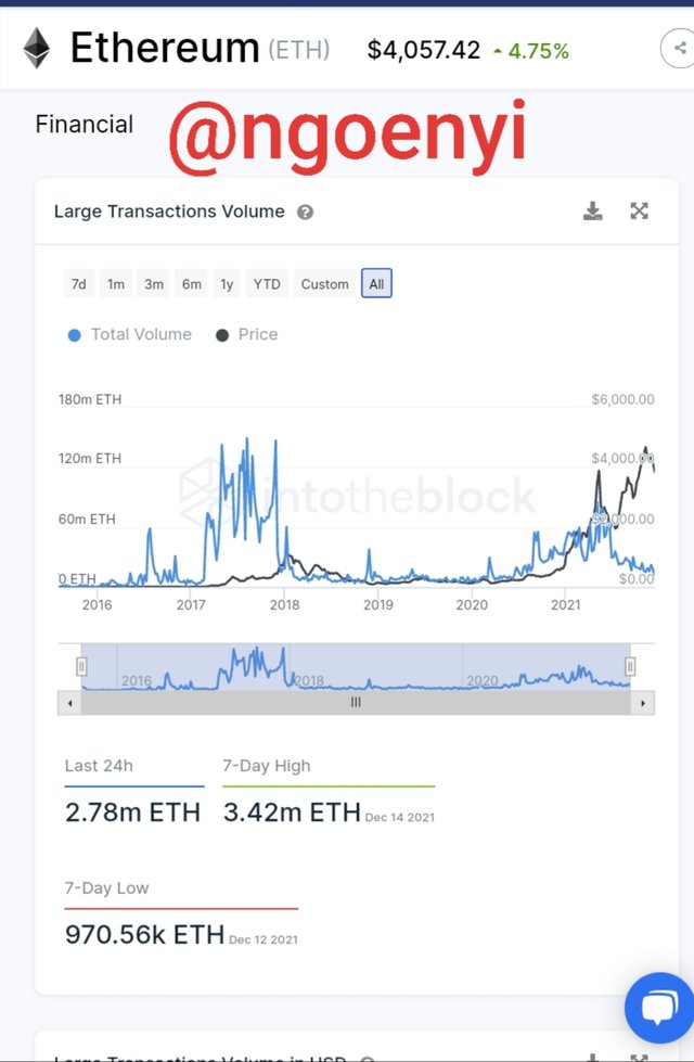
This the Ethereum Large Transaction Volume chart. It does not have the options of Total or Adjusted LTV like BTC had, so I assume, that the figures displayed present the real information about large volume transaction movement of Ethereum.
Determining whether it supports bullish, bearish or neutral
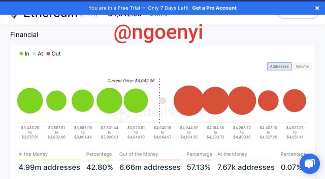
From the screenshot above, we have 4.99m addresses in ITM making up 42.80% of the holders while there are 6.66m addresss in OTM making up 57.13% of the holders.
From this analysis the markets seems bearish, but most would prefer to be neutral until a clear direction is defined.
Finding support and resistnce using GIOM
Using GIOM we can find the suport and resistances of an asset.
The ITM cluster range forms the resistance. The bigger the cluster the stronger the resistance. The size of the cluster is dependent on the number of addresses. If the asset moves to another address, the cluster either enlarges, reduces, cease to exist or forms a new one. Remember too that each cluster has an average price range, so it is this price range that forms the resistance of the asset.
To illustrate, assuming that the current price 9f BTC 8s $48,709,
Cluster 1 has an averange price range of $53,670 and
Cluster 2 has average price range of $57.908
The price at $55,670 forms the first resistance as the current price moves up. If it succeeds in crossing this resistance, it will now be heading to cluster 2 price range, which is the next resistance. This resistance will be stronger because most of the addresses will not sell off their asset, thus they will be migrated to cluster 2, making the resistance more formidable.
The OTM on the otherhand forms the support, the bigger the size of the cluster, the stronger the support. The size of the cluster is also dependent on the number of addresses in the cluster. Just like explained above for the ITM and its resistance, th3 same applies to the OTM and its use as a support. So the average price range of an OTM cluster forms a support on the price chart of the asset.
Determining upside and downside momentum using GIOM
This is to ascertain whether the duture is bullish for the asset ot bearish. The relative difference between the ITM and the OTM within a defined time for a particular price range could be used ascertain whether the future will be bearish or bullish.
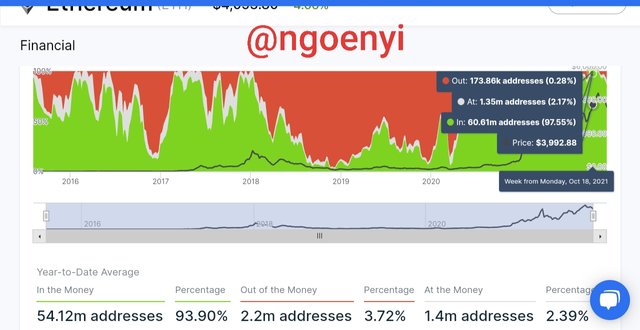
I am using a price range of $3800 - $4000.
My analysis will be between the months of October 2021 and December 2021.
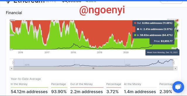
For Oct 18, 2021
Out = 178.86k Addresses constituting (0.28%)
IN = 60.61m addresses constituting (87.55%)
For Dec 13, 2021
OUT = 8.06m addresses (11.06%)
IN = 56.92m addresses (84.47%)
From the analysis we have above, from Oct 18, 2021 to Dec 13, 2021, there have been a noticable drop in the number addresses in ITM where there have been an increase in the number of addresses in OTM. This simply implies a downside momentum for Ethereum, since many addresses now belongs to the OTM group.
So assuming there was increase in the number of addresses in the ITM over the same period and for the specified price range, It would have been that the momentum is on the upside.
Conclusion
This have been another wonderful lesson from @sapwood. Learning GIOM from him is an added knowledge to my trading skills.
GIOM as an on-chain metric can be used to ascertain what type of trend the market should be expecting. It gathers the addresses of holders from $100k and above, forming them into clusters using price ranges. These price ranges are now used to determine the average price of each cluster.
This on-chain metric is also used to know or check the activities of whales in the market, be it individuals or institutional investors and its effect in the overall market. These price ranges of these clusters can also form support or resistance depending on how big a cluster is, which is determined by the number of addresses.
There are so many applications of GIOM in asset analysis. Once more, I say great thanks to @sapwood for this great lecture.
