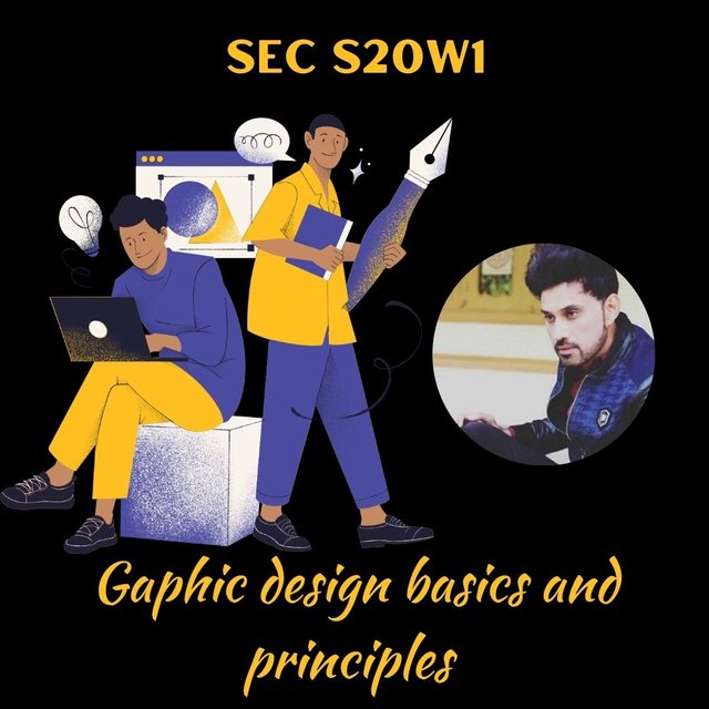
Many many thanks to @lhorgic for organizing one of most interesting contest in week 1 and for guiding users from a very basic step of graphic design introduction and principles.
Graphic design is basically a sort of art and practice of transferring your thoughts,ideas and messages by visual (That can be seen) and textual (That can be read)content. It includes creation of different visual elements like creative logos, icons, typography, and images for delivering of messages and information, for expressing thoughts and for creation of aesthetically attractive compositions.
If I talk about suitable we will elements then these may include beautiful and attractive colours images and different shapes that are suitable and attractive according to you. You just need to choose best elements and combine them in One frame or in one picture so that you may deliver your colourful thoughts to people or audience that are awaiting for graphic designs.
Graphic designers utilizes multiple techniques, softwares, and technologies for creating visual communications that may be useful for informing, educating and entertaining audiences through creative Personally,I really like animations and gifs in graphic designs and I really love to learn them properly in this season through these graphic lessons.
In total, there are not only three principles of graphic design but here I am going to describe three principles with some additional illustration of other principles too by images designed by me!
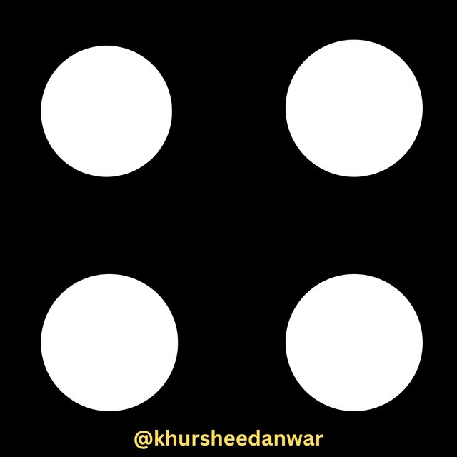
Balance
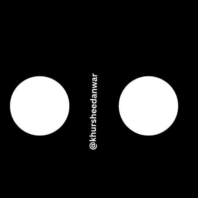
Balance is a basic principle which means you arrange visual elements for create a sense of stability and balance in image. If I keep myself in place of a designer and think for a while that I am a professionalist designer so for making this type of image I would try to equally distribute weight and texture as well as colours in effective way. There are subdivisions of balance also and that are symmetrical,asymmetrical and radial but I would not go into its depth. Below just I have shown a representation of balance through this image.
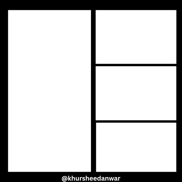 |  |
|---|---|
| ✅ | ❌ |
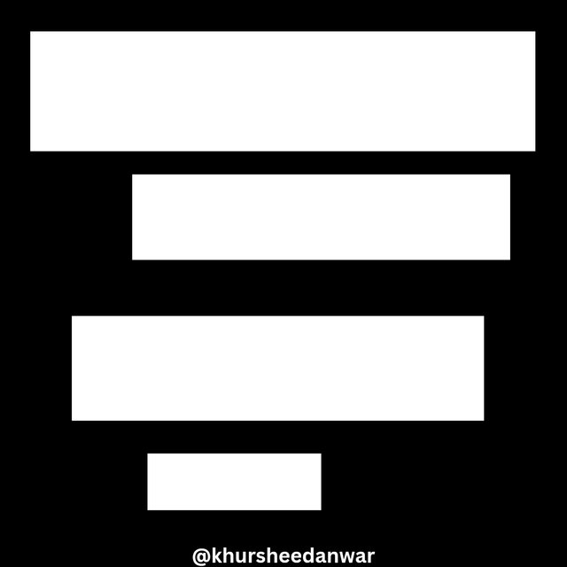
Contrast
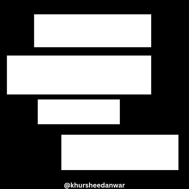
Contrast means that if I am using visual elements for creating visual interest and for drawing attention. Here I am supposing myself as a graphical designer so I am using contrast in colours ,in size and in texture for guiding eyes of audience and for creating a proper hierarchy. Below is real representation of contrast.
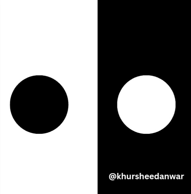 |  |
|---|---|
| ✅ | ❌ |
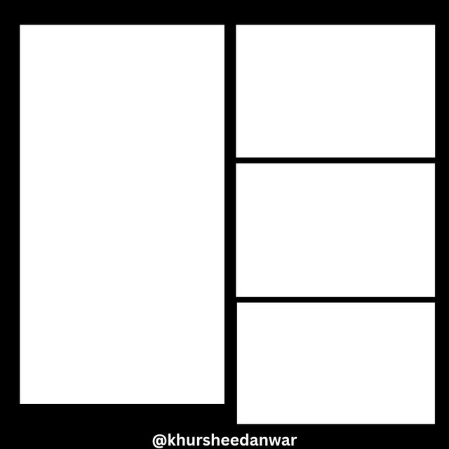
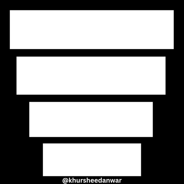
Alignment
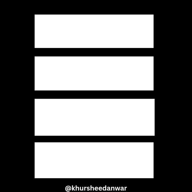
Alignment may be considered as positioning of visual elements along an axis or along a proper grid. Being a designer I keep in mind that all elements should give me a sense of alignment,organisation and professionalism so for creating its representation I aligned element in centre which is true as well as I like this type of representation personally because it may create ease for audience to access thoughts of designer easily as it is most easiest to read and to visualize.
 |  |
|---|---|
| ✅ | ❌ |
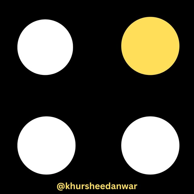
This is how EMPHASIS and HIERARCHY looks like!
 |  |
|---|---|
| ✅ | ❌ |
 |  |
|---|---|
| ✅ | ❌ |
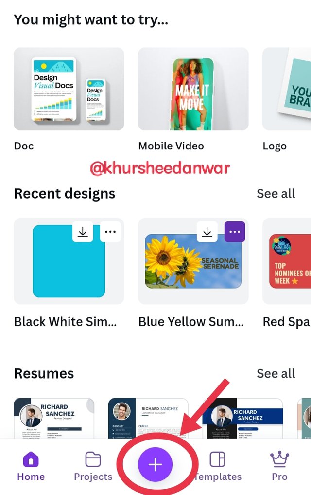
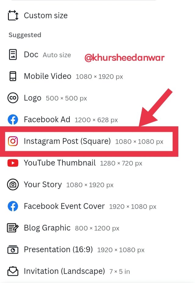
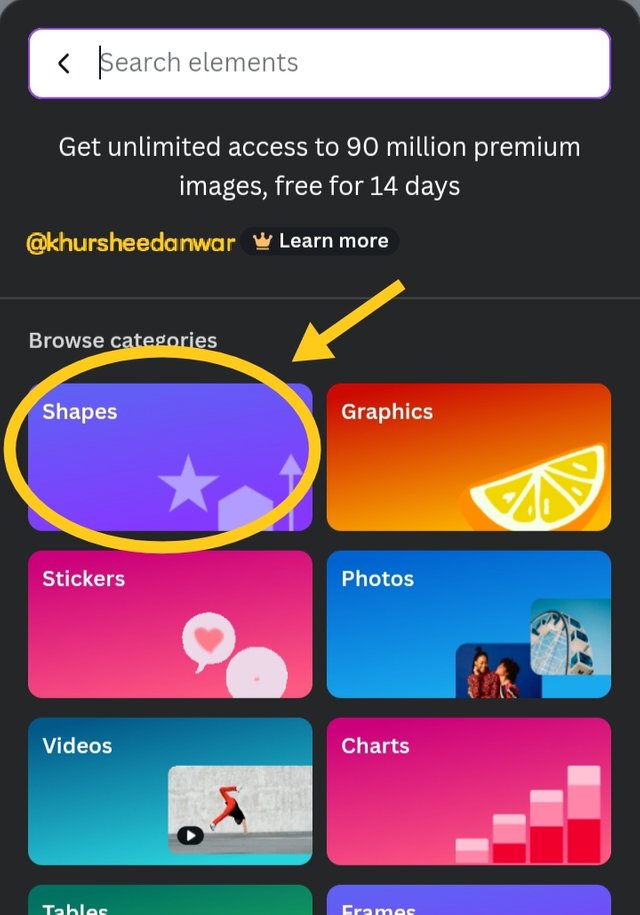
Step 1
 |  |  |
|---|
In step one I opened canva app and I was at home page where I saw + sign and I just click on it so that I may select size or dimensions of image I want to use for creating a graphical image.I used Instagram 1080×1080 px as it can be clearly seen through above provided screenshots. After that a blank image that I have choose was opened in front of me.
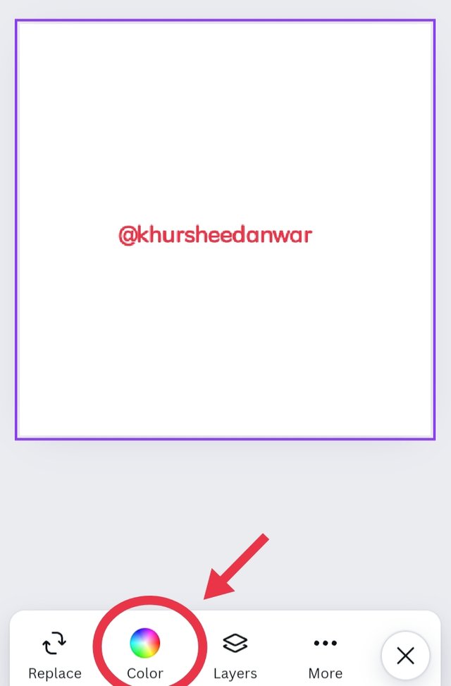
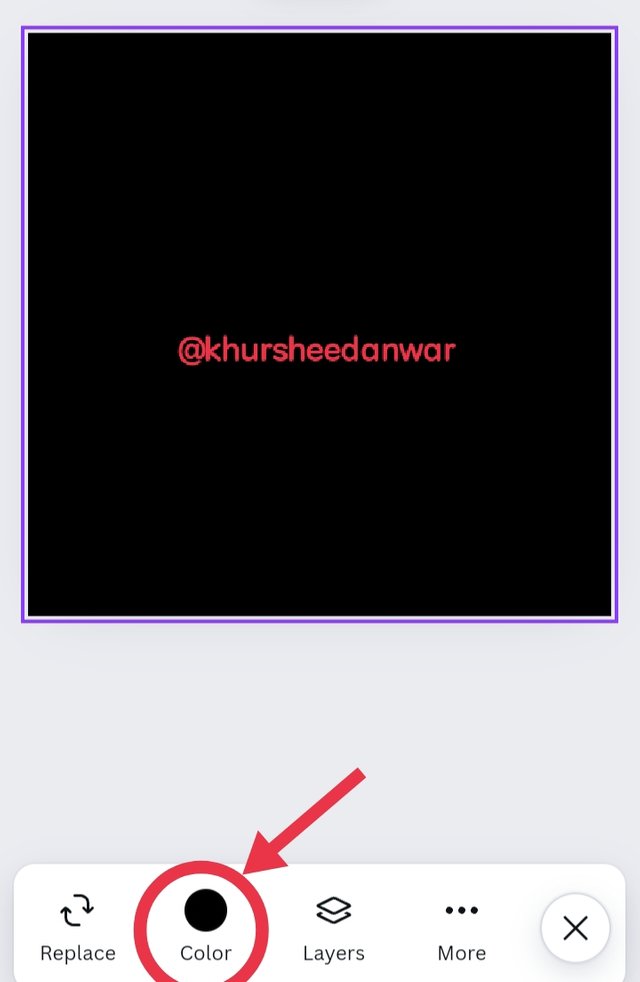
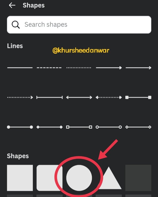
Step 2
 |  |  |
|---|
In screenshots you can clearly see that I choosed colour icon so that I may change colour of image by locating toolbar. I choosed black colour and then I go to elements icon through toolbar. There were different options present there when I go to elements but I choosed shapes.
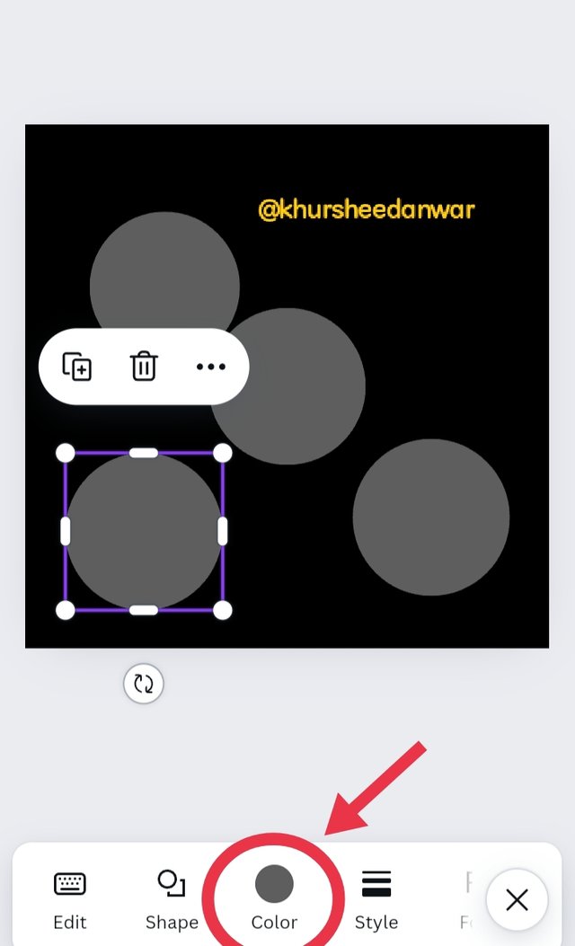
Step 3
 |  |  |
|---|
First of all I select circular shape and then when I click on it then I moved to that page at which I was creative graphic image and that circle was also there so when I click on circle then I see a sign of + at top of circle that was just present with del sign so I click on that + sign for having similar more three shapes like that and then I aligned them in for corners with giving them equal space and then I changed colors of three circles by again locating colour icon from toolbar as you can see in the screenshots.
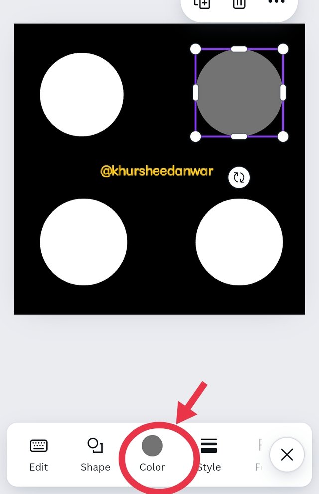
Step 4
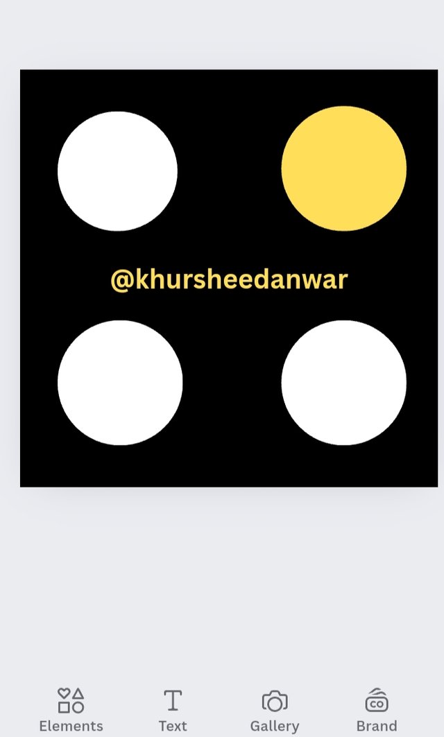 | 1080×1080 dimensions |
|---|
I changed that circle colour into yellow and then this is EMPHASIS (Graphic design) I have created successfully with a step by step guide.
I want to invite @event-horizon,@jyoti-thelight,@josepha to participate in this lesson
Hello @khursheedanwar thank you for participating in this week's lesson. We have assessed your entry and we present the result of our assessment below.
Feedback:
• You have clearly defined Graphic design the way you best understand it, and I appreciate the remarkable effort you put into it.
• Your selection on the principles of design is nice coupled with your comprehensive explanation and visual representation of those principle. It's quite commendable.
• Finally, your practical is quite detailed and comprehensive. From what I see, it was carefully done as every step all the way down to the final result was captured. I commend you for a job welldon. I hope you keep up with the energy level.
Regards
@lhorgic❤️
Downvoting a post can decrease pending rewards and make it less visible. Common reasons:
Submit
I like to hear if this post is posted in the right community @lhorgic
I am not sure this is entertaining
@khursheedanwar please, let know what the idea is. If you post here you know what the rules are if it comes to hashtags and topics
@wakeupkitty
Downvoting a post can decrease pending rewards and make it less visible. Common reasons:
Submit