 |
|---|
Hello friends and welcome to my article in the SLC: S21/W3 in this great timr. I would definitely be sharing my thoughts on the theme in my best possible way too.
I studied the lessons so intensively this time and understood the types of logic we have and aspects of logos too. It's important to know these logos while identifying their unique features as striking difference which separates one logo from the other.
These are logos intended to share their information through elements, texts, images and a host of other intuitive symbols denoting the brand. A good example is the Jordan logo, Nike logo, just to mention a few. It is important as brands to use them to communicate to customers who easily identify them with their symbols for relatability and identification.
These logos are designed by combining text and images inside a shape, more relatively like a motto or badge for easy identification. These logos are seen on air hostesses, chefs, military, just to mention but a few. They are used by brand who wants a more organized settings in their parastatals.
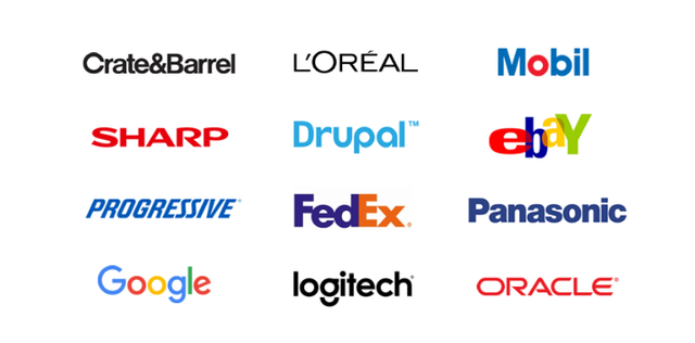
These are logos type which are confidentially bearing the ruling of their respective company name, while laying emphasis on topography and special characters. These are exclusive logos for unique brands. They are used for simply naming brands for easy relatability and identification by customers.
 source source |
|---|
These are logos that assume shapes, elements and signs that practically mean nothing to a lay-man but communicate ideas or feelings to concerned people. They are mostly used to create memorials. A good example would be the Olympics logo quite abstract and clueless to a ordinary person. It may be used to convey feelings or concept on specific products, mot importantly to an abstract majority.
These are made by combining names of brand and symbols or image. The synchronic combination of these texts and symbols shows a lot. The logos are mostly used to help customers recognise brand effectively.
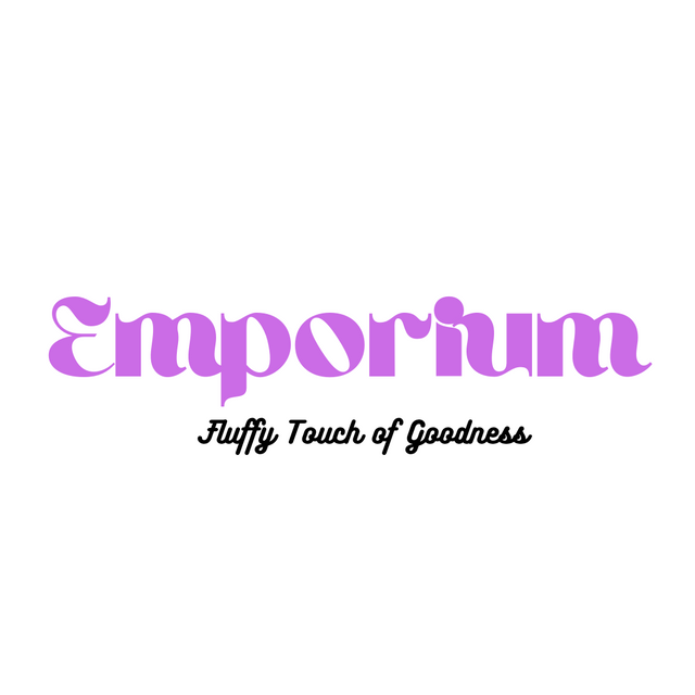
I would be choosing the Wordmark This is believed to be the most relatable by people. I actually had an idea behind this design. It was an idea on a comfortable sofa or bedding for family relaxation. The color used at the end of the design which is purple represents royalty , therefore it is for the people making them feel special.
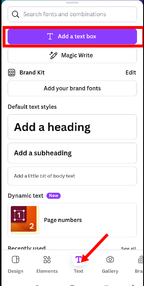
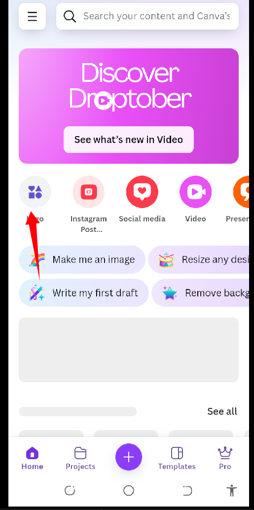
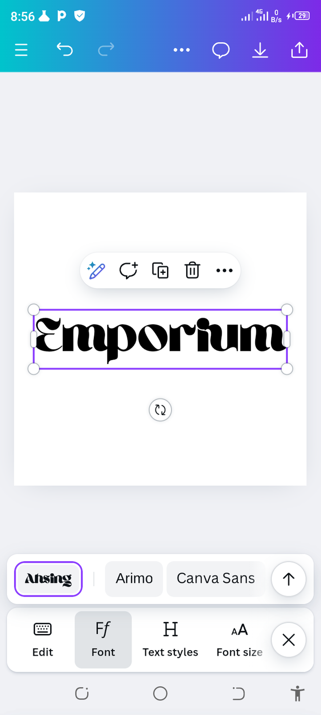
I actually started by opening the canva app, after that I clicked on logo to start my creating journey. After that the beautiful blank interface popped open and I clicked text and finally added add text to my brand name.
 |  |
|---|
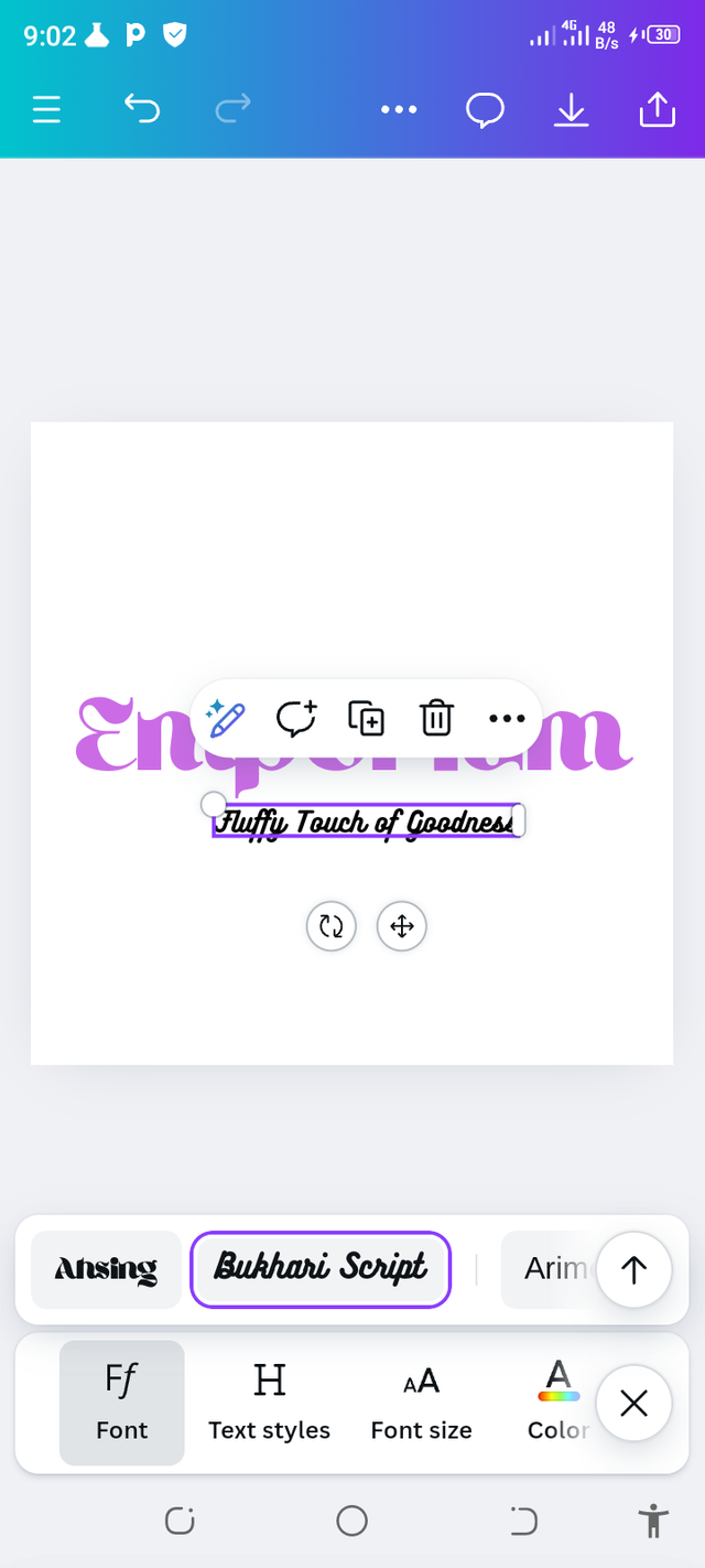
On the created space I wrote my intended idea on the blank space choosing a suiting font for the great design. I immediately chose my color and style as needed. Final results showed a beauty. The fonts used are also visibly seen respectively.
 |  |
|---|
This is indeed the final result of the design made
 |
|---|
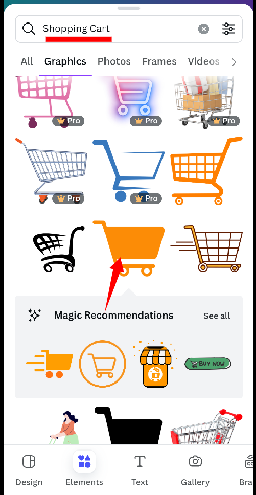
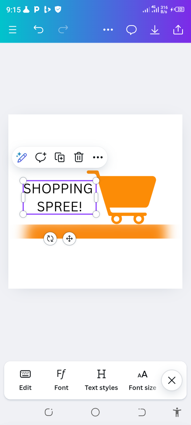
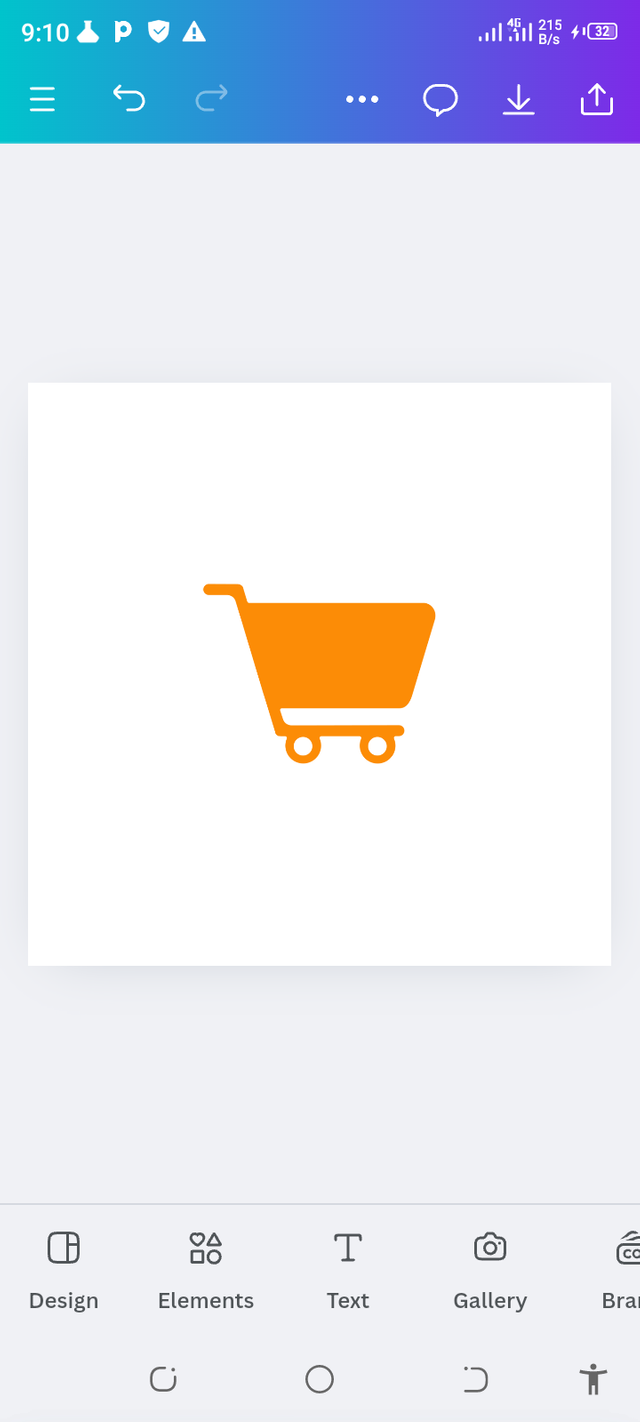
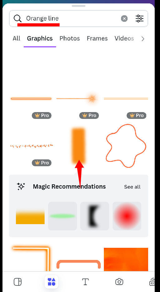
I immediately made use of the Combination Logo just to keep in mind what is obtainable to the work. I opened my canva app, clicked on logo chose my resort. A shopping cart to complement my information for my work.
 |  |
|---|
I chose a right font for designing my work and special elements to make it look special to the eyes. The color suiting my taste and this was the result received.
 |  |
|---|
 |  |
|---|
The beauty was received after much editing as we all can see here.
 |
|---|
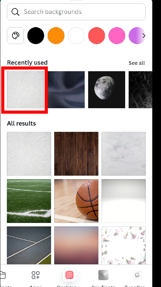
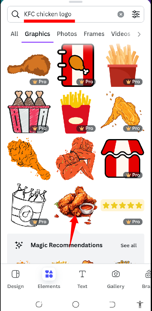
This is the flier created by me fo a shopping harvest. Below is process encountered and achieved after much work put in place. I chose a background and added the chicken element from the archive.
 |  |
|---|
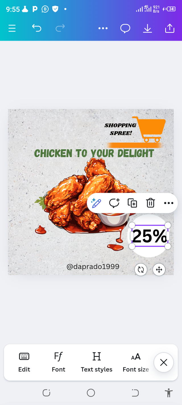
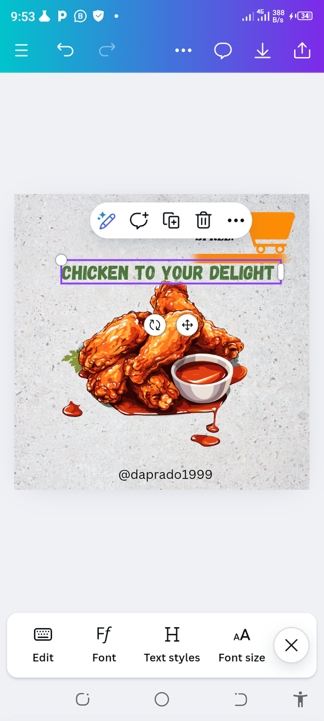
I immediately chose my font and colors added my design and made my flier slowly. I chose the best fitting for my chicken discount bouquet coming up soon.
 |  |
|---|
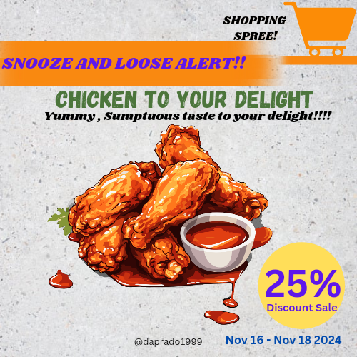
This is definitely what my design turned out to be after a beautiful action of studious designing. I enjoyed this class emphatically and would definitely br in the next edition.
Cc;
@lhorgic
¡Holaaa amigo!🤗
Cuando vemos un logotipo en una tienda nueva, automáticamente ya nos sentimos cómodos porque, lo estamos asociando con una buena calidad y aquí es donde comprendemos con gran amplitud que, el logotipo es la insignia más vital de la marca por ello, es necesario cuidarla.
Te deseo mucho éxito en la dinámica... Un fuerte abrazo💚
Downvoting a post can decrease pending rewards and make it less visible. Common reasons:
Submit
Warm regards and thanks so dearly for stopping by
Downvoting a post can decrease pending rewards and make it less visible. Common reasons:
Submit
Thank you for publishing an article in the Steem4nigeria community today. We have assessed your entry and we present the result of our assessment below.
MODs Comment/Recommendation:
This is so nice and I see the steps and effort you put into bringing this up. Thanks for sharing. Appreciated
Remember to always share your post on Twitter using these 3 main tags #steem #steemit $steem
Hi, Endeavor to join the #Nigeria-trail for more robust support in the community. Click the link Nigeria-trail
Guide to join
Downvoting a post can decrease pending rewards and make it less visible. Common reasons:
Submit