Hello people,
I am doing something different now. I will continue the JavaScript progressive tutorial after this post. I use Bootstrap to create a nice looking leaderboard. Anyone could use for their website if they need something related to this. I use more of cool Bootstrap classes and little CSS.
Bootstrap 5 alpha is out, and I read that they have removed JQuery. This is good news as the size of files will reduce drastically. And they are now built with vanilla javascript. I think things will look more simple and effective now. JQuery has been part of Bootstrap of several years and this removal seems like a really big change. So, prepare your mind for something new.
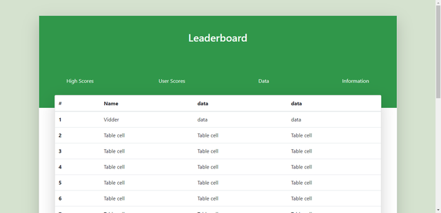
This is the look of the Interface. Something simple and unique.
<!doctype html>
<html lang="en">
<head>
<meta charset="utf-8">
<meta name="viewport" content="width=device-width, initial-scale=1, shrink-to-fit=no">
<link rel="stylesheet" href="https://stackpath.bootstrapcdn.com/font-awesome/4.7.0/css/font-awesome.min.css">
<link rel="stylesheet" href="https://stackpath.bootstrapcdn.com/bootstrap/4.4.1/css/bootstrap.min.css" integrity="sha384-Vkoo8x4CGsO3+Hhxv8T/Q5PaXtkKtu6ug5TOeNV6gBiFeWPGFN9MuhOf23Q9Ifjh" crossorigin="anonymous">
<link rel="stylesheet" href="./css/bootstrap.min.css">
<link rel="stylesheet" href="/leaderboard.css">
<title>leaderboard</title>
</head>
<body>
<div class="container">
<div class="card shadow-lg mb-5 bg-white rounded mt-5">
<header>
<div class="head">
<p class="h2 text-center text-white pb-5 pt-5">Leaderboard</p>
<div class="row pb-5 pt-5 top-row">
<div class="col-6 col-sm-4 col-md-3 text-center mb-4">
<a class="link" href="#">High Scores</a>
</div>
<div class="col-6 col-sm-4 col-md-3 text-center mb-4">
<a class="link" href="#">User Scores</a>
</div>
<div class="col-6 col-sm-4 col-md-3 text-center mb-4">
<a class="link" href="#">Data</a>
</div>
<div class="col-6 col-sm-4 col-md-3 text-center mb-4">
<a class="link" href="#">Information</a>
</div>
</div>
</div>
</header>
<section>
<div class="body-board">
<div class="body-head">
<div class="card top-card ml-5 mr-5 shadow-lg mb-5 bg-white rounded">
<table class="table table-reflow">
<thead>
<tr>
<th>#</th>
<th>Name</th>
<th>data</th>
<th>data</th>
</tr>
</thead>
<tbody>
<tr>
<th scope="row">1</th>
<td> Vidder</td>
<td> data</td>
<td>data</td>
</tr>
<tr>
<th scope="row">2</th>
<td>Table cell</td>
<td>Table cell</td>
<td>Table cell</td>
</tr>
<tr>
<th scope="row">3</th>
<td>Table cell</td>
<td>Table cell</td>
<td>Table cell</td>
</tr>
<tr>
<th scope="row">4</th>
<td>Table cell</td>
<td>Table cell</td>
<td>Table cell</td>
</tr>
<tr>
<th scope="row">5</th>
<td>Table cell</td>
<td>Table cell</td>
<td>Table cell</td>
</tr>
<tr>
<th scope="row">6</th>
<td>Table cell</td>
<td>Table cell</td>
<td>Table cell</td>
</tr>
<tr>
<th scope="row">7</th>
<td>Table cell</td>
<td>Table cell</td>
<td>Table cell</td>
</tr>
<tr>
<th scope="row">8</th>
<td>Table cell</td>
<td>Table cell</td>
<td>Table cell</td>
</tr>
<tr>
<th scope="row">9</th>
<td>Table cell</td>
<td>Table cell</td>
<td>Table cell</td>
</tr>
<tr>
<th scope="row">10</th>
<td>Table cell</td>
<td>Table cell</td>
<td>Table cell</td>
</tr>
<tr>
<th scope="row">11</th>
<td>Table cell</td>
<td>Table cell</td>
<td>Table cell</td>
</tr>
<tr>
<th scope="row">12</th>
<td>Table cell</td>
<td>Table cell</td>
<td>Table cell</td>
</tr>
<tr>
<th scope="row">13</th>
<td>Table cell</td>
<td>Table cell</td>
<td>Table cell</td>
</tr>
<tr>
<th scope="row">14</th>
<td>Table cell</td>
<td>Table cell</td>
<td>Table cell</td>
</tr>
<tr>
<th scope="row">15</th>
<td>Table cell</td>
<td>Table cell</td>
<td>Table cell</td>
</tr>
<tr>
<th scope="row">16</th>
<td>Table cell</td>
<td>Table cell</td>
<td>Table cell</td>
</tr>
<tr>
<th scope="row">17</th>
<td>Table cell</td>
<td>Table cell</td>
<td>Table cell</td>
</tr>
<tr>
<th scope="row">18</th>
<td>Table cell</td>
<td>Table cell</td>
<td>Table cell</td>
</tr>
<tr>
<th scope="row">19</th>
<td>Table cell</td>
<td>Table cell</td>
<td>Table cell</td>
</tr>
<tr>
<th scope="row">20</th>
<td>Table cell</td>
<td>Table cell</td>
<td>Table cell</td>
</tr>
</tbody>
</table>
(html comment removed: -->
</div>
</div>
</div>
</section>
</div>
</div>
</body>
</html>
CSS
body {
    background: #d5e2cf;
}

.head {
    margin-bottom: 40px;
    background: #30974a;
}

.top-row .link {
    text-decoration: none !important;
    color: #fff !important;
}

.top-row .link:hover {
    color: #b9e983 !important;
}

.user {
    display: grid;
}


.body-head .card {
    margin-top: -80px;
}

@media(max-width: 400px) {
    .body-head .card {
        margin: 0px !important;
    }
}
I used a little media query to ensure it is responsive. The mobile view is perfect and cool. You could try this out any time with your editor.
We will continue our JS tutorial in the next post.
Have a great day!)
Where I can use this one??
Downvoting a post can decrease pending rewards and make it less visible. Common reasons:
Submit
Wow! I don’t have a website yet but I think this would be useful for people that have something like game sites or something that got to do with people competing.
Thank you for posting always.
Downvoting a post can decrease pending rewards and make it less visible. Common reasons:
Submit