 |
|---|
Glad to see this very amazing creative task. Thank you to Professor @lhorgic for teaching us about these valuable Principles that make us a professional Graphic Designer. Let me share my home work task enthusiastically.
 |  |  |
|---|
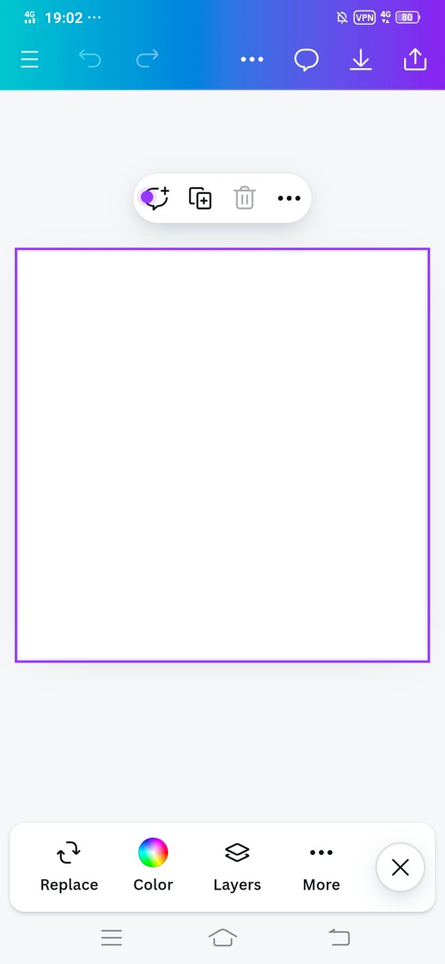
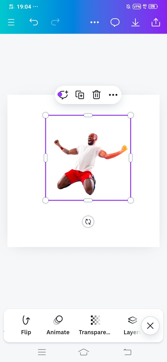
• I selected the space to create my design.
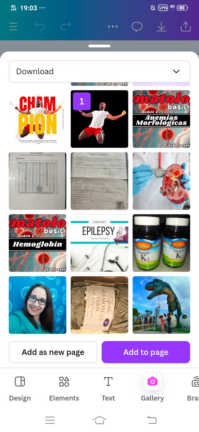
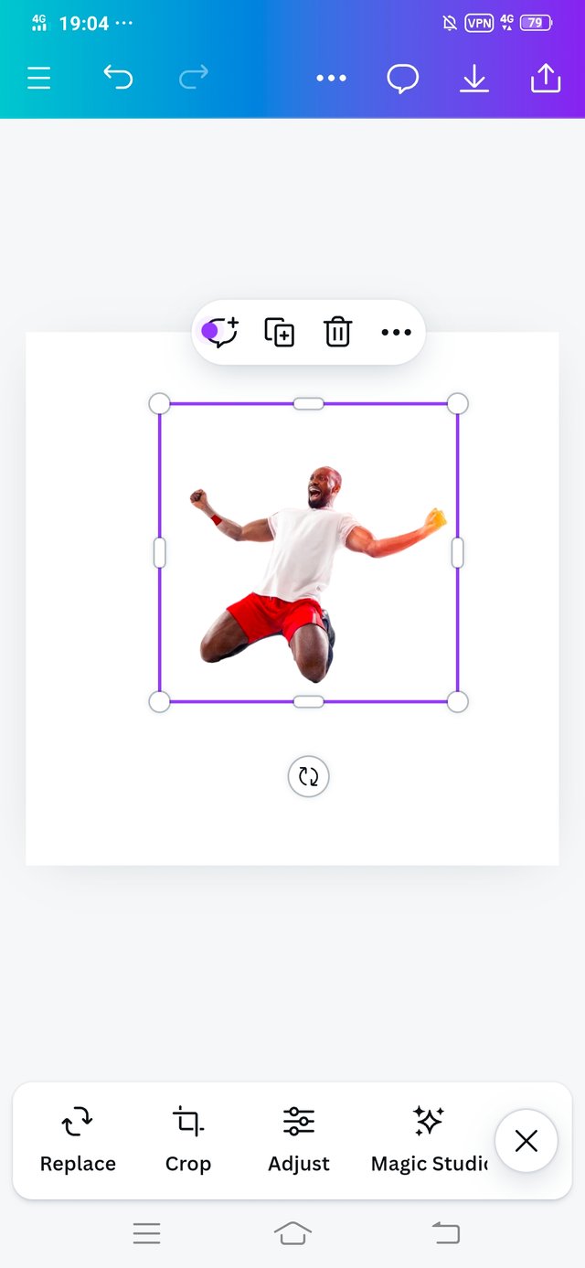
• I clicked on the Gallery and add the downloaded picture that the instructor gave us in the course. Select it and then clicked on add to page.
 |  |  |
|---|
 |  |  |
|---|
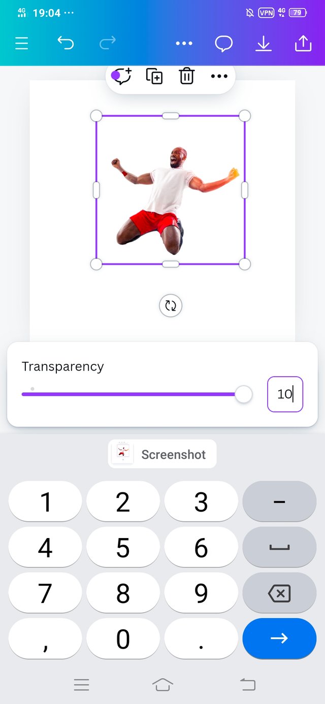
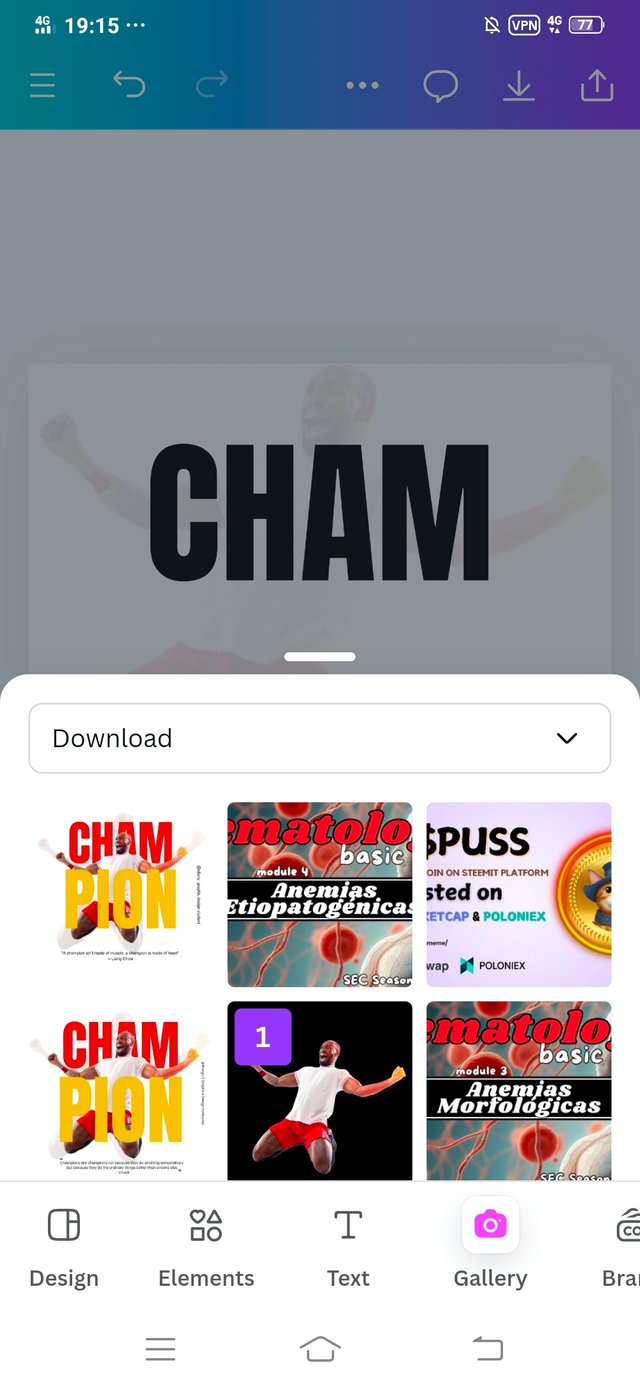
• The purpose of this image was to show my background. I completed my transparency work.
• I set the transparency of my selected images 10. From which you can see in the picture.
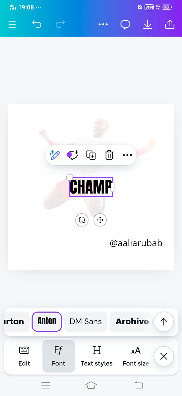
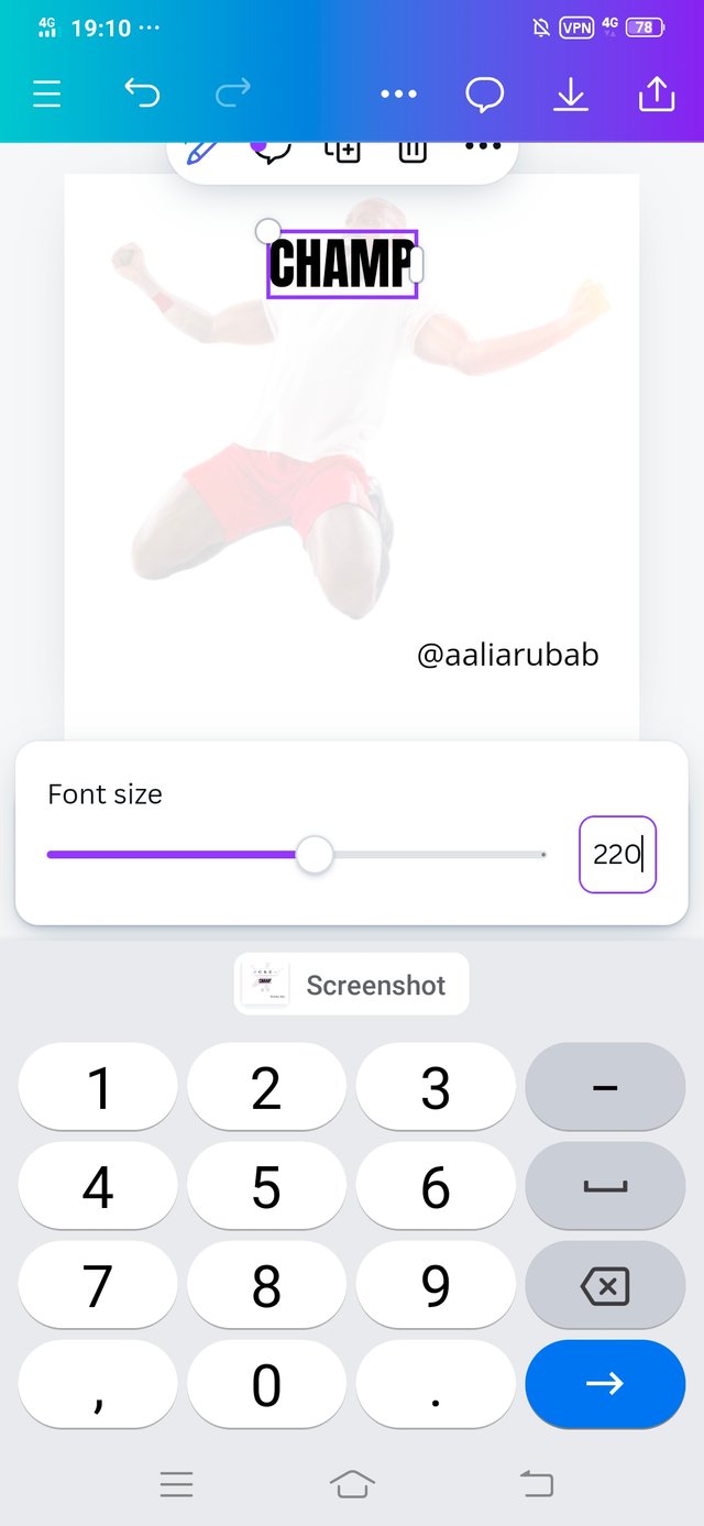
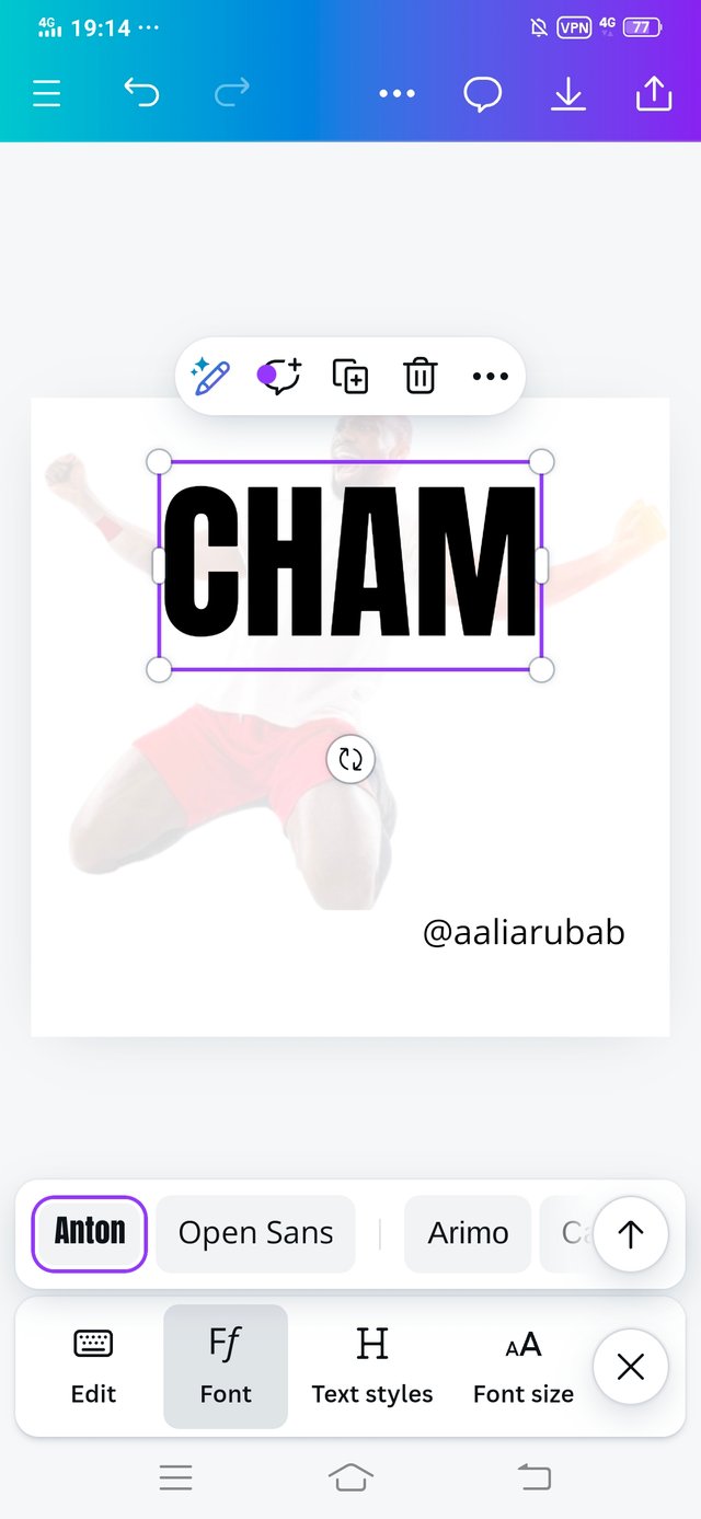
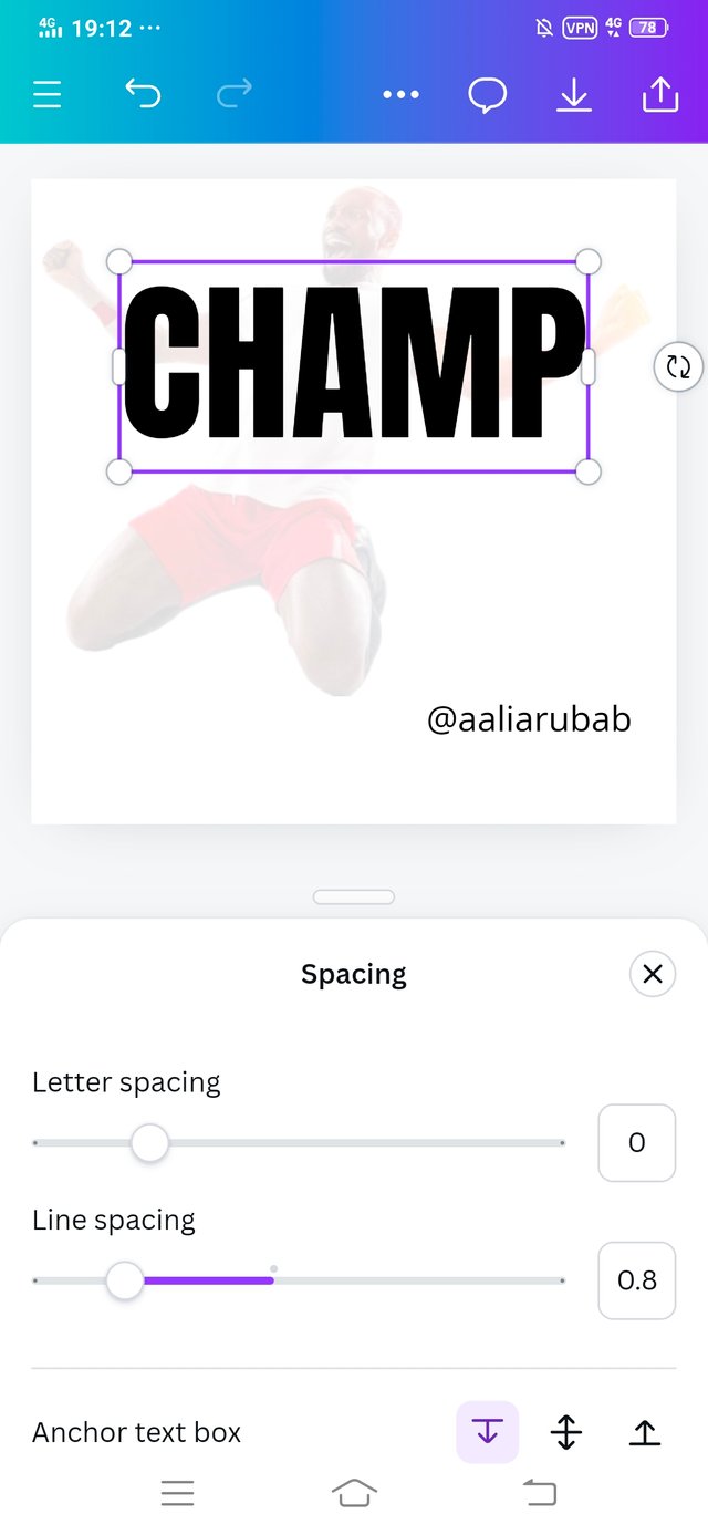
• After completing the transparency process, I clicked on the text and wrote CHAM. Changed the font size of the CHAM and adjusted the line spacing that is 0.8.
 |  |
|---|
 |  |
|---|
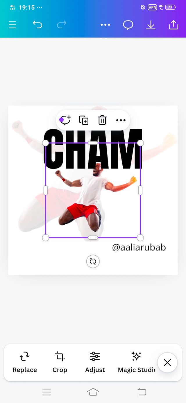
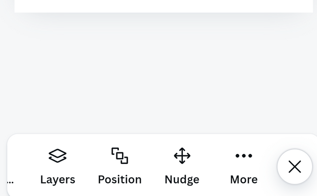
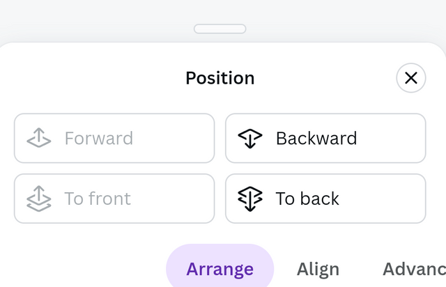
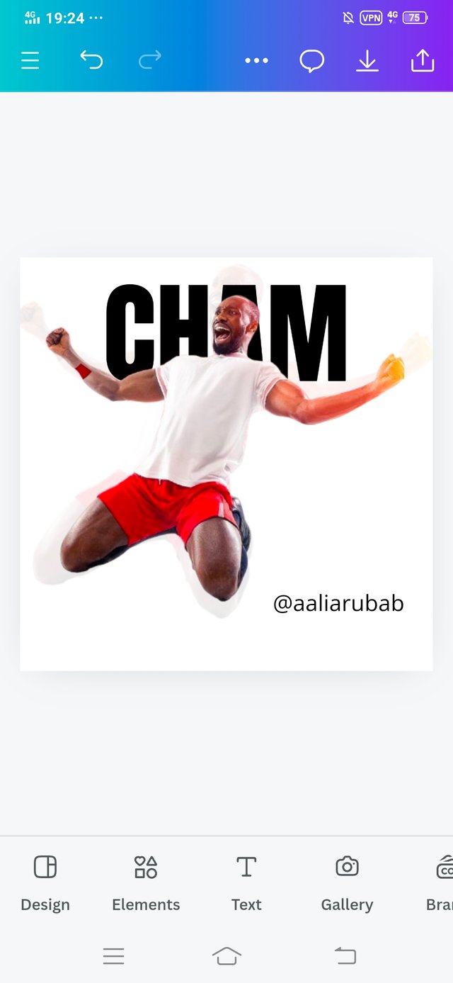
• As you have backward the position of the CHAM in the original design. So in this step I changed the position of the CHAM.
• I clicked on the position and different options came up I clicked on backward. This adds to the beauty of my design.
 |  |
|---|
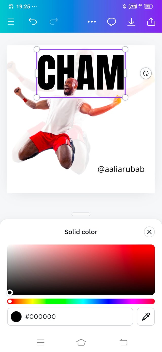
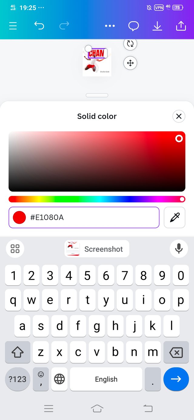
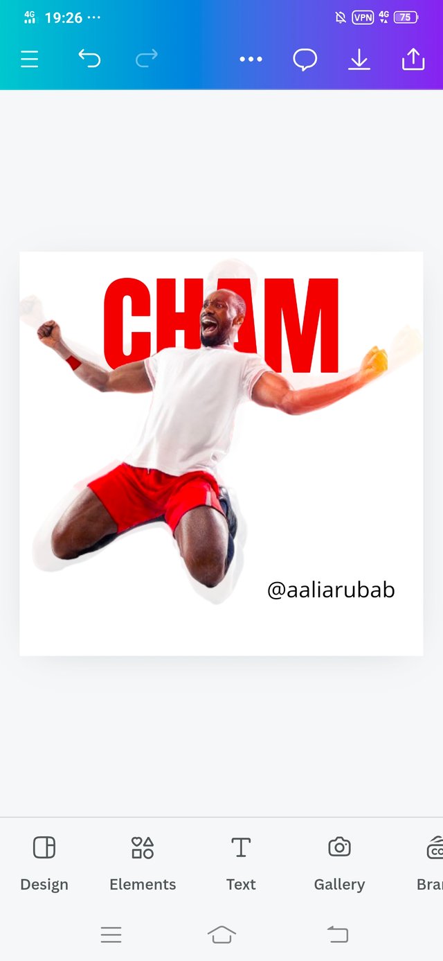
• After changing the position of the CHAM, it was now time to give him a color.
• Using the color option, I selected the color of the text which the hex code is #E1080A, it is a red color.
 |  |
|---|
 |  |  |
|---|
 |  |
|---|
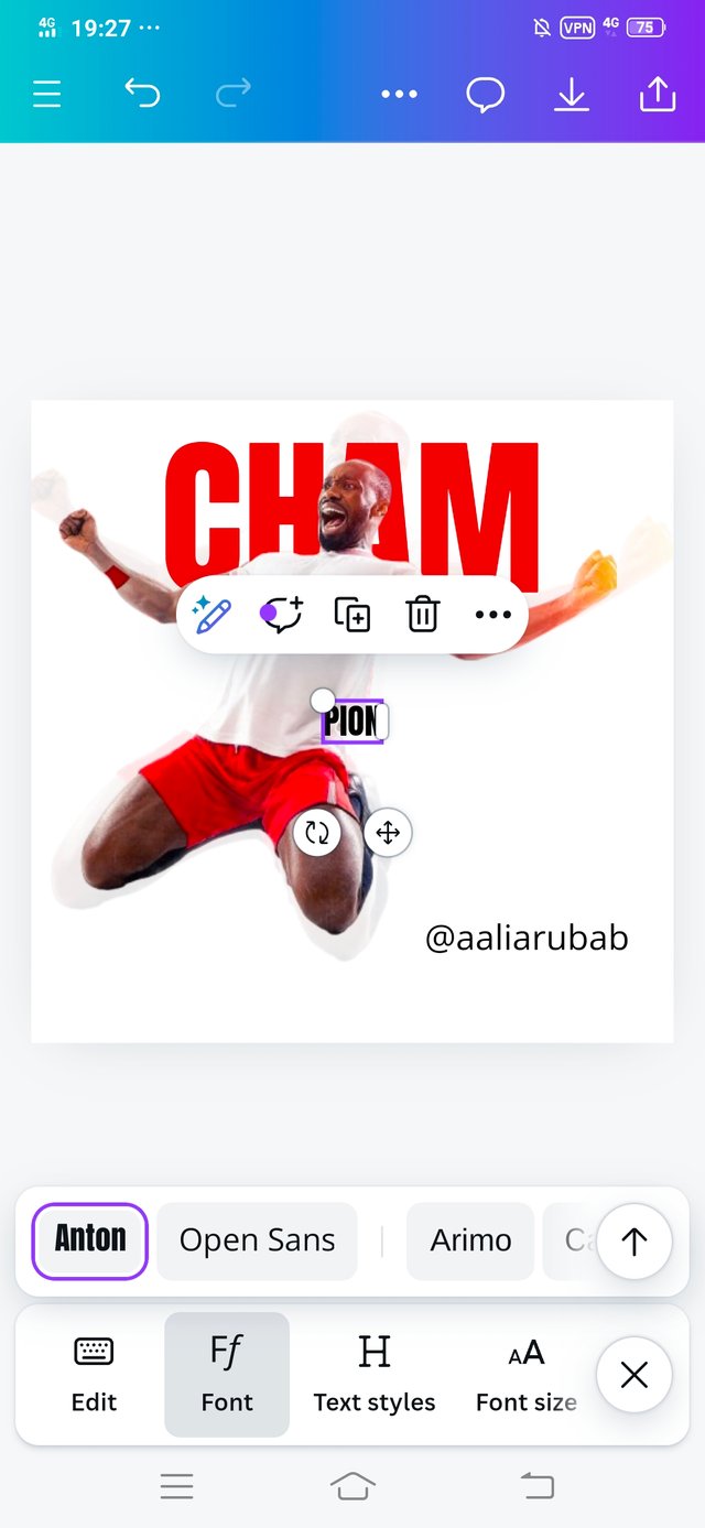
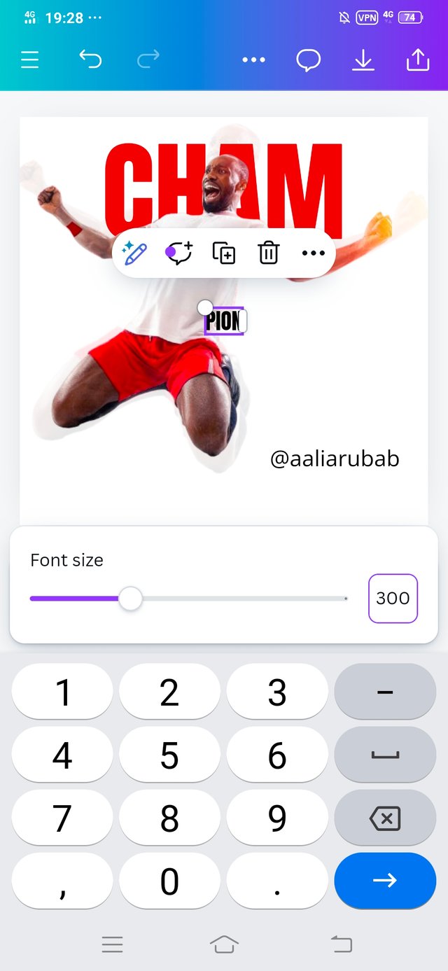
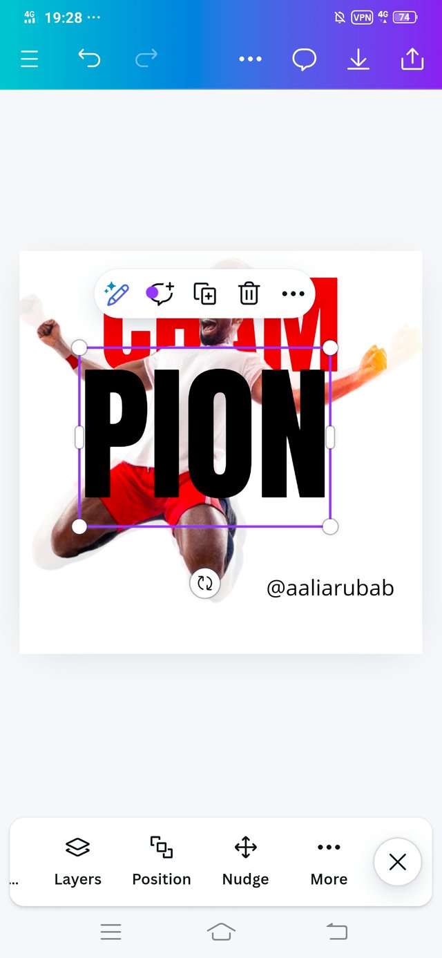
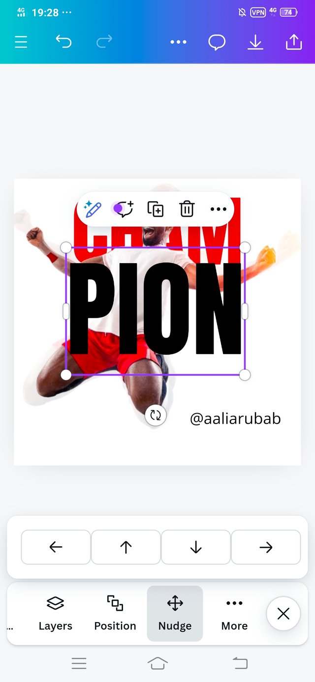
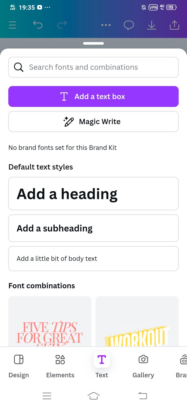
• Now the second text was added that is PION and select the font size of PION.
I increased its font size to 300 and adjusted it on the image.
 |  |
|---|
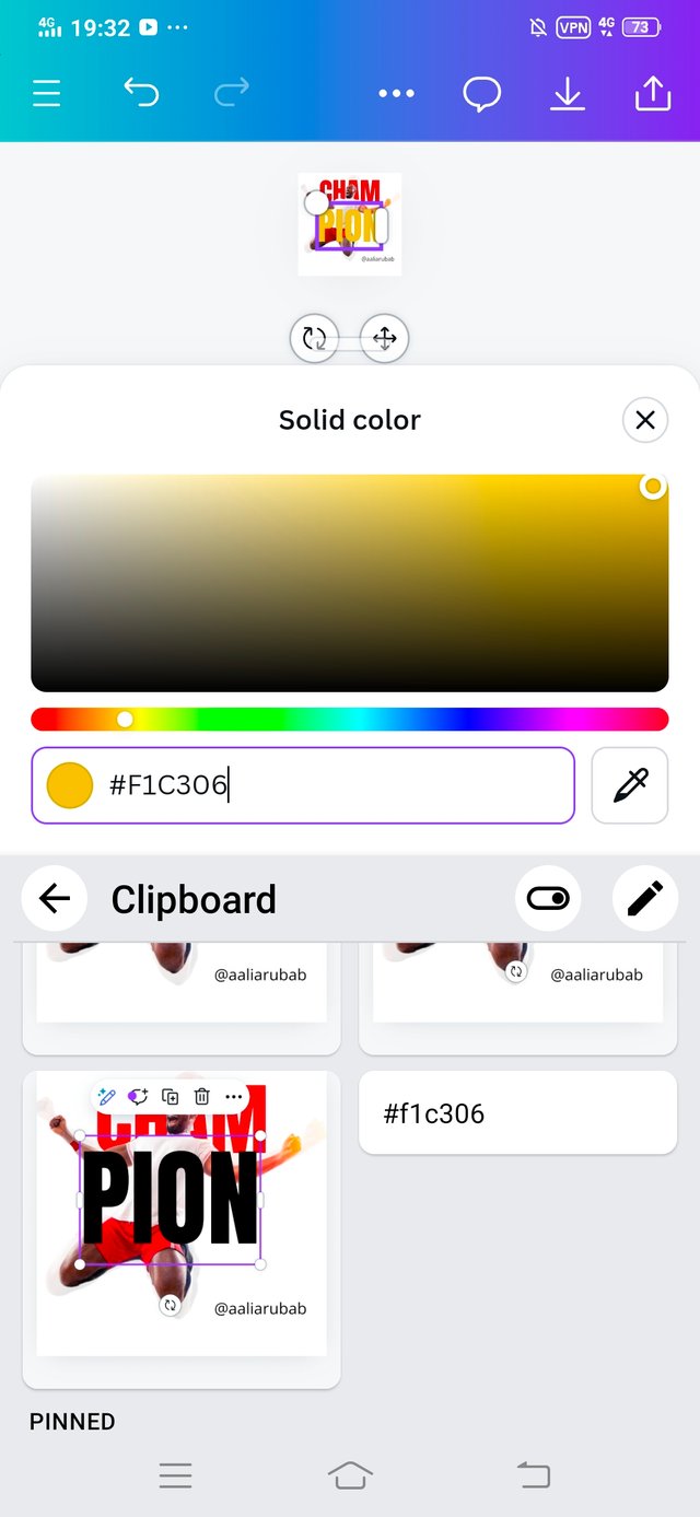
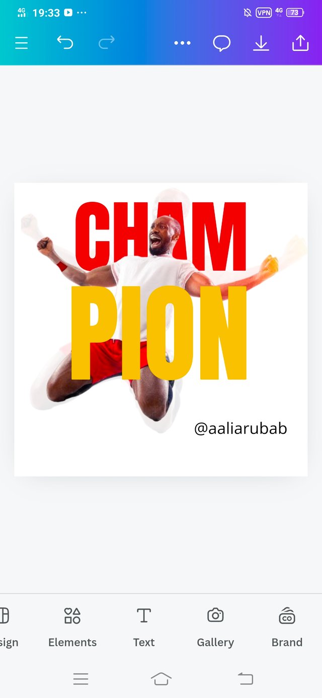
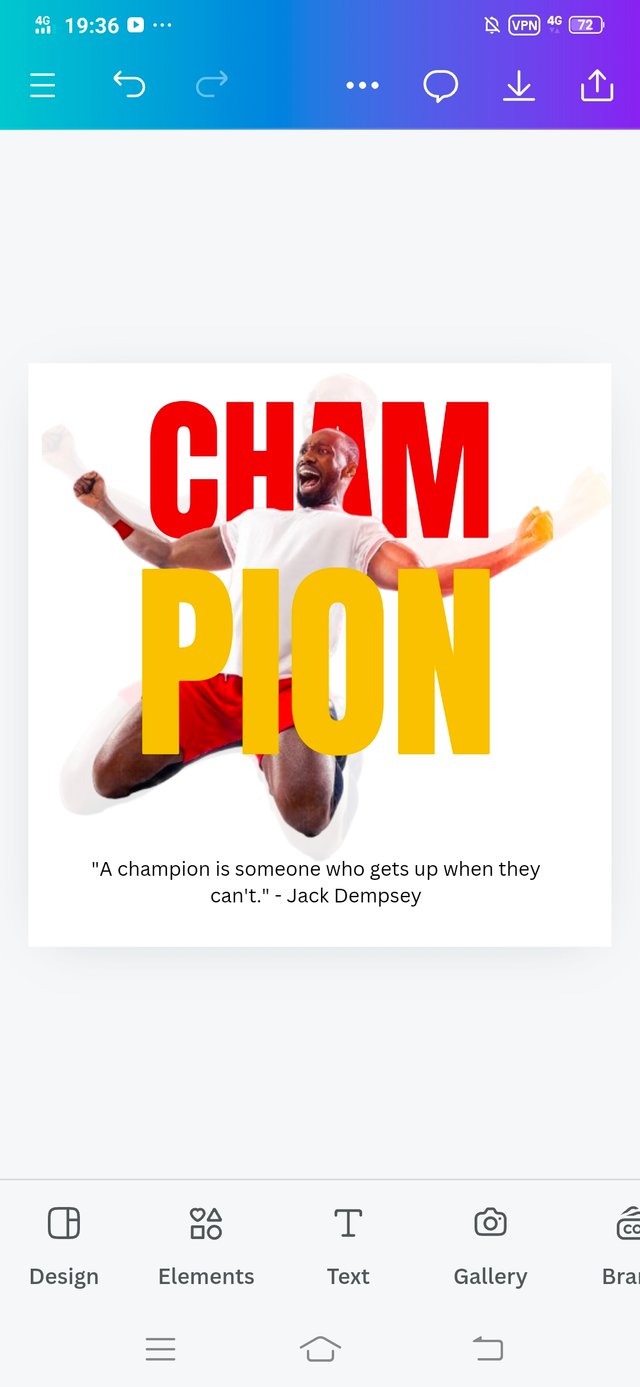
• Using the color option, I selected the color of the text which the hex code is #F1C306, it is a yellow color as shown in image.
 |  |  |
|---|
• The most important step.
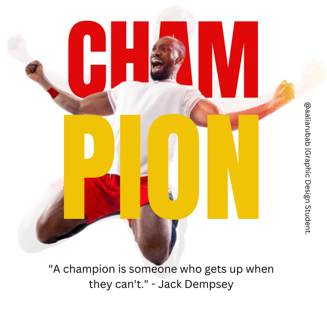
I added to my quote "A champion is someone who gets up when they can't." - Jack Dempsey
• I also added my username @aaliarubab.
 |
|---|
Home Work Task Completion
.png) |  |
|---|---|
| Graphic Design Instructor | Graphics Design Student |
Thank you Professor for teaching me valuable Principals that make it easy for me to design it.
Colour Combination: I used this principle in my designing. Red and yellow is a awesome combination. I have learned about the codes of The colour, Colour Theory. I have learned one thing that white background always spark up our designs. For quotation, I used black colour and believe you me a person must learn about the colour theory first, then he should start Graphic Design.
Alignment: Next principle that attracts me more is Alignment. When I added the text CHAM in forward position and PION then I learned that there must be Alignment. So I used Nudge option and use errows to make my design outclassing.
Transparency: This is also important one. I have never use this option before so thanks to my I instructor who made be able to use this one 🙈.
Positioning / Balancing : You know very first time I have explore tha Canva and find the option of positions. I applied it and you can see the results in the images.
Emphasis: For a professional graphic designer , it's mandatory that he must understand what he is going to highlight. In this design our emphasis was on Champion. And you can see how our design is pretending.
In the last, I'm thankful to my instructor for giving us this opportunity where I explore Canva in depth and I'm able to design this. I invite my friends @ruthjoe, @zuly7059 and @alejos7ven. Thank you in advance.
Graphic Design Student,
Aalia Rubab
Hello @aliarubab thank you for participating in this week's lesson. We have assessed your entry and we present the result of our assessment below.
Feedback:
Let me start by commending you for the effort put into this practical.Your work came out cool, However I have few things to point out to point out
You did a very good job going precept by precept. I noticed that when comparing both result (yours and the sample design) your main image wasn't correctly position, if you had tilted it a bit, it would sit comfortably in the middle of your workspace and the shadow on the left will not be too close to the edge.
Thanks for talking about the principles you engaged in making this design and how you engaged them.In all, you did beautifully well and I must commend your effort. I hope you keep up with the energy level dear student.
Regards
@lhorgic❤️
Downvoting a post can decrease pending rewards and make it less visible. Common reasons:
Submit
Thank you very much professor for giving me this amazing opportunity where I shared my graphic skills. Believe you me I enjoyed a lot.
Graphic designing is a trending now a days. It doesn't matter if you are a student or job holder, everyone must learn these graphic skills. Thank you for your wonderful insights.
You made me happy. 🙈 My eyes are on winner announcement now 🙈. Thank you dear 🙈. Stay blessed.
Downvoting a post can decrease pending rewards and make it less visible. Common reasons:
Submit
Downvoting a post can decrease pending rewards and make it less visible. Common reasons:
Submit
Thank you so much my dear friend @stef1.
Downvoting a post can decrease pending rewards and make it less visible. Common reasons:
Submit
Downvoting a post can decrease pending rewards and make it less visible. Common reasons:
Submit
Upvoted. Thank You for sending some of your rewards to @null. It will make Steem stronger.
Downvoting a post can decrease pending rewards and make it less visible. Common reasons:
Submit