Logo Design
Hello guys!
Welcome to yet another blessing of the steeemit Learning challenge. It's been an amazing week of logo designs And this week we continue in the same phase while looking at the different approach to logo designs. Without taking much time, let's start right away.
Discuss briefly on each of the logo types we have and then mention about and the conditions when such logo should be used and when not to be used for a brand
Alright, let's venture into the world of logos! Take for instance a logo as an identity of your brand. It needs to be recognizable, remembered, and represent what your brand portray. Below are a few common types of logos and when they might be the perfect fit (or not) in application.
Wordmark Logos
Think of these as the classic nameplate. They use typography to spell out the brand name in a unique way. Think Coca-Cola or Google. These type of logos are great for brands with, memorable,simple names that are the center of their identity. Nevertheless, they might not be the best pick if your brand name is complex or long , as it could get disappear in the design.
Lettermark Logos
These are like a secret handshake, using initials or letters to represent the brand. IBM and HP are classic examples. They're perfect for established brands with long names or those that want a more modern, minimalist look. But, they might not be the best for new brands, as they can be harder to recognize without context.
Pictorial Mark Logos
When we look at the World of design, We can picture out iconic symbols we instantly recognize, such as the Apple logo or the Twitter bird. They're powerful for creating a strong visual identity and can be dynamic across different media. However, they can be tricky to design and might not work well for complex or abstract concepts.
Abstract Mark Logos
These are presented in forms of little puzzles, applying abstract symbols and shapes to represent the brand. Examples can be seen in the Pepsi logo or the Mercedes-Benz star. They're vicious for conveying complex emotions or ideas and can be much versatile. However, they can be harder to understand and might require more detailed explanation for some people to connect well with the brand.
Combination Mark Logos
These are the intertwined of two logo design formation, combining a wordmark with a icon or symbol. Imagine of the Doritos logo or the Lacoste crocodile. They're powerful for creating a strong brand identity that's both memorable and recognizable. Nevertheless, they can be more complex to design and might not work well in smaller sizes.
Emblem Logos
These are like fancy crests or badges, often featuring intricate details and typography. Picture the Harley-Davidson logo or the Ritz-Carlton crest. They're spectacular for conveying luxury, heritage, or tradition. But, they can be much more complex to design and might not work well in digital applications.
Mascot Logos
These are the friendly faces of the brand, often using characters or animals to represent the brand. Imagine of the Michelin Man or the Aflac duck. They're so great for creating an emotional connection with the audience and can be very versatile in marketing materials. However, they can be more expensive to develop and might not work well for all industries.
Dynamic Mark Logos
These are the capable to adapt to change and in different situations. Examples are Olympic rings and Airbnb logo. They're both great for flexible , modern brands that want to stand out. However, they can be more complex to design and might not work well for traditional or conservative brands.
Note, picking the best logo for your brand will depend solely on your specific goals and needs. Measure your target audience, include your brand's personality, and the industry you're in when taking your decision. And overall, don't be timid to experiment and explore with your logo design!
When And When Not to use the following logos
Wordmark Logos
Use When:
- Your brand name is simple, memorable, and central to your identity.
- You want a clean, timeless look that's easy to recognize.
- You would want a logo that's versatile and can be applied in various formats and sizes
Avoid When:
- Your brand name is complex or too many characters.
- You have go for a logo that stands out visually and is easily recognizable at single glance.
Lettermark Logos
Use When:
- If Your brand has a long name or you wish for a more minimalist, modern look.
- You want a logo that's easily memorable and recognizable , even in little sizes.
- You need a logo that's versatile and can be applied across different media and platforms.
Avoid When:
- Your brand is new and not well recognized.
- You desire a logo that which communicates your brand's values or personality.
Pictorial Mark Logos
Use When:
- You want a striking visual logo that's easy to be recognize.
- You desire a logo that can be used in various formats and sizes without losing its impact.
- You want a logo that can portray your brand's values or personality without words.
Avoid When:
- Your brand concept is complex or abstract.
- You need a logo that can be easily adapted to different cultures or languages.
Abstract Mark Logos
Use When:
- You want a unique and memorable logo that stands out from the competition.
- You need a logo that can convey complex ideas or emotions.
- You want a logo that's versatile and can be used in various sizes and formats.
Avoid When:
- Your target audience is not familiar with abstract symbols.
- You need a logo that's easy to understand and recognize at first glance.
Combination Mark Logos
Use When:
- You want a logo which can both recognize and memorized
- You need a logo that can be used in various sizes and formats, including small ones.
- You want a logo that clearly communicates your brand's personality or values.
Avoid When:
- Your brand name is complex with so many characters.
- You need a logo that's simple and easy to
understand.
Emblem Logos
Use When:
- You want to convey a sense of tradition, heritage, or luxury.
- You need a logo that's visually striking and memorable.
- You want a logo that can be used in various sizes and formats, including small ones.
Avoid When:
- You require a logo which is either modern or trendy.
- You want a logo that's easy to understand and recognize at first glance.
Mascot Logos
Use When:
- You want to create an emotional connection with your target audience.
- You need a logo that's fun, friendly, and memorable.
- You want a logo that can be used in various marketing materials and campaigns.
Avoid When:
- Your brand is authentic.
- You need a logo that's infinite of time .
Dynamic Mark Logos
Use When:
- You looking for a modern and adaptable logo.
- You need a logo that can be used in various digital and print applications.
- You want a logo that can evolve and change over time.
Avoid When:
- You need a logo that's infinite of time and classic.
- You want a logo that's easy to understand and recognize at first glance.
Pick any two (2) of the Logo types discussed and then practically demonstrate how to make them
For this task, I have decided to pick the Wordmark logo and the combination Mark logo For my designs. This is what I find easy to work with and of which I could be able to be more creative to the best of my knowledge.
Wordmark logo design
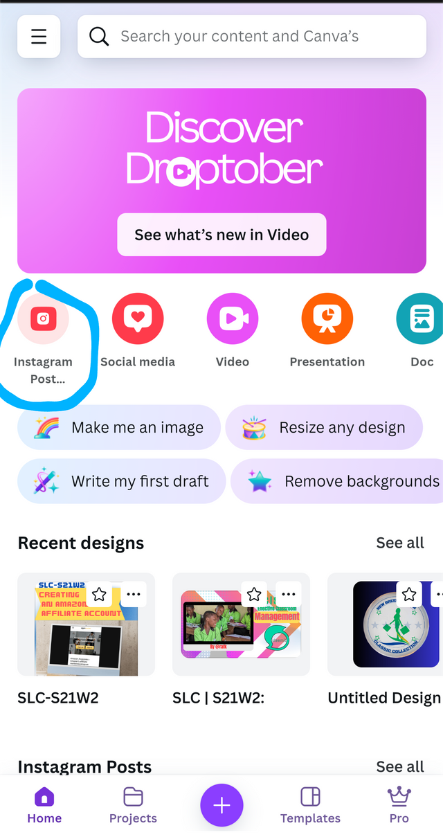
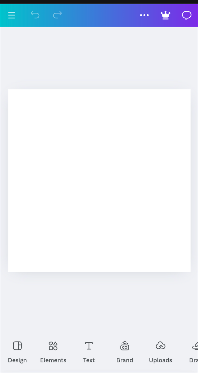
Alright. To begin with, I open my canva app and select the Instagram template which I will be using for this design. I believe we know how to selected already and then this will take me straight to my workspace.
 |  |
|---|
From here, I select the name I am going to be using for my design. Has to explain above a wordmark logo speaks volumes just by representing the brand with a simple, short and memory name. The name should be able to tell the audience what your brand is all about.
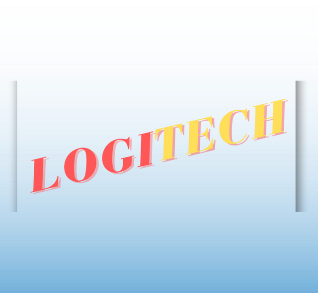
The name I have selected for my brand is LOGITECH From its name, one can say it is going to deal with a lot of tech brands. So get more info and insight is I might might want to get the type of take we do. Let's begin with a design.
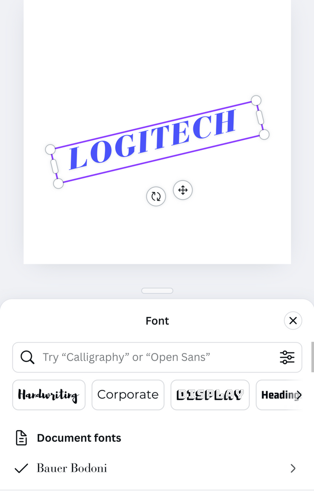
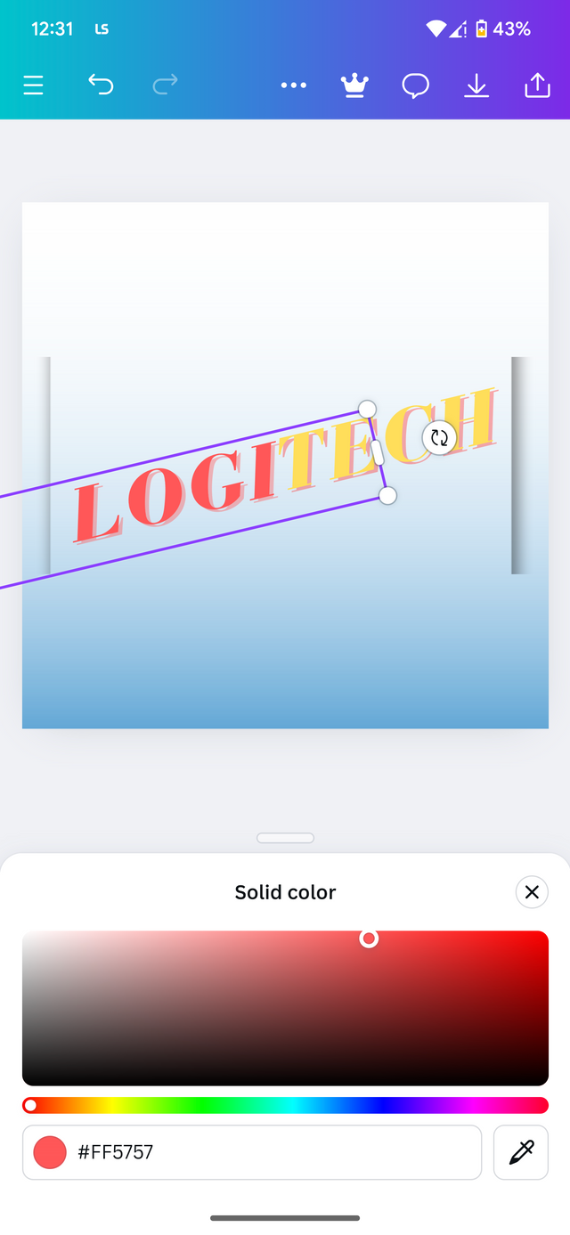
Using the wordmark logo principle, I have to pick a type face Which is so catchy and able to be memorized to the audience.
 |  |  |
|---|
All right. Like I said earlier, This type of logo is easy to design but then care has to be taken to make it look appealing and memorable today audience. So between the type of font to use for this type of logo is very crucial. For the font I use bodoni bold Which was the typeface no required for this exercise.
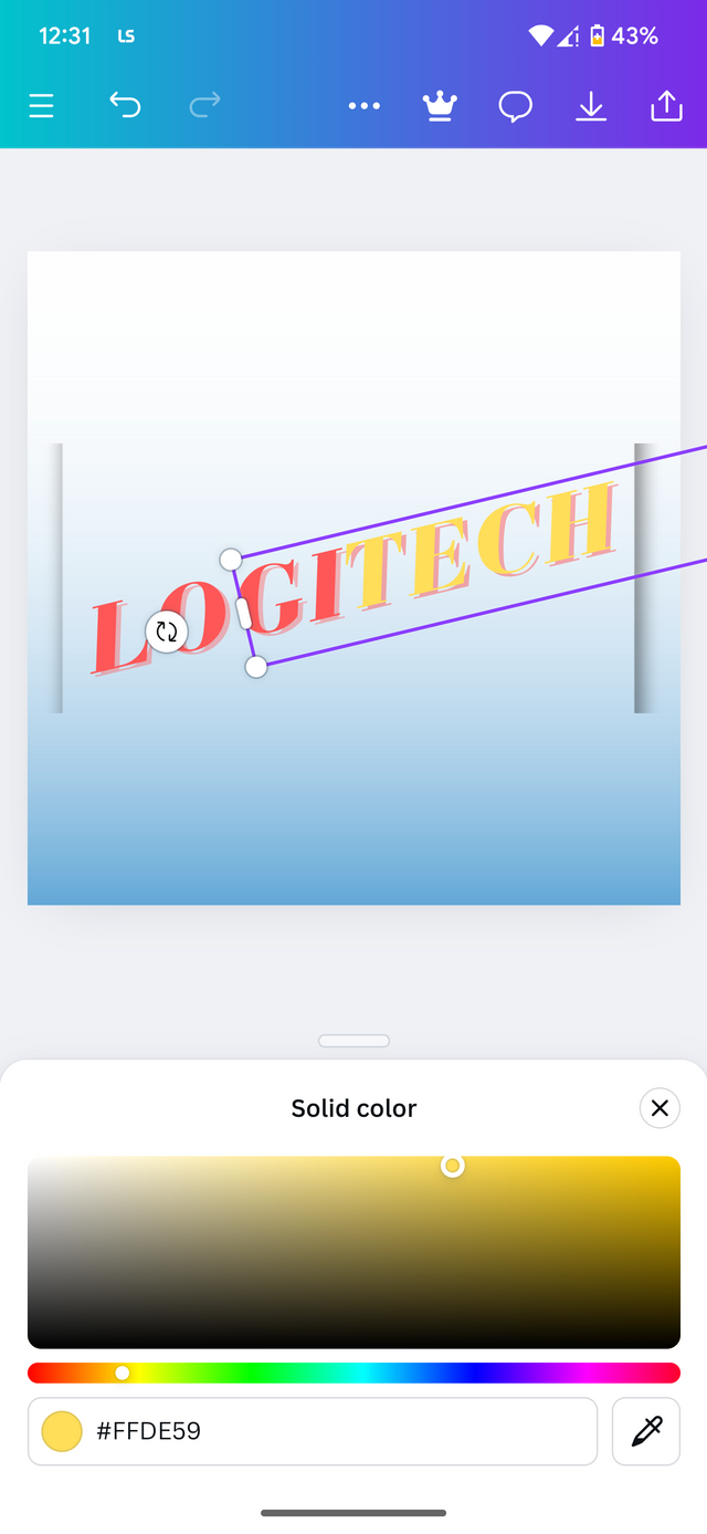
After that, I applied the following colors as seen in the images to produce the results as shown. This is the final image upon completion.
Combination Mark logo
Again, as mentioned earlier, this type of local involves a blend of wordmark logo With an icon or symbol. As a Starting company. It is often required to use this type of logo so that the audience can quickly grab the idea behind what your company is all about. I wish the design a combination logo for A coffee shop. Let's begin.
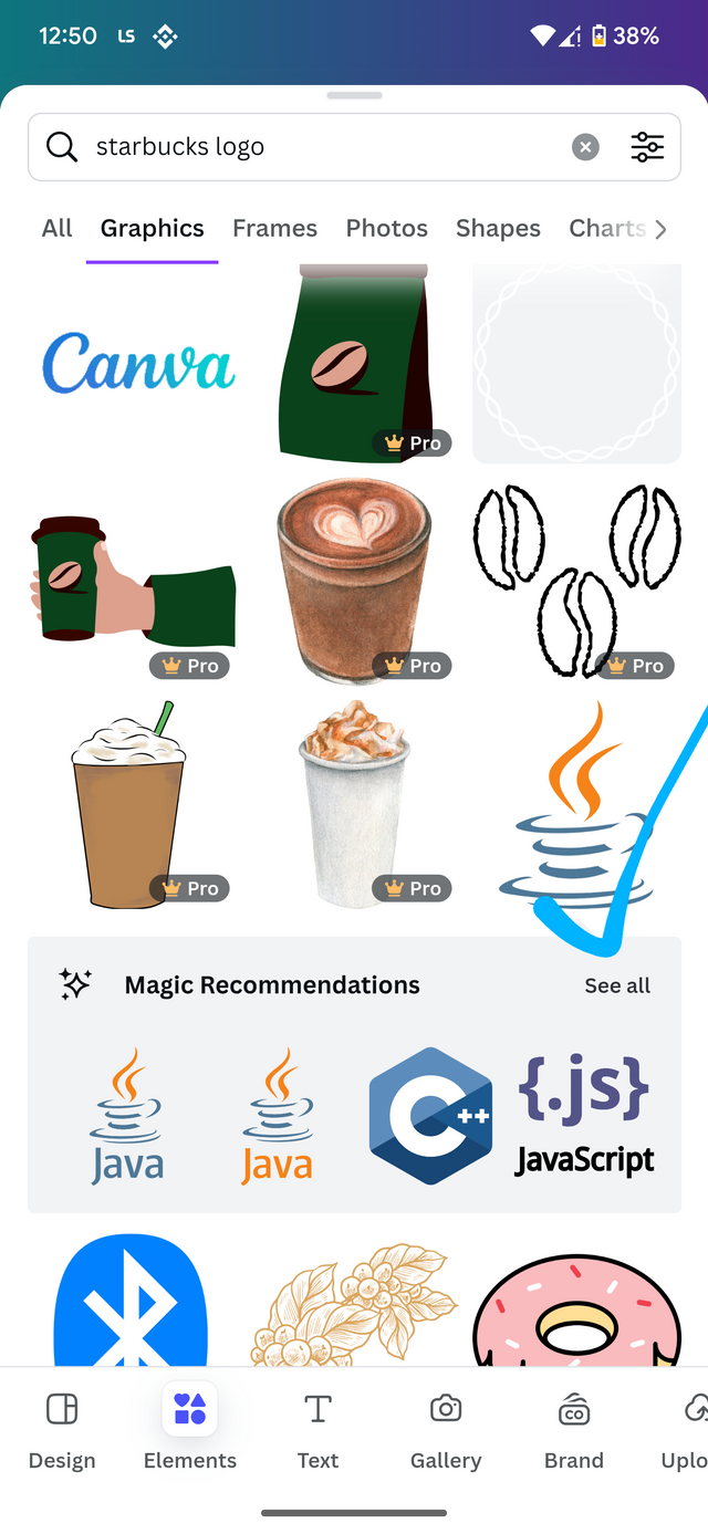
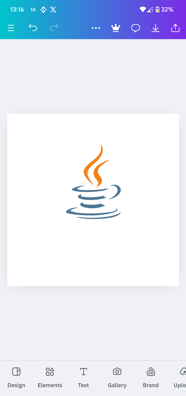
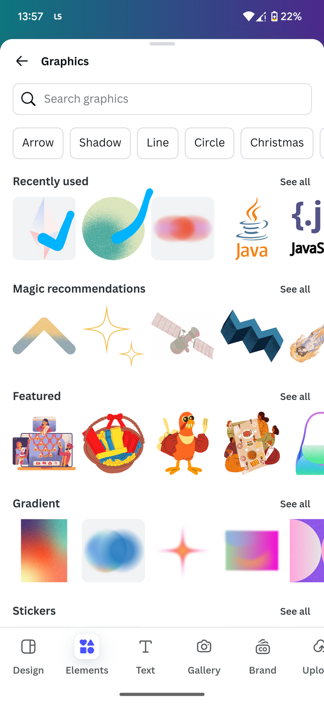
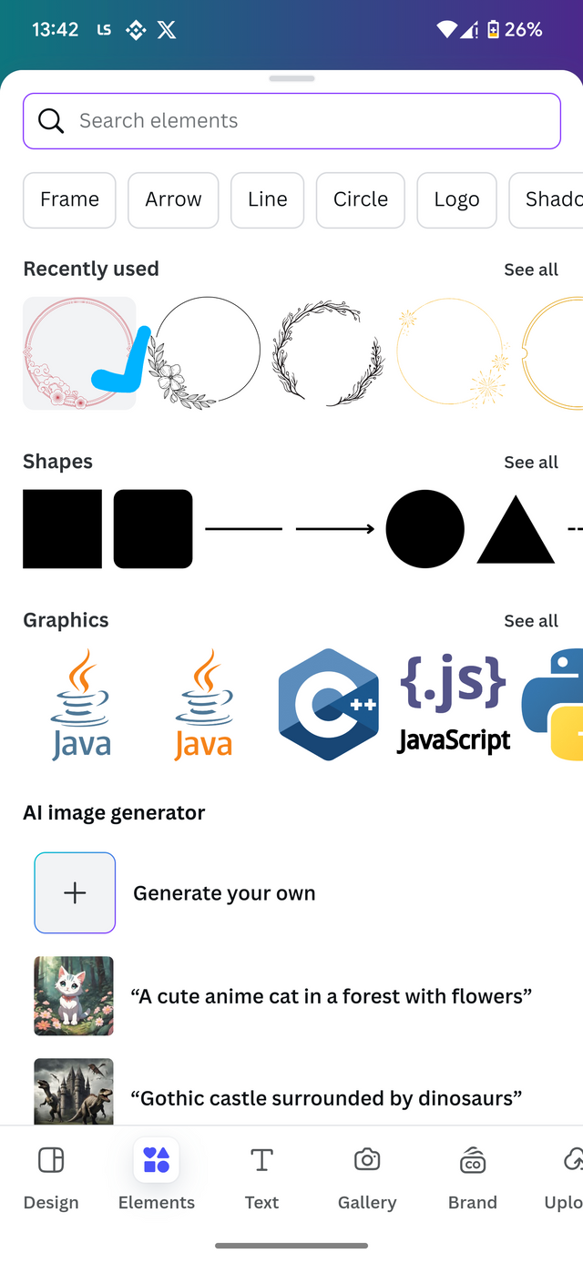
While in my canva app, eye open the Instagram template again and then dash to my workspace. As this request the use of symbol elements, I will be using elements which are related to the design I wish to portray. So I'm not the element section. I will be checking on which template best work with my design.
 |  |  |
|---|
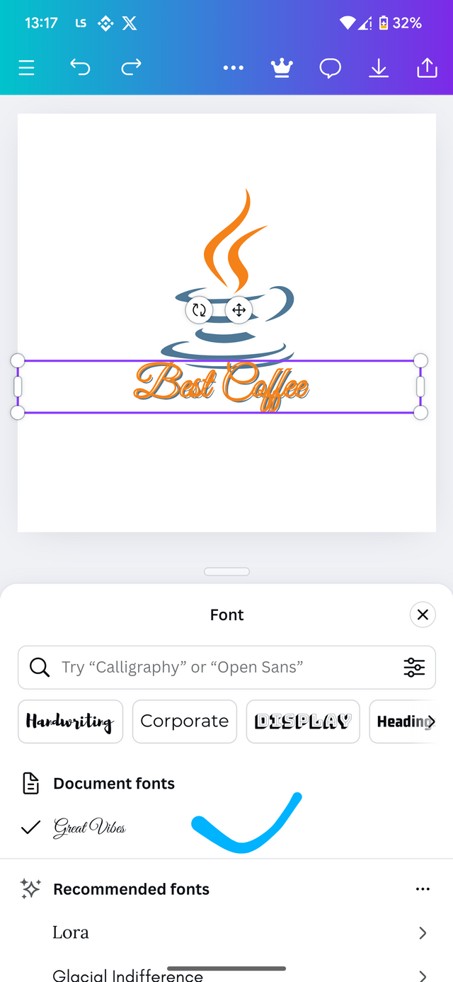
After selecting the required typeface and element, add ed them in my design and made a little effect of Bleach glitch In my typeface To make it look desirable. I didn't proceed so I just did items to make them align.
 |  |  |
|---|
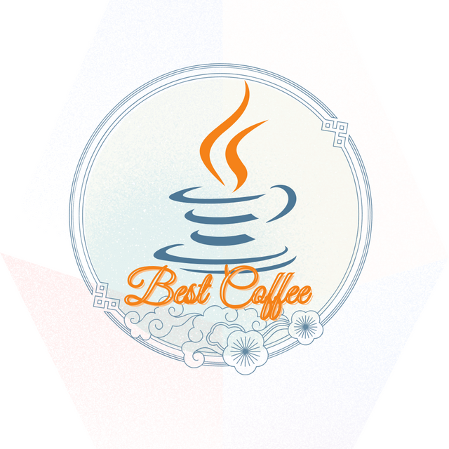
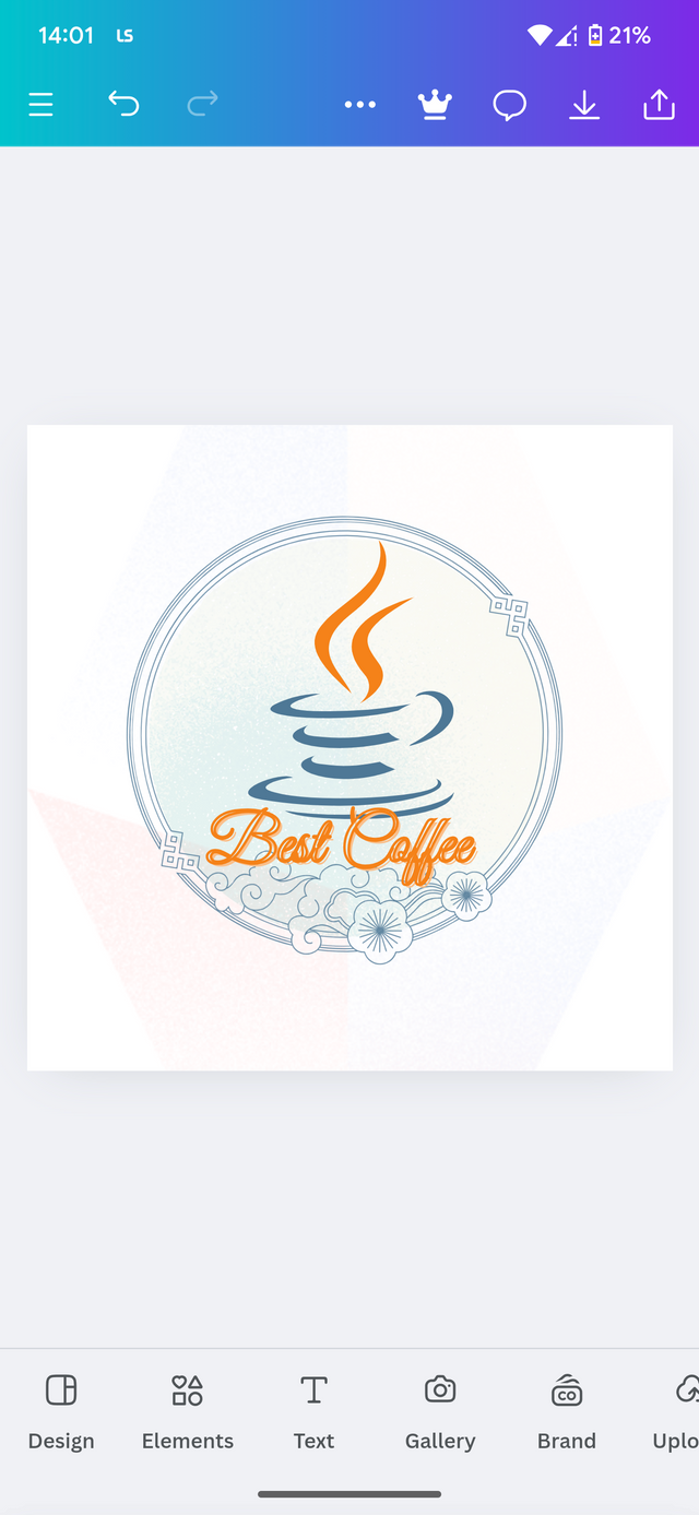
I then proceed to A few more elements to complete my design. After adjusting I was able to come up with the following results. This is the logo that represent my coffee shop With the brand name Best Coffee ☕
Design a simple flier for My brand and then strategically place one of the logo you made in the flier.
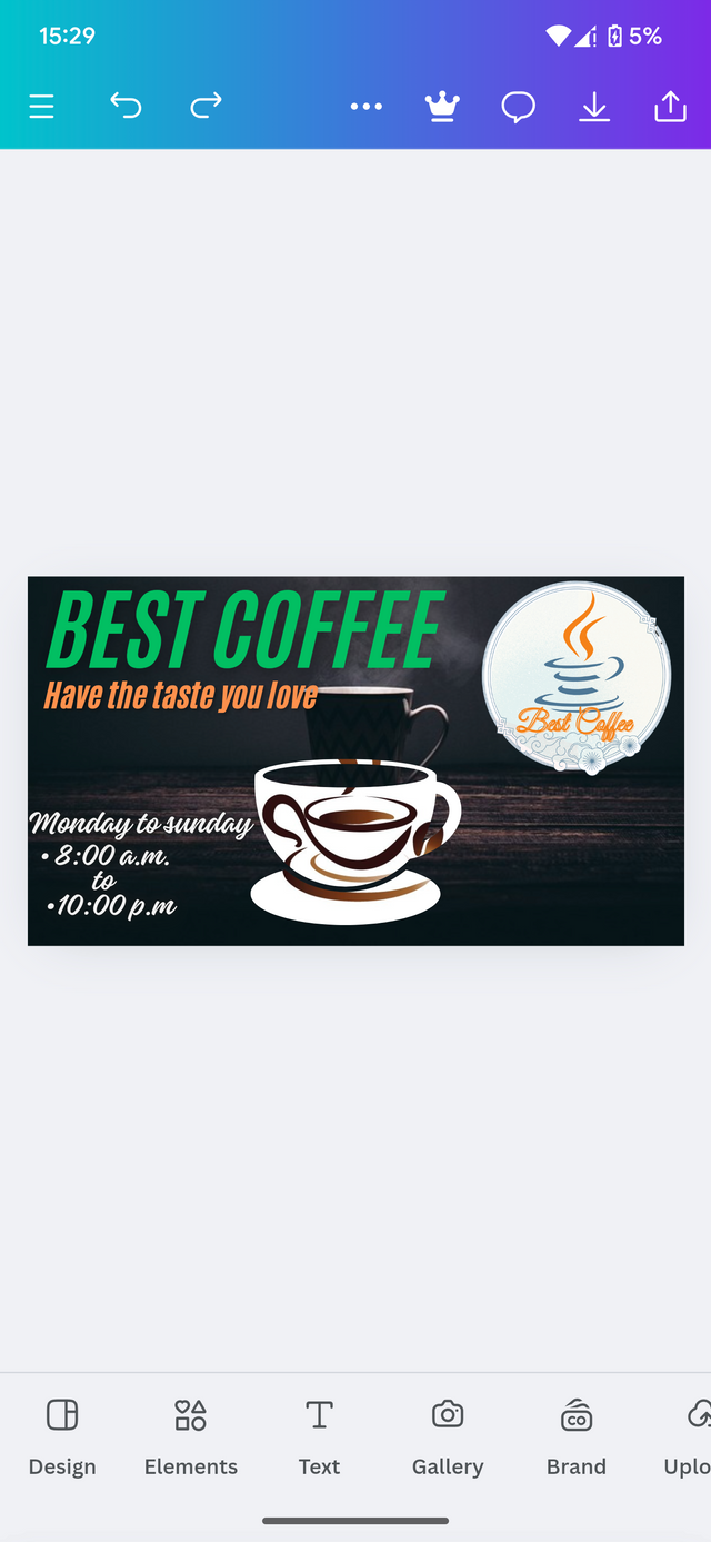
In this section, I wish to apply one of my logos on a flyer which best represent my company or whatever I am about to portray to the audience. In this post I want to continue with the coffee shop. So I will be using the logo I designed for the coffee shop for my flyer.
First, I open my camera app, and then select the YouTube thumbnail. After which I move to Pixabay To get some free images which I can use in my foreground and background.
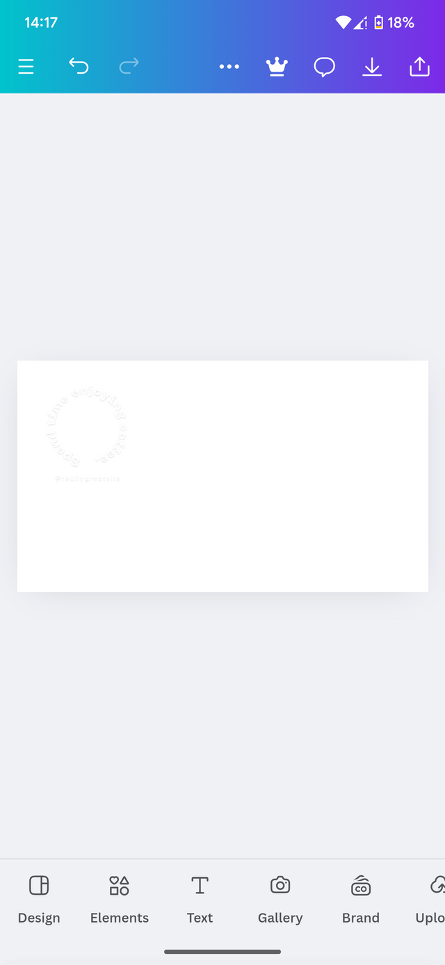 |  |  |
|---|
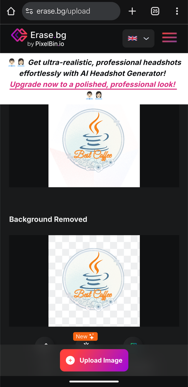
I equally go on Chrome and then use an online background remover which I was able to crop out my logo from the white background. From here I insert my logo into the design.
 |  |
|---|
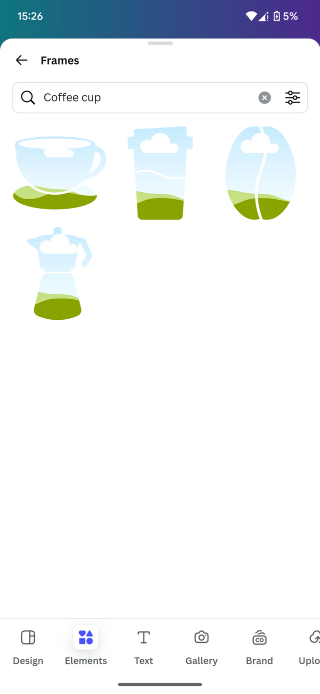
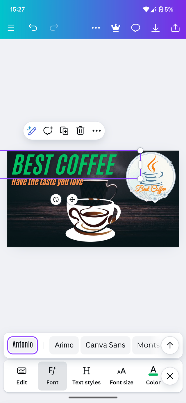
After adding a few more elements and my typeface, I then concluded its design With the details required for the flyer. This equally would take me to this stage.
 |  |
|---|
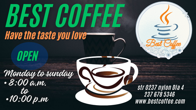
This stage marks the end of my design. Here's the final product of how my design looks like.

Best coffee.
Mastering and taking into consideration the right logo type for your brand is a crucial decision that can significantly impact your brand's identity and recognition. By understanding the strengths and weaknesses of each logo type, you can make an informed choice that aligns with your brand's values and target audience.
I hereby invite the following persons to join me participate in this contest. @chant, @simonnwigwe and @wirngo
Cc: @lhorgic
Best regards to: @rafk
