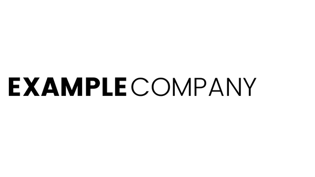
In magazines, poster design, and flyers you can use multiple fonts to create great designs. Instead of using font-weight, size or text-effects, different fonts can give your layouts structure. But in logo design, you only have a few elements that don’t need a big hierarchical structure.
Mix font-weights not typefaces
If you use wordmark logos or combination marks, you can try to mix fonts. It seldom works. Better results can be achieved in most cases by simply using differences in font-weight or making parts of your text bold, italic, or condensed.

If you use different typefaces, you seldom achieve the same effect. In most cases, using more than one typeface makes your design look unfinished or “frankensteined”. In Frankensteining, you combine two existing designs to form a new one – this technique almost always leaves you with bad results.
When can you mix typefaces in logo design
The only exception is: detailed "traditional" logos that use many design elements. In these logos you’ll have so many shapes, letters, numbers, symbols, etc. that your logo designs need structure. With the need for that, mixing typefaces becomes viable.
Just like on a magazine page, hierarchy helps the reader (viewer) to understand the content. It shows them what can be grouped together, what has more importance, and what can be neglected at first.
But even here, font-weight, bold, italics, creating paragraphs and other techniques of forming hierarchies are better.
Modern layouts use only one typeface on each page – sometimes even in a whole chapter.
As modern logo design has moved towards simplicity, good logo design has only 1 to 3 elements in total. All these elements should form a group. Bringing in a hierarchical divider through using multiple typefaces destroys that group, which is the main reason why logo designs with more than a single typeface fail so often.