I dont think we even have to ask.....
Authors get paid when people like you upvote their post.
If you enjoyed what you read here, create your account today and start earning FREE STEEM!
If you enjoyed what you read here, create your account today and start earning FREE STEEM!
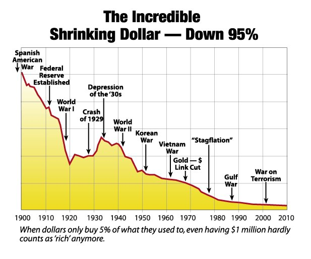
This graph doesn't actually show anything. Yes, it depicts a downtrend, but there ins't enough information to give it's attempt at expression validity or credibility.
Downvoting a post can decrease pending rewards and make it less visible. Common reasons:
Submit
your correct it shows no numbers and no comparison, but the graph is correct if we look at how many dollars it took to buy a gallon of gas 2 years ago 5,10,30,100 years ago it will always take more dollars to buy what we need. Thank you for the comment :)
Downvoting a post can decrease pending rewards and make it less visible. Common reasons:
Submit
Yeah - but it's not that simple. You're completely neglecting inflation, cost of living, price of commodity, supply and demand. Basically everything we know about economics. Liquidity for goodness sake. The argument you make is moot, essentially.
Downvoting a post can decrease pending rewards and make it less visible. Common reasons:
Submit
Inflation is The expansion of the money supply which is making it so we need more dollars to buy houses, more dollars to buy commodities.
Downvoting a post can decrease pending rewards and make it less visible. Common reasons:
Submit
So that graph is no where near wrong the fed prints money which means its gonna take more dollars to buy things its really that simple.
Downvoting a post can decrease pending rewards and make it less visible. Common reasons:
Submit
Buy more silver!
Downvoting a post can decrease pending rewards and make it less visible. Common reasons:
Submit