Well a week has past and i don't think i have actually stopped for 5 minutes to realise how far this project has come in so short a time!
Thank you #steemit!
Ok so without further ado (not sure if that is actually the right way of spelling it or if our non English speaking friends will understand haha) ok ok lets do this properly...
I am very pleased to show you the print versions of the bike graphics i have been working on the past week. I took the mocks i showed with my last update https://steemit.com/motocross/@b0y2k/steemit-factory-racing-update-1 and also the comments from the #steem community, and worked them up into full vector print resolution. I have also modelled the bikes graphic template so the graphics will fit the current model perfectly.
So here we go guys, let me know which you prefer and also if you think i have missed or need to edit something. Remember once it's printed its permanent :)
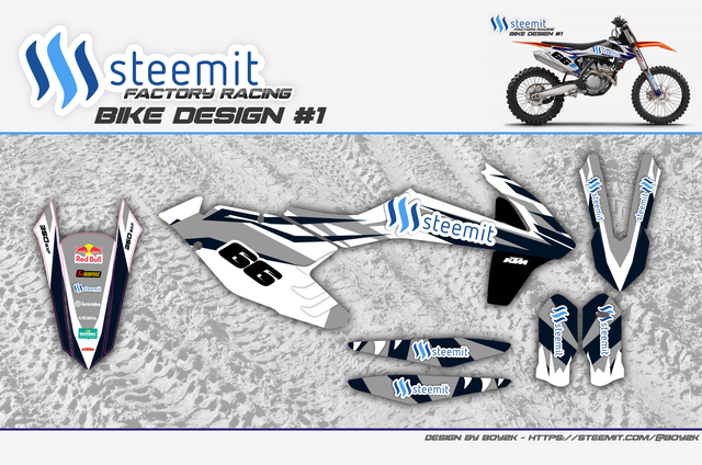
Bike design 1.
This was a rework of the original idea based on the feedback i received from the original post. I think it would work really nice with an orange framed KTM.

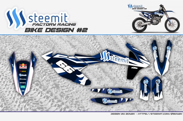
Bike design 2.
This was the #steemit favourite design, it's very #yamaha to my eyes but obviously it suits the #steemit colour scheme very well. the one drawback is that for actual racing in my class it would need a little editing as numbers have to be black and number backgrounds white. Small details and easy to sort out.

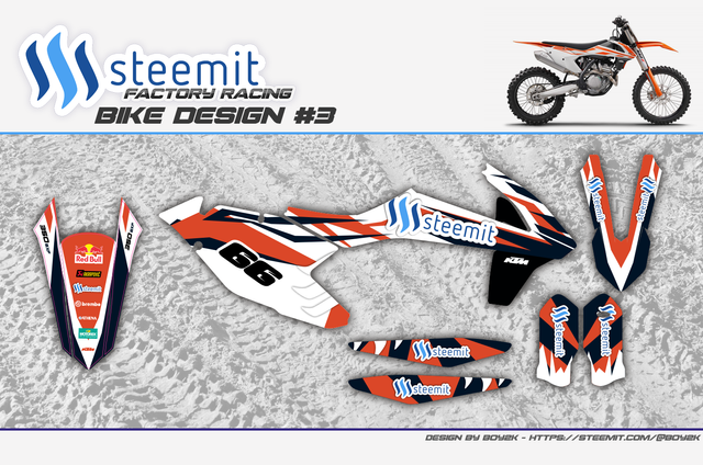
Bike design 3.
This was modelled with the KTM team in mind. Orange is a big thing for KTM owners so i wanted to stay true to that and offer an option for them.

So guys please comment here and let me know what you think :)
Im for bike design 2. Also pops out Red Bull nicely :)
Downvoting a post can decrease pending rewards and make it less visible. Common reasons:
Submit
Thanks @asmolokalo :)
Downvoting a post can decrease pending rewards and make it less visible. Common reasons:
Submit
Great design's B0y2k!
love the orange one m8!
Downvoting a post can decrease pending rewards and make it less visible. Common reasons:
Submit
Thanks mate! I have orange close to my heart as a KTM man lol
Downvoting a post can decrease pending rewards and make it less visible. Common reasons:
Submit
great designs b0y2k! as always!
Downvoting a post can decrease pending rewards and make it less visible. Common reasons:
Submit
THanks @coinbar :) lots of hours in these!
Downvoting a post can decrease pending rewards and make it less visible. Common reasons:
Submit
Yess! We need more motocross in this community.
Bikes look really cool!
Downvoting a post can decrease pending rewards and make it less visible. Common reasons:
Submit
Yes @eneismijmich! yes we do haha.
Thanks for the good comments, really put some hours into these. I'm still not 100% with them but they are close i think.
Downvoting a post can decrease pending rewards and make it less visible. Common reasons:
Submit
"Bike design 3.
This was modelled with the KTM team in mind. Orange is a big thing for KTM owners so i wanted to stay true to that and offer an option for them."
I agree with KTM owners, but I would take out white totally there, except steemit logo outlines.
Great work, anyways!
Downvoting a post can decrease pending rewards and make it less visible. Common reasons:
Submit
Totally @richman? I think it needs some contrast in there... I do have to keep a white background for the numbers if i want to keep it in race spec anway... but i think it needs something to bounce the orange off. Maybe i need to work the design a bit more...
Downvoting a post can decrease pending rewards and make it less visible. Common reasons:
Submit
2 seems the best color scheme to me... it fits nicely with steemit colors.
Downvoting a post can decrease pending rewards and make it less visible. Common reasons:
Submit
Its proving popular @alexgr
Downvoting a post can decrease pending rewards and make it less visible. Common reasons:
Submit
Designs kick ass. Orange one all the way!
Downvoting a post can decrease pending rewards and make it less visible. Common reasons:
Submit
Nice one @machinelearning :) (great name)
I have orange in my blood don't worry haha.
Downvoting a post can decrease pending rewards and make it less visible. Common reasons:
Submit
Nice design, i realy like the blue one. That is my favorite ;)
Downvoting a post can decrease pending rewards and make it less visible. Common reasons:
Submit
welcome back @nippel66 :)
Downvoting a post can decrease pending rewards and make it less visible. Common reasons:
Submit
Tank you mate :)
Downvoting a post can decrease pending rewards and make it less visible. Common reasons:
Submit
Go for Bike design 1!!! I love it.
Downvoting a post can decrease pending rewards and make it less visible. Common reasons:
Submit
Thanks @rules169, this was the wildcard design :)
Downvoting a post can decrease pending rewards and make it less visible. Common reasons:
Submit
Kickin it bro...i like the middle one (Design 2) it shows that the steemit logo works well on light and dark contrasts.
Downvoting a post can decrease pending rewards and make it less visible. Common reasons:
Submit
Design 2 was the previous favourite @cryptoiskey haha.
I agree it sits on the eye a lot easier as the colours are all complimentary, thing is... you need some 'pop' with MX graphics. Taking all comments on board though :)
Thats the great part of putting this up here, we get to learn from everyone what they want to represent #steemit :)
Downvoting a post can decrease pending rewards and make it less visible. Common reasons:
Submit
lol yeah just pushing that one home for the win,lol....you do need pop yeah, but some pop can be over the top pop,lol...i like all the designs and man if you could use all 3 well even better..a different one for each competition to give yourself even more randomness and keep the fans guessing.
Downvoting a post can decrease pending rewards and make it less visible. Common reasons:
Submit
@cryptoiskey that is something i was considering alot myself :)
Nothing wrong with having some box fresh designs to put on for each raceday :)
Downvoting a post can decrease pending rewards and make it less visible. Common reasons:
Submit
Exactly, it keeps things fresh and you come across as being creative aswell in the sport which always sits well with fans.
Downvoting a post can decrease pending rewards and make it less visible. Common reasons:
Submit
If I had the money for a bike be sure they would see me in one of these designs!
Awesome work. Thanks
Downvoting a post can decrease pending rewards and make it less visible. Common reasons:
Submit
Thanks @timaid :)
Maybe i can offer out these files or do some custom ones for people once the project gets going...
Downvoting a post can decrease pending rewards and make it less visible. Common reasons:
Submit
If there is something where I can help just hit me
Downvoting a post can decrease pending rewards and make it less visible. Common reasons:
Submit
Design #2 kicks ass!
Downvoting a post can decrease pending rewards and make it less visible. Common reasons:
Submit
Still seems a popular choice @sascha :)
Downvoting a post can decrease pending rewards and make it less visible. Common reasons:
Submit
I think #2 looks really cool
Downvoting a post can decrease pending rewards and make it less visible. Common reasons:
Submit
:) another one chalked up for 2.. haha
thanks @incomemonthly
Downvoting a post can decrease pending rewards and make it less visible. Common reasons:
Submit
Blue designs are cool but the orange really stands out
Downvoting a post can decrease pending rewards and make it less visible. Common reasons:
Submit
your talking my language @totyodude :)

Downvoting a post can decrease pending rewards and make it less visible. Common reasons:
Submit
👍great design
Downvoting a post can decrease pending rewards and make it less visible. Common reasons:
Submit
Thanks @meteor78 :) hard work getting to this point :)
Downvoting a post can decrease pending rewards and make it less visible. Common reasons:
Submit
This is awesome @b0y2k! Thanks for sharing your Steemit bike designs with us.
As a motorhead, I love these designs, and I hope they make it to a real bike soon, and if they do, please share it with us.
Thanks again for sharing this!
Downvoting a post can decrease pending rewards and make it less visible. Common reasons:
Submit
Thanks @albertfall :)
Nice to meet a fellow motorhead haha. Im itching to get them printed mate!
Downvoting a post can decrease pending rewards and make it less visible. Common reasons:
Submit
Thanks for the reply @b0y2k!
Likewise. Maybe we should start a tag just for people like us...motorheads.
So you are printing them? And will these be going on your personal bike(s)?
Downvoting a post can decrease pending rewards and make it less visible. Common reasons:
Submit
Yes they will be printed mate, and yes on my bike or a new bike depending how steemit backs the project! I would also love to expand out to sponsor a few other riders that could do with a little help.
Downvoting a post can decrease pending rewards and make it less visible. Common reasons:
Submit
It's always exciting to see things go from concept to reality, especially in the petrol world.
If I had a bike, I would have asked you take my money already and ship me a set of the graphics. I'm sure that a few riders on here would love to be sponsored.
Again, awesome work! Please share more updates as you transition into overlaying the graphics.
Downvoting a post can decrease pending rewards and make it less visible. Common reasons:
Submit
Downvoting a post can decrease pending rewards and make it less visible. Common reasons:
Submit
not sure about this post @rggreen maybe work on actual comments... not copy paste :)
Downvoting a post can decrease pending rewards and make it less visible. Common reasons:
Submit
Missed this when it first got posted sorry about the late response. Love the way this is progressing and can't wait to see the final product.
I still like the second design the most with the first one coming in second choice (it looks a lot better with the drop shadowing). Any word on when you are going to get it printed?
Downvoting a post can decrease pending rewards and make it less visible. Common reasons:
Submit
Downvoting a post can decrease pending rewards and make it less visible. Common reasons:
Submit
Thanks @koolaidssss
Downvoting a post can decrease pending rewards and make it less visible. Common reasons:
Submit