DOING A SECOND VERSION OF THE THEME #3 SUBMISSION
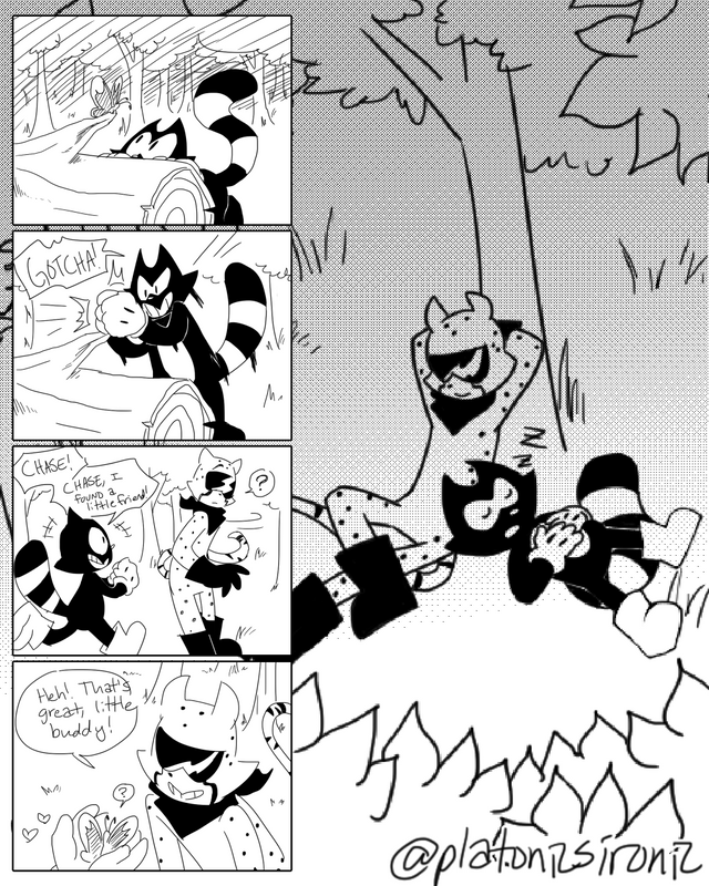
So I'm seriously thinking maybe I need to layout my comics like. Yknow, comics, even if they're simple like this?
That way people look at the thumbnail image and they know hEY LOOK IT'S A COMIC!
Because I'm starting to wonder if that maybe gets more people to view it.
So anyway, would you guys say this is visually preferable over [this]? Or no..?
Because I might lay these out like 4-komas from now on, though idk because I don't want to force the comics to happen in 4 panels? But.... Idk, I might try something here.
But also my bro says that he doesn't have to squint at it the other way :P Do you guys have any trouble viewing it?
i personally prefer the way you have presented the comic, in this post it has a nice feel to it and you don't have to scroll while reading it which is nice. Either way keep up the good work :)
btw i love the comic, it's adorable XD
Downvoting a post can decrease pending rewards and make it less visible. Common reasons:
Submit
I didn't realize someone might prefer not scrolling! I guess it does make the page shorter lol :P
Thanks for the input! ^^) tried to reply to this last night but my internet was being dumb dgfvjfcg
And thanks sgtdhyff <333333 I just love drawing these two together they're so cute, AAAFDFDS
(ノ◔▽◔)ノ :。・::・゚’★,。・::・゚’☆
Downvoting a post can decrease pending rewards and make it less visible. Common reasons:
Submit