Assalam-o-Alaikum!!!
Greetings to my all STEEMIT members. Hopefully you all are fine and enjoying a great and blessed life on STEEMIT, I am also want to participate in this task. So I am going to share my all tasks . And I want to try that I will share quality content

Made in poster my wall
Excel charts are graphical representations of data and universes designed to facilitate visualization and comparison. They are a powerful tool in Excel that allow users to present complex data sets in a clear and understandable way.
There are three categories of data and decision making charge.
Column Chart:
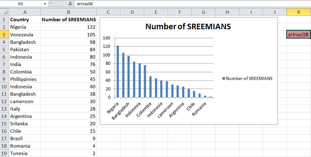
First of all I will tell you about column chat. The outside height corresponds to the value of this category. This is useful for comparing data across different categories
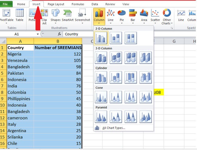
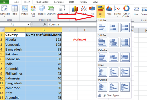
Practical Representation of COLUMN Chart:
So first of all I will select the whole data than of to the Insert option. When we will fine the option of COLUMN chart. And then we will select
 |  |
|---|
Here I want to show the countries and no of Steemians in columns Chart that's why I add the data on countries and no of Steemians. in two columns.
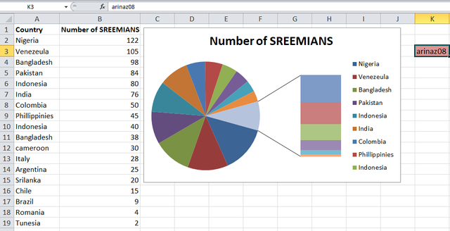
Pie Chart:
A pie chart presents data as slices of a pie where each slice corresponds to a percentage of the whole category.
Practical representation:
Its method is same like Column Method. I just want to find the option of PIE Chart. And then I will choose 3D pie chart
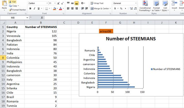
Line Chart:
A line chart plots data points on a graph and connects them with a line. This is useful for showing trends over time, such as monthly sales temperature charts or stock market performance.
Practical representation
So like previous two charts I will select the Line Chart options. So here is the screenshot
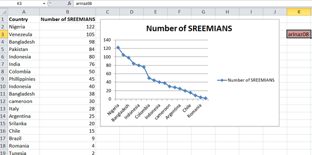
Number of Steemians per country.
| Country | Number of Steemians |
|---|---|
| Nigeria | 122 |
| Venezuela | 105 |
| Bangladesh | 98 |
| Pakistan | 84 |
| Indonesia | 80 |
| India | 76 |
| Colombia | 50 |
| Philippines | 45 |
| Indonesia | 40 |
| Bangladesh | 38 |
| Cameroon | 30 |
| Italy | 28 |
| Argentina | 25 |
| Sri Lanka | 20 |
| Chile | 15 |
| Brazil | 9 |
| Romania | 4 |
| Tunisia | 2 |
 |  |
|---|
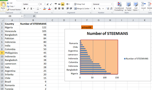
After that I add some designing and want to make it more beautiful and to show its final LOOK
DATA ANALYSIS TECHNIQUES in EXCEL:
Excel Data offers a range of data analysis techniques that can help you interpret and analyze data in a way
we will share with you in some key techniques.
The first technique is sorting , which helps you organize data based on specific columns, such as sales data by date or product, while filtering allows you to view only that data. that meet specific criteria such as showing records from a specific region or within a specific sales range
Pivot tables:
pivot tables that categorize large data sets and allow dynamic reporting, methods, and groups of data by categories such as products or regions to easily calculate sums or percentages clear worlds and insights.
Conditional Formatting:
This tool displays data based on perceived conditions, for example up-performance. It can use color scales to show different conditions, for example green for high and headlines for low to see comparisons. For data we can use from outside and icon set*
Charts and Graphs:
These tools used in bar charts, pie charts, line charts and etc. it also making it easy to identify graph patterns and trends, especially when working with time series data comparisons or ratios.
Data Validation:
Data extensibility Limits the types of data entered into cells Ensures data consistency For example, you can limit entries to a list of values, dates, or specific ranges Clean and correct data sets Help maintain
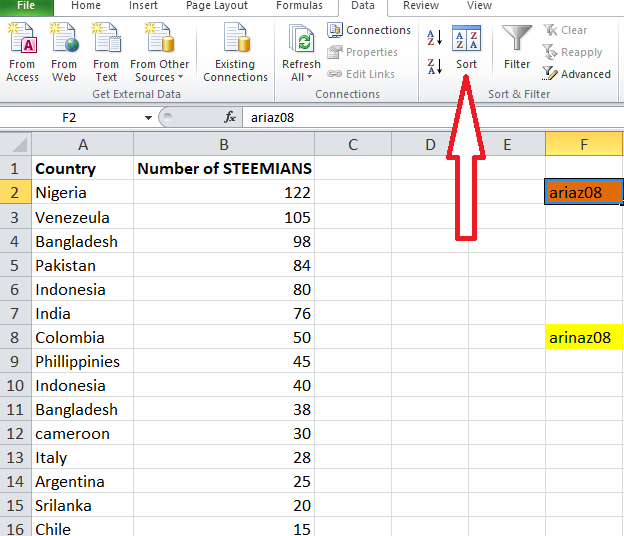
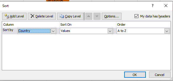
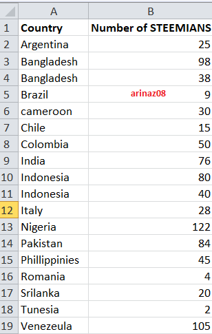
Here is very easy and simple method that I will share with you . And for this I go to the Data tab and then I will sel;evt the option of Sorting . And here is two that that if we want to arramge the data in alphatically order from Z to A . And also from A to Z. And I want to arranage the data in Alphabatical order from A to Z
 |  |
|---|
25% to @null
Special Thanks to @josepha , @simmonwigwe
Downvoting a post can decrease pending rewards and make it less visible. Common reasons:
Submit
Thanks a lot @o1eh for your appreciation and support
Downvoting a post can decrease pending rewards and make it less visible. Common reasons:
Submit