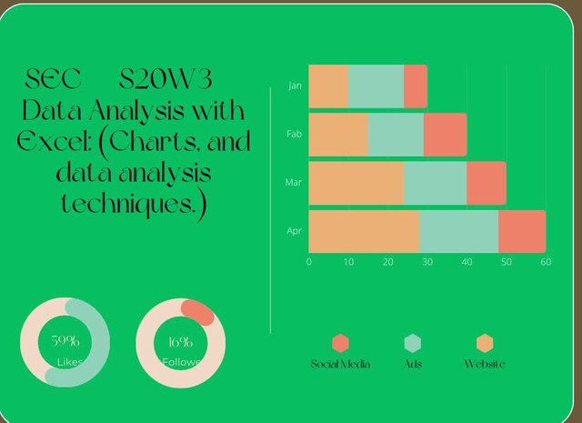
Steem greetings from the motherland-Cameroon and welcome to my blog as I share my thoughts about “data analysis” using Excel charts. It is a privilege to join the course this week and I hope you find pleasure in reading through my masterpiece.
My explanations and data presentation will concentrate on the questions below 👇 👇 👇 .
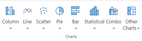
Explain what you understand by Excel charts and discuss three (3) types of Excel charts that you know with clear screenshots |
|---|
From my understanding, excel charts are a way of representing data in a graphical format on an Excel sheet. This is of help to data analysts as it helps them to interpret and give meaning to the data in a visual format. Excel charts make it easier to interpret and understand data at first glance.
The charts are used to represent data following trends and patterns, which are easily understood by anyone seeing the charts at first glance.
There are several different charts used to represent data in Excel namely; pie charts, bar charts, line charts, pivot charts, histogram charts, maps, etc.
For the purpose of the challenge, I’m gonna explain 3 of the many charts of my choice.
Bar Chart
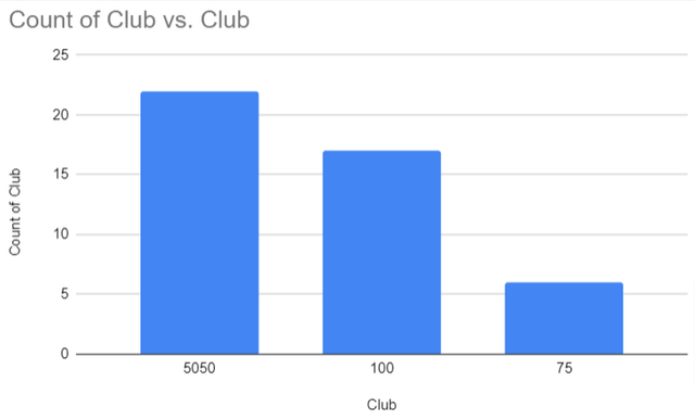
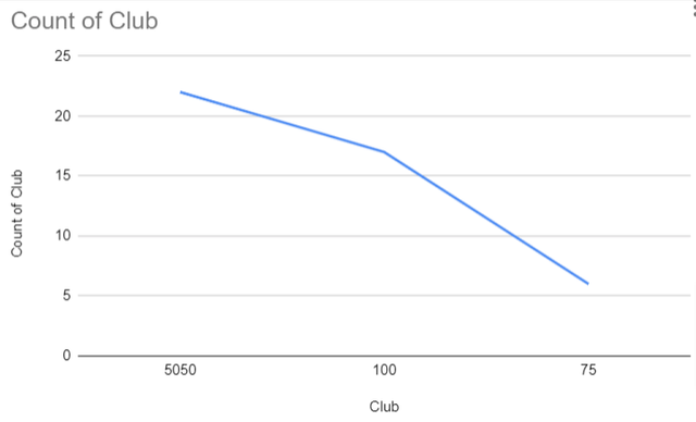
This is used to represent the values of different variables and categorise the variables in the form of rectangles or horizontal or vertical lines. It is used to compare the values of the different variables over a period of time. For instance, the numbers of club100, club75, and club5050 that participated in a contest over a period of 7 days.
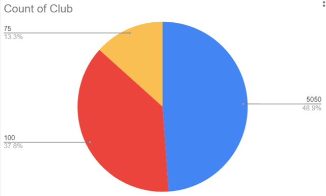
Pie Chart
This represents statistical information in a circular form, divided into slices with each representing a numerical proportion. That is each slice of the chart is proportionate to the quantity it represents.
Line Chart
It is a chart used to represent data points connected with a straight line. It is easy to use a line chart to trace changes in patterns or trends over some time. This is commonly used by business owners to track the price action of an asset.
Verify that you can read the information regarding chart location and creation in Excel and interpret it correctly using Bar Charts |
|---|
After explaining some of the charts, I will give a step-by-step guide to use and add data on Excel to create a chart as seen below 👇.
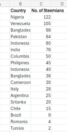
- I Will begin by opening the Excel page on my laptop. For those using a phone, you will need to download the Excel app before you can proceed. Create two columns where I will input the data, each representing steemit users, and country. - I Will proceed and create 18 rows where the data for different steemit users will be filled as seen in the image below.
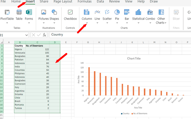
- I Will highlight all the data inputed for the different steemit users and click on insert beside the home button. It will navigate to the chart design bar and I select the chart design I want. I will click on a bar chart or column chart. Once I clicked on a column chart, the data automatically represented on the chart as seen below.
- I Will go ahead and customise my chart by resizing, adding colours and naming it to my taste. Below is the final chart I got.
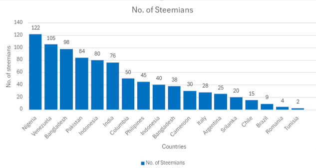
From the chart, I can interpret that steemit users from Nigeria were top of the list. Venezuelan was second followed by Bangladesh. The least on the chart were Tunisians with a smaller number of Steemian.
Briefly discuss Data Analysis Techniques In Excel and tell us how we can organize data in Excel for analysis. |
|---|
Data Analysis Techniques in Excel
These are tools used by businesses or individuals to visualise, summarise and give a better meaning to different datasets. Some of the data analysis techniques are as follows;
Descriptive Statistics: It is used to summarise the characteristics of different datasets and gives them a better understanding from a quantitative standpoint and can be easily interpreted. The following measures are used to describe datasets ; central tendency and variability, where central tendency represents Mean, Median and Mode with the formula
=Average()
=Median()
=Mode()
While variability represents standard deviation and variance where it is easier to understand the minimum and maximum numbers of variables. The following formula is used to quantify standard deviation:
=STDEV.S()
=VAR.S()
Regression Analysis: It is used to measure and estimate the relationship between an independent variable to one or even more dependent variables.
Correlation Analysis: This is used to find out the connection between two or more variables and be able to measure and determine the action between the variables.
Before analysing your data, it is important to categorise your data to make it easier to access your data. If your data is not well organised, you might end up with an inaccurate view. That said, the following are ways to organise your data for analysis:
Sorting: Here you arrange your data in a way that each category will be easy to understand or visualised. When you sort your data well, it will be easier to read the story behind the summarised data.
Clear headers: To better understand your data for analysis, make sure that your headers are easy to understand. Name your rows and columns in a clear way for easy understanding.
Filtering :This makes your data analysis to be focused and efficient. You used this feature to narrow down your information from a general perspective to a specific aspect. That is you reduced your data from generic datasets to a more valuable dataset.
Pivot Table: This is a correlative way of summarising a larger amount of data in detail which will help you to answer some of the unexpected questions about your data analysis.
Conditional Formatting: This is used to sort out data from the sheet based on specific values. For instance, highlighting cells with different colours to sort out their specific values.
Using the data given in question 2, arrange the names of countries alphabetically using data sorting techniques. Screenshots are needed. |
|---|
As already mentioned above, data sorting is arranging your data in a way that it will be easy to categorise and visualise your data, making it easy to understand.
With the data from question 2, I will use the sorting technique to sort out the data in alphabetical order.
- I highlighted the data on country and steemians. Click on the “data” dialogue box and select sort either in ascending “A-Z”or descending order “Z-A”. I will sort my data in ascending order "A-Z".
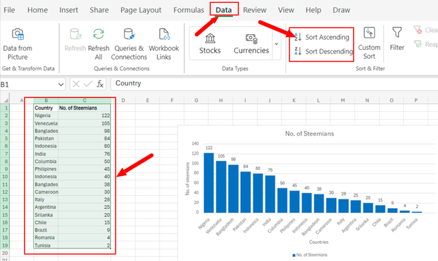
- Once I click on Ascending "A-Z", Excel will automatically arrange the data in an ascending order alphabetically.
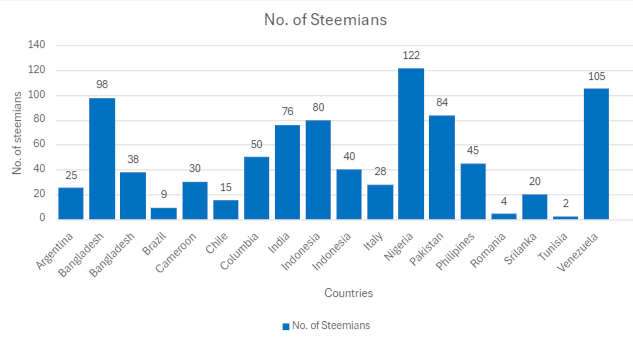
From the chart, one can clearly understand that the countries have been placed in alphabetical order with Argentina appearing first, second by Bangladesh respectively.
In sum, excel charts are vital to companies, researchers and individuals to visualise data efficiently which can be easily understood. The data can be represented using different charts based on their specific need. To analyse the data, different techniques can be used such as the sorting technique.
I will not go without inviting @pelon53, @waterjoe, @max-pro and @anailuj1992 to share ideas about data analysis using Excel.
This post has been upvoted/supported by Team 7 via @philhughes. Our team supports content that adds to the community.
Downvoting a post can decrease pending rewards and make it less visible. Common reasons:
Submit
Thank you for the support @philhughes.
Downvoting a post can decrease pending rewards and make it less visible. Common reasons:
Submit
Exellent dear. You have explained the Excel chart and its importance in data analysis very effectively. Excel is very helpful also you have taught It step by step. You have been provided a great knowledge regarding Excel. Keep up the amazing work.
Downvoting a post can decrease pending rewards and make it less visible. Common reasons:
Submit