.png)
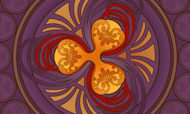
I was extremely uncertain whether to participate for the third time in the Crypto Logo Art Challenge by @sndbox. But the new theme was extremely inspiring as well. I was able to work at night only, but it was great fun.
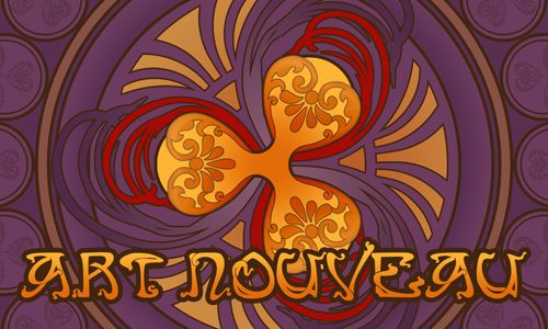
I always try to understand the form, to analyze it before doing anything else. The previous one, The Ethereum logo, was very solid, with sharp edges, perfect for the Art Deco style. This Ripple logo on the other hand has soft, almost natural elements. That reminded me of Alphonse Mucha's incredible and distinct style. ^.^
So I decided to do an Art Nouveau. Or at least I tried. :D
.png)
I was inspired by these images:
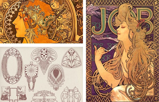
Links are down bellow:
Source 01
Source 02
Source 03
.png)
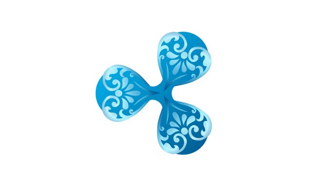
As always, I started changing the logo first.
I had some ornaments I developed for another project, but decided to use in this composition. It's not Art Nouveau related, but creates interesting contrast as part of the logo.
.png)
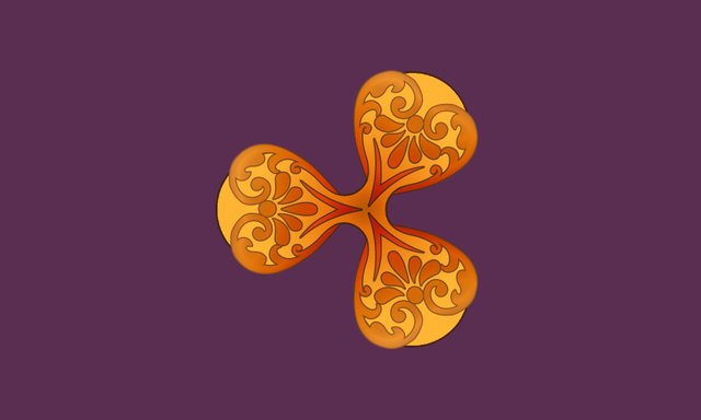
It was time to change the color scheme to look more like the reference photos.
.png)
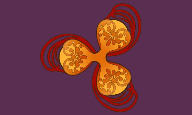
From here on all I had to do was adding more and more details. One thing I had in mind - all had to be in the same direction as the three elements of the logo.
So first were ornaments very similar to human hair. ;)
In this composition the logo is the brightest one, all the others are darker.
.png)
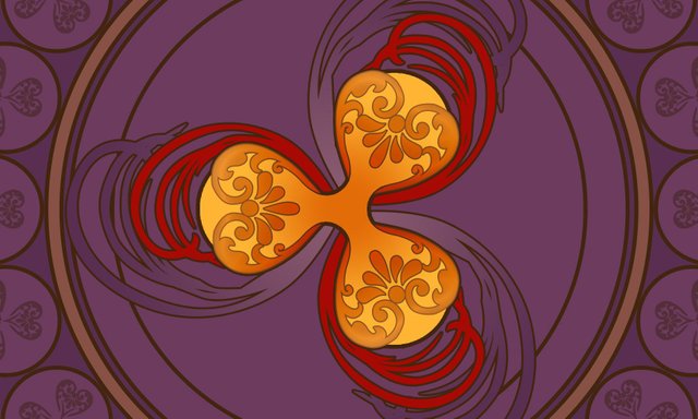
Next was additional elements for the background, because I didn't know how to finish the center. Decided to leave it for a day. :D
Just duplicated the same "hairy" elements but in different color gradient and size.
.png)
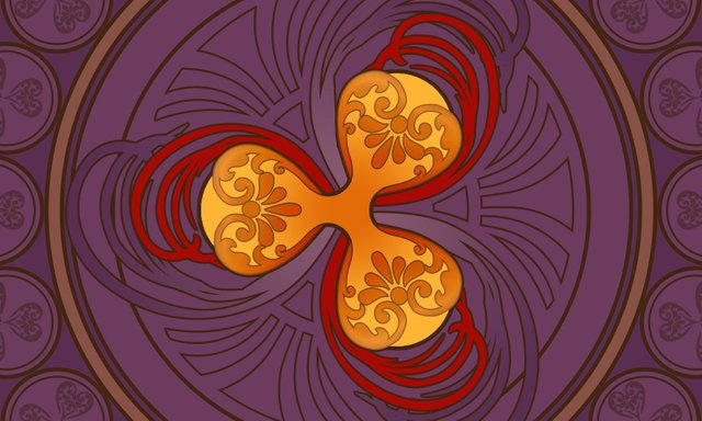
Finally, had an idea how to fill the gaps. It looked a lot like stylized lotus flower, hehe. This was pure coincidence. ^^
.png)
Finally, I was able to finish it with some additional color, but with a lower opacity than the Ripple logo.
.png)
I really hope you like it!
^.^ Have an incredible day, everyone! ^.^
Thanks for stopping by!
Waw. This is really amazing. I like this
Downvoting a post can decrease pending rewards and make it less visible. Common reasons:
Submit
Thank you very much! ^^
Downvoting a post can decrease pending rewards and make it less visible. Common reasons:
Submit
Wahh. It awesome... Combine old art and nowdays technical for future logo design... Ganbatte
Downvoting a post can decrease pending rewards and make it less visible. Common reasons:
Submit
Hehe, arigatou gozaimasu, @muktaridha! ^.^
I'm glad you like it!
Downvoting a post can decrease pending rewards and make it less visible. Common reasons:
Submit
wawaw so classsssssy and very art nouveau * ___ * love this ! GOOD LUCK IN THE COMP katalina <3
upvotes
Downvoting a post can decrease pending rewards and make it less visible. Common reasons:
Submit
Thanks, @veryspider! ^^ <3 I'm so glad you like it! ^^
Btw, a small present from my part of the world. ^.^
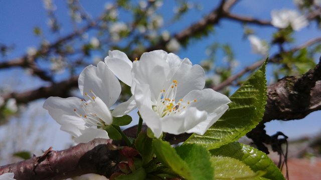
Welcome to my spring:
Downvoting a post can decrease pending rewards and make it less visible. Common reasons:
Submit
Congratulations @katalinaooma! You have completed some achievement on Steemit and have been rewarded with new badge(s) :
Click on any badge to view your own Board of Honor on SteemitBoard.
To support your work, I also upvoted your post!
For more information about SteemitBoard, click here
If you no longer want to receive notifications, reply to this comment with the word
STOPDownvoting a post can decrease pending rewards and make it less visible. Common reasons:
Submit
Congratulations! Your post has been selected as a daily Steemit truffle! It is listed on rank 16 of all contributions awarded today. You can find the TOP DAILY TRUFFLE PICKS HERE.
I upvoted your contribution because to my mind your post is at least 12 SBD worth and should receive 67 votes. It's now up to the lovely Steemit community to make this come true.
I am
TrufflePig, an Artificial Intelligence Bot that helps minnows and content curators using Machine Learning. If you are curious how I select content, you can find an explanation here!Have a nice day and sincerely yours,

TrufflePigDownvoting a post can decrease pending rewards and make it less visible. Common reasons:
Submit
You put so much thought into your logo design. I hope you win.
-upvoted-
Downvoting a post can decrease pending rewards and make it less visible. Common reasons:
Submit
Oh, thank you, @scrawly! ^^
I was one of the winners in the previous challenge, so I don't know about this one. Either way, it was fun doing this entry. ;)
Downvoting a post can decrease pending rewards and make it less visible. Common reasons:
Submit
Oh you already won before? Then they must like your creations :D.
I think it would be terrible if they don't choose this one ONLY because you have created something good before, seems a bit harsh to punish you for making good stuff repeatedly.
Downvoting a post can decrease pending rewards and make it less visible. Common reasons:
Submit
Oh, don't worry, I don't see it as punishment. ;) In fact, many of the previous winners prefer not to participate again. I wasn't sure either, but just couldn't resist, because the idea was interesting. ;)
Downvoting a post can decrease pending rewards and make it less visible. Common reasons:
Submit
I hope you'll win again, Katalina (I've read in the comments that you were one of the winners in the previous round- congratulations :)) This entry is very very good! I love its geometry, colours, and beautiful lines. Fantastic work and great showing of the process <3
Downvoting a post can decrease pending rewards and make it less visible. Common reasons:
Submit
Thank you so much, dear! ^.^ <3
Yes, they really liked the previous entry in Art Deco style. ;)
This time I was not very detailed in the description of the text (I was very tired, I only worked at night on this project). I hope it turned out good. ;)
Downvoting a post can decrease pending rewards and make it less visible. Common reasons:
Submit
Looks Epic, Pet! Great work there! I love the research, True designer workflow! But you know that :D
Downvoting a post can decrease pending rewards and make it less visible. Common reasons:
Submit
Hehe, thanks, Dragu! I'm very happy you like it!
Btw, can't wait to get "Passing the point of remission" in my hands. ;)
Downvoting a post can decrease pending rewards and make it less visible. Common reasons:
Submit
Oh yeah, i can't wait to finish it too. But i feel like i have to change the cigar design. idk. :D
Downvoting a post can decrease pending rewards and make it less visible. Common reasons:
Submit
Hmm, I like the design. But maybe it's too bright unlike the other elements in your composition? Or the contrast between the male character and the cigar is too big. Just a suggestion. ;)
Downvoting a post can decrease pending rewards and make it less visible. Common reasons:
Submit
i will figure it out tomorrow, now i'm too tired to think. :) Thank you!
Downvoting a post can decrease pending rewards and make it less visible. Common reasons:
Submit
Welcome, Dragu. Take some good rest, will ya? ;)
Downvoting a post can decrease pending rewards and make it less visible. Common reasons:
Submit
I did :P :D
Downvoting a post can decrease pending rewards and make it less visible. Common reasons:
Submit
Beautiful result, I'm really happy you made the cut @katalinaooma. Congrats!
Downvoting a post can decrease pending rewards and make it less visible. Common reasons:
Submit
Thank you, dear! I'm so glad you like it! ^.^
Congratulations to you too! Your design is so unique, and your approach - even more awesome and beautifully expressed (unfortunately, I've always been bad with abstract forms ^^')
Downvoting a post can decrease pending rewards and make it less visible. Common reasons:
Submit
Thank you @katalinaooma. Art nouveau is very abstract as well, only this guy I used created asymmetric compositions which are much more difficult to balance, in there lies the challenge. Any who, I look forward to seeing your work in the next competitions :)
Downvoting a post can decrease pending rewards and make it less visible. Common reasons:
Submit
Congratulations @katalinaooma! You have completed some achievement on Steemit and have been rewarded with new badge(s) :
Click on any badge to view your own Board of Honor on SteemitBoard.
For more information about SteemitBoard, click here
If you no longer want to receive notifications, reply to this comment with the word
STOPDownvoting a post can decrease pending rewards and make it less visible. Common reasons:
Submit
🎉 Congratulations @katalinaooma! 👏, your amazing Artwork has been selected to be featured in my curation post.

Downvoting a post can decrease pending rewards and make it less visible. Common reasons:
Submit
Thank you so much, @melooo182! ^.^ I'm so happy!
Downvoting a post can decrease pending rewards and make it less visible. Common reasons:
Submit