Steemit Home Page Redesign Part VII - Visual Styling Grid View
Visual Styling: Time to Polish it Up - Taking the Conceptual to Color
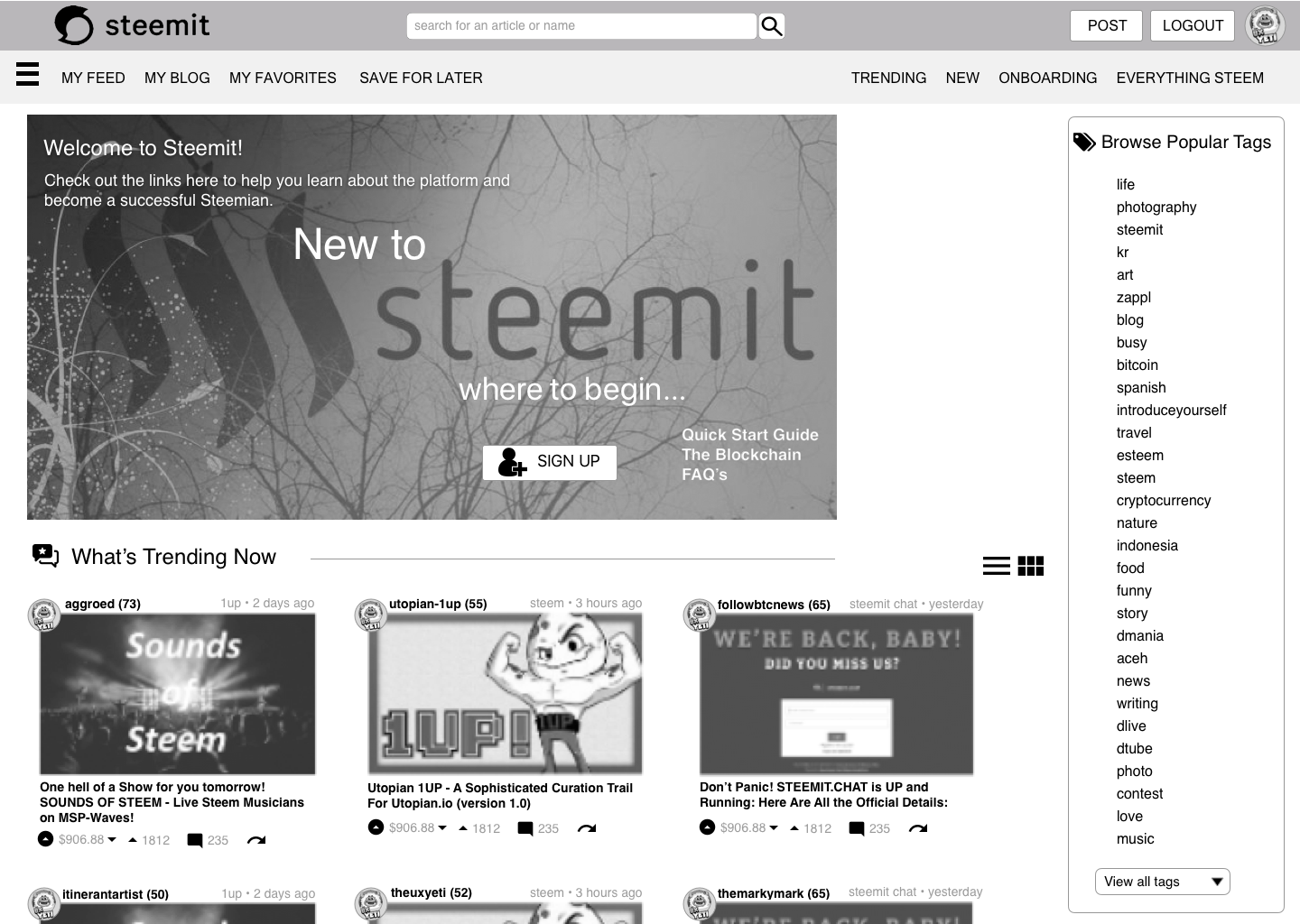
Check out the first pass at the New UI for Steemit Home Page - Grid View - New User!
Community do you resonate better with a list view or a grid view?
Persona: I am a new user accessing Steemit.com for the first time. The Default is the list view but i could easily change it to the Grid view.
New User Home Page - Wireframe Preliminary for Grid View

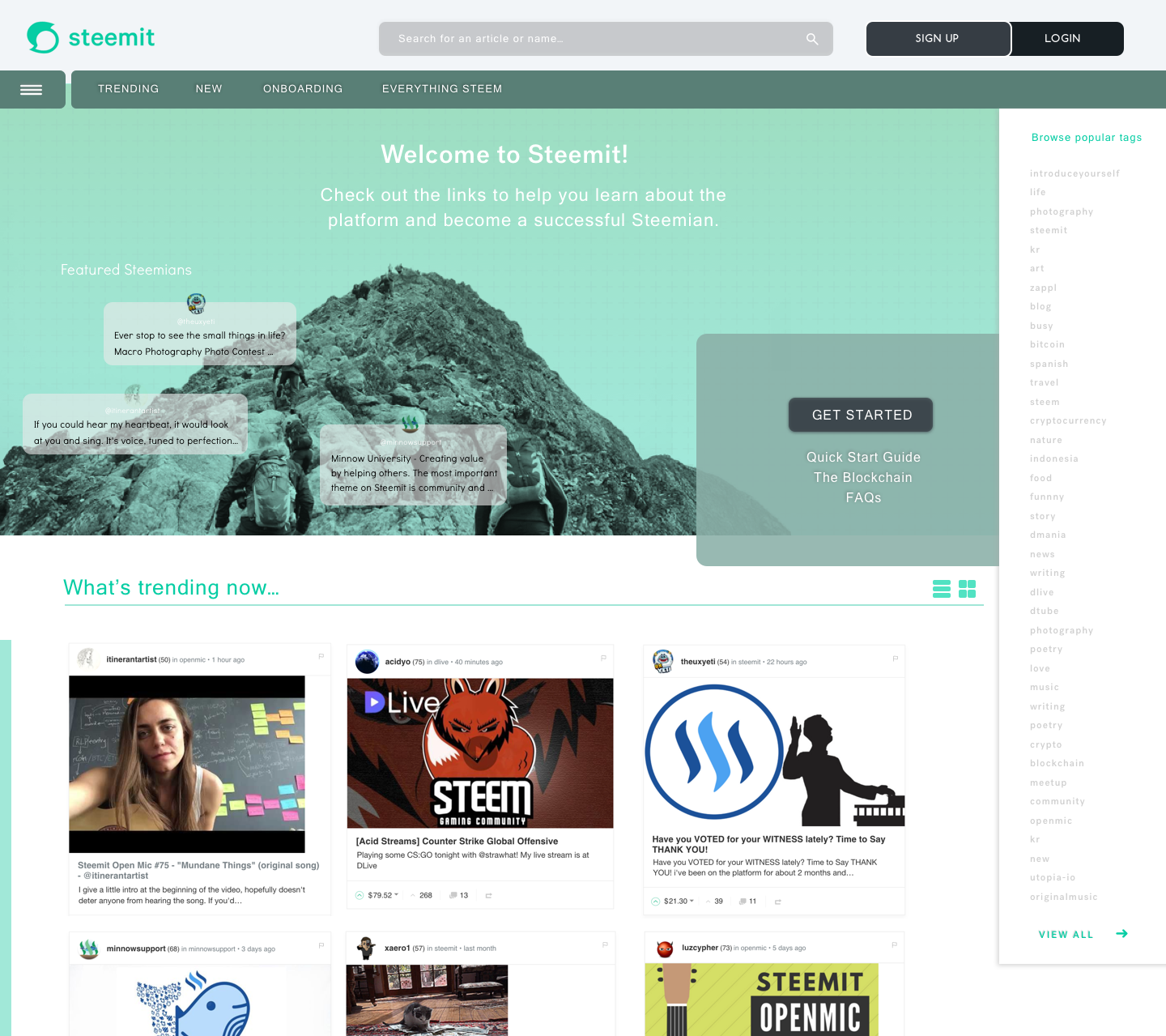
New User Home Page - UI Polished for Grid View
UX Designers Direction
- I wanted to show a toggle view between the standard default list view and what a grid view could look like. The current toggle doesn’t use the space well so I wanted to use an alternate view. People connect to images 7x faster then they do reading a line of text.
- I wanted a user to easily relate to the platform with images vs long lists of mixed content
- I wanted a user to easily understand where to start as well as explore and browse new content
- I wanted to create a form on personalization for the platform. The platform should have an easy way to resonate with new users to improve interaction and engagement.

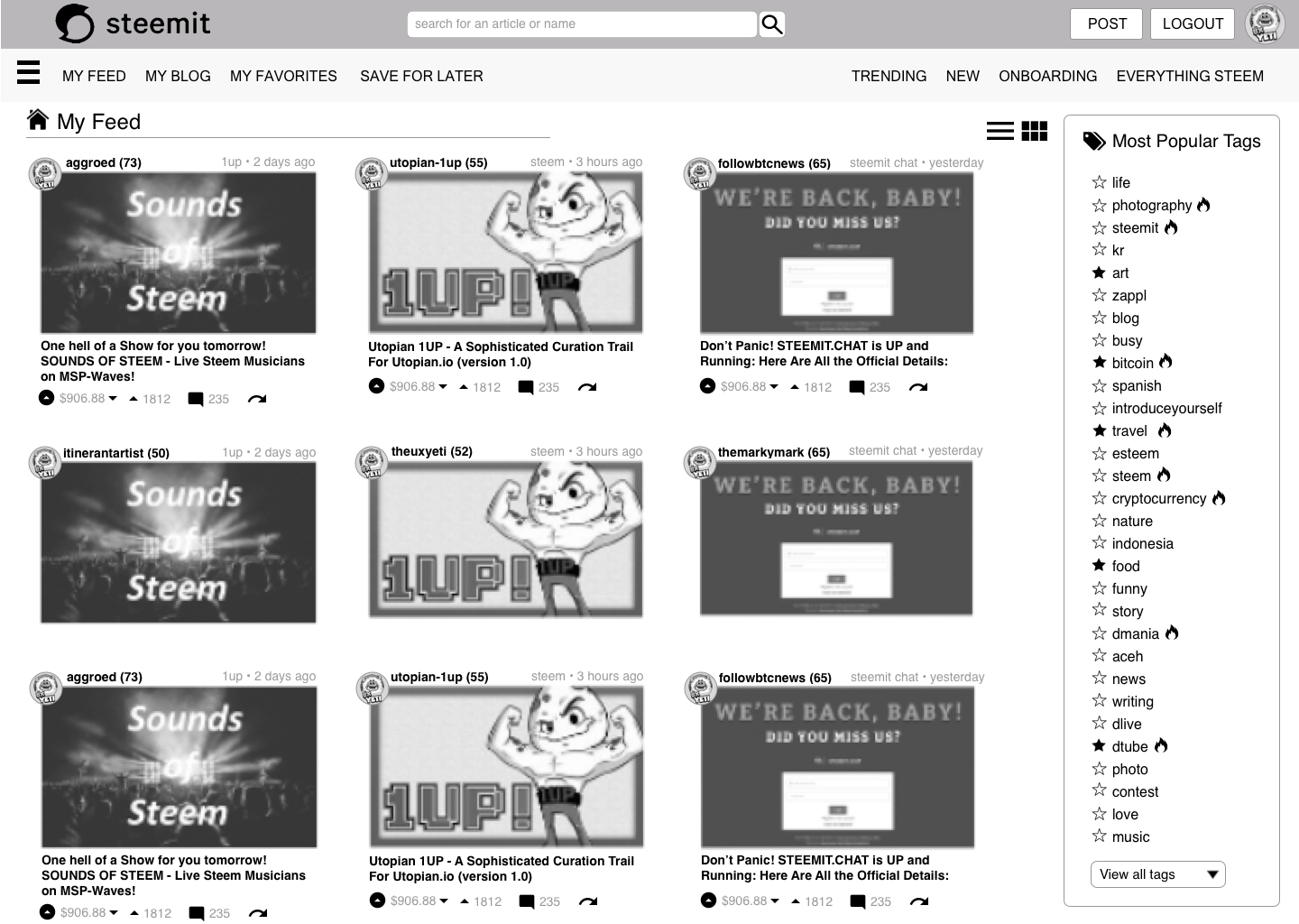
Persona: I am a returning user and see additional personalization that is catered to my interests.
Returning User Home Page - Wireframe Preliminary for Grid View

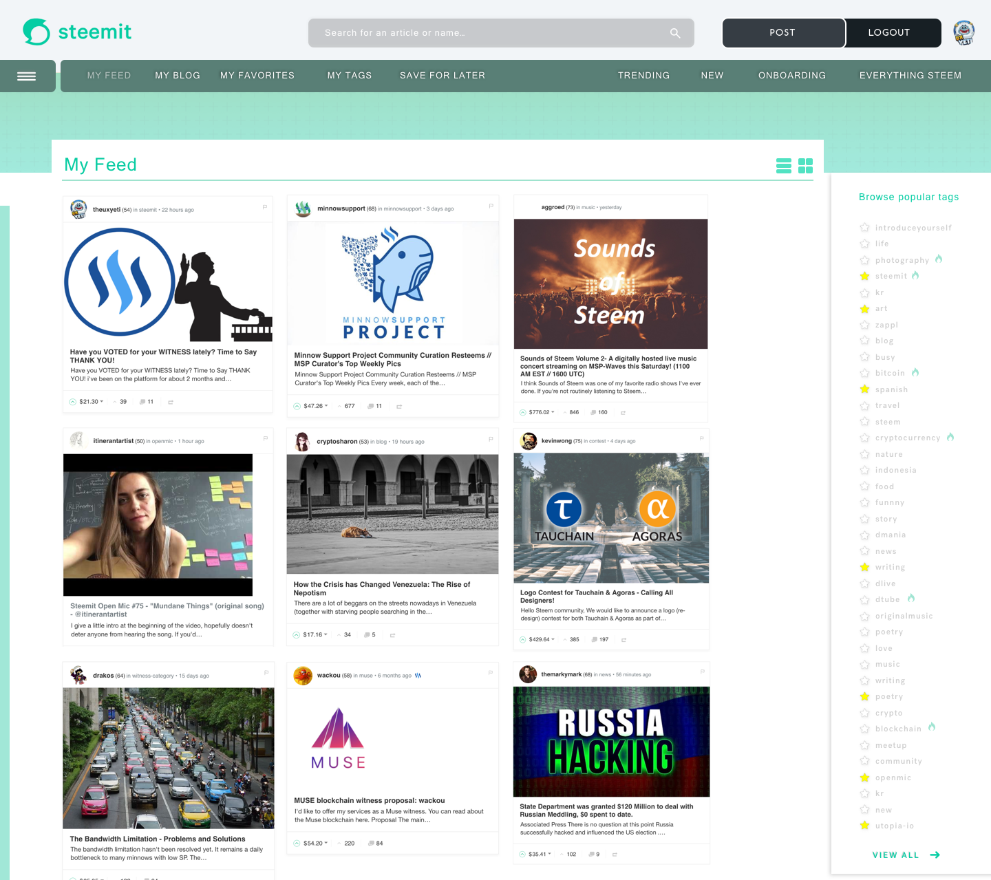
Returning User Home Page - UI Polished for Grid View
UX Designers Direction
- I wanted to create a strong personalized dashboard as the homepage curated around top navigation that is dynamic to user selection.
- I wanted to surface both “my feed” easier so I could relate to my content faster with images
- I would like for this view to stay the way it is after logout to retain as my preference.
Conclusion:
New User
I wanted to create a new user home page that would allow the user to become engaged with the platform easier. It’s been an uphill battle for me and other users trying to adopt the arcaic on-boarding UI of what exists today. Many Rage Quits, many fallouts users, many people slowly falling away from the platform so an easy way to improve user retention, and overall engagement was the goal. People resonate with Images faster then reading so perhaps this could be a better engagement to retain users to stay in the platform longer, assuming the default content in the feed is relevant and interesting.
Returning User
I wanted to create a more personalized experience for a returning user to see images instantly they can relate to. Building great websites is about a few principles up front: Relevance, Easy to Use, Simplified. By allowing an alternate view users can connect with content easier if they prefer a visual cognition.
This Home Page will be updated based on feedback from the community and additional improvements in my redesign series to come.

I will be moving onto the "My Blog” Page next. I am combining this with My Profile.
Focusing on
- How to favorite a follower
- How to view my analytics of my Voting Power, Vote Value, Rep , Band Width, Incoming Rewards
- What does my profile page look like when I'm Viewing it.
- What does my profile page look like when another user is looking at it
- Inserting Notifications and where
- Stats about other users in the content feed
- How to display content in “my blog” and how can I sort the content as a logged in user.
Additional Pages in the Works!
- Content Layout - Adding analytics based on votes $ / voter, save for later, favorite the author,
- My Wallet - Complete redesign of this
- My Profile - What does it look like when i See it?
- My Profile - When a user looks at my profile what do they see?

Design Series
If you’d like to review the Redesign Series and see how I came to this solution in our series here are the other redesign posts.
Part 6 of this Redesign Series
Part 5 of this Redesign Series
Part 4 of this Redesign Series
Part 3 of this Redesign Series
Part 2 of this Redesign Series
Part 1 of this Redesign Series

THANK YOU

First off a BIG THANK YOU to my newest discovery for Design Talent and my sole helper in the Visual Design @itinerantartist.
- We are VERY aligned with creative and what a great discovery on the Steemit Platform for me to have found her. Solid design work, speed, direction and very sweet. We will be doing all of these installations together.
Thank You Steemians! Look at all the Supporters!
It’s you that use the UI and you are the voice that allows me to help shape this community.
Thank you for your votes, your constructive comments, and your resteems. your voice is being heard, scribed and translated into features for UI.
@aggroed, @themarkymark, @velimir, @fredrikaa, @fulltimegeek, @brandonp, @geofftk, @fourfourfun, @dlew, @venalbe, @grizgal, @shawnvanderveer, @dedicatedguy, @datascience, @mitneb, @edicted, @jlordc, @arcange, @spiritualmax, @makerhacks, @isnochys, @dlew, @mikesthoughts, @rock220, @daan, @davidshaw, @rawdawg, @yogajill, @mcblessing1, @patrice, @princessmewmew, @kerlund74, @yabapmatt, @ma1neevent, @poeticsnake @shadowspub, @folken, @whatsup, @kubbyelizabeth, @freedomexists, @bbrewer, @kurtgrey, @swolesome, @flemmy, @reewy, @leonard17, @syednur47, @amisteem, @memocorredor, @outtheshellvlog, @moreseke1, @travissilvers699, @artizm, @mafi001, @queenbee12, @blusky, @jerrybanfield, @gomovies, @theversatileguy, @theb0red1, @thecryptogold, @strangevision, @atmosblack, @drmake, @tattoodjay, @futurethinker, @rondak, @ashleykalila, @jpederson96, @therealwolf, @thebugiq, @minatubo, @el-cr, @thewayiseeit, @princessdharmy, @crystalpacheco30, @aleksandar.vasic, @gcamkerten, @cryptical, @itinerantartist, @libertyranger, @mikesthoughts, @dedicatedguy, @theversatileguy, @austinhopper, @masscollective, @multi4g, @giddyupngo, @pittsburghhodlr, @charitybot, @pathtosuccess, @minnowsupport, @socky, @thehoneys, @yogajill, @zahril, @funbobby51, @cryptosharon, @maverickinvictus, @polebird, @minnowsupport, @travelersmemoire, @thatsweeneyguy, @icedrum, @tts, @mominsdt, @alltech1, @thatkidsblack, @muqarrabshah, @danielsaori, @nicnas, @shares, @k9disc, @artgirl, @acidyo, @wackou, @ausbitbank, @xaero1, @wesleybos, @lrock, @playitforward, @mod-tamichh, @noboxes, @discordia, @kodaxx, @dbzfan4awhile, @teamhumble, @hottopic, @kimzilla, @whatsup, @scorer, @overkillcoin, @yairdd, @dshelton32, @revisesociology, @lenatramper, @glenalbrethsen, @coffeex, @fourfourfun, @msp-lovebot, @travelersmemoire, @mitneb, @friendsofgondor, @interfecto, @sexdeathrebirth, @ms10398, @robertvogt, @drakos, @ryacha21, @mackcom, @triverse, @oliviadejeu, @baby07, @thealliance, @jdevora, @saffisara, @fishyculture, @fabiyamada, @indian-mom, @jamesgetsit, @ipromote, @carface, @slickwilly, @edwardlewis, @geofftk, @etcmike, @austinhopper, @karencarrens, @titusfrost, @dolladu, @doggedfi, @steempowerpics, @akrid, @ericwilson, @jschindler, @bandm2016, @creon, @macmaniac77, @cgbartow, @fow, @saadiallan, @c0ff33a, @shuta, @guchtere, @thehoneys, @masscollective, @alexis555, @bue, @techslut, @protegeaa, @fminerten, @steempty, @stephen.king989, @spydo, @personz, @cron, @timwu, @inventor16, @jlordc, @oleksandr, @theb0red1, @inus12345, @v4vapid, @totolina, @appreciator, @smartsteem, @abh12345, @inquiringtimes, @wesleybos, @leeuw, @geofftk, @protegeaa, @moreseke1, @cryptocat, @mes, @edb1984, @remcovdpluijm, @drpuffnstuff, @celsius100, @eirik, @atmosblack, @pwrup, @seveaux, @thecryptogold, @stsl, @mstafford, @evecab, @sutekh, @kevbot, @hitmeasap, @arobquinn, @larus, @yekrats, @zipporah, @jlordc, @iansart, @ponoj, @samysamy, @beccadeals, @roguelike, @stopfox, @memebot, @alnedkov, @movievigilante, @trkaplan, @thebugiq, @jmvs, @t2tang, @ahmadrabdi, @benmaurice, @eeks, @wesleybos, @clayford08, @etcmike, @r0nd0n, @mattclarke, @datascience, @steematis, @arcange, @rawdawg, @katrina-ariel, @minnowuniversity, @stormriderstudio, @planet-power, @raphaelle, @jacobts, @fukumineko, @netuoso, @brandonp, @fminerten, @shadowspuub, @ammonite, @kriptonoob, @jamesbarraclough, @venalbe, @nataliejohnson, @ghasemkiani, @antimedia, @pjau, @cryptotem, @arobquinn, @allfothegood, @dogeking, @antoniokt, @practicallyapro, @mulletwang,
Your comments, criticism, pain points, and praise help drive successful change.
Thank you. Don’t forget to leave your comments below, and upvote if you liked the design work and the direction.
To the corporate steemit team @ned @pkattera @andrarchy @sneak please review my design series of exploratory UX research, testing, community engagement and revisions.
If you liked what you read, Please don't forget to Upvote, Resteem, and follow me. There's much more great design work to come. Everything helps allowing me to expand my posts to reach the community!


@theUXyeti - Geek of all Trades, Master of Many! Had over 200 clients building UI for websites, mobile apps, mobile games, console games, VR/AR games, wearables, Appliance UI, Aerospace and Military UI. For lifetime fun I’ve been an Ex reality tv guy, competitive card player both pretor MTG and WSOP, scuba instructor, dart thrower, hearthstone mechanic exploiter, sports handicapper, movie metaphor gif commentor and all around humorous and fast wit jackass.
How to find me
Steemit: www.steemit.com/@theUXyeti
Discord: TheUXyeti or TheUXyeti#5698
Dtube Channel:
The grid frame is a great idea! Keep up your good design idea's ;).
Can you also implement tech in the website? If so maybe it is a idea to get an option like;
Toggle draft saving on/off.
Mobile version of steemit is really slow because of the continous draft saving. Which i personally don't even use.
Downvoting a post can decrease pending rewards and make it less visible. Common reasons:
Submit
hah thats a great dev ops thing to surface. I like that feature. for my first build thats a nice to have but not a necessity for me as of now but ive got that marked for improvements to user behavior. There are SO many issues with the UI so its so hard to pick which battles to fight but ive got that on there. :) thanks
Downvoting a post can decrease pending rewards and make it less visible. Common reasons:
Submit
Your dashboard looks so neat! Bdw I am not an expert about making web design or a like. As a new user of this platform I admit its kinda confusing. For sure more people would love to join the community since your suggested design looks more user friendly. Thank you for your unending hardwork. Keep it up @theuxyeti . Oh and bdw you do a lot of things in life you are amazing !
Downvoting a post can decrease pending rewards and make it less visible. Common reasons:
Submit
Thank you for the kind words. I am just doing whatever i can to help the community
Downvoting a post can decrease pending rewards and make it less visible. Common reasons:
Submit
It's exeptional. Hope they will see how good you are.
Downvoting a post can decrease pending rewards and make it less visible. Common reasons:
Submit
looking good!! a shoutout to so many who supported, upvoted, resteemed and overall just contributed to the beautiful community in ways that inspired us. You are immortalized in our designs forever! :
@luzcypher @themarkymark @cryptosharon @openmic @minnowsupport @aggroed @kevinwong @wackou @drakos @xaero1 @acidyo
thank you all for the incredible support!
Downvoting a post can decrease pending rewards and make it less visible. Common reasons:
Submit
Hah thanks bff!!! Sorry so many names I’ll add the ones in there i missed!
Downvoting a post can decrease pending rewards and make it less visible. Common reasons:
Submit
no worries:) i think its nice to do a personal shoutout to the ones we feature in the designs anyway :)
Downvoting a post can decrease pending rewards and make it less visible. Common reasons:
Submit
Some excellent improvements to the page design of Steemit, I'd still like a little more robustness built into the back end before anything else so we can continue to upvote and comment on posts without hinderance. I have long thought the Promoted tab is a bit pointless - they could certainly loose that and replace it with something more useful - would be great to see a Charity feed instead just showing pages dedicated to posts supporting or doing charitable work - just as long as they found a way for the posts to be added by respected community members to ensure it was not abused and spammed. Love your designs though, funky and fresh.
#thealliance
Downvoting a post can decrease pending rewards and make it less visible. Common reasons:
Submit
yes so if there were a charity tab etc it could be buried inside a top level navigation tab, but you said it the issue would be would the content be aggregated or curated? Perhaps you could have a tab that would be curated monthly for charity type posts. Great idea, ill jot it down for a future build coming.
the hardest thing with users is trying to figure out whats easiest for sorting / filtering and how easy is it to do vs how smart is it doing it lol. thanks for the comments, great ideas.
Downvoting a post can decrease pending rewards and make it less visible. Common reasons:
Submit
Looking forward to how you redesign the wallets and the analytics page as well! 👊🏾 You’re an impressive dude taking this upon yourself.
Downvoting a post can decrease pending rewards and make it less visible. Common reasons:
Submit
Thank you! Wallet page is definitely on the list
Downvoting a post can decrease pending rewards and make it less visible. Common reasons:
Submit
Looks pretty amazing, man. I like the images; they actually work.
I got horizontal lines right now in my feed and blog. I don't like top to bottom. I'm a landscape guy. It would be great if the sorting filled all horizontal width available with more columns.
I'd love to have about 5 wide on a big screen. Lemme see the BIG picture!
Good luck on it getting picked up.
Downvoting a post can decrease pending rewards and make it less visible. Common reasons:
Submit
Hah... with the lack of steemit response im building it on my own with a small dev team so no luck needed. I will start the first wave of development on this UI in 2 weeks once im not sick anymore from the flu so stay tuned. As for the width concern, agreed, thats a great way to view content, similar to a set-top-box on a tv looking at content for tv/video
Downvoting a post can decrease pending rewards and make it less visible. Common reasons:
Submit
Hey man, these kids running this business have to be shitting their pants right now. Can you imagine the pressure? The responsibilities are piling up and the money is adding zeroes. SMTs could be insane money/disruption.
I'll be watching your work man. Keep it coming. I've got some ideas on teaching, learning, and classes that I'm going to be attending to. You can find me in the dogs department. :-)
Peace~
Downvoting a post can decrease pending rewards and make it less visible. Common reasons:
Submit
true. i dont know if SMT's are the right avenue without securing a solid user base first and onboarding properly but what do i know lol
Downvoting a post can decrease pending rewards and make it less visible. Common reasons:
Submit
I hear you. SMTs are off platform though. I'd bet they're focused on a few big media entities on the tokenization and monetization workflow.
They should jump all over your project. It looks good, doesn't seem too crazy from what's already here. Should be rather easy to skin and add a few display and collation wrinkles.
And I don't know much. :D
Downvoting a post can decrease pending rewards and make it less visible. Common reasons:
Submit
@theuxyeti really thanks you very much just wondering if we can do that. really appreciate it you know you are always the best .
Downvoting a post can decrease pending rewards and make it less visible. Common reasons:
Submit
thanks I can always count on great support from you my friend. thanks :)
Downvoting a post can decrease pending rewards and make it less visible. Common reasons:
Submit
told you from the start following you like a hitman. 😁
Downvoting a post can decrease pending rewards and make it less visible. Common reasons:
Submit
your improvements <3 I love new card view you add.
Downvoting a post can decrease pending rewards and make it less visible. Common reasons:
Submit
Ty
Downvoting a post can decrease pending rewards and make it less visible. Common reasons:
Submit
Your thank you list will soon contain all active steem users.. :))
It is already.. Really really really really really long:)
Downvoting a post can decrease pending rewards and make it less visible. Common reasons:
Submit
Haha... funny thing is as more and more steemians upvote and comment, the more that tells me how difficult the UI currently is and also gives me enough initiative to push forward and build my own UI since im already rebuilding the front-end in these series. I have decided to build the UI with some devs and see what we can do. The people have spoken and its time for me to see if I can build it.
Downvoting a post can decrease pending rewards and make it less visible. Common reasons:
Submit
I would love to see that as a beta sometime :)
Just to play around.
Keep up the good work!
Downvoting a post can decrease pending rewards and make it less visible. Common reasons:
Submit
i will make every attempt to get mine built. i think it would be a hit for sure. thanks for the continued support
Downvoting a post can decrease pending rewards and make it less visible. Common reasons:
Submit
Nice post
Thanks for post
Keep posting
Downvoting a post can decrease pending rewards and make it less visible. Common reasons:
Submit
hey thanks to you as well for the comment. definitely grateful for you taking the time to respond. thanks
Downvoting a post can decrease pending rewards and make it less visible. Common reasons:
Submit
Hello @theuxyeti
I would so much love the home page to look this way.
Right from time I've always been a big fan of "Grid view".
It makes everything easier from navigating the site to improving the overall engagement.
I don't know if you have talked about this before, But there's one option i would like to see: The names of people who view your post.
What do you think?
Downvoting a post can decrease pending rewards and make it less visible. Common reasons:
Submit
Hmm. That’s possible. Though i think they don’t do that bc you can see voters and that’s good enough
Downvoting a post can decrease pending rewards and make it less visible. Common reasons:
Submit
This looks very awesome! I wish it was implemented soon, but maybe it would be easier to find someone to fork the site. The grid view is NECESSARY!
Downvoting a post can decrease pending rewards and make it less visible. Common reasons:
Submit
dont really understand what that means, but i do have access to the github code and will build out my version soon
Downvoting a post can decrease pending rewards and make it less visible. Common reasons:
Submit
It's great to see you having a crack at getting this site looking better.
I won't get into what you are designing, I'll just let you know what I want myself:
I like line view and hate grid view.
I use Steemit More Info addon on Firefox to get a bunch of features that need to be here in the first place.
My main frustration is not being able to quickly jump to replies to answer them and having to scroll down 100 comments looking for the one in a green box
I want a good bookmarking system Like I have on Opera. BUT I have to use bloody Firefox just for Steemit to get More Info.
And Formatting my posts - I want what I have on Wordpress, and not having to bugger about in HTML. I want Bold, Italic, Heading 1 and 2, link, and center image. That's all.
Downvoting a post can decrease pending rewards and make it less visible. Common reasons:
Submit
hah very understandable requests. how to adapt to steemit is the question. I agree the Steem More info is a great plugin and i like that. as for grid view vs list view itd just be a toggle so thats no big deal, scrolling to comments i can agree it becomes a bit laborious but its not that bad, but agreed it could be worked on. Ive honestly been using "evernote" to copy an article template into and reuse that to write the base post then dump into steemit and refine. its really fast for me. great comments thanks
Downvoting a post can decrease pending rewards and make it less visible. Common reasons:
Submit
This is face of beauty, I hope you get it up and running...am already trying it out.
Downvoting a post can decrease pending rewards and make it less visible. Common reasons:
Submit
hey thanks for the support and positivity. pretty excited to get things rolling as well. ill keep you updated.
Downvoting a post can decrease pending rewards and make it less visible. Common reasons:
Submit
I love how you present these. I hope that somebody is listening to you on your awesome redesigns.
Downvoting a post can decrease pending rewards and make it less visible. Common reasons:
Submit
I have to admit, I am not a huge fan of the mass tagging, but very impressive work nonetheless. Keep it up. Reluctant follow because your content is pretty good :)
Downvoting a post can decrease pending rewards and make it less visible. Common reasons:
Submit