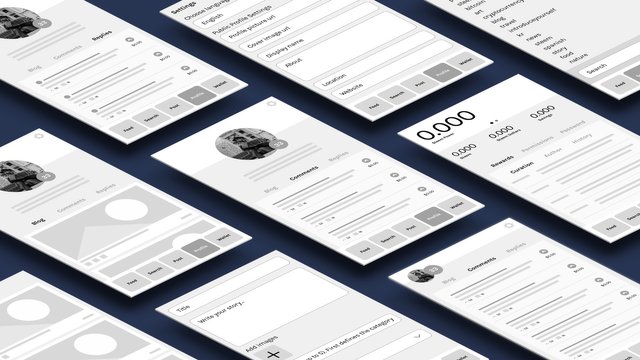
Having been on Steemit for just over a month, there are things I am really growing to love, namely the community, but also how the members contribute to the progression of the platform as a whole.
There are some amazing projects built on the Steem blockchain, including great examples such as eSteem and Busy.org, however, the beauty of the platform is that anyone can use it to create their own vision of a more suitable UX for a specific purpose.
That said, I felt I wanted to contribute by creating designs that offer a different user experience in the hope that maybe a developer would want to get involved and help realise this project in the future.
Let’s get started.
Navigation
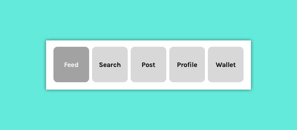
Starting with the navigation you will see the app adopts a tabbed approach. I felt this was more straightforward than the material design slide out drawer that, although holds more options when activated, can hide the most important functions behind extra touch input. With this style every major function is available within a single tap.
Feed
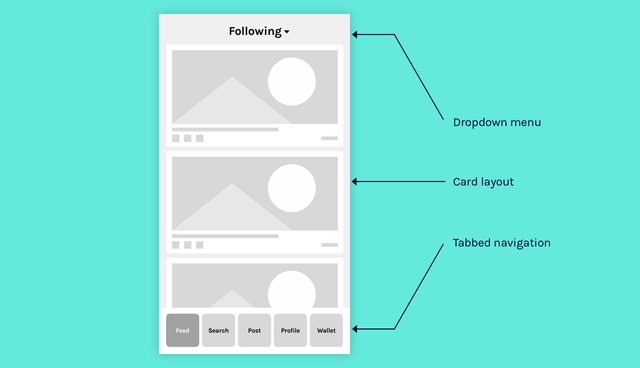
The first navigation option shows the feed and uses cards to display a rich level of detail and large image areas for each post. The dropdown menu at the top will also allow for a quick switch between your personal feed, trending, hot, and new.
Search
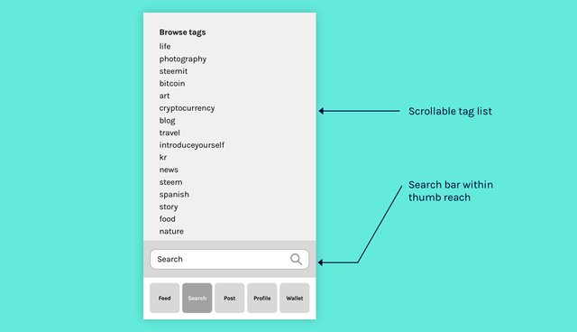
The next along the navigation area is search. This has a list of tags that are easily accessible together with a search bar for custom queries. One of my pet hates is having a search bar that needs selecting to activate, but is pushed all the way to the top of the view and out of reach of an immediate follow-up selection. With this design I would look to place the search bar within thumb reach after activation so when the keyboard transitions in the view, the search can still be accessed by a single hand.
Post
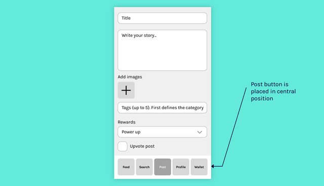
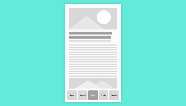
Having the ‘Post’ option in the central position places emphasis on content creation. Steemit gains its value from its creators so it makes sense to have this feature easily accessible and in the most prominent placement.
Profile
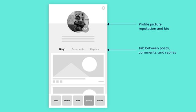
The profile page uses the same card layout as the feed but with the profile picture, reputation score, and biography available at the top. There is also a settings icon top-right that allows access to particular options that are not needed on a regular basis.
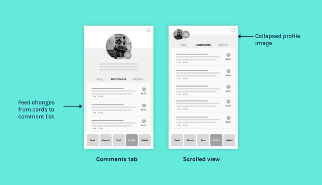
A tab area allows the user to switch their feed between posts, comments and replies. There is one feature I’m keen to include and that’s a scrolling behaviour that shrinks the profile image and reputation score to allow more room for the posts.
Wallet
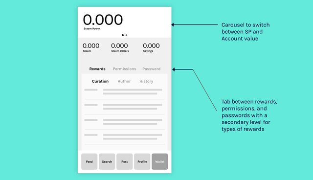
Finally, the wallet view. This uses similar behaviour outlined in other views such as sub-tabbed areas, but there’s also a second tabbing option for switching between lists such as curation rewards, author rewards and history.
With the ‘balances’ area, all totals are displayed together with a carousel that allows the user to switch between ‘Steem Power’ and ‘Account Value’.
Wrap Up
As these are wireframes, they don’t necessarily have a direct relationship with the final UI designs, they are merely to point out minimal functionality and hierarchy of information.
I feel these are heading in the right direction but are obviously heavily influenced by my experiences and behaviours on the Steemit platform. If you want to see a rough prototype then visit this link to see them in action.
I am totally open to features and opinions that you guys feel should be included so feel free to start a conversation in the comments, plus I need to think of a name which would be great come up with together.
Anyway, thanks for stopping by!

The files were created in Sketch and you can click here to download them.
Posted on Utopian.io - Rewarding Open Source Contributors
Hey @mattniblock I am @utopian-io. I have just upvoted you!
Achievements
Suggestions
Get Noticed!
Community-Driven Witness!
I am the first and only Steem Community-Driven Witness. Participate on Discord. Lets GROW TOGETHER!
Up-vote this comment to grow my power and help Open Source contributions like this one. Want to chat? Join me on Discord https://discord.gg/Pc8HG9x
Downvoting a post can decrease pending rewards and make it less visible. Common reasons:
Submit
Thank you for the contribution. It has been approved.
You can contact us on Discord.
[utopian-moderator]
Downvoting a post can decrease pending rewards and make it less visible. Common reasons:
Submit
Awesome, thanks so much!
Downvoting a post can decrease pending rewards and make it less visible. Common reasons:
Submit
Hi! I am a robot. I just upvoted you! Readers might be interested in similar content by the same author:
https://steemit.com/utopian-io/@mattniblock/steemit-app-design-wireframes
Downvoting a post can decrease pending rewards and make it less visible. Common reasons:
Submit