What Will I Learn?
- You will learn how to programming languages HTML, CSS, and JavaScript
- You will learn how to create top navigation responsive
- You will learn how to create top navigation content
- You will learn how to use javascript
Requirements
- You must have interest first
- You have basic about Hypertext Markup Language (HTML)
- You have basic about Cascading Style Sheets (CSS )
- You have basic about JavaScript (JS)
Difficulty
- Basic
Tool
SublimeText / Notepad++
Browser Chrome / Mozilla Firefox
Tutorial Contents
As we know on the website must have got its name Navigation is a hint of the position and direction of travel. In the web world, navigation is important to be on certain pages do not get lost and easily find other pages on your website. Therefore you can follow the tutorial with step by step:
In the first step you should create a file name with .html extension, like I make the file name is (menu.html). to make the file you can use SublimeText or Notepad ++. For this file we will later write the HTML code in this file.
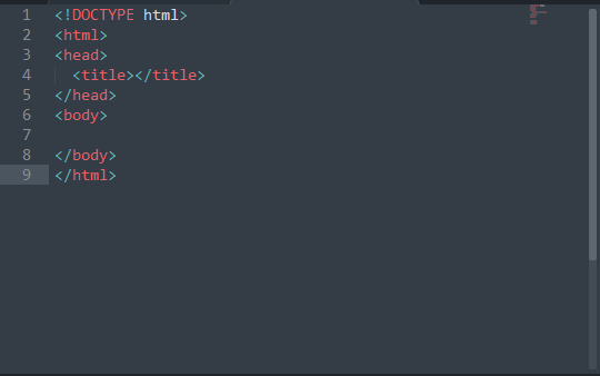
In this second step we are writing HTML HTML code in the file. Html you have created, but for those of you who are proficient not advised to follow this second step for you who just learn to create a website with HTML is suggested to follow it, the code s HTML you can see as below:
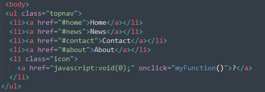
In this third step we will make the top navigation using HTML inside the tag <body> </ body> and do not forget the class name in the <ul> tag, because later we will create css using this class name, below this:
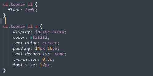
Then in the next step we will make the CSS, but this way a bit too different with other tutorials. I will here create CSS in one .html file or commonly called internal CSS, I no longer make external CSS. Actually it's the same, but the file just separated with HTML is the .css extension file, To follow the following steps you can create the css in the <head></head> above < body > and create a <style></style> to create the css code, you can see below:
Remove margins and padding from the list, and add a green background color

Float the list items side by side and Style the links inside the list items
Change background color of links on hover, Hide the list item that contains the link that should open and close the topnav on small screens , When the screen width is less than 680 pixels, hide all items of item items the first is ("Home"). Also show a list of items that contain links to open menu ie (li.icon)
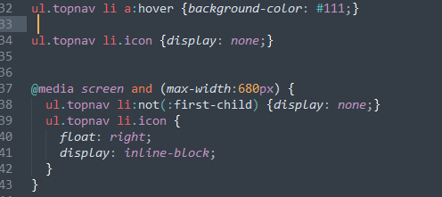
Class with name "responsive" will be added by JavaScript when user click icon. The appearance of this class will display the contents of the menu list
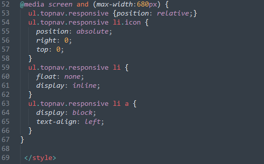
- And the last one is the javascript code, create the javascript code you can create outside the tag <body> as below:
Toggle between adding and removing the class "responsif" to topnav when the user clicks the icon
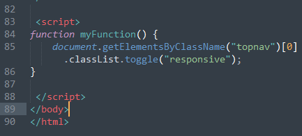
After writing all the above code, then you save and run.
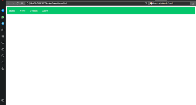
now try to reduce your browser or screen, it will be responsive as follows:
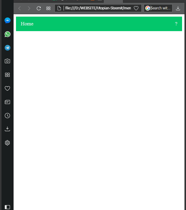
Then click on the sign (?), It will exit its navigation menu
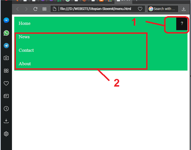
Finish , how to make the top navigation menu responsive.
Full Syntax inside Google Drive : Download Here
Thank You For Utopian Upon Arrival I Became a New Member.
Posted on Utopian.io - Rewarding Open Source Contributors
Your contribution cannot be approved because it does not follow the Utopian Rules.
You can contact us on Discord.
[utopian-moderator]
Downvoting a post can decrease pending rewards and make it less visible. Common reasons:
Submit
Hey @ewq, I just gave you a tip for your hard work on moderation. Upvote this comment to support the utopian moderators and increase your future rewards!
Downvoting a post can decrease pending rewards and make it less visible. Common reasons:
Submit
@otakngoding, Upvote for supporting you.
Downvoting a post can decrease pending rewards and make it less visible. Common reasons:
Submit