Toastr is Javascript library replacement for default javascript popup notification. This is very simple, easy-to-use and responsive. In this tutorial learn how to use toastr library .
How to Install?
We need a file project to use toastr library. first we create a html file and you can save wherever you prefer. In this case I make a file called index.html and I put on D:\Tutorial\Toastr.
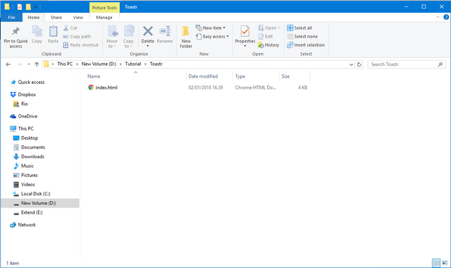
We can install Toastr with two step.
- Download Toastr library from official site Toastr
- Initialize Toastr using CDNJS
In project file index.html we need initialize the html tags. Then we need import Jquery and Toastr library from CDNJS. Here's the code of index.html.
<!DOCTYPE html>
<html>
<head>
    <title>How to use Toastr</title>
    (html comment removed:  jQuery )
    <script src="https://cdnjs.cloudflare.com/ajax/libs/jquery/3.2.1/jquery.min.js"></script>
    (html comment removed:  Toastr )
    <link rel="stylesheet" type="text/css" href="https://cdnjs.cloudflare.com/ajax/libs/toastr.js/latest/css/toastr.min.css">
    <script type="text/javascript" src="https://cdnjs.cloudflare.com/ajax/libs/toastr.js/latest/js/toastr.min.js"></script>
</head>
<body>
</body>
</html>
Toastr has been installed with the blank page. Now we need a html and css structure code to design to trigger Toastr popup notification.
Here's the design code:
<!DOCTYPE html>
<html>
<head>
    <title>How to use Toastr</title>
    (html comment removed:  jQuery )
    <script src="https://cdnjs.cloudflare.com/ajax/libs/jquery/3.2.1/jquery.min.js"></script>
    (html comment removed:  Toastr )
    <link rel="stylesheet" type="text/css" href="https://cdnjs.cloudflare.com/ajax/libs/toastr.js/latest/css/toastr.min.css">
    <script type="text/javascript" src="https://cdnjs.cloudflare.com/ajax/libs/toastr.js/latest/js/toastr.min.js"></script>
    (html comment removed:  Styles )
    <style type="text/css">
        body {background: whitesmoke;text-align: center;}
        button{background-color: darkslategrey;color: white;border: 0;font-size: 18px;font-weight: 500;border-radius: 7px;padding: 10px 10px;cursor: pointer;white-space: nowrap;}
        #success{background: green;}
        #error{background: red;}
        #warning{background: coral;}
        #info{background: cornflowerblue;}
        #question{background: grey;}
    </style>
</head>
<body>
    <div>
        <h1>How to use <b>Toastr</b></h1>
        <div>
            <h4>Popup Type</h4>
            <p>Toastr have 4 popup type and the different is icon and background</p>
            <button id="success" >Success</button>
            <button id="info" >Info</button>
            <button id="error" >Error</button>
            <button id="warning">Warning</button>
        </div>
        <br>
        <div>
            <h4>Image and Loading</h4>
            <p>Popup notification with image and progress bar</p>
            <button id="image">Image and Loading</button>
        </div>
        <br>
        <div>
            <h4>Position</h4>
            <p>There is 8 Toastr position support</p>
            <p>
            <form id="positionForm">
                <input type="radio" name="position" value="top-left" checked>Top Left
                <input type="radio" name="position" value="top-center">Top Center
                <input type="radio" name="position" value="top-right">Top Right
                <input type="radio" name="position" value="top-full-width">Top Full Width
                <input type="radio" name="position" value="bottom-left">Bottom Left
                <input type="radio" name="position" value="bottom-center">Bottom center
                <input type="radio" name="position" value="bottom-right">Bottom right
                <input type="radio" name="position" value="bottom-full-width">Bottom Full Width
            </form>
            </p>
            <button id="position">Show Toast</button>
        </div>
    </div>
</body>
</html>
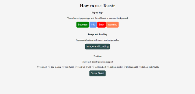
In the design actually make a few button for trigger toastr notification. 4 button for toastr popup type and 2 button for show popup notification with image and toastr position support.
Each button is assigned a different id as a trigger to call the Toastr. It's looks like:
How to Use?
Now, we can use Toastr with trigger button using jquery. first we trigger each button from popup type category. In this category just display default messages to the user. in this case the code for calling Toastr is placed inside the script tag at the bottom before closing the body tag.
The different of this popup notification just the icon and background popup notification. There are 4 default toastr notification called succes, info, warning, and error. eg:
toastr.warning('This is popup message', 'This is popup title')
Before we make a function of trigger button. we need default configuration toastr when website first load. and here's the configuration code.
<!DOCTYPE html>
<html>
<head>
    <title>How to use Toastr</title>
    (html comment removed:  jQuery )
    <script src="https://cdnjs.cloudflare.com/ajax/libs/jquery/3.2.1/jquery.min.js"></script>
    (html comment removed:  Toastr )
    <link rel="stylesheet" type="text/css" href="https://cdnjs.cloudflare.com/ajax/libs/toastr.js/latest/css/toastr.min.css">
    <script type="text/javascript" src="https://cdnjs.cloudflare.com/ajax/libs/toastr.js/latest/js/toastr.min.js"></script>
    (html comment removed:  Styles )
    <style type="text/css">
        body {background: whitesmoke;text-align: center;}
        button{background-color: darkslategrey;color: white;border: 0;font-size: 18px;font-weight: 500;border-radius: 7px;padding: 10px 10px;cursor: pointer;white-space: nowrap;}
        #success{background: green;}
        #error{background: red;}
        #warning{background: coral;}
        #info{background: cornflowerblue;}
        #question{background: grey;}
    </style>
</head>
<body>
    <div>
        <h1>How to use <b>Toastr</b></h1>
        <div>
            <h4>Popup Type</h4>
            <p>Toastr have 4 popup type and the different is icon and background</p>
            <button id="success" >Success</button>
            <button id="info" >Info</button>
            <button id="error" >Error</button>
            <button id="warning">Warning</button>
        </div>
        <br>
        <div>
            <h4>Image and Loading</h4>
            <p>Popup notification with image and progress bar</p>
            <button id="image">Image and Loading</button>
        </div>
        <br>
        <div>
            <h4>Position</h4>
            <p>There is 8 Toastr position support</p>
            <p>
            <form id="positionForm">
                <input type="radio" name="position" value="top-left" checked>Top Left
                <input type="radio" name="position" value="top-center">Top Center
                <input type="radio" name="position" value="top-right">Top Right
                <input type="radio" name="position" value="top-full-width">Top Full Width
                <input type="radio" name="position" value="bottom-left">Bottom Left
                <input type="radio" name="position" value="bottom-center">Bottom center
                <input type="radio" name="position" value="bottom-right">Bottom right
                <input type="radio" name="position" value="bottom-full-width">Bottom Full Width
            </form>
            </p>
            <button id="position">Show Toast</button>
        </div>
    </div>
    <script type="text/javascript">
    // Default Configuration
        $(document).ready(function() {
            toastr.options = {
                'closeButton': true,
                'debug': false,
                'newestOnTop': false,
                'progressBar': false,
                'positionClass': 'toast-top-right',
                'preventDuplicates': false,
                'showDuration': '1000',
                'hideDuration': '1000',
                'timeOut': '5000',
                'extendedTimeOut': '1000',
                'showEasing': 'swing',
                'hideEasing': 'linear',
                'showMethod': 'fadeIn',
                'hideMethod': 'fadeOut',
            }
        });
</script>
</body>
</html>
That's configuration is configuration about duration, show and hide toastr popup notification. we can setting to show or hide close button and duplicate prevent popup notification. Then we can start function code inside after toastr option code to show the Toastr on the website And we start from 4 Popup type button. Here is the code
        $('#success').click(function(event) {
            toastr.success('You clicked Success toast');
        });
        $('#info').click(function(event) {
            toastr.info('You clicked Info toast')
        });
        $('#error').click(function(event) {
            toastr.error('You clicked Error Toast')
        });
        $('#warning').click(function(event) {
            toastr.warning('You clicked Warning Toast')
        });
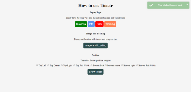
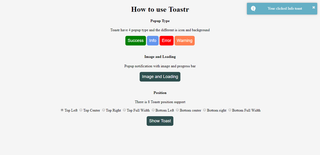
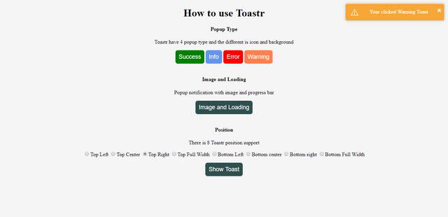
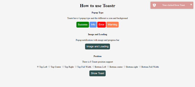
That's code define to show toastr notification with 4 category and toast message inside the quote. success mean success notification and the background of notification is green color. for info background color is blue, error is red and warning is orange. Its looks like:
Then we add some code for trigger Toastr with image inside popup notification. Here's the code:
        $('#image').click(function(event) {
            toastr.options.progressBar = true,
            toastr.info('<img src="https://image.flaticon.com/icons/svg/34/34579.svg" style="width:150px;">', 'Toast Image')
        });
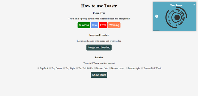
toastr.options.progressBar = true it's defined to show progress bar popup notification.
toastr.info() is defined info popup notification and the first parameter inside quote define the image source with html tag, and the second quote its define the title of popup notification
It's looks like:
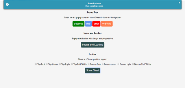
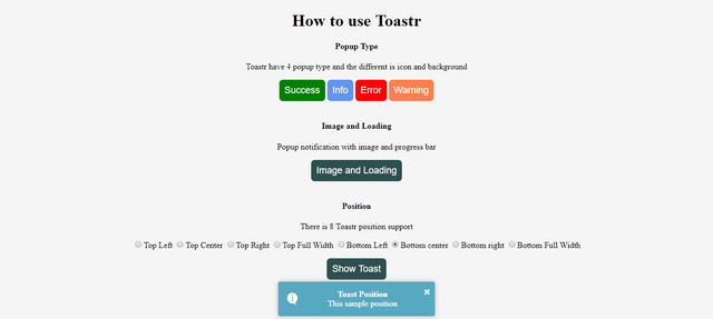
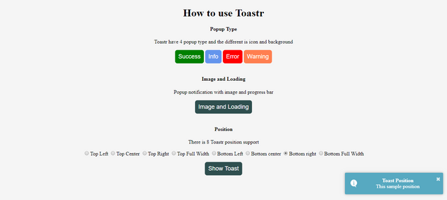
Finally, we insert the code to configuration of toastr position. any 8 position to setting the toastr.
Here's the code:
        $('#position').click(function(event) {
            var pos = $('input[name=position]:checked', '#positionForm').val();
            toastr.options.positionClass = "toast-" + pos;
            toastr.options.preventDuplicates = false;
            toastr.info('This sample position', 'Toast Position')
        });
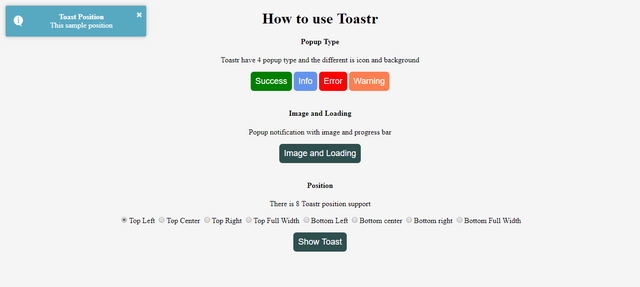
var pos = $('input[name=position]:checked', '#positionForm').val(); get a variabel with value from input type and then insert variabel on toastr.options.positionClass. Its automatically define position popup. and then define code of toastr message toastr.info('This sample position', 'Toast Position'). Here is some screen shot of toastr position support.
Conclusion
Goal of this tutorial can help you to use Toastr popup notification and you can implement to your project. for more option settings of Toastr you can check official website Here.
To demo of this tutorial you can check Here
Regards
@riyo.s94
Posted on Utopian.io - Rewarding Open Source Contributors
Nice post! Follow you!
Downvoting a post can decrease pending rewards and make it less visible. Common reasons:
Submit
Thank you. I just follow back
Downvoting a post can decrease pending rewards and make it less visible. Common reasons:
Submit
Congratulations @riyo.s94! You have completed some achievement on Steemit and have been rewarded with new badge(s) :
Click on any badge to view your own Board of Honor on SteemitBoard.
For more information about SteemitBoard, click here
If you no longer want to receive notifications, reply to this comment with the word
STOPDownvoting a post can decrease pending rewards and make it less visible. Common reasons:
Submit
Thank you for the contribution. It has been approved.
You can contact us on Discord.
[utopian-moderator]
Downvoting a post can decrease pending rewards and make it less visible. Common reasons:
Submit
Hey @riyo.s94 I am @utopian-io. I have just upvoted you!
Achievements
Suggestions
Get Noticed!
Community-Driven Witness!
I am the first and only Steem Community-Driven Witness. Participate on Discord. Lets GROW TOGETHER!
Up-vote this comment to grow my power and help Open Source contributions like this one. Want to chat? Join me on Discord https://discord.gg/Pc8HG9x
Downvoting a post can decrease pending rewards and make it less visible. Common reasons:
Submit