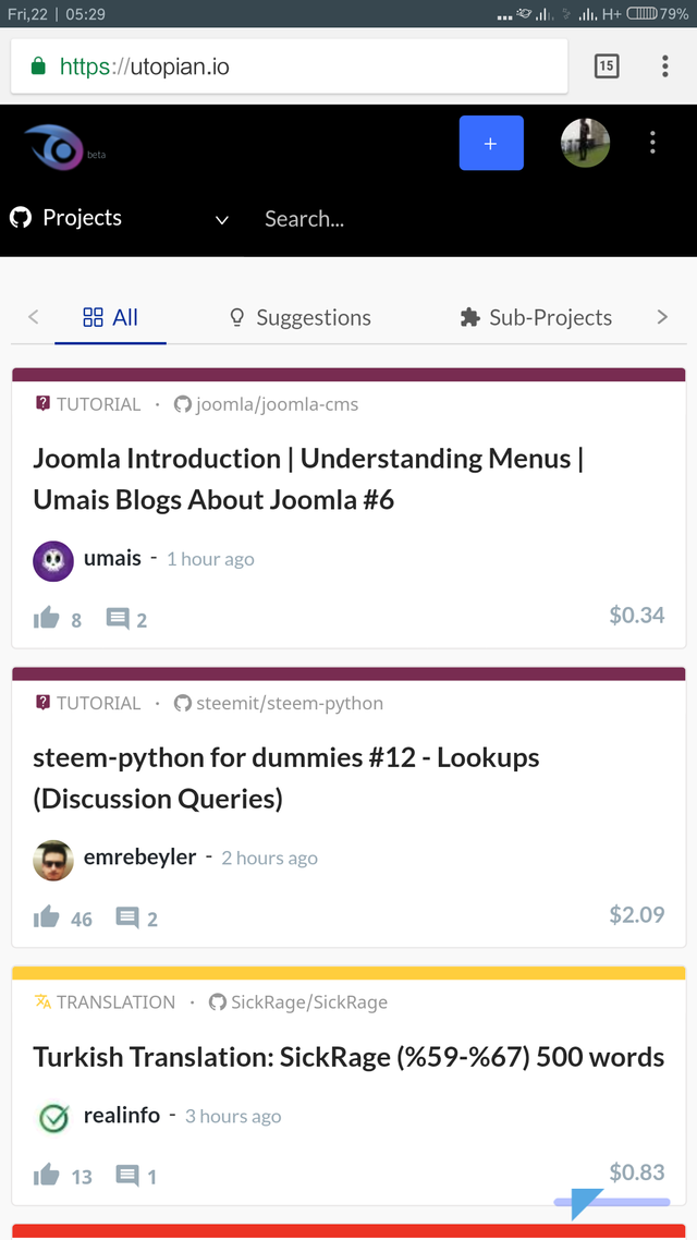
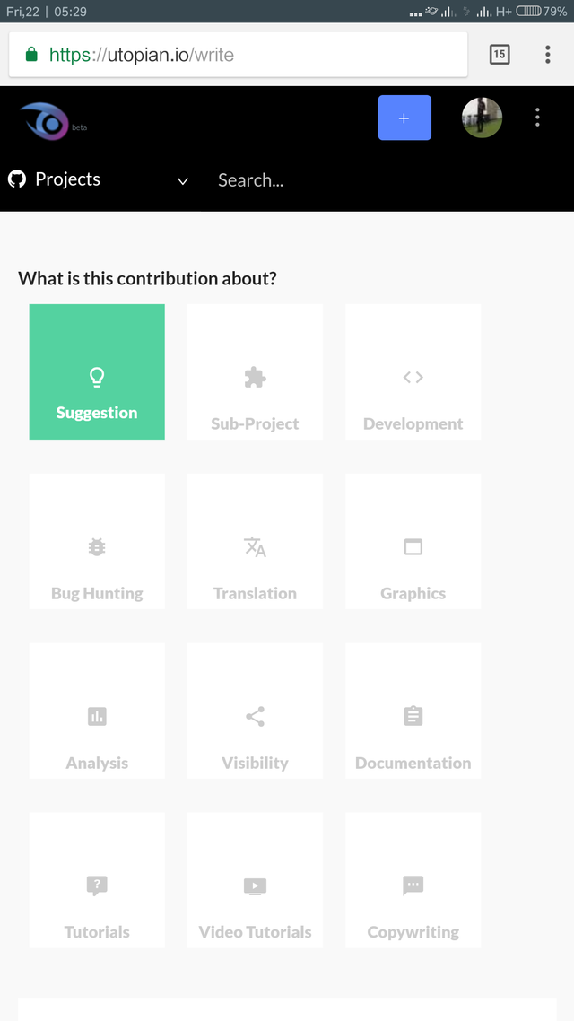
Am writing this suggestion based on on some stuffs am noticing on the mobile display of the platform which I don't think will make mobile users easily acquaint themselves with the platform.
I just found out that the "+ Contribution" button doesn't show the "Contribution" on mobile devices ever tho the button doesn't click too(which I already suggested but sadly someone beats me to it, lol).


As can be seen in the above images, the "Contribution" is clearly seen on PC and also in the downward side at the bottom right of the screen, the "chat" part can be clearly seen too(on PC top) but on mobile, that ain't the case as can be seen in the below images:


As can be easily noticed, both the "Contribution" and "Chat" can't be seen on mobile devices and it would be really nice if that is looked into because I have tested it on multiple devices and browsers and it's same thing.
Thanks for reading and I hope this suggestion is okay.
Posted on Utopian.io - Rewarding Open Source Contributors
Hello @theoutspokenking, your contribution can not be approved.
The
"contribution"is showing properly with the"+"sign at the top left. Also, the chat app was deliberately removed from that page as it disturbs users to in clicking the #submit button.[utopian-moderator]
Downvoting a post can decrease pending rewards and make it less visible. Common reasons:
Submit
Well, I didn't know that the "chat" was deliberately removed and it's nice to know. And regarding the contribution showing, it doesn't. It only shows the "+" sign and it's all good too. Thanks!
Downvoting a post can decrease pending rewards and make it less visible. Common reasons:
Submit