
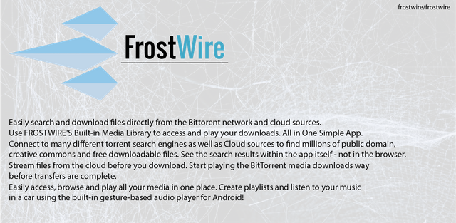
About FrostWire
Easily search and download files directly from the Bittorent network and cloud sources. Use FROSTWIRE'S Built-in Media Library to access and play your downloads. All in One Simple App.
Benefits / Improvement
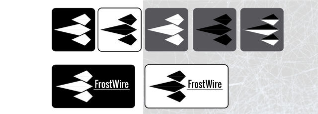
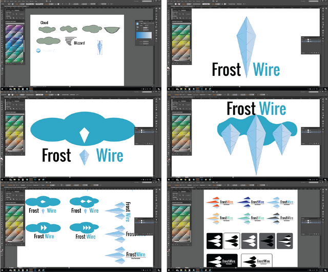
The current logo/icon of FrostWire looks fine but its doesn’t feel right. My proposed logo/icon first idea CloudPlayer. Begin with cloud and for play button I did Ice dams. It turns into this at last. At last It appears like play button wit ice dams. You can see downward comparison of current and my proposed logo.
Comparison of New and Current

The new logo/icon was made with Adobe Illustrator. As you can see, the new logo/icon create with three Ice dam. I tried different variations you can see them as well. Bellow are some proofs of my work and some implemenations of the logo/icon.
Different Colour Comb.
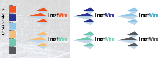
One Colour Comb.
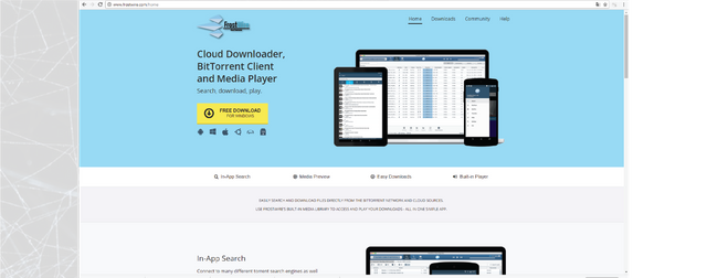
On Site
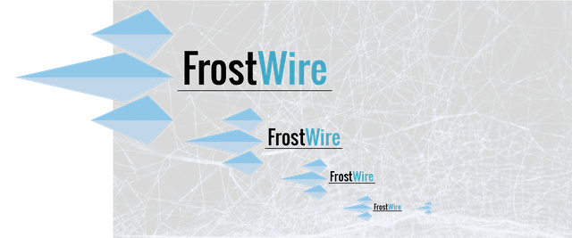
Different Size of logo / icon
Design Process / Proof of Work
Download editable vector files
FrostWire Page
FrostWire Source Code: Github
Background images sources: 1, 2
Posted on Utopian.io - Rewarding Open Source Contributors
Thank you for the contribution. It has been approved.
You can contact us on Discord.
[utopian-moderator]
Downvoting a post can decrease pending rewards and make it less visible. Common reasons:
Submit
Thank you very much.
Downvoting a post can decrease pending rewards and make it less visible. Common reasons:
Submit
Tова е страхотно!! Bravo!!!
Downvoting a post can decrease pending rewards and make it less visible. Common reasons:
Submit
Радвам се, че харесвате. Благодаря ви.
Downvoting a post can decrease pending rewards and make it less visible. Common reasons:
Submit
2 things need to be fixed:
Downvoting a post can decrease pending rewards and make it less visible. Common reasons:
Submit
Hey @zoltarian I am @utopian-io. I have just upvoted you!
Achievements
Community-Driven Witness!
I am the first and only Steem Community-Driven Witness. Participate on Discord. Lets GROW TOGETHER!
Up-vote this comment to grow my power and help Open Source contributions like this one. Want to chat? Join me on Discord https://discord.gg/Pc8HG9x
Downvoting a post can decrease pending rewards and make it less visible. Common reasons:
Submit