The world map looks different than you think. You have seen this map in a lot classrooms, books and other places.
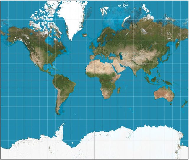
Above map is extremely presented in the wrong way. As we know the earth is a sphere and that means it's impossible to present her surface on two-dimensional map. It's a Mercator Projection. Let's see an example. Wyoming is a US state and is located here
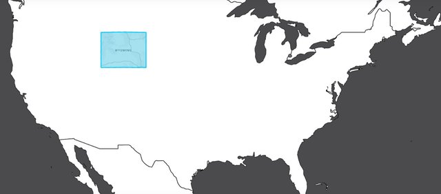
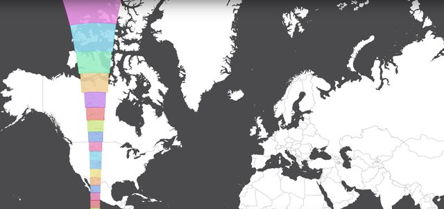
The size of this state going towards the North Pole is increasing in size and if going towards the South below is decreasing in size as we see below
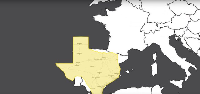
Let's look on other state. How looks Texas compared to other countries? Texas is much bigger than Spain and Portugal taken together
It might seem that Alaska is huge on the map
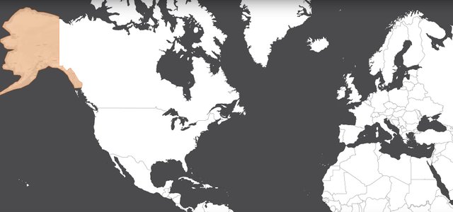
But comparing Alaska to the Europe is not huge like you thought
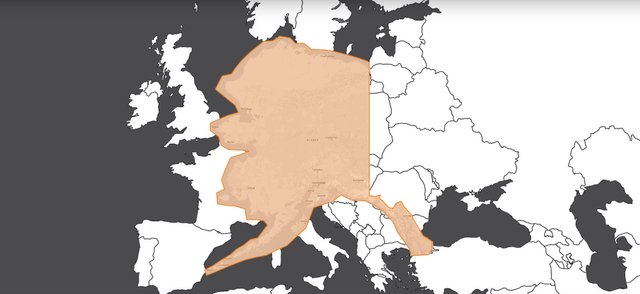
France seems be pretty big but if you take and move it to Africa looks much smaller
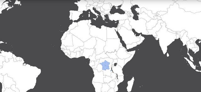
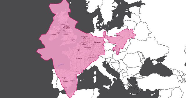
United Kingdoom also seems to be pretty big. Let's compare it to real size of India and we can be a little surprised
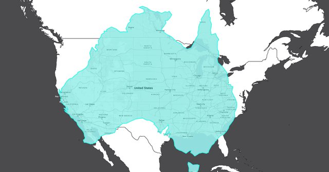
Australia is much bigger than most people think. It can cover almost whole entire territory of US
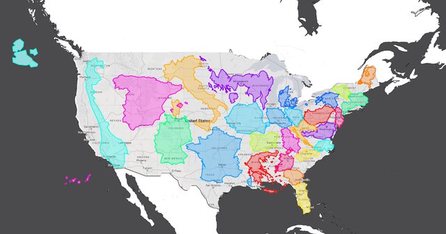
Area of US can accommodate many countries like Spain, Germany or France as we can see below
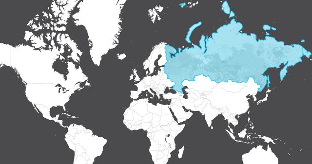
Russia seems to be large on the top of map
But in fact Russia is much smaller comparing to the Africa
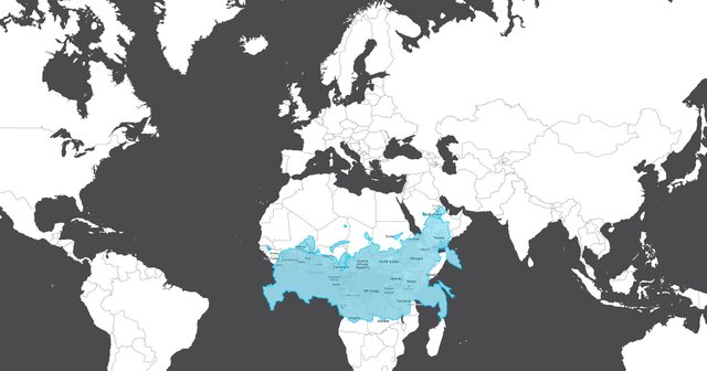
As you can see the size of countries on Mercator Projection is not presented accurately and we have to change size of country depending on location of map.
✅ @risen255, I gave you an upvote on your first post! Please give me a follow and I will give you a follow in return!
Please also take a moment to read this post regarding bad behavior on Steemit.
Downvoting a post can decrease pending rewards and make it less visible. Common reasons:
Submit
Congratulations @risen255! You received a personal award!
You can view your badges on your Steem Board and compare to others on the Steem Ranking
Vote for @Steemitboard as a witness to get one more award and increased upvotes!
Downvoting a post can decrease pending rewards and make it less visible. Common reasons:
Submit