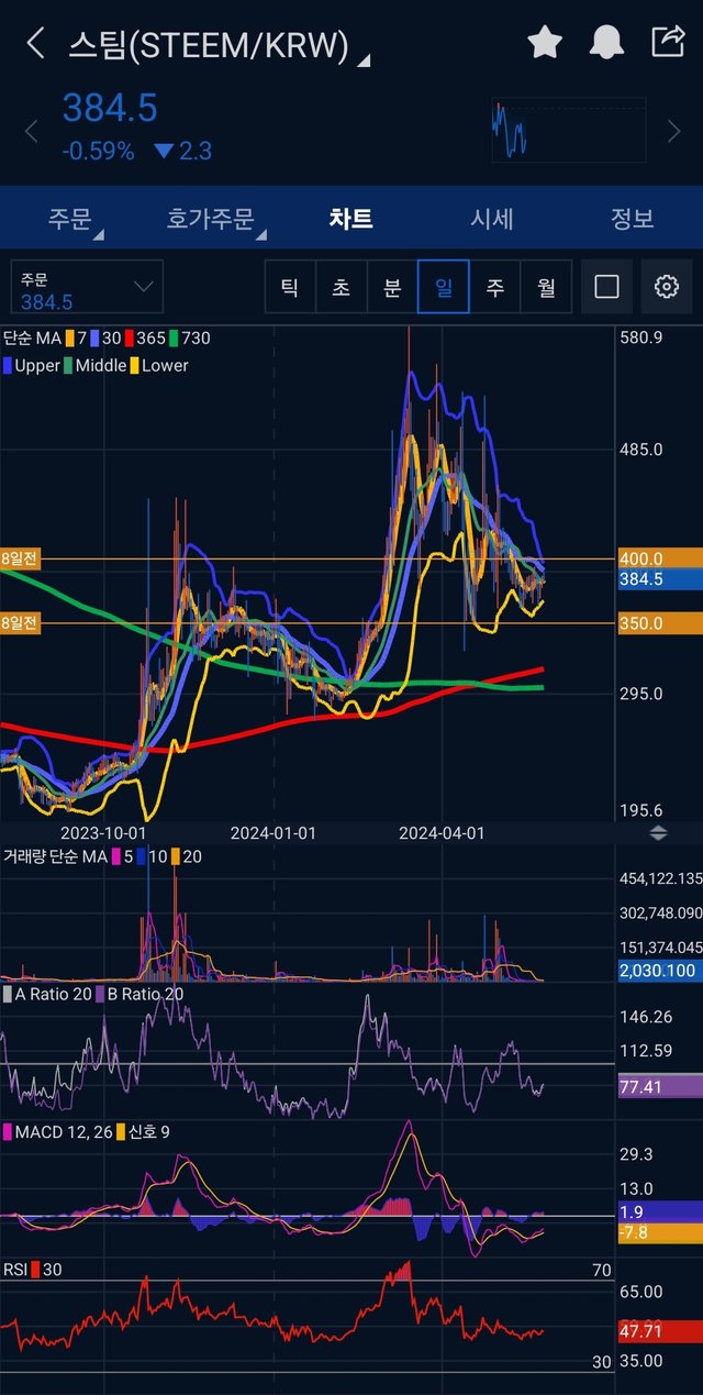
This is a daily candlestick chart of $STEEM. While the MACD is still minus, a golden cross occurred a few days ago. Furthermore, the Bollinger bands are converging. It seems that a big movement is coming 🧐

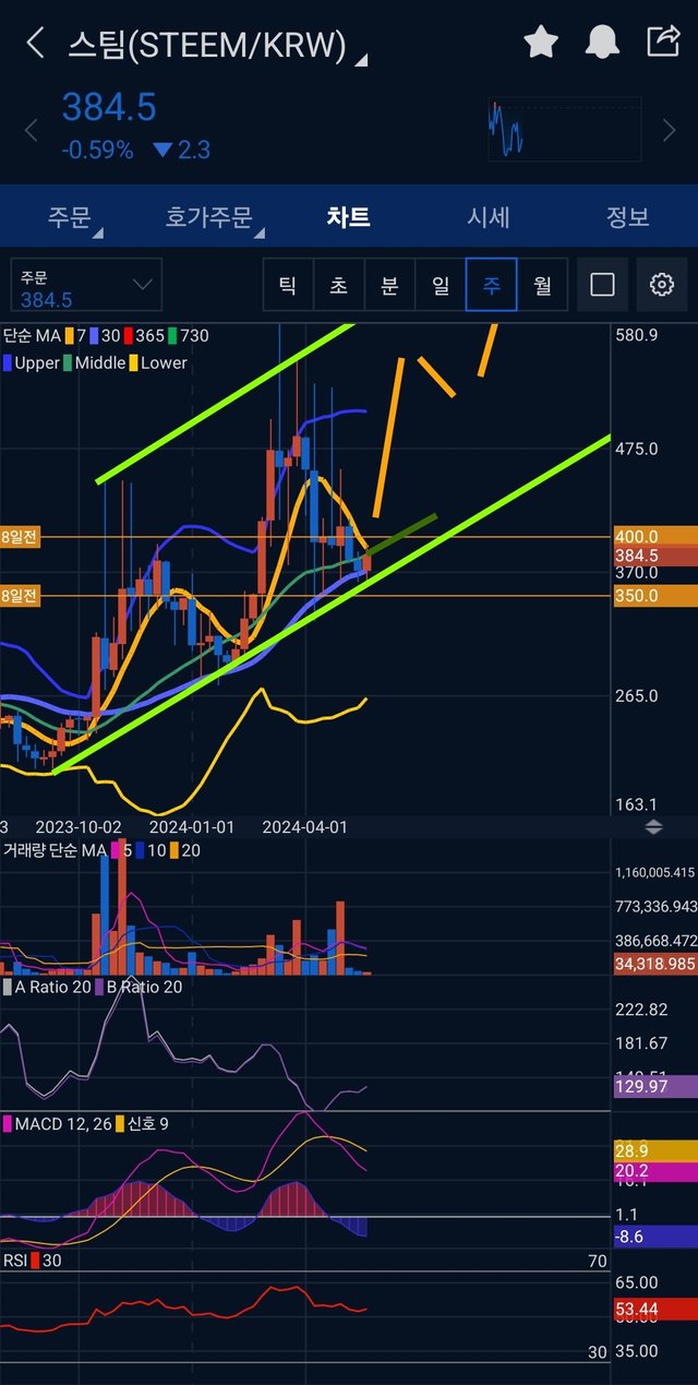
This is a weekly candlestick chart of $STEEM. Fortunately, the A, B ratio & MACD is plus. It's better than minus. The thick green and orange lines were drawn by me. The thick green lines mean the upward channel. The thick orange lines mean the estimated price movement.
I'm looking forward to $STEEM is going to break $0.3 again, and record a new ATH(All Time High). What's gonna be the next? $0.5?
This comment is for rewarding my analysis activities. Upvotings will be proceeded by @h4lab and @upex
Downvoting a post can decrease pending rewards and make it less visible. Common reasons:
Submit
Upvoted! Thank you for supporting witness @jswit.
Downvoting a post can decrease pending rewards and make it less visible. Common reasons:
Submit
Congratulations, your post has been upvoted by @upex with a 100.00% upvote. We invite you to continue producing quality content and join our Discord community here. Keep up the good work! #upex
Downvoting a post can decrease pending rewards and make it less visible. Common reasons:
Submit
Downvoting a post can decrease pending rewards and make it less visible. Common reasons:
Submit