Eclipse of 2016 二零一六的月蚀
Update: Later, @sneak wrote a post 'to clear up some confusion'. In the post, @sneak asked the bigot to die in a fire.
Now Steemit has a new Logo. The new logo is protected by IP laws. It cannot be used without permission. On the other hand, the old Steem logo is not changed. It can be used without permission.
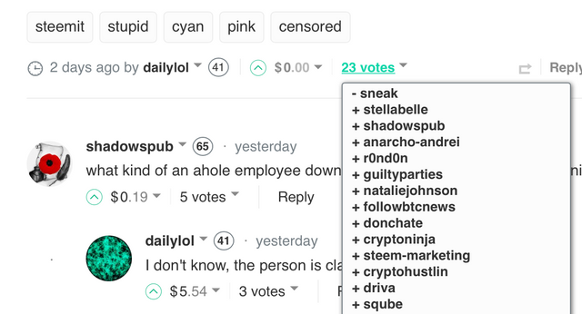
Somebody don't like the new logo and new color. In this post, @dailylol wrote I'm not sure whos idea it was to change the logo and the steemit color but wow it looks really ***. I don't know what is ***, but the URL of his post shows cyan-is-so-gay-looking. Therefore *** may stand for gay.
The post of @dailylol was flagged by @sneak. I am not sure who is @sneak. But this post shows @sneak is the CTO of Steemit.

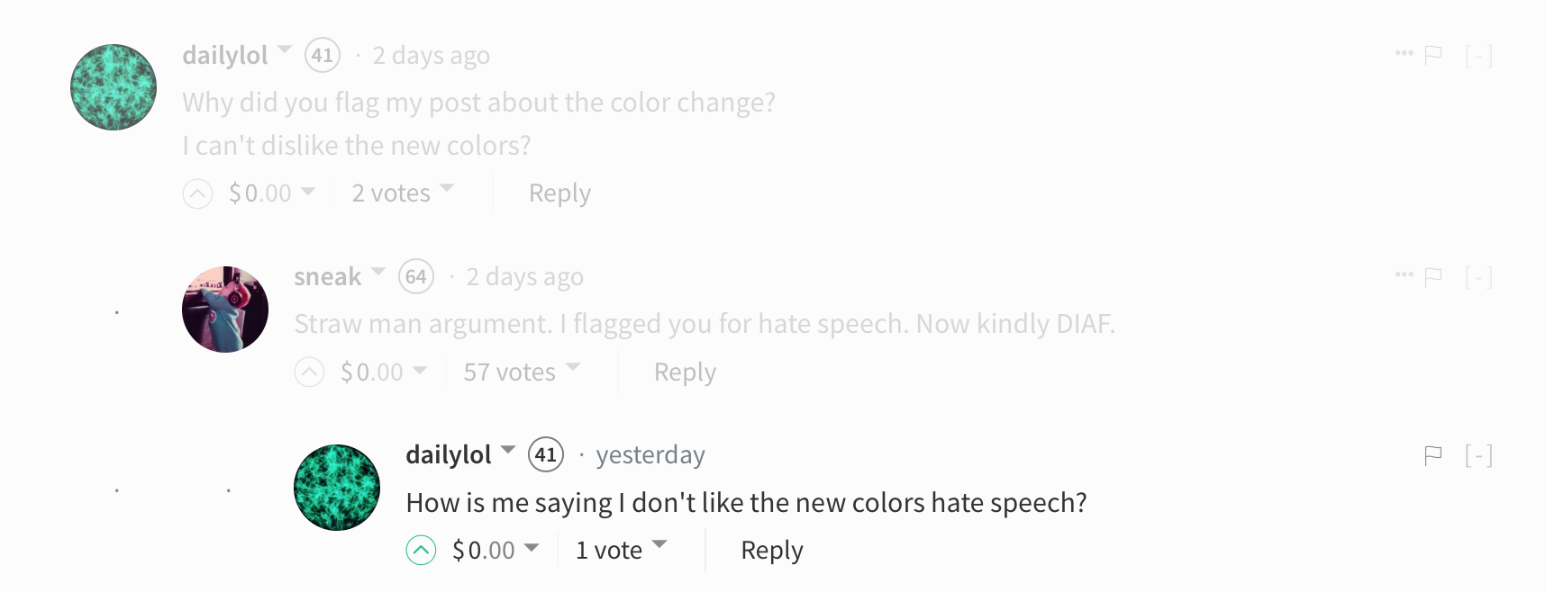
Then, @dailylod asked why he was flagged. @sneak replied that it's hate speech and said Now kindly DIAF. As I understand DIAF means Die In A Fire.

Now both comments of @dailylol and @sneak were flagged. @dailylol's comment was flagged by @sneak and @blacklist-a.
更新:后来 @sneak专门写了一个帖子来澄清迷惑,重新阐明让Bigot去死。
Steemit现在有了 新图标。新图标收版权法保护,未经许可不能使用。Steem的蓝色旧图标没有变,可以不经许可继续使用。
有些人不喜欢这个新图标或者这个新颜色。 @dailylol发了一篇文章吐槽新图标说这个颜色很基,就被 @sneak踩了。根据这篇文章, @sneak是Steemit的CTO。
@dailylol问为什么踩他。 @sneak说是因为仇恨言论,并让他去死(DIAF,Die In A Fire)。这两个人的评论都被踩。其中 @dailylol的评论还被 @blacklist-a所踩。
吓得我都不敢评论了。。。
数据、观察、分析系列
- Value of Your Post 为什么你的帖子不值十块钱
- Observation and Analysis - Heroes and Villains II 观察与分析之侠客英雄传之二
- Observation and Analysis - Who is the Best Curator 观察与分析之最好的点赞者
- Observation and Analysis - New Victim of the Scam 观察与分析之新的受害者
- Observation and Analysis - Who is the Scammer 观察与分析之谁是骗子
- Observation and Analysis - The Fake Cheetah 观察与分析之诈骗
- Observation and Analysis - The Dark Hand of Steemit 观察与分析 Steemit的黑手🔥
- How to Attract 200 Users per Day Under the Nose of Steemcleaners 如何放心地发垃圾评论
- Observation and Analysis - Firepower of Spamming 观察与分析之奇葩列传🔥
- Observation and Analysis - Heroes and Villains 观察与分析之侠客英雄传
- Observation and Analysis 20171004 观察与分析之雪花飘
- Observation and Analysis - Blocktrades 观察与分析Blocktrades
- Observation and Analysis 观察与分析 20171002
- 2017年9月下旬中文区大鲸点赞统计
- Observation and Analysis 观察与分析 20171001
- Upvote Analysis of CN Whales CN区大鲸点赞分析
- Upvote Analysis of CN Whales II CN区大鲸点赞分析之二
- Reflections on Steemit 有关Steemit的杂想
- 魑魅魍魉
- 聊聊聊斋
更多系列游记
- One Day in Lisbon 里斯本一日
- Journey of China in 2017 中国之旅
- Journey of New Zealand South Island 新西兰南岛之行🔥
- 邮轮攻略
- 纽约旅游指南
© Copyright 所有照片与文字皆为 @nationalpark原创。All photos taken by @nationalpark. All rights reserved.
新配色实在是不舒服。是大家的审美出现问题了,还是开发者的审美有问题?
Downvoting a post can decrease pending rewards and make it less visible. Common reasons:
Submit
颜色不是一般的难看。尤其是链接也是那种亮绿的颜色,如果是一大片链接特别晃眼睛。
Downvoting a post can decrease pending rewards and make it less visible. Common reasons:
Submit
是的,尤其不能忍受的就是链接的配色。 访问顺畅了可惜配色这么难看,期待下次更新(不会更让人失望了吧)。
Downvoting a post can decrease pending rewards and make it less visible. Common reasons:
Submit
我都打算换地方了。正在考虑使用busy或者steemkr。
另外如果首席技术官这么不靠谱,以后可以考虑少写文章了。
Downvoting a post can decrease pending rewards and make it less visible. Common reasons:
Submit
busy的界面不太喜欢,steemkr访问速度有点慢。APP啥时候能够出来啊,有说在开发吗?
如果CTO真的是这样,太让人失望。
Downvoting a post can decrease pending rewards and make it less visible. Common reasons:
Submit
我还没有用过busy,因为不想在第三方网站输入密码。看我忍这个颜色能忍到什么时候吧:)
Downvoting a post can decrease pending rewards and make it less visible. Common reasons:
Submit
是的,如果不是必须,宁可不用也不想在第三方输入密码。
Downvoting a post can decrease pending rewards and make it less visible. Common reasons:
Submit
完全可以理解,眼睛快瞎了~
上班看電腦螢幕閃,
下班騎車看車燈更閃,
回頭看Steemit完全閃閃閃!!
Downvoting a post can decrease pending rewards and make it less visible. Common reasons:
Submit
是的,搞得眼睛很不舒服。黑夜模式稍微好一点
Downvoting a post can decrease pending rewards and make it less visible. Common reasons:
Submit
但看久了一樣不太習慣啊~~ :(
Downvoting a post can decrease pending rewards and make it less visible. Common reasons:
Submit
我对配色倒没啥意见,韩国最大网站naver也是类似这种亮绿(naver的好像稍微顺眼一点),但是cto这么冲在前面得有个公关管一管啊
Downvoting a post can decrease pending rewards and make it less visible. Common reasons:
Submit
我去看了一下naver,感觉那个颜色还不错
Downvoting a post can decrease pending rewards and make it less visible. Common reasons:
Submit
也去看了下,那个绿色比这个好看多了。
Downvoting a post can decrease pending rewards and make it less visible. Common reasons:
Submit
要他看到我们这么公然批评他的审美又该把我们都拉黑了
Downvoting a post can decrease pending rewards and make it less visible. Common reasons:
Submit
要真是这样的话,前景堪忧啊,拉黑也就无所谓了。
Downvoting a post can decrease pending rewards and make it less visible. Common reasons:
Submit
我也是这样想的。CTO这么不靠谱的公司前途堪忧
Downvoting a post can decrease pending rewards and make it less visible. Common reasons:
Submit
审美嘛,不能反抗就享受吧。
Downvoting a post can decrease pending rewards and make it less visible. Common reasons:
Submit
哈哈哈
Downvoting a post can decrease pending rewards and make it less visible. Common reasons:
Submit
可以理解你的难以忍受,你的文章最绿了
Downvoting a post can decrease pending rewards and make it less visible. Common reasons:
Submit
我以后都不敢贴链接了
Downvoting a post can decrease pending rewards and make it less visible. Common reasons:
Submit
不把工夫花到改善性能上,净弄这些没用的玩意儿。
Downvoting a post can decrease pending rewards and make it less visible. Common reasons:
Submit
整没用的还好,整得颜色这么刺眼,看完以后闭上眼睛,眼前还是亮的
Downvoting a post can decrease pending rewards and make it less visible. Common reasons:
Submit
一个新图标引发的大战
Downvoting a post can decrease pending rewards and make it less visible. Common reasons:
Submit
CTO应该先把网站做好再参战
Downvoting a post can decrease pending rewards and make it less visible. Common reasons:
Submit
看完你们的评论我都不敢说话了。。。。。
Downvoting a post can decrease pending rewards and make it less visible. Common reasons:
Submit
这配色难不难看另说, 但改的确实有点莫名奇妙. sneak 的做法和评论如果不考虑他的立场也无可厚非, 他也是人, 看到不喜欢的文章踩一下骂两句也没啥
Downvoting a post can decrease pending rewards and make it less visible. Common reasons:
Submit
一般正常人很少去踩别人。况且他又是CTO。他的行为不只代表他自己,还代表了公司和团队
Downvoting a post can decrease pending rewards and make it less visible. Common reasons:
Submit
界面仿佛上世纪末的感觉
建议还是好好请个UI吧
Downvoting a post can decrease pending rewards and make it less visible. Common reasons:
Submit
我从上世纪末走过来,没见过这么晃眼的网站
Downvoting a post can decrease pending rewards and make it less visible. Common reasons:
Submit
和Windows的二货设计有一拼
为了Aero坚持win7一百年不动摇
Downvoting a post can decrease pending rewards and make it less visible. Common reasons:
Submit
連評論喜好都不行的話豈不成一言堂了,不妙啊😒
Downvoting a post can decrease pending rewards and make it less visible. Common reasons:
Submit
小声说一句,感觉这个CTO有点二
Downvoting a post can decrease pending rewards and make it less visible. Common reasons:
Submit
that is a hars complain and replay. but complaining like that sand saying a gay, i guess is also not very polite.
Downvoting a post can decrease pending rewards and make it less visible. Common reasons:
Submit
I am not sure about it. According to that author, gay is a neutral word
Downvoting a post can decrease pending rewards and make it less visible. Common reasons:
Submit